ggplot(shelter_cats_dogs) +
  geom_point(aes(x = intake_type, y = age_at_intake)) +
geom_boxplot(aes(x = outcome_type, y = intake_duration))HW 1
Viz dat, wrangle dis!
HW
Mon, Jan 26 at 5 pm
For any exercise where you’re writing code, insert a code cell and make sure to label the cell. Use a short and informative label. If using a package other than tidyverse, load it on the code cell labeled load-packages on top of your Quarto document. For any exercise where you’re creating a plot, make sure to label all axes, legends, etc. and give it an informative title. For any exercise where you’re including a description and/or interpretation, use full sentences. Make a commit at least after finishing each exercise, or better yet, more frequently. Push your work regularly to GitHub. Once you’re done, inspect your GitHub repo to make sure you’ve pushed all of your changes, `
Note
Your homework repositories are set up to Git ignore the resulting hw-1.html file and the folder that keeps the auxiliary files generated during rendering (hw-1_files). Therefore, you won’t see these files pop up in the Git pane. Before we grade your work, we will generate these files.
Question 1
Collab, sketch, plot
This week’s TidyTuesday dataset.
a. Part (a) of this question can be completed this week.
- Go to this week’s Tidy Tuesday data and carefully read the accompanying README to understand the context, variables, and data limitations: https://github.com/rfordatascience/tidytuesday/blob/main/data/2026/2026-01-13/readme.md
- Pair up or form a small group with students around you.
- As a group, brainstorm one clear research question that can be answered using this dataset, and decide on one or more visualizations that would help answer that question.
- Sketch your proposed visualization(s) on paper, including the main variables, axes, and any annotations you plan to include. (Each student must make their own sketch.)
- Implement the visualization in R.
In your submission, include:
- Your research question.
- A brief description of the planned visualization.
- A photo or scan of your sketch, saved as a PNG, JPG, etc. file in the
imagesfolder. - The code used to produce the final visualization.
- Name(s) of the student(s) you worked with on this question
b. Part (b) of this question will require you to revisit this dataset later this week or next week.
-
Go on social media (Bluesky, Mastadon, LinkedIn, etc.) to find community submissions of data visualizations of the TidyTuesday dataset you used in Part (a). Below are a few URLs to find such posts, you’re welcomed to look on other platforms as well.
Pick 2-3 posts with visualizations that you like (or dislike), share links to them, include images of the visualizations (saved as PNG, JPG, etc. files in the
imagesfolder), and write 1-2 sentences on each describing what you like (or dislike) about them.(Completely optional, not graded) Share your visualization on social media with the hashtag #tidytuesday.
Question 2
Cats and dogs.
The dataset for this question comes from the City of Long Beach. It comprises of the intake and outcome record from Long Beach Animal Shelter.1
a. Your first task is to clean the data following a specific set of steps, with the goal of reviewing data importing and transformation skills from previous courses.
In a single pipeline, load the data file called
animal-shelter-intakes-and-outcomes.csvfrom your data folder, convert all variable names tosnake_casewith a single function, and save the result asshelter_animals.-
In a second pipeline,
- transform:
- calculate
age_at_intakeas the number of days betweenintake_dateand date of birth (dob), - transform
intake_typeto combine any levels that occur fewer than 1000 times to a level called"Other"and convert the levels to sentence case, and - transform
outcome_typeto combine any levels that occur fewer than 1000 times to a level called"Other"and convert the levels to sentence case, and then
- calculate
- subset the data to keep only cats and dogs (
animal_type) that are greater than or equal to 0 days at intake (age_at_intake), that entered the shelter in 2025 (intake_date), that stayed in the shelter for more than 0 days (intake_duration), and that don’t have"Other"as theirintake_typeoroutcome_type. - reorganize the data to have the following variables as the first six columns:
animal_type,age_at_intake,intake_type,intake_date,intake_duration, andoutcome_type
You should accomplish this with a single
mutate(), a singlefilter(), and a singlerelocate()call in your pipeline. The resulting data frame should be calledshelter_cats_dogs. - transform:
Display the number of rows and columns and the variable names of
shelter_cats_dogs. (Hint: It should have 2,976 rows and 30 columns.)
b. What does the following code do? Does it work? Does it make sense? Why/why not?
c. Which of the following two plots makes it easier to compare days at the shelter (intake_duration) across different outcome types (outcome_type)? What does this say about when to place a faceting variable across rows or columns?
ggplot(shelter_cats_dogs) +
  geom_density(aes(x = intake_duration)) +
facet_grid(outcome_type ~ ., scales = "free")ggplot(shelter_cats_dogs) +
geom_density(aes(x = intake_duration)) +
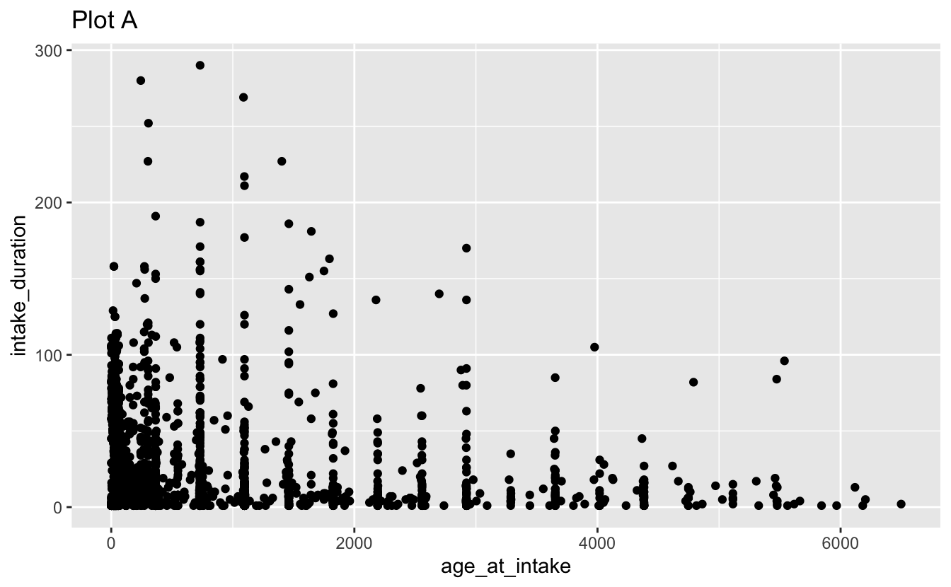
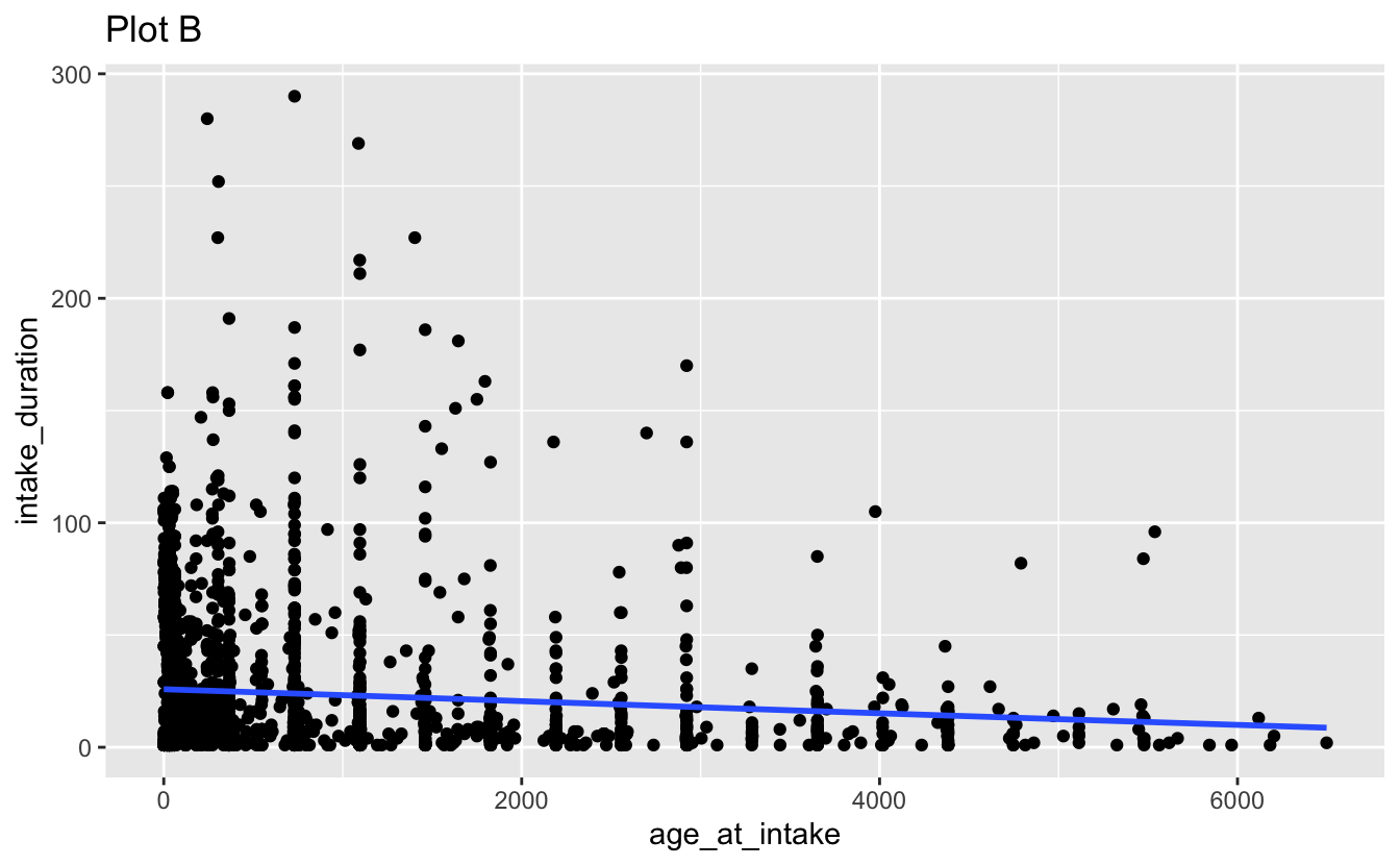
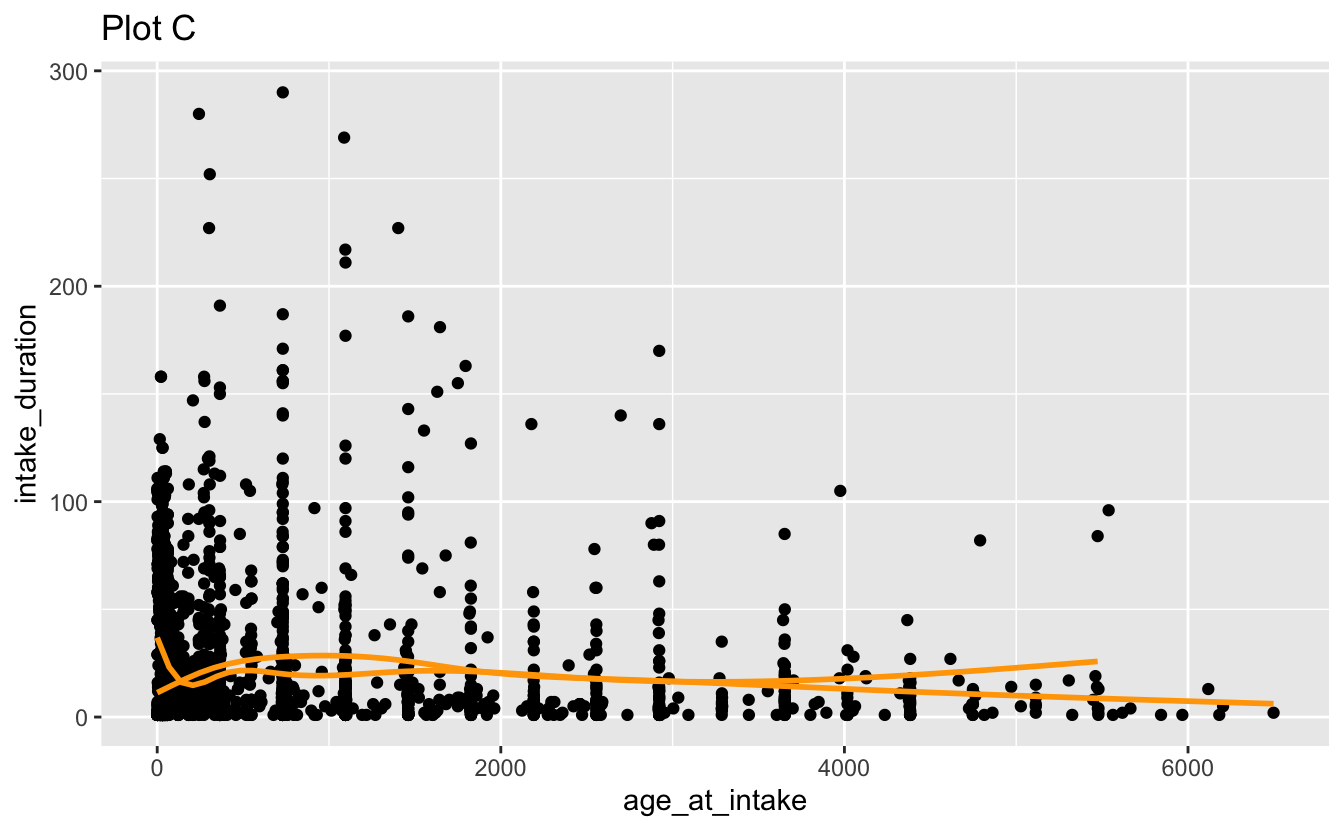
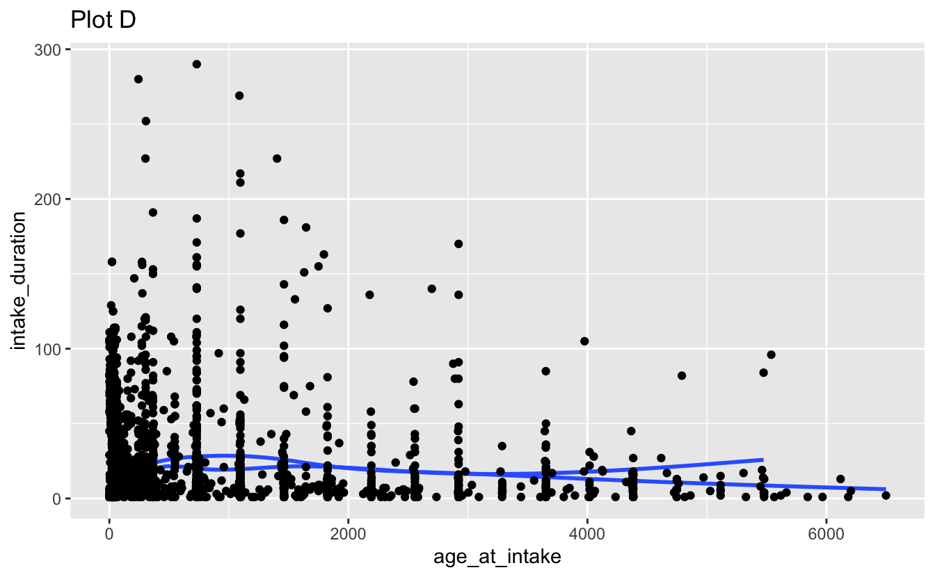
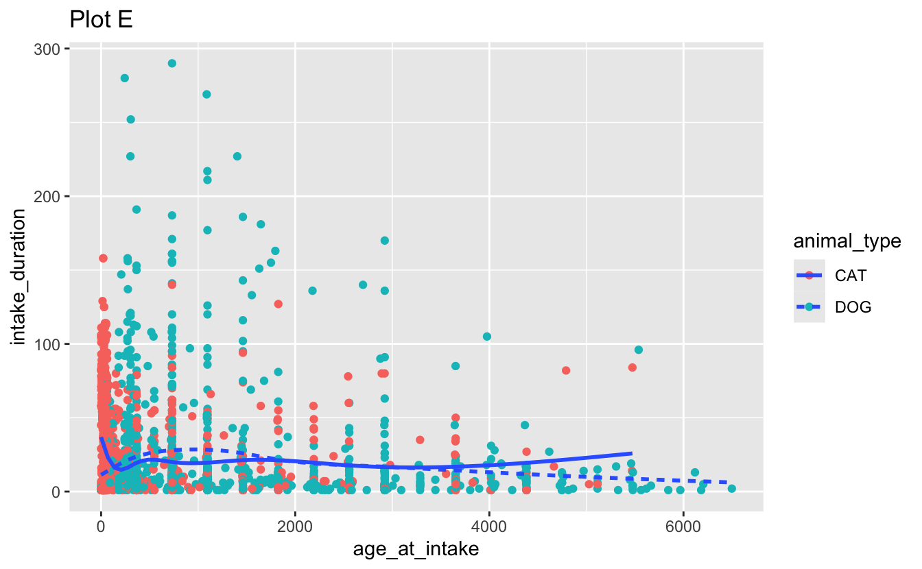
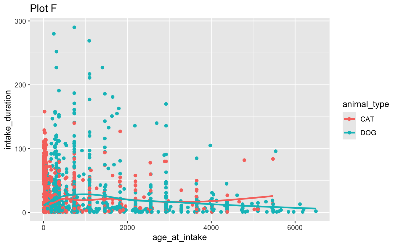
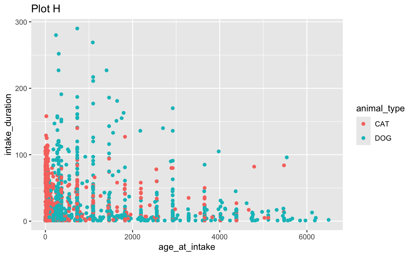
facet_grid(. ~ outcome_type, scales = "free")d. Recreate the following visualizations. Note that wherever a categorical variable is used in the plot, it’s animal_type.

Question 3
Credit card balances.
The data for this exercise is on credit card balances. The dataset is in the data folder of your repository, and it’s called credit.csv. It contains the following variables:
-
balance: Credit card balance in $ -
income: Income in $1,000 -
student: Whether the individual is a student (Yes) or not (No) -
married: Whether the individual is a married (Yes) or not (No) -
limit: Credit limit
a. Recreate the following visualization. The only aspect you do not need to match are the colors, however you should use a pair of colors of your own choosing to indicate students and non-students. Choose colors that appear “distinct enough” from each other to you. Then, describe the relationship between income and credit card balance, touching on how/if the relationship varies based on whether the individual is a student or not or whether they’re married or not.
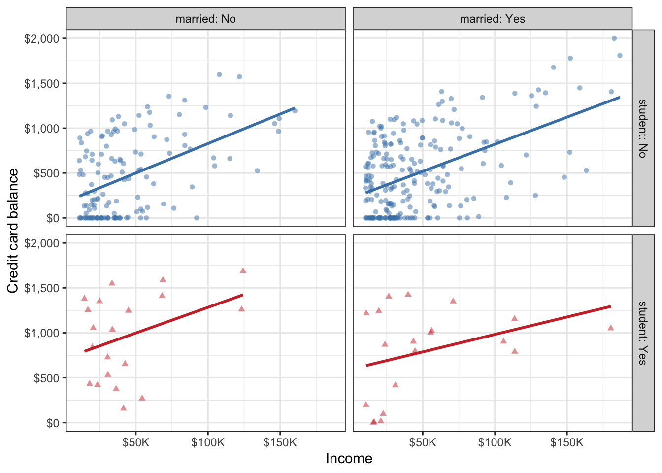
b. Based on your answer to part (a), do you think married and student might be useful predictors, in addition to income for predicting credit card balance? Explain your reasoning.
c. Credit utilization is defined as the proportion of credit balance to credit limit. Calculate credit utilization for all individuals in the credit data, and use it to recreate the following visualization. Once again, the only aspect of the visualization you do not need to match are the colors, but you should use the same colors from the previous exercise.
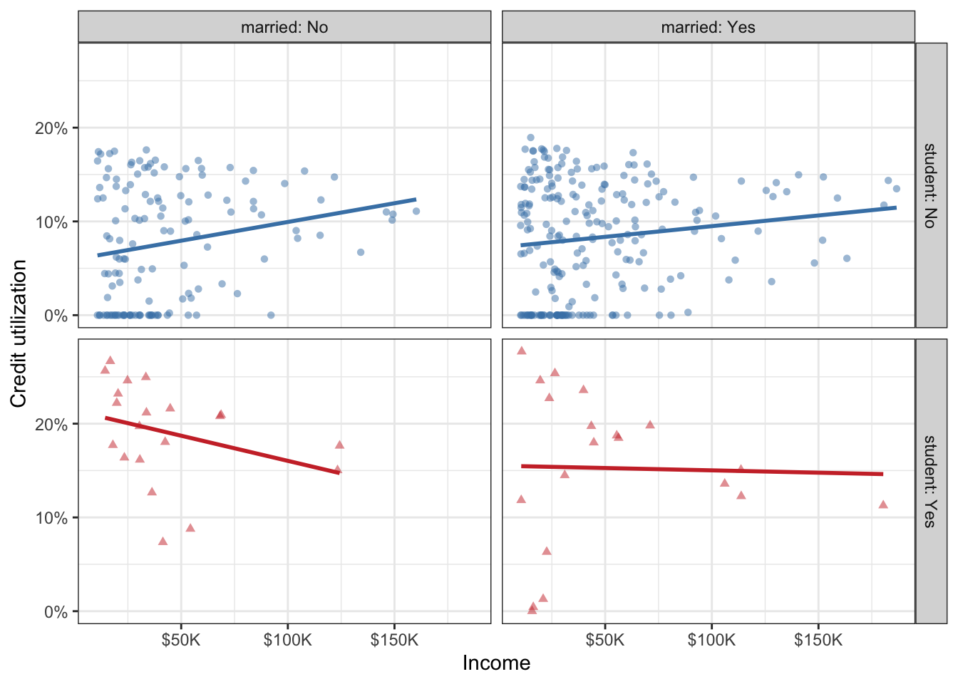
d. Based on the plot from part (c), how, if at all, are the relationships between income and credit utilization different than the relationships between income and credit balance for individuals with various student and marriage status.
Question 4
Expect More. Plot More.
Make the following image (it’s the logo for the retail store Target) using ggplot2. Write a few sentences describing your approach.

Some tips:
- I didn’t give you a dataset to plot, you’ll need to make one. Use
tibble()ortribble()to do that again. It really doesn’t matter what you choose to include in that dataset as long as you achieve the final look. - The red used in the plot is the “Target red”, you can google and find out what that is. Don’t forget to cite your source for this too!
- The registered trademark symbol (R in a circle) can be a bit trickier to figure out. There is a only a very small number of points associated with that component of the plot. So think of it as a “stretch goal” and work on figuring out the rest of the plot first.
- The aspect ratio of of your plot in your Quarto document is just as important as the plot. Once you figure out the code to make the plot, knit your document to make sure it looks good in the output of your Quarto document.
- There are many ways you can do this, feel free to discuss with classmates but fight the urge to adopt their approach. Instead, try to come up with your unique one.
Question 5
Napoleon’s march.
The instructions for this exercise are simple: recreate Napoleon’s march plot by Charles John Minard in ggplot2. The data is provided as a list, saved as napoleon.rds in the data folder of your repo. Read it in using read_rds(). This object has three elements: cities, temperatures, and troops. Each of these is a data frame, and the three of them combined contain all of the data you need to recreate the visualization. Your goal isn’t to create an exact replica of the original plot, but to get as close to it as you can using code you understand and can describe articulately in your response. I’ll be the first to say that if you google “Napoleon’s march in ggplot2”, you’ll find a bunch of blog posts, tutorials, etc. that walk you through how to recreate this visualization with ggplot2. So you might be thinking, “why am I being asked to copy something off the internet for my homework?” Well, this is an exercise in (1) working with web resources and citing them properly, (2) understanding someone else’s ggplot2 code and reproducing their work, (3) describing what that code does in your own words, and finally (4) putting some final touches to make the final product your own. Some more guidelines below:
You should make sure your response properly cites all of the resources you use. I’m defining “use” to include “browse, read, get inspired by, or directly borrow snippets of code from”. You don’t need to worry about formal citations, it’s okay to make a list with links to your resources and provide a brief summary of how you used each one.
For this exercise, you’re asked to describe what your code does. If you write the code, it should be straightforward for you to describe it. If you borrow any code from outside resources, you need to understand what that code does, and describe it, in your own words. (This is important, you’re allowed to use found code, but you are not allowed to copy someone’s blog post or tutorial as your description of their code.)
Finally, you should personalize the visualization with your own touch. You can do this in a myriad of ways, e.g., change colors, annotations, labels, etc. This change should be made to make the plot more like the original in some way. You need to explicitly call out what change you made and why you made it.