W.E.B. Du Bois
AE 07
The visualizations presented in this article are original data visualizations by W.E.B. Du Bois and the captions reflect the language of the time in history.
The most prevalent type of visualizations created by W. E. B. Du Bois are bar charts, so the activities will focus on recreating the following, seemingly simple, bar charts.
In the following two activities, we will recreate these visualizations using R and the following packages:
Activity 1 - Enrollment in Public Schools
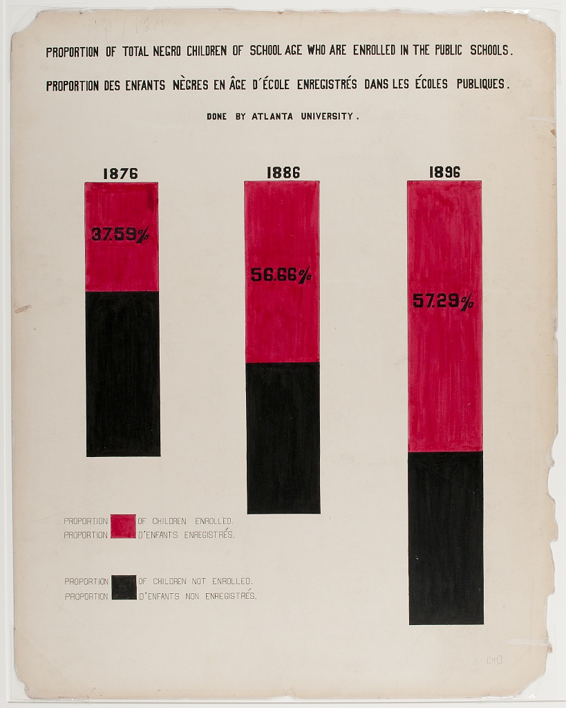
The goal of the this activity is to reproduce the visualization shown in Figure 1 (a), which displays the percentages of school aged Black children who are and are not enrolled public schools in the years 1876, 1886, and 1896.
We will break down the task of reproducing the visualization, starting with ggplot2 defaults and customizing a little bit at each step until we reach something very similar (though not a perfect replica) of the original visualization.
- Create a data frame called
public_schoolwith the relevant data. This data frame should have three columns:enrolled,year, andpercent, wherepercentis given as a number between 0 to 100.
# add code here- Create a stacked bar chart where year is on the x-axis and percent enrolled is on the y-axis. Once you do, compare the plot you made to the original visualization in Figure 1 (a) and make a list of all of updates you will need to make to this plot to make it look more like for a complete reproduction.
# add code here- Update the colors on the plot to match the inspiration figure. Also make sure that the order in which the colors show up in the bars as well as the legend labels match. Note: For this task you can either use red and black colors, or use an additional piece of software (e.g., Digital Color Meter on a Mac) to match the exact colors.
# add code here- Place the percentages of “yes”s in the red portions of the bars and remove all axis elements by setting
theme_void(). Hint: First calculate where on the y-axis the annotation should be placed and store those values in the data as a new column.
# add code here- Add back the x-axis labels, but place them on top of the bars.
# add code here- Make the bars skinnier and increase the white space between them.
# add code here- The original visualization in Figure 1 (a) features three bars of unequal he*ight. Presumably, this might indicate a larger population being represented, but we don’t have data on how much larger this population is. But we can eyeball that the bar for 1886 is roughly 25% taller than the bar for 1876 and the bar for 1896 is roughly 60% taller. Recreate the visualization with unequal bar heights using these rough estimates.
# add code here- Move the legend underneath the first bar and reduce the size of the legend key.
# add code here- Adjust the size and aspect ratio of the figure.
# add code here- Change the background of the plot to match the background of the original visualization in Figure 1 (a). Hint: Look for an image of a “parchment paper” on a free image site like Pixabay (https://pixabay.com) and place the image in the background of the plot.
# add code here- What other updates would you make to match the original visualization in Figure 1 (a)?
Add answers here.
Activity 2 - Income expenditures
We will get started on this, time permitting. You’ll continue working on it in HW 3.
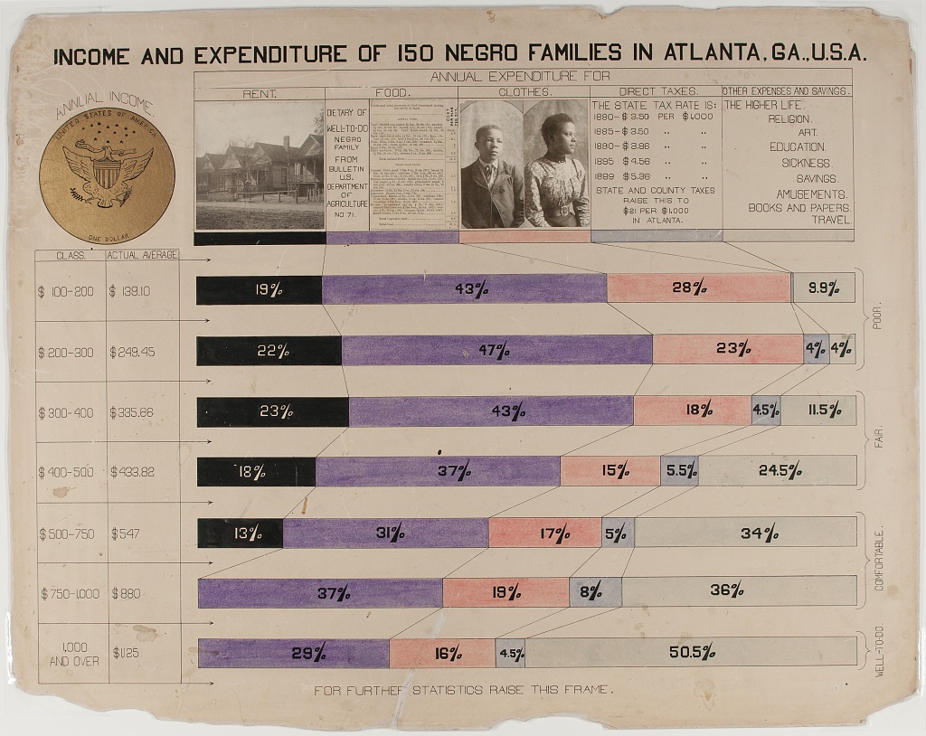
The second activity focuses on recreating Figure 1 (b), which was originally created using ink and watercolors. It also stands out due to the use of photographs at the top of the graph. The visualization shows family budgets split by income classes for 150 families in Georgia.
- Discuss the following questions with your neighbor.
- What is the topic of the graph?
- What do you observe from the graph?
- What questions do you have after viewing this graph? What do you want to learn more about?
- Read the data file
data/income.csvasincome_wide.Then, we dive into the reproduction exercises, using the following dataset.
# add code here- Create the segmented bar plot. Hint: You will first need to pivot your data longer.
# add code here- Add annotations that show the percentages associated with each of the segments.
# add code here- Update the color palette and legend to match the original Du Bois visualization.
# add code here- Re-position the legend and match it, as closely as you can, to the original visualization.
# add code here- Add some more finishing touches to get as close to the original visualization as you can.
# add code here- What other updates would you make to match the original visualization in Figure 1 (b)?