# load packages
library(tidyverse)
library(scales)
library(openintro)
library(ggthemes)

# set theme for ggplot2
ggplot2::theme_set(ggplot2::theme_minimal(base_size = 14))

# set figure parameters for knitr
knitr::opts_chunk$set(
  fig.width = 7, # 7" width
  fig.asp = 0.618, # the golden ratio
  fig.retina = 3, # dpi multiplier for displaying HTML output on retina
  fig.align = "center", # center align figures
  dpi = 300 # higher dpi, sharper image
)Data wrangling + tidying for visualization
Lecture 3
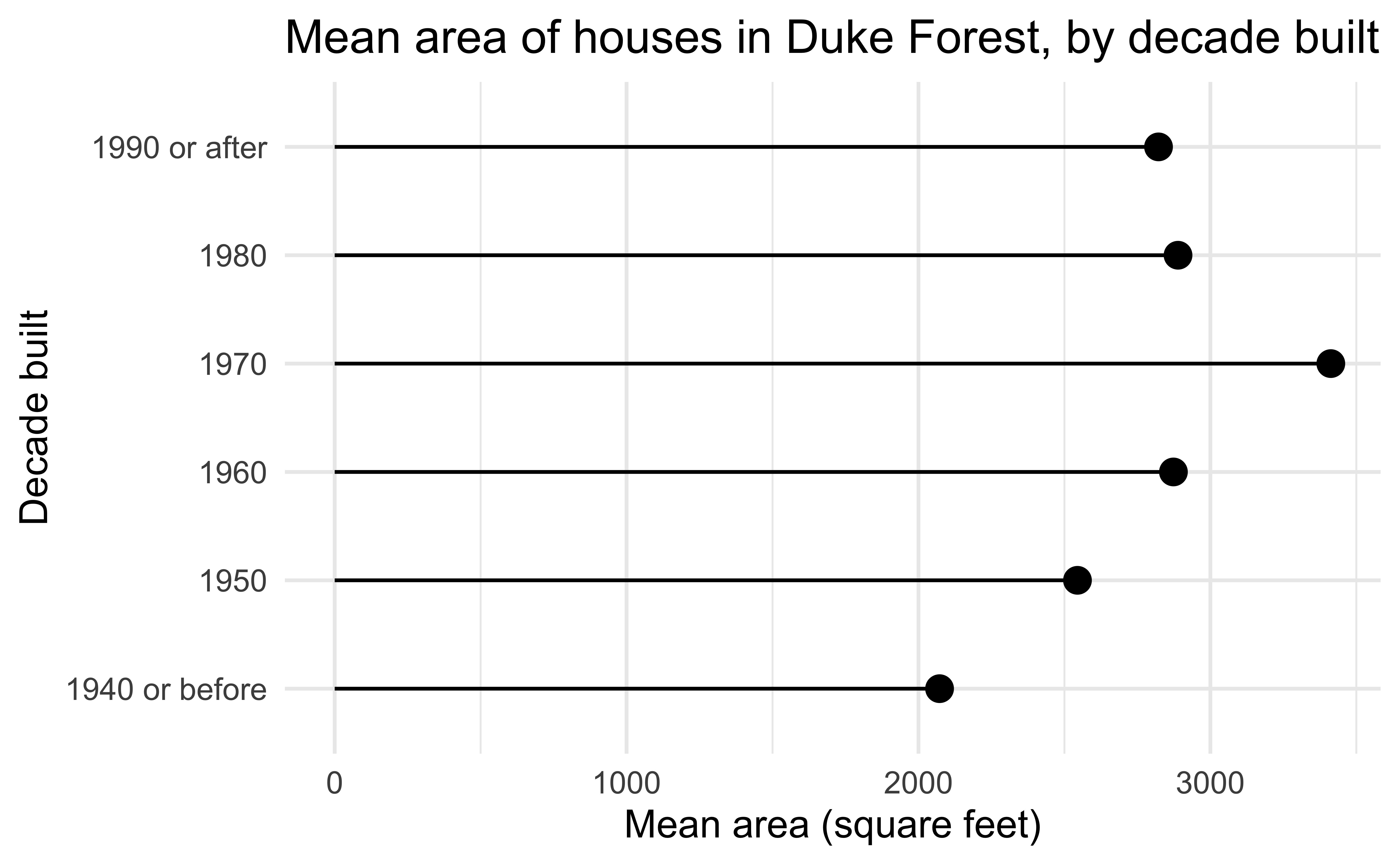
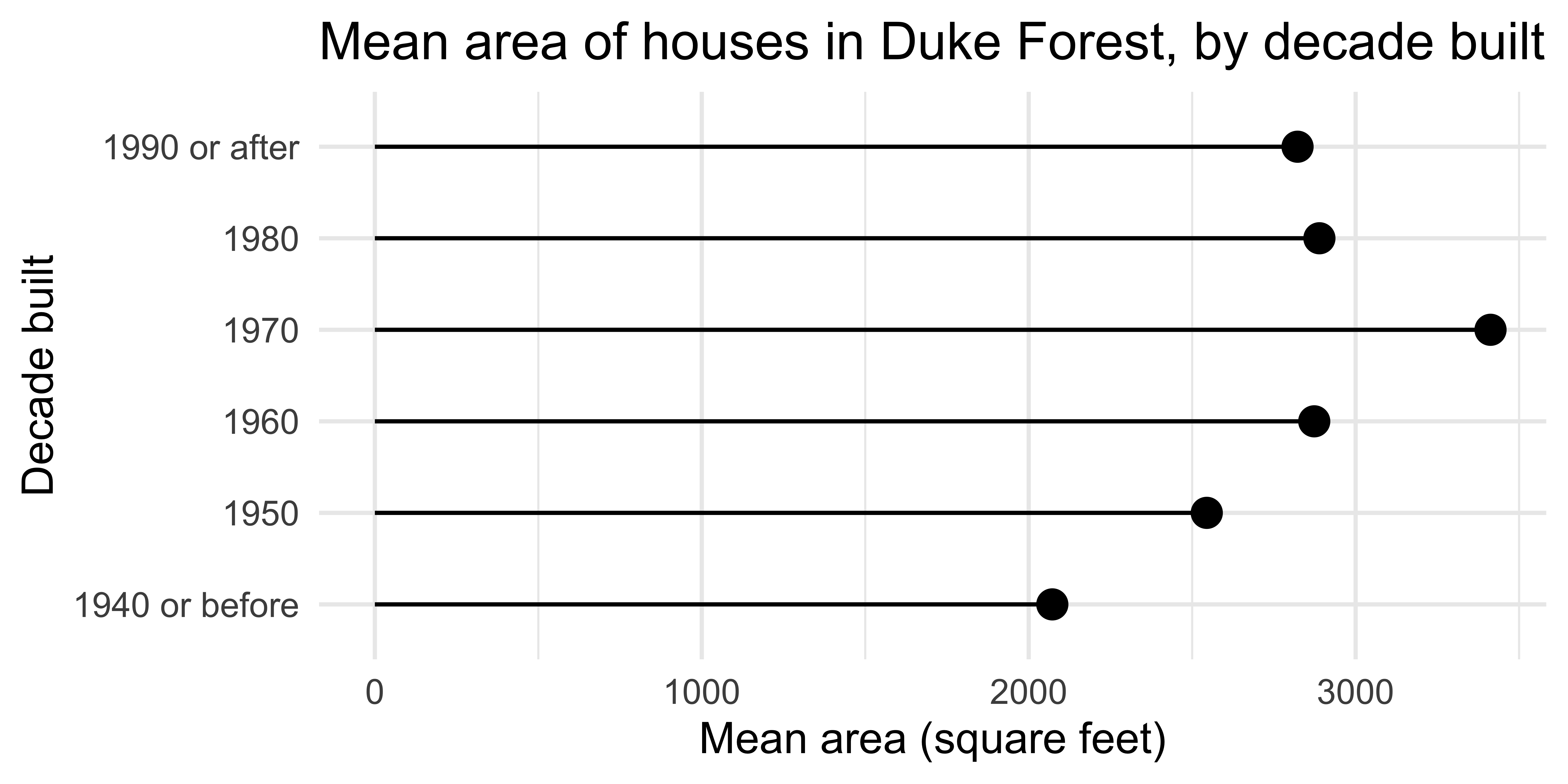
Lollipop chart
Code
duke_forest <- duke_forest |>
  mutate(
    decade_built = (year_built %/% 10) * 10,
    decade_built_cat = case_when(
      decade_built <= 1940 ~ "1940 or before",
      decade_built >= 1990 ~ "1990 or after",
      .default = as.character(decade_built)
    )
  )

mean_area_decade <- duke_forest |>
  group_by(decade_built_cat) |>
  summarize(mean_area = mean(area))

ggplot(
  mean_area_decade,
  aes(y = decade_built_cat, x = mean_area)
) +
  geom_point(size = 4) +
  geom_segment(
    aes(
      x = 0,
      xend = mean_area,
      y = decade_built_cat,
      yend = decade_built_cat
    )
  ) +
  labs(
    x = "Mean area (square feet)",
    y = "Decade built",
    title = "Mean area of houses in Duke Forest, by decade built"
  )
Bad data

Bad perception
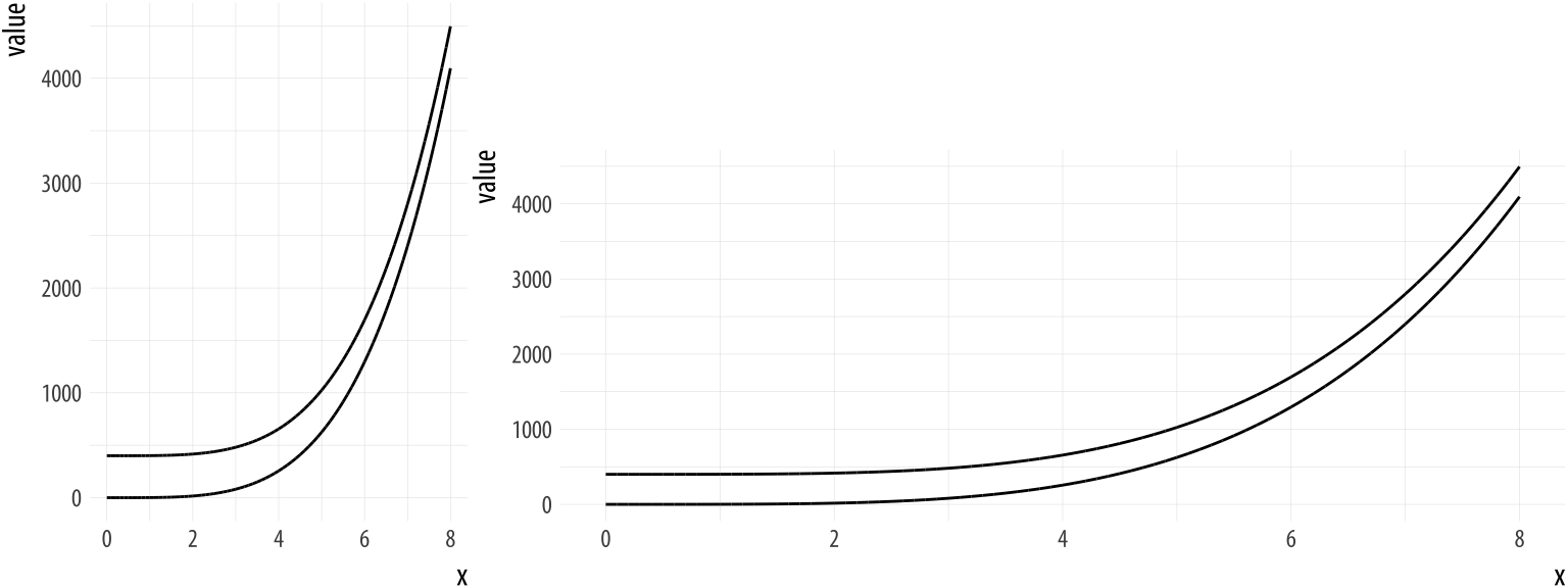
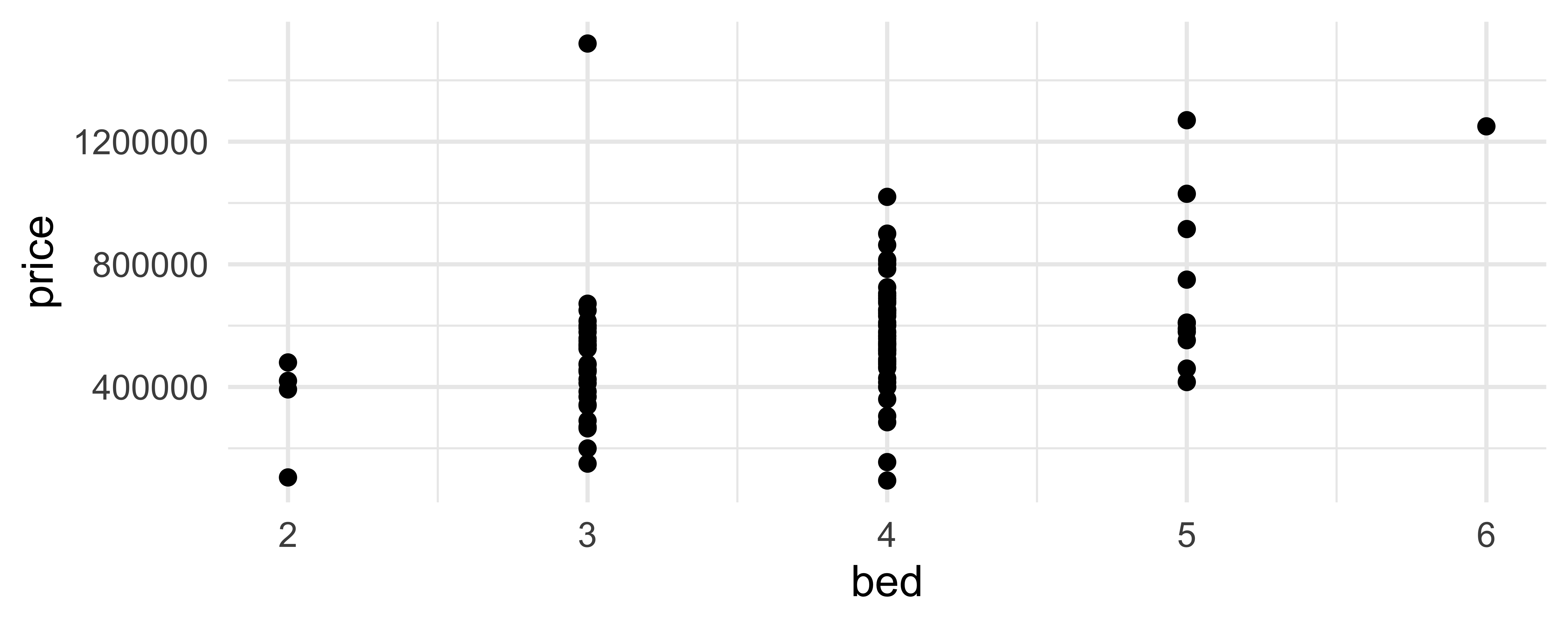
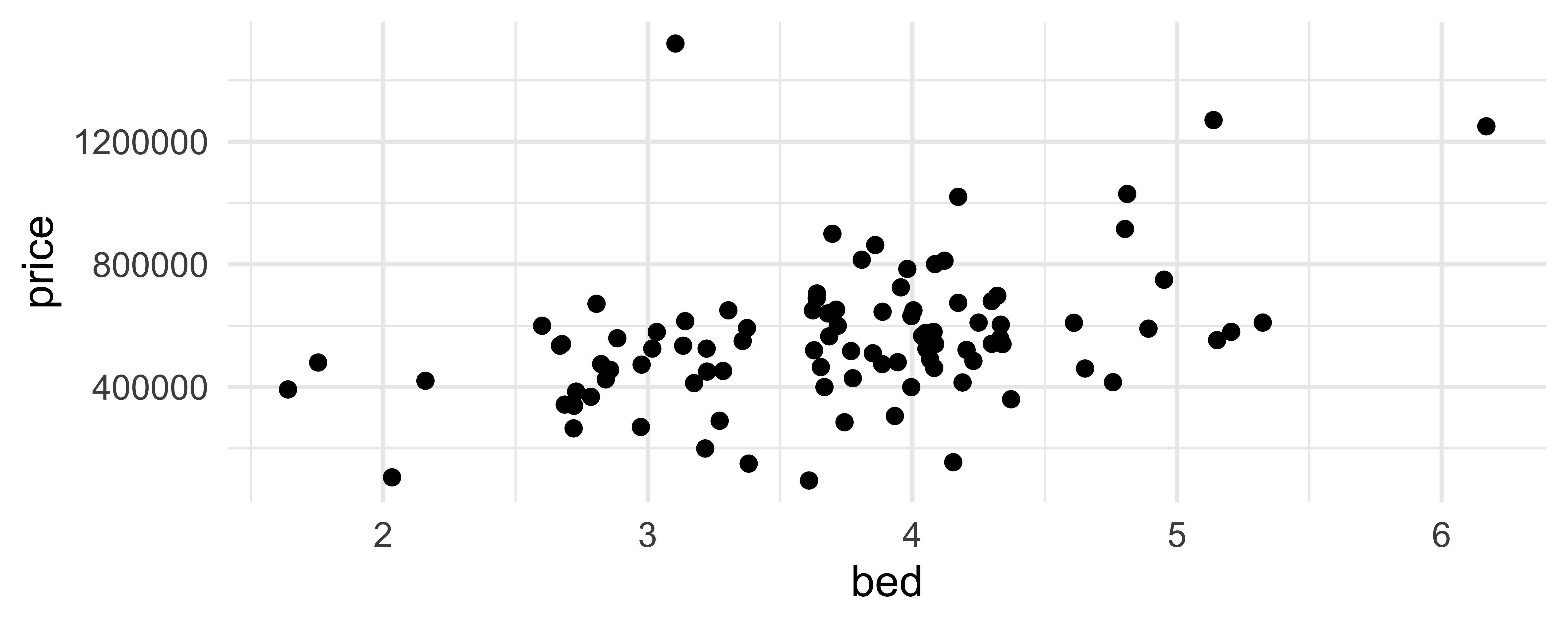
Activity: Spot the differences I
Can you spot differences between plots 1 ans 2? How about differences in codes 1 ans 2?

ggplot(
  mean_area_decade,
  aes(y = decade_built_cat, x = mean_area)
) +
  geom_point(size = 4) +
  geom_segment(
    aes(
      x = 0,
      xend = mean_area,
      y = decade_built_cat,
      yend = decade_built_cat
    )
  ) +
  labs(
    x = "Mean area (square feet)",
    y = "Decade built",
    title = "Mean area of houses in Duke Forest, by decade built"
)geom_dotplot()
What does each point represent? How are their locations determined? What do the x and y axes represent?

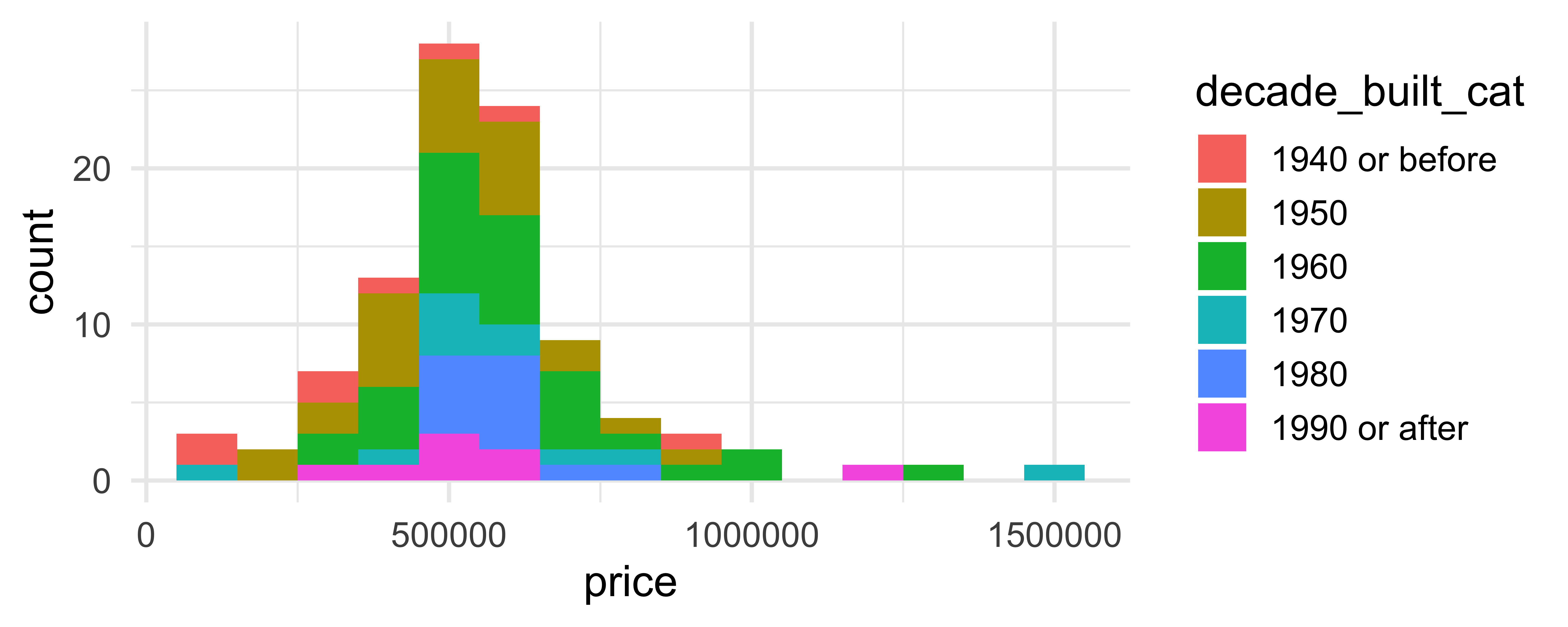
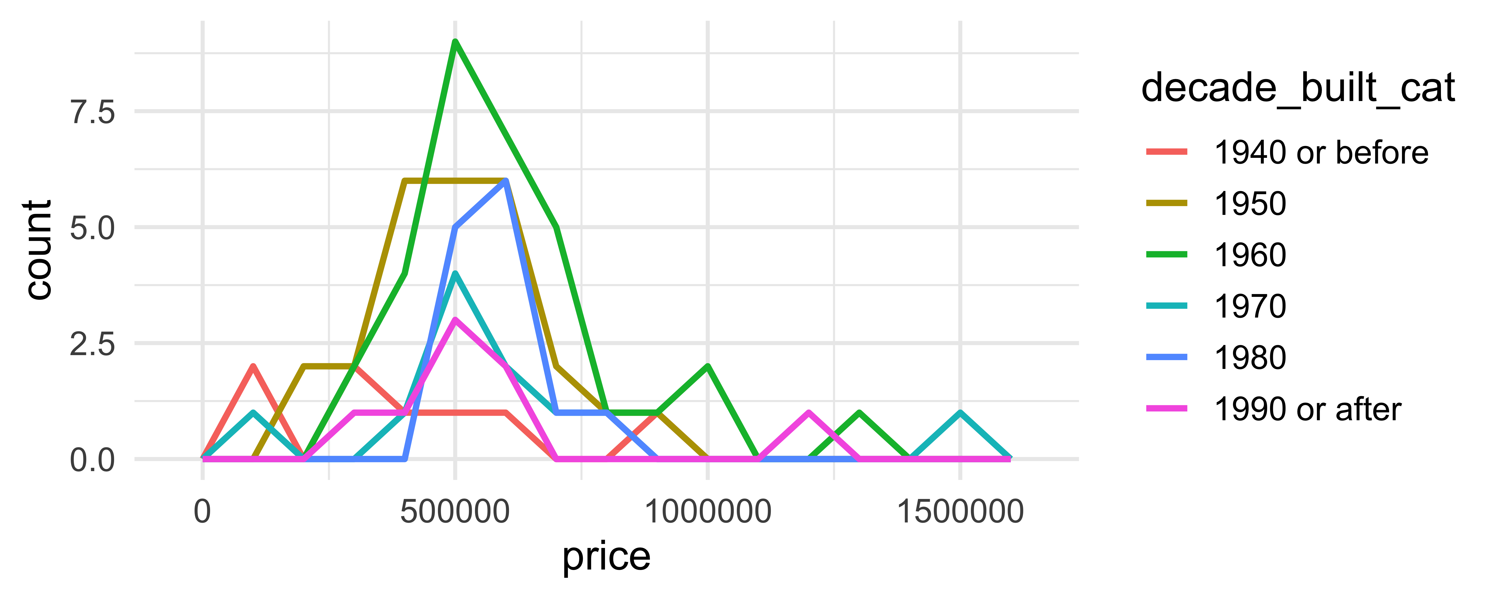
Comparing across groups
Which of the following allows for easier comparison across groups?
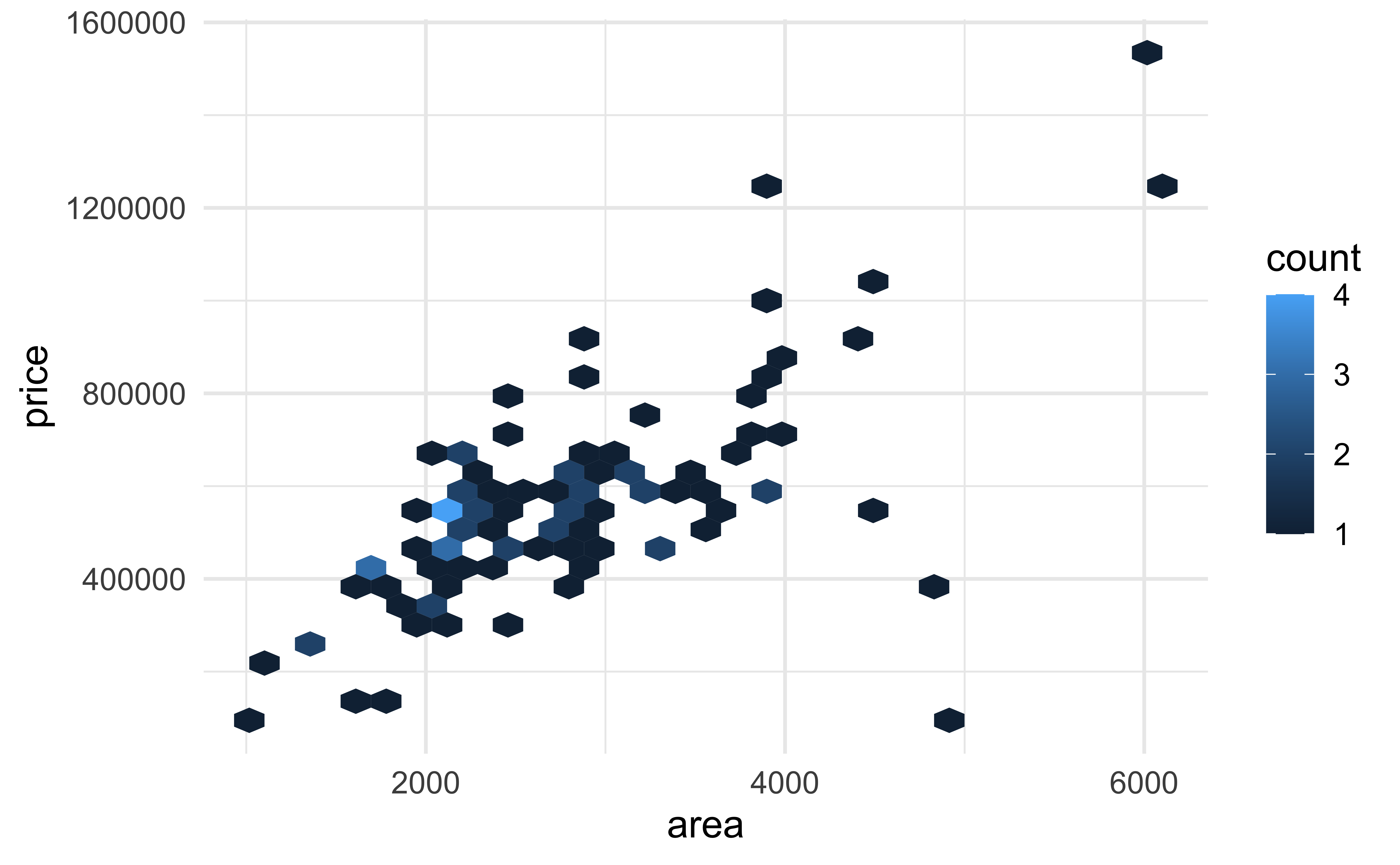
geom_hex()
Not very helpful for 98 observations:
geom_hex()
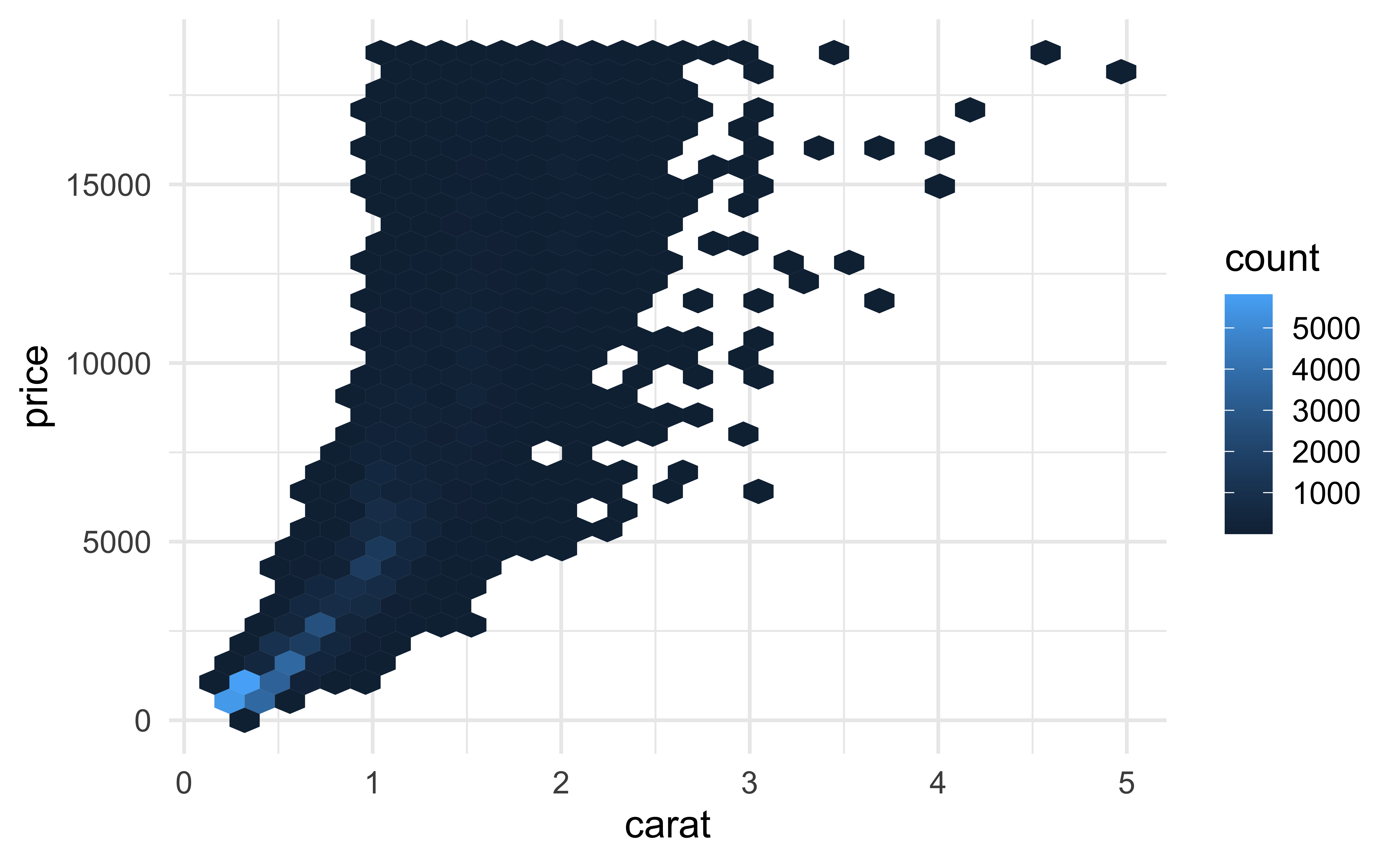
More helpful for 53940 observations:
geom_hex()
(Maybe) even more helpful on the (natural) log scale:

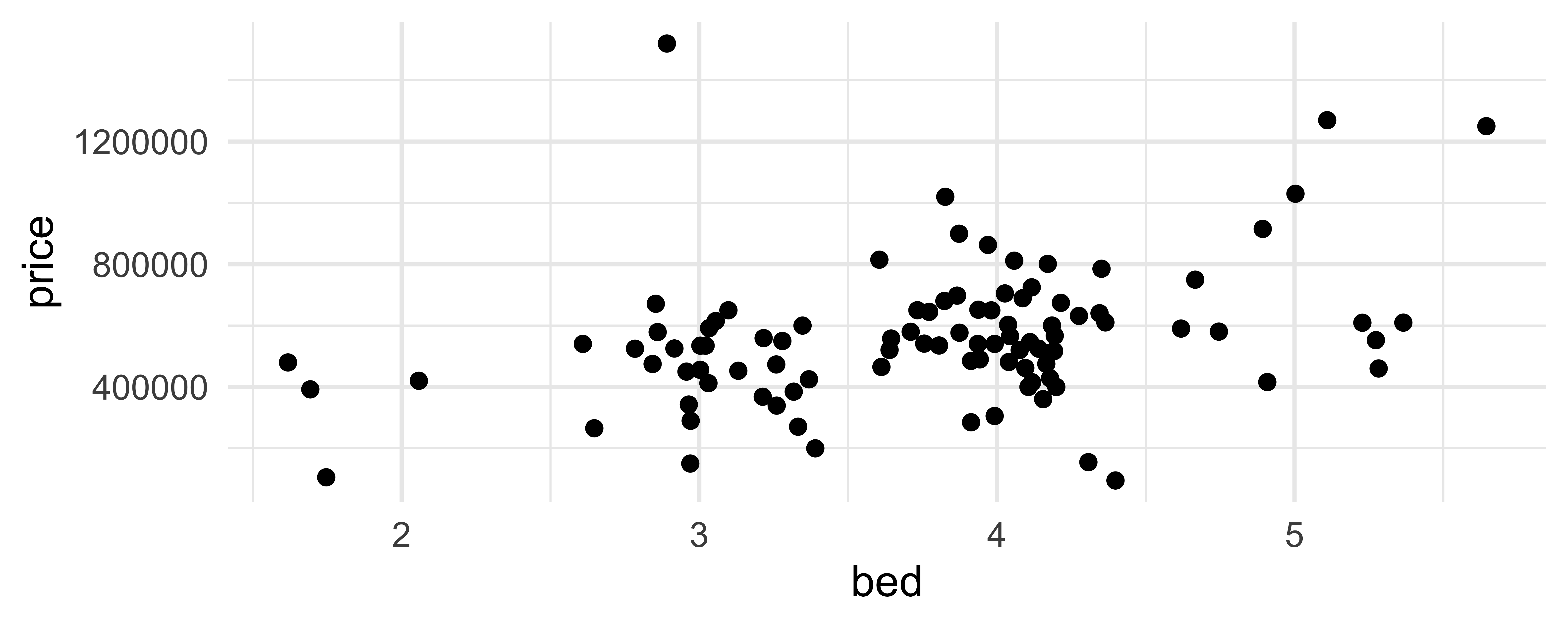
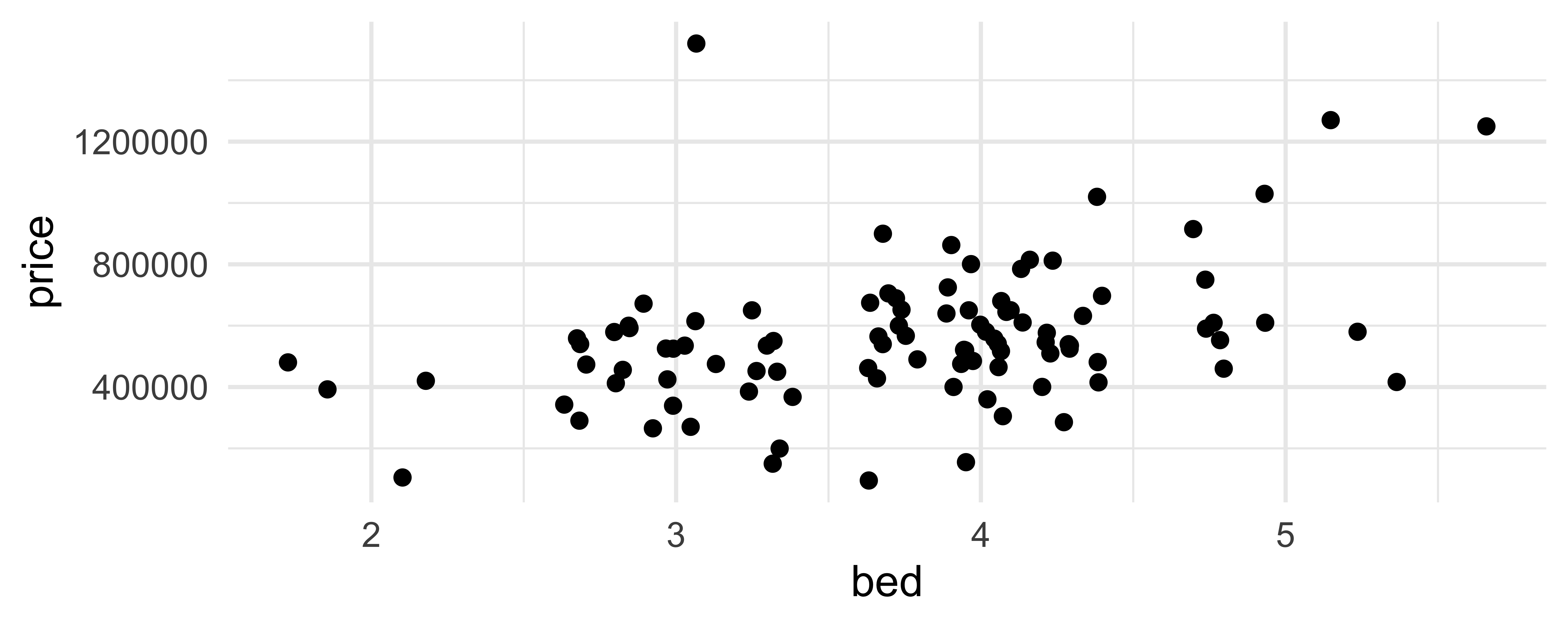
geom_jitter()
How are the following three plots different?
geom_jitter() and set.seed()

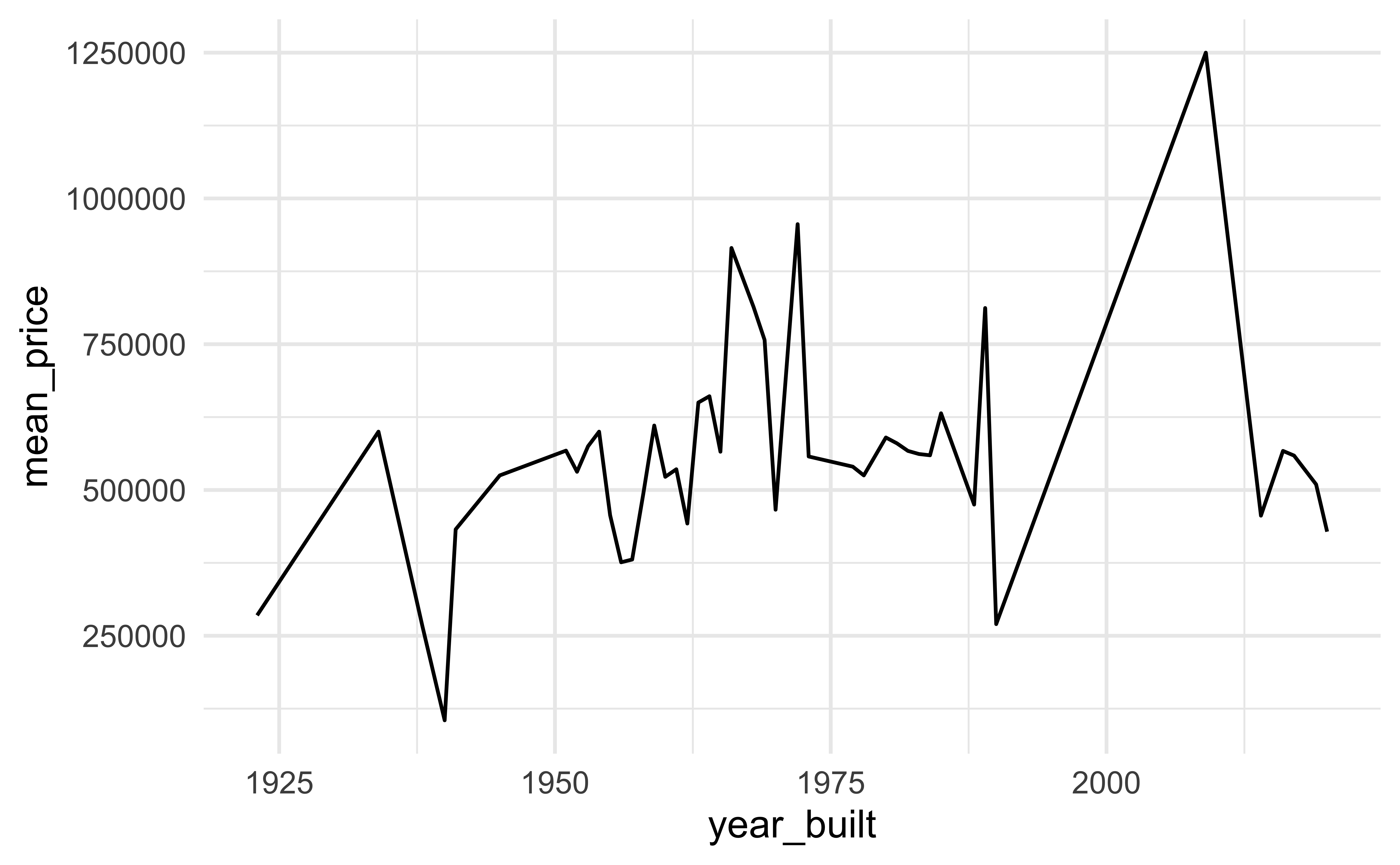
geom_line()
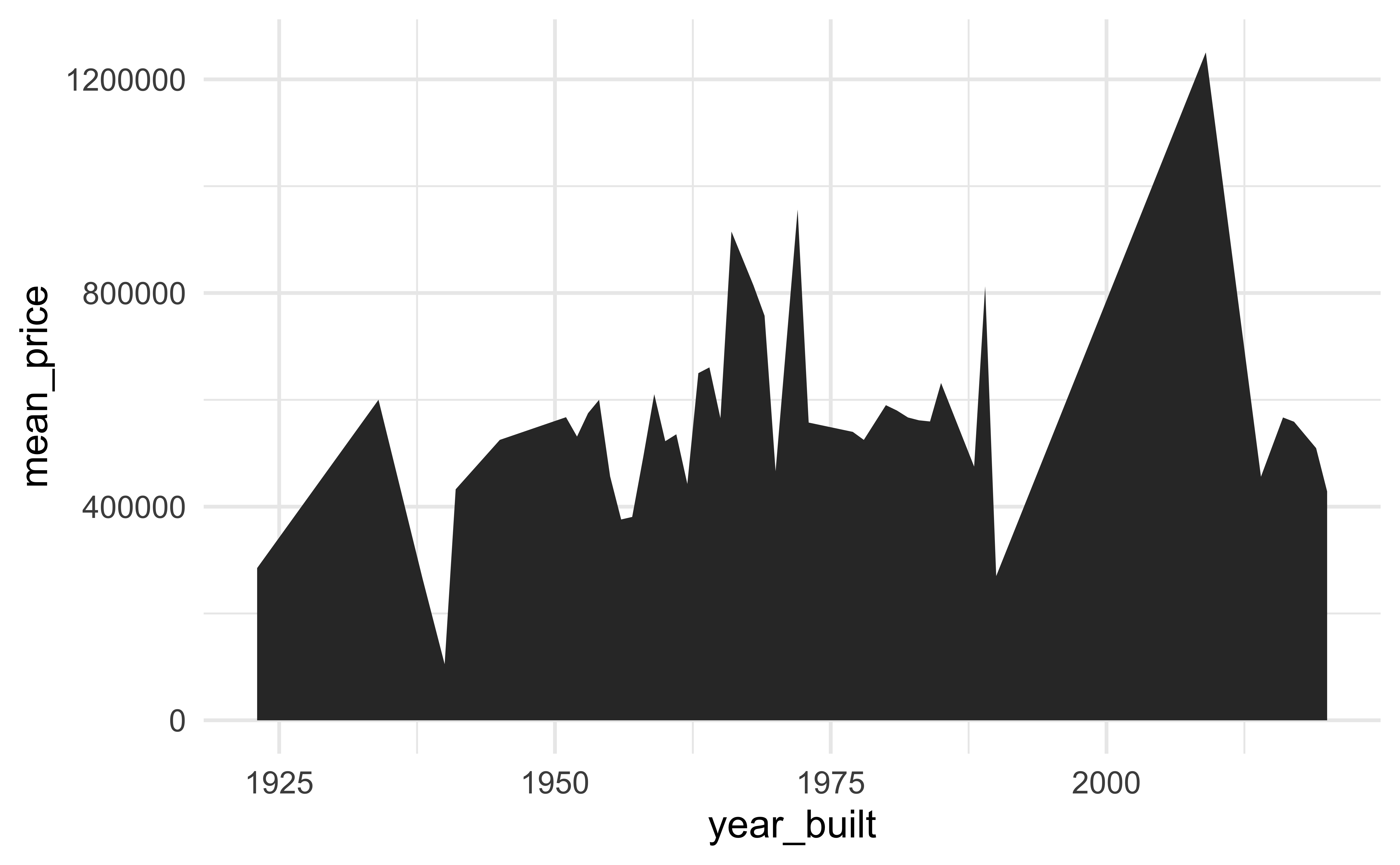
geom_area()
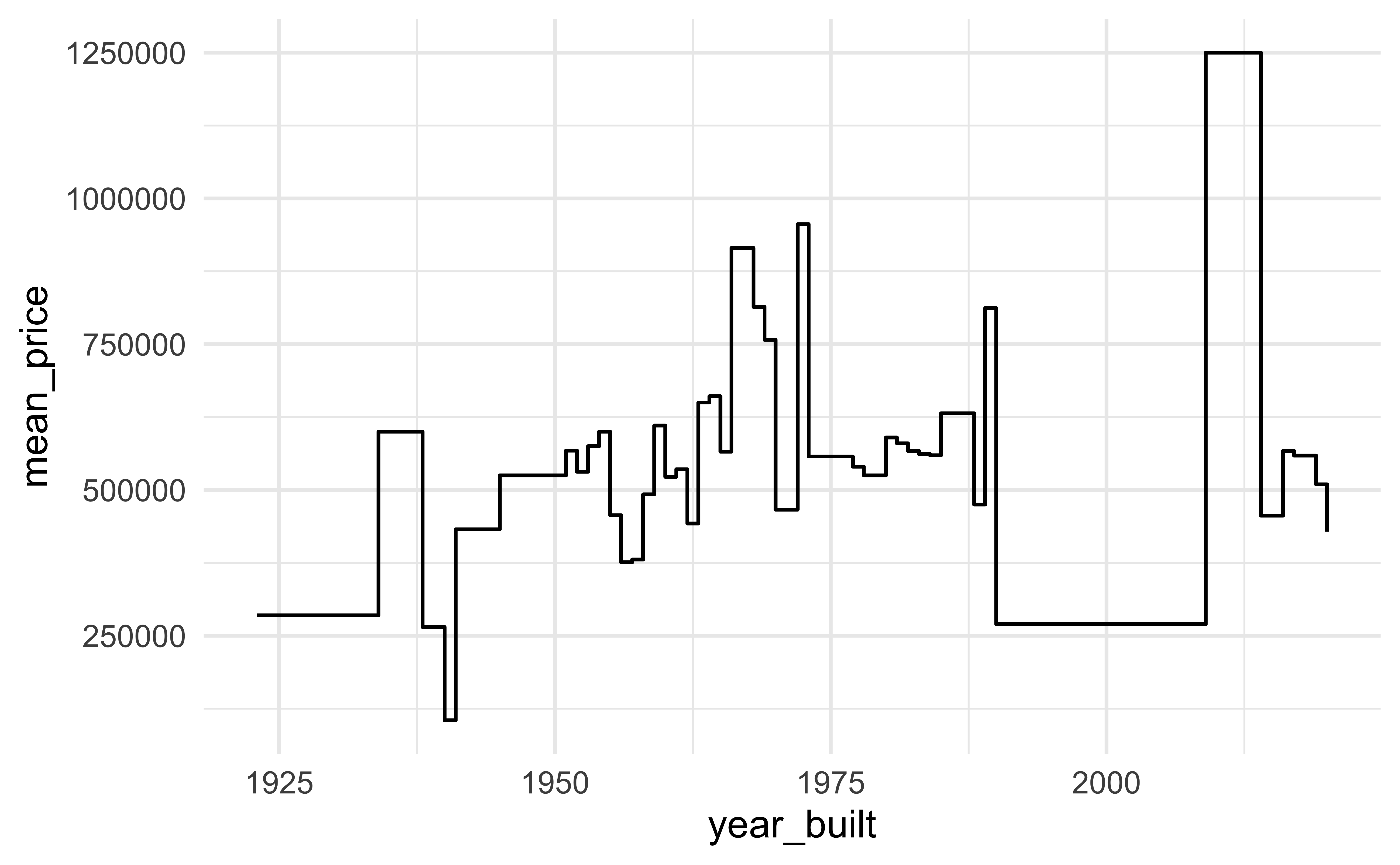
geom_step()
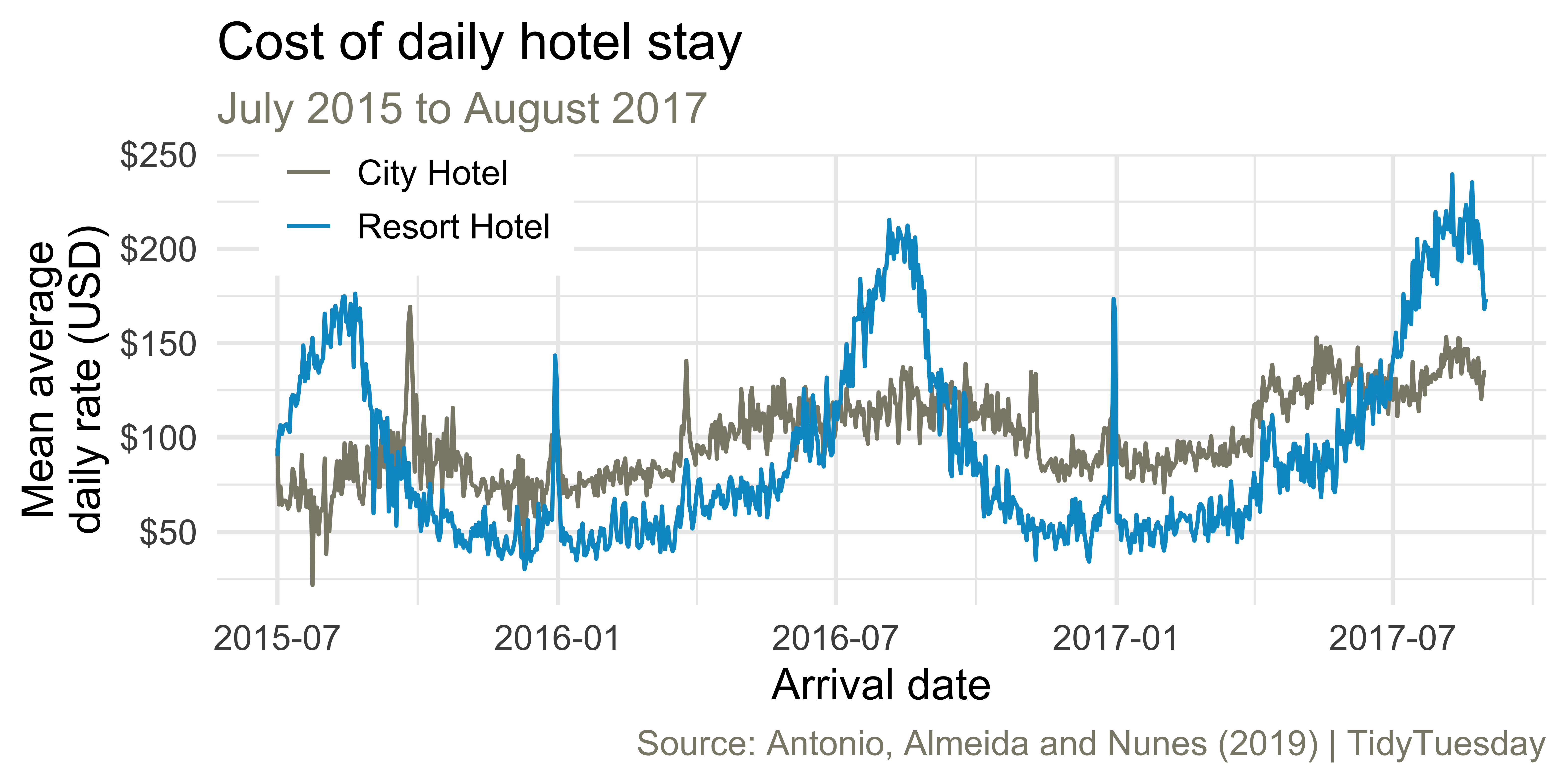
Average cost of daily stay
ae-02 - Part 1: Let’s recreate this visualization!