Data visualization with Python II
Lecture 23
Dr. Mine Çetinkaya-Rundel
Duke University
STA 313 - Spring 2026
Warm up
Announcements
Project 2 peer evaluation 1 due today at 5 pm – no extensions as we’d like to share summaries before lab tomorrow, those who haven’t yet submitted it received a reminder at 11 am
HW 5 posted, due Monday, April 20 at 5 pm
- A bit on data prep
- A bit on Shiny
- A bit on Python
- At a minimum, read it over before tomorrow’s lab
Next week:
- Monday: In memory of Bill Cleveland – read the Graphical Perception paper by Cleveland and McGill (1984)
- Wednesday: Your choice! Animation? Visual inference? A primer on dataviz with AI prior to guest speaker following week? 3D pie charts?! You tell me!
Setup
- R:
- Python:
From last time
Key differences from ggplot2
| ggplot2 (R) | plotnine (Python) |
|---|---|
aes(x = var) |
aes(x="var") (quoted strings) |
+ at end of line |
+ at start of line (inside parens) |
theme(legend.position = ...) |
theme(legend_position=...) (underscores) |
| No parens needed | Wrap in () for multi-line plots |
ggsave() |
.save() method on plot object |
Back to ae-16
Go to ae-16 and work on ae-16-R-and-Python.qmd.
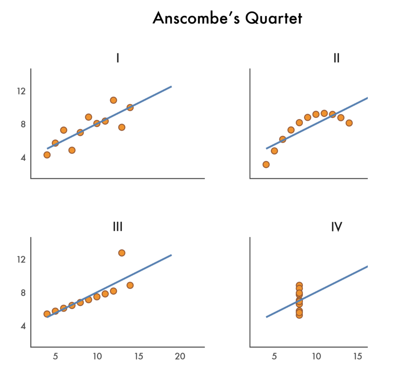
Anscombe’s Quartet
What is Anscombe’s Quartet?
- Four datasets created by statistician Francis Anscombe in 1973
- Each dataset has 11 observations with x and y variables
- Designed to illustrate the importance of visualizing data before analyzing it
The data
   x1 x2 x3 x4    y1   y2    y3    y4
1  10 10 10  8  8.04 9.14  7.46  6.58
2   8  8  8  8  6.95 8.14  6.77  5.76
3  13 13 13  8  7.58 8.74 12.74  7.71
4   9  9  9  8  8.81 8.77  7.11  8.84
5  11 11 11  8  8.33 9.26  7.81  8.47
6  14 14 14  8  9.96 8.10  8.84  7.04
7   6  6  6  8  7.24 6.13  6.08  5.25
8   4  4  4 19  4.26 3.10  5.39 12.50
9  12 12 12  8 10.84 9.13  8.15  5.56
10  7  7  7  8  4.82 7.26  6.42  7.91
11  5  5  5  8  5.68 4.74  5.73  6.89
Longer data
# A tibble: 44 × 3
   set       x     y
   <chr> <dbl> <dbl>
 1 1        10  8.04
 2 2        10  9.14
 3 3        10  7.46
 4 4         8  6.58
 5 1         8  6.95
 6 2         8  8.14
 7 3         8  6.77
 8 4         8  5.76
 9 1        13  7.58
10 2        13  8.74
# ℹ 34 more rows
Summary statistics
# A tibble: 4 × 6
  set   mean_x mean_y  sd_x  sd_y cor_xy
  <chr>  <dbl>  <dbl> <dbl> <dbl>  <dbl>
1 1          9   7.50  3.32  2.03  0.816
2 2          9   7.50  3.32  2.03  0.816
3 3          9   7.5   3.32  2.03  0.816
4 4          9   7.50  3.32  2.03  0.817
The statistics are (nearly) identical!
- Mean of x: 9 (exactly)
- Mean of y: 7.50 (to 2 decimal places)
- Standard deviation of x: 3.32
- Standard deviation of y: 2.03
- Correlation: 0.816
- Linear regression line: y = 3 + 0.5x
But are the datasets the same?
Let’s visualize!
ggplot(anscombe, aes(x = x, y = y)) +
  geom_point(size = 3) +
  geom_smooth(method = "lm", se = FALSE, color = "steelblue") +
  facet_wrap(
    ~set,
    labeller = labeller(set = c("1" = "Dataset I", "2" = "Dataset II", "3" = "Dataset III", "4" = "Dataset IV"))
  ) +
  theme_minimal(base_size = 16) +
  labs(
    title = "Anscombe's Quartet",
    subtitle = "Four datasets with nearly identical summary statistics"
  )
Let’s visualize!
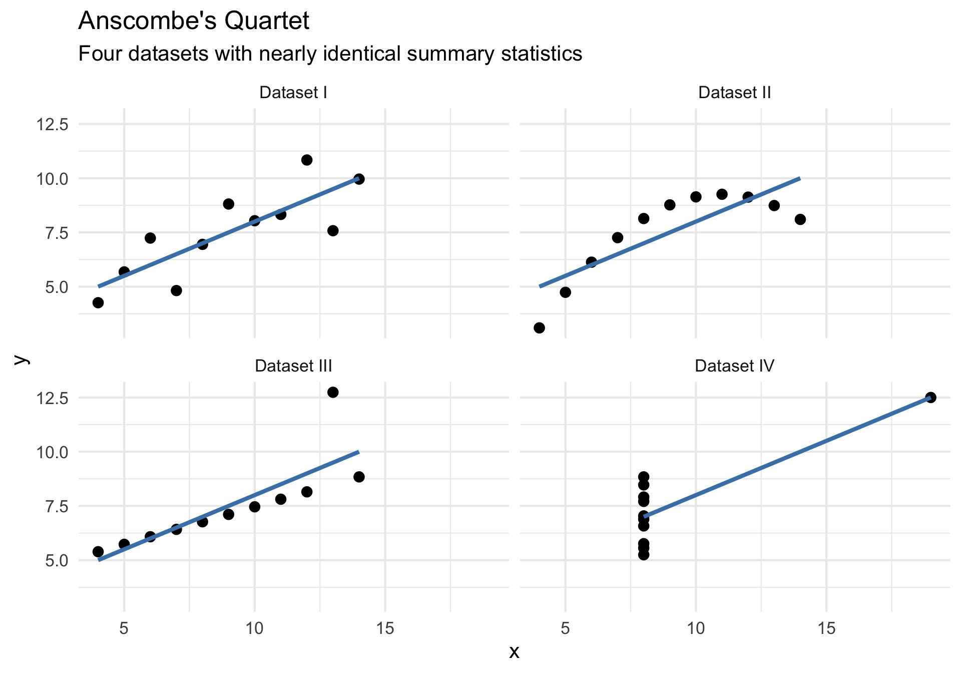
What do we see?
- Dataset I: Linear relationship (what we might expect)
- Dataset II: Non-linear (quadratic) relationship
- Dataset III: Perfect linear relationship with one outlier
- Dataset IV: No relationship, but one extreme point creates correlation
The lesson
Always visualize your data! Summary statistics alone can be misleading.
ae-17
Visualize Anscombe’s Quartet in Python using plotnine! Try to get it to be as close to the plot below as possible.