# Load packages ---------------------------------------------------------------
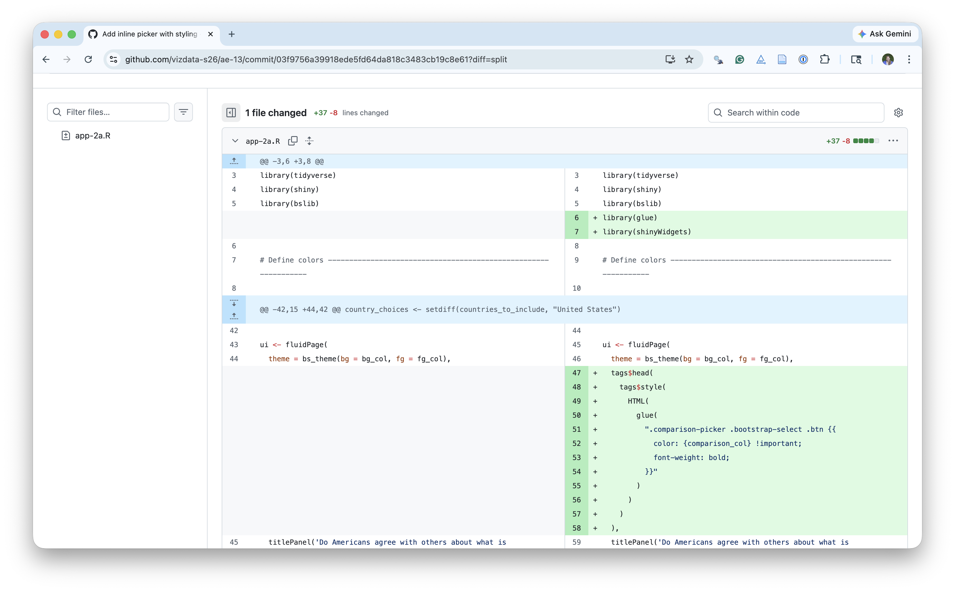
library(tidyverse)
library(shiny)
library(shinyWidgets)
library(bslib)
library(DT)
library(glue)
# Define colours --------------------------------------------------------------
bg_col <- "#FAFAFA"
fg_col <- "#000000"
highlight_col <- "#7f93b3"
comparison_col <- "#FA9161"
# Load data -------------------------------------------------------------------
absolute_judgements <- read_csv(
"data/absolute-judgements-subset.csv"
)
respondent_metadata <- read_csv(
"data/respondent-metadata-subset.csv"
)
# Prep data -------------------------------------------------------------------
countries_to_include <- respondent_metadata |>
distinct(country_of_residence) |>
pull()
# Set country choices ---------------------------------------------------------
country_choices <- setdiff(countries_to_include, "United States")
# UI --------------------------------------------------------------------------
ui <- fluidPage(
theme = bs_theme(bg = bg_col, fg = "#000000"),
tags$head(
tags$style(
HTML(
glue(
".comparison-picker .bootstrap-select .btn {{
color: {comparison_col} !important;
font-weight: bold;
}}"
)
)
)
),
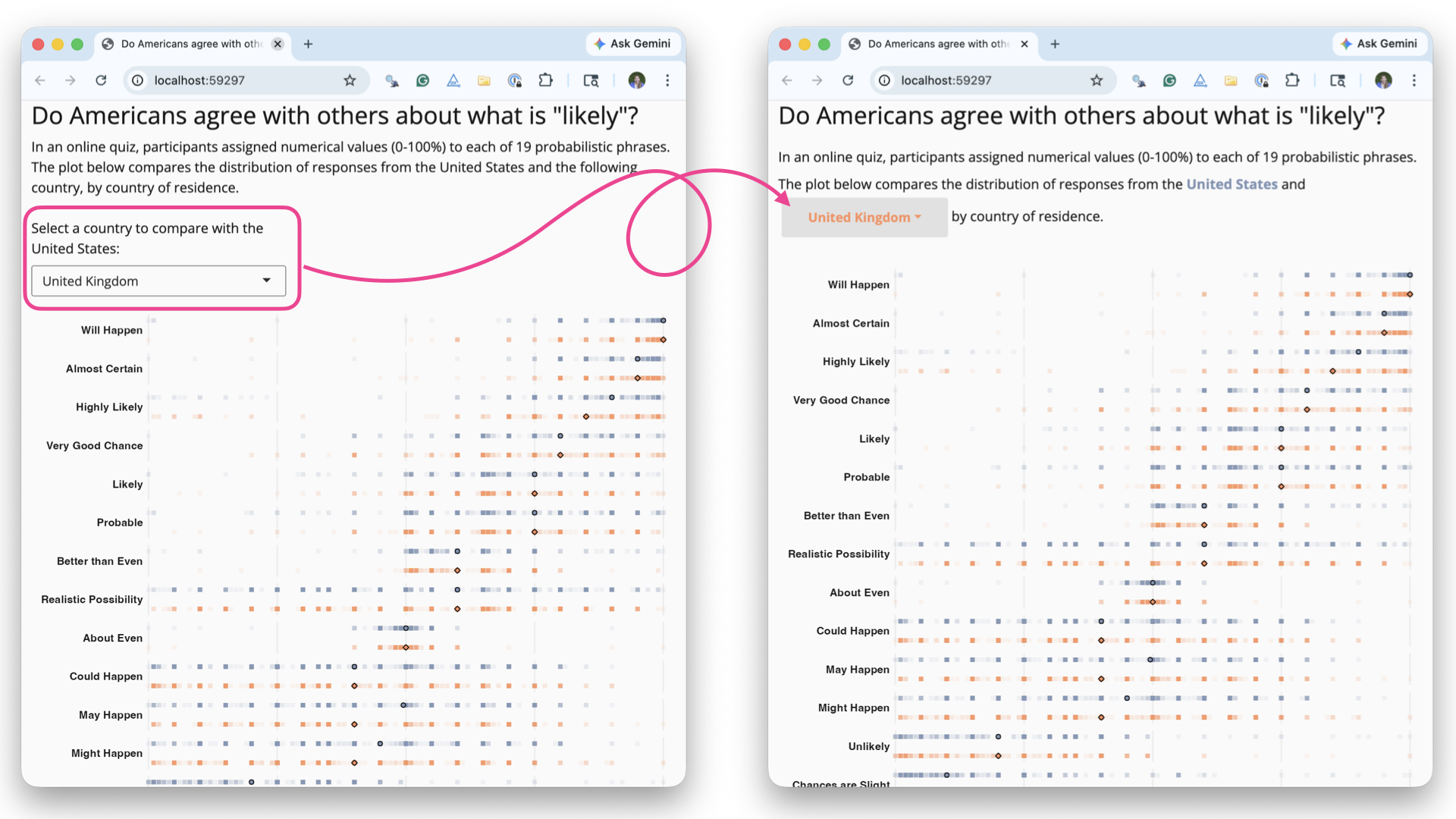
titlePanel('Do Americans agree with others about what is "likely"?'),
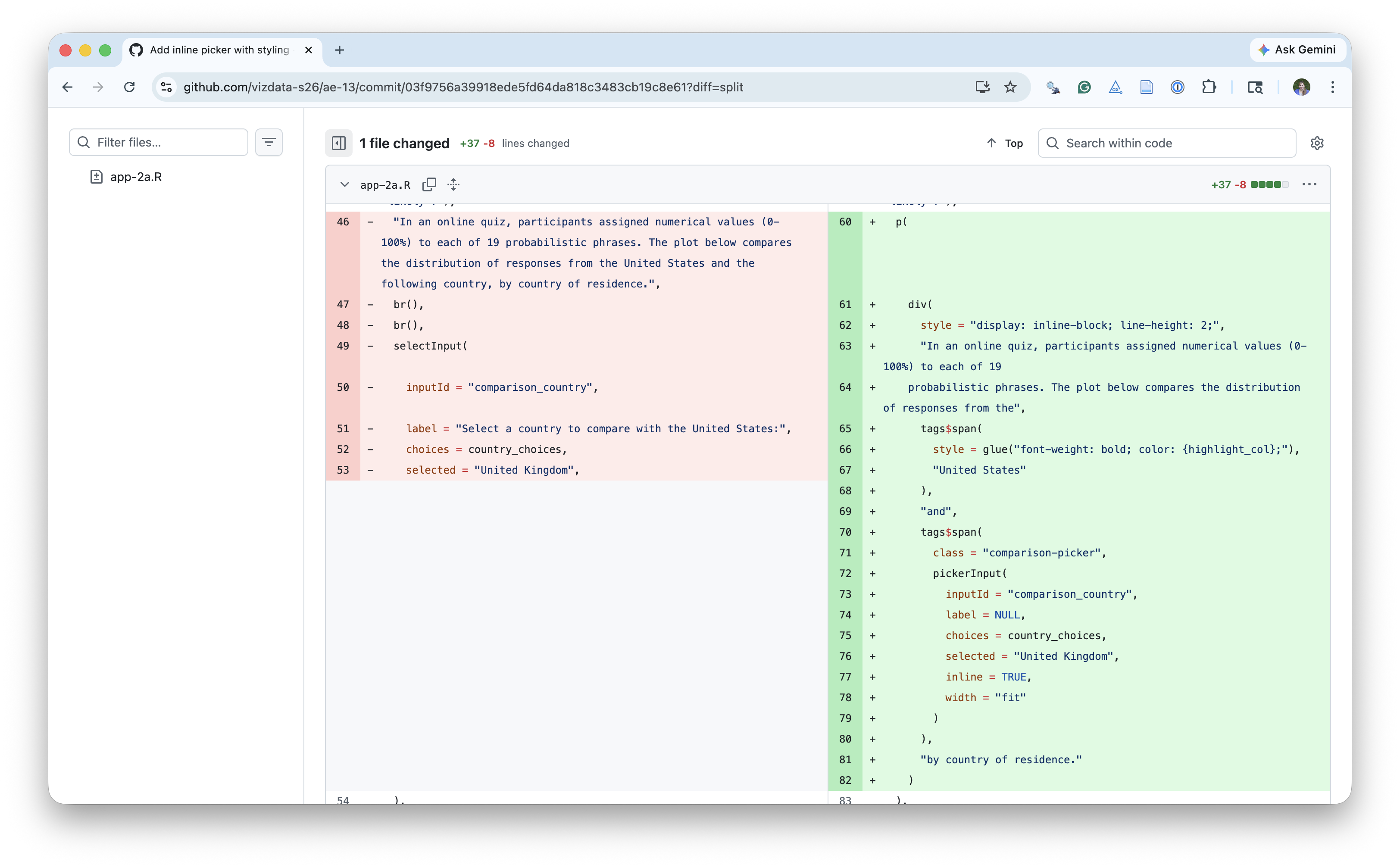
p(
div(
style = "display: inline-block; line-height: 2;",
"In an online quiz, participants assigned numerical values (0-100%) to each of 19
probabilistic phrases. The plot below compares the distribution of responses from the",
tags$span(
style = glue("font-weight: bold; color: {highlight_col};"),
"United States"
),
"and",
tags$span(
class = "comparison-picker",
pickerInput(
inputId = "comparison_country",
label = NULL,
choices = country_choices,
selected = "United Kingdom",
inline = TRUE,
width = "fit"
)
),
"by country of residence."
)
),
tabsetPanel(
tabPanel(
"Plot",
plotOutput("prob_plot", height = "900px", brush = "brushed_points"),
br(),
uiOutput("note_text"),
br(),
br(),
HTML(
"<b>Source</b>: Kucharski AJ (2026) CAPphrase: Comparative and Absolute Probability ",
"phrase dataset. DOI: <a href='https://doi.org/10.5281/zenodo.18750055'>10.5281/zenodo.18750055</a>."
)
),
tabPanel(
"Data",
br(),
DTOutput("data_table")
)
)
)
# Server ----------------------------------------------------------------------
server <- function(input, output, session) {
output$note_text <- renderUI({
HTML(
glue(
"<b>Note</b>: Responses from participants outside of the United States and {input$comparison_country}, and from those who did not provide their country of residence, are excluded. Terms are ranked by overall median probability."
)
)
})
plot_data <- reactive({
countries <- c("United States", input$comparison_country)
term_ranks <- absolute_judgements |>
left_join(respondent_metadata, by = "response_id") |>
group_by(term) |>
summarize(med_prob = median(probability)) |>
arrange(desc(med_prob))
absolute_judgements |>
mutate(term = factor(term, levels = term_ranks$term)) |>
left_join(respondent_metadata, by = "response_id") |>
filter(country_of_residence %in% countries) |>
drop_na(country_of_residence) |>
mutate(y = if_else(country_of_residence == "United States", 0.5, -0.5))
})
summary_data <- reactive({
plot_data() |>
group_by(country_of_residence, term) |>
summarize(med_prob = median(probability), .groups = "drop") |>
mutate(y = if_else(country_of_residence == "United States", 0.5, -0.5))
})
output$data_table <- DT::renderDT({
brushedPoints(
plot_data() |> select(-c(timestamp)),
input$brushed_points,
panelvar1 = "term"
)
})
output$prob_plot <- renderPlot({
comp <- input$comparison_country
ggplot() +
geom_point(
data = plot_data(),
mapping = aes(
x = probability,
y = y,
color = country_of_residence
),
alpha = 0.1,
shape = "square",
size = 2
) +
geom_point(
data = summary_data(),
mapping = aes(
x = med_prob,
y = y,
fill = country_of_residence,
shape = country_of_residence
),
size = 2,
alpha = 1
) +
facet_wrap(~term, ncol = 1, strip.position = "left") +
scale_color_manual(
values = setNames(
c(comparison_col, highlight_col),
c(comp, "United States")
)
) +
scale_fill_manual(
values = setNames(
c(comparison_col, highlight_col),
c(comp, "United States")
)
) +
scale_shape_manual(
values = setNames(
c("circle filled", "diamond filled"),
c("United States", comp)
)
) +
scale_x_continuous(expand = expansion(0, 0)) +
scale_y_continuous(limits = c(-0.75, 0.75)) +
labs(
x = "Probability (%)",
y = NULL,
color = NULL,
fill = NULL,
shape = NULL,
) +
coord_cartesian(clip = "off") +
theme_minimal(base_size = 16) +
theme(
legend.position = "none",
plot.margin = margin(20, 15, 5, 5, "pt"),
plot.background = element_rect(fill = bg_col),
panel.background = element_rect(fill = bg_col, colour = bg_col),
strip.text.y.left = element_text(
face = "bold",
angle = 0,
hjust = 1
),
axis.text.y = element_blank(),
axis.title.x = element_text(hjust = 1),
panel.grid.major.y = element_blank(),
panel.grid.minor.y = element_blank(),
panel.grid.minor = element_blank(),
)
})
}
shinyApp(ui, server)