# load packages
library(tidyverse)

# set figure parameters for knitr
knitr::opts_chunk$set(
  fig.width = 7, # 7" width
  fig.asp = 0.618, # the golden ratio
  fig.retina = 3, # dpi multiplier for displaying HTML output on retina
  fig.align = "center", # center align figures
  dpi = 300 # higher dpi, sharper image
)Interactive reporting + visualization with Shiny
Lecture 18
Shiny
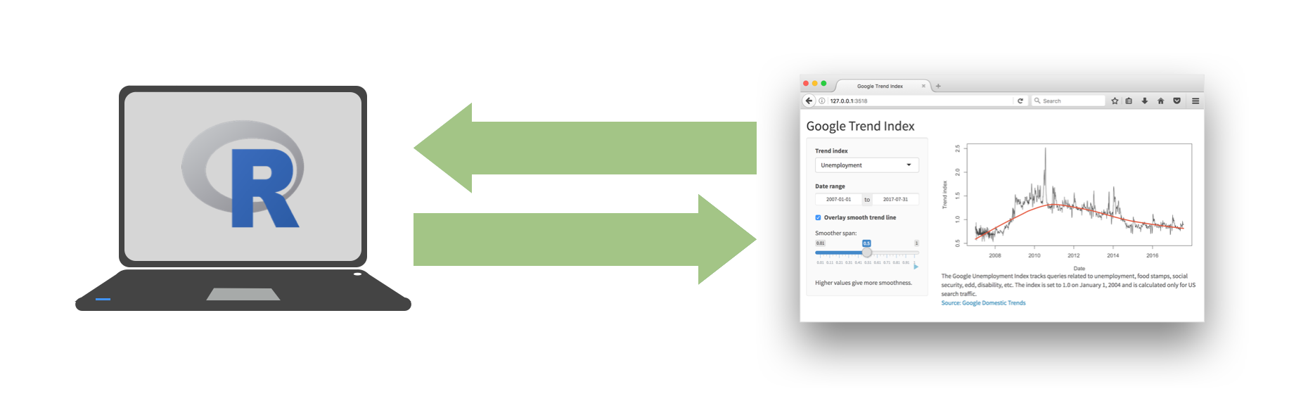
Every Shiny app has a webpage that the user visits,
and behind this webpage there is a computer that serves this webpage by running R.
Shiny
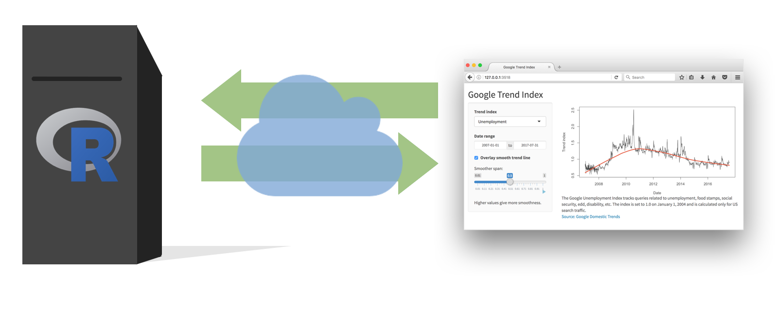
When running your app locally, the computer serving your app is your computer.
Shiny
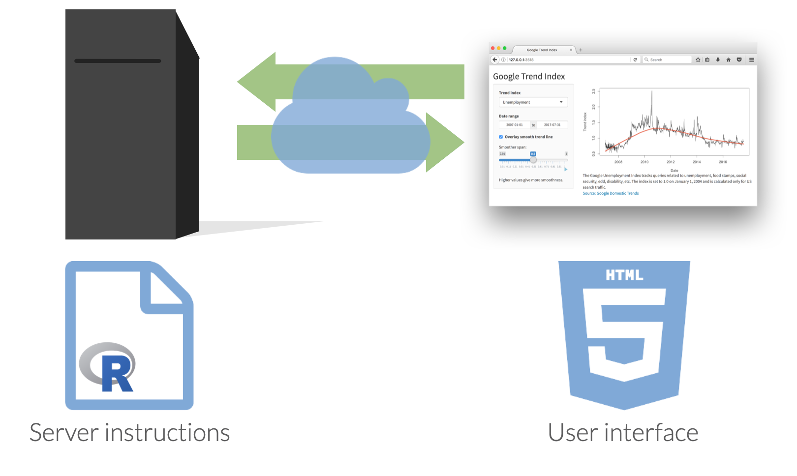
When your app is deployed, the computer serving your app is a web server.
Shiny
Reference
The code for the app can be found here.
# Load packages ----------------------------------------------------------------

library(shiny)
library(tidyverse)
library(ggthemes)
library(scales)
library(countrycode)

# Load data --------------------------------------------------------------------

manager_survey <- read_rds("data/manager-survey.rds")

# Find all industries ----------------------------------------------------------

industry_choices <- manager_survey |>
  distinct(industry_other) |>
  arrange(industry_other) |>
  pull(industry_other)

# Randomly select 3 industries to start with -----------------------------------

selected_industry_choices <- sample(industry_choices, 3)

# Define UI --------------------------------------------------------------------

ui <- fluidPage(
  titlePanel(title = "Ask a Manager"),
  sidebarLayout(

    # Sidebar panel
    sidebarPanel(
      checkboxGroupInput(
        inputId = "industry",
        label = "Select up to 8 industies:",
        choices = industry_choices,
        selected = selected_industry_choices
      ),
    ),

    # Main panel
    mainPanel(
      hr(),
      "Showing only results for those with salaries in USD who have provided information on their industry and highest level of education completed.",
      br(), br(),
      textOutput(outputId = "selected_industries"),
      hr(),
      br(),
      tabsetPanel(
        type = "tabs",
        tabPanel("Average salaries", plotOutput(outputId = "avg_salary_plot")),
        tabPanel(
          "Individual salaries",
          conditionalPanel(
            condition = "input.industry.length <= 8",
            sliderInput(
              inputId = "ylim",
              label = "Zoom in to salaries between",
              min = 0,
              value = c(0, 1000000),
              max = max(manager_survey$annual_salary),
              width = "100%"
            )
          ),
          plotOutput(outputId = "indiv_salary_plot", brush = "indiv_salary_brush"),
          tableOutput(outputId = "indiv_salary_table")
        ),
        tabPanel("Data", DT::dataTableOutput(outputId = "data"))
      )
    )

  )
)

# Define server function -------------------------------------------------------

server <- function(input, output, session) {

  # Print number of selected industries
  output$selected_industries <- reactive({
    paste("You've selected", length(input$industry), "industries.")
  })

  # Filter data for selected industries
  manager_survey_filtered <- reactive({
    manager_survey |>
      filter(industry_other %in% input$industry)
  })

  # Make a table of filtered data
  output$data <- DT::renderDataTable({
    manager_survey_filtered() |>
      select(
        industry,
        job_title,
        annual_salary,
        other_monetary_comp,
        country,
        overall_years_of_professional_experience,
        years_of_experience_in_field,
        highest_level_of_education_completed,
        gender,
        race
      )
  })

  # Futher filter for salary range
  observeEvent(input$industry, {
    updateSliderInput(
      inputId = "ylim",
      min = min(manager_survey_filtered()$annual_salary),
      max = max(manager_survey_filtered()$annual_salary),
      value = c(
        min(manager_survey_filtered()$annual_salary),
        max(manager_survey_filtered()$annual_salary)
      )
    )
  })

  # Plot of jittered salaries from filtered data
  output$indiv_salary_plot <- renderPlot({

    validate(
      need(length(input$industry) <= 8, "Please select a maxiumum of 8 industries.")
    )

    ggplot(
      manager_survey_filtered(),
      aes(
        x = highest_level_of_education_completed,
        y = annual_salary,
        color = industry
      )
    ) +
      geom_jitter(size = 2, alpha = 0.6) +
      theme_minimal(base_size = 16) +
      theme(legend.position = "top") +
      scale_color_colorblind() +
      scale_x_discrete(labels = label_wrap_gen(10)) +
      scale_y_continuous(
        limits = input$ylim,
        labels = label_dollar()
      ) +
      labs(
        x = "Highest level of education completed",
        y = "Annual salary",
        color = "Industry",
        title = "Individual salaries"
      )
  })

  # Linked brushing
  output$indiv_salary_table <- renderTable({
    brushedPoints(manager_survey_filtered(), input$indiv_salary_brush)
  })

  # Plot of average salaries from filtered data
  output$avg_salary_plot <- renderPlot({

    validate(
      need(length(input$industry) <= 8, "Please select a maxiumum of 8 industries.")
    )

    manager_survey_filtered() |>
      group_by(industry, highest_level_of_education_completed) |>
      summarise(
        mean_annual_salary = mean(annual_salary, na.rm = TRUE),
        .groups = "drop"
      ) |>
      ggplot(aes(
        x = highest_level_of_education_completed,
        y = mean_annual_salary,
        group = industry,
        color = industry
      )) +
      geom_line(linewidth = 1) +
      theme_minimal(base_size = 16) +
      theme(legend.position = "top") +
      scale_color_colorblind() +
      scale_x_discrete(labels = label_wrap_gen(10)) +
      scale_y_continuous(labels = label_dollar()) +
      labs(
        x = "Highest level of education completed",
        y = "Mean annual salary",
        color = "Industry",
        title = "Average salaries"
      )
  })
}


# Create the Shiny app object --------------------------------------------------

shinyApp(ui = ui, server = server)![]()