# load packages
library(tidyverse)

# set theme for ggplot2
ggplot2::theme_set(ggplot2::theme_minimal(base_size = 16))

# set figure parameters for knitr
knitr::opts_chunk$set(
  fig.width = 7, # 7" width
  fig.asp = 0.618, # the golden ratio
  fig.retina = 3, # dpi multiplier for displaying HTML output on retina
  fig.align = "center", # center align figures
  dpi = 300 # higher dpi, sharper image
)Interactive visualizations and reporting with Shiny
Lecture 18
Dr. Mine Çetinkaya-Rundel
Duke University
STA 313 - Spring 2026
Warm up
Announcements
- HW 4 due today at 5 pm.
Setup
Shiny: High level view
Shiny
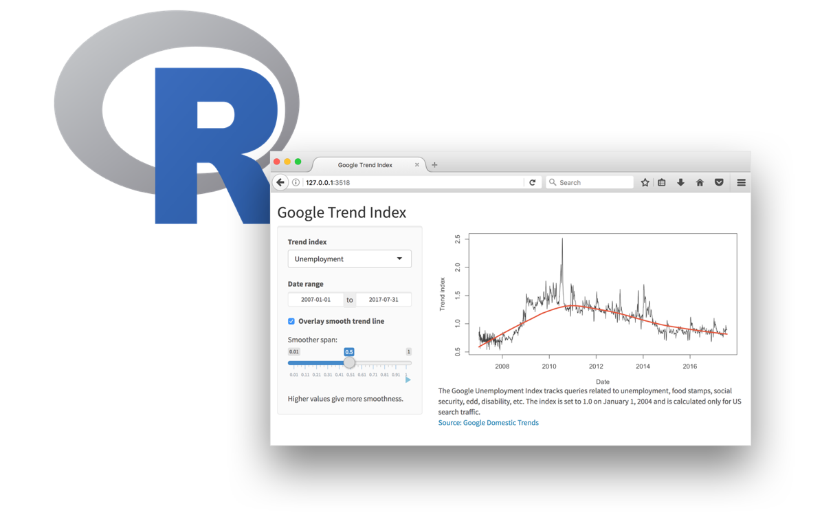
Every Shiny app has a webpage that the user visits,
and behind this webpage there is a computer that serves this webpage by running R.
Shiny
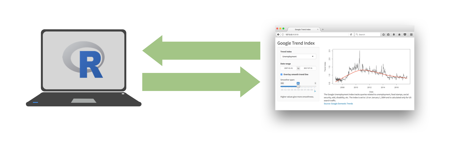
When running your app locally, the computer serving your app is your computer.
Shiny
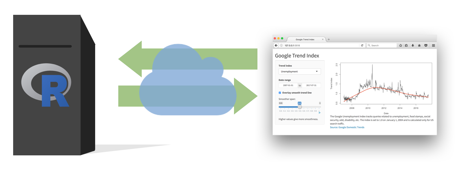
When your app is deployed, the computer serving your app is a web server.
Shiny
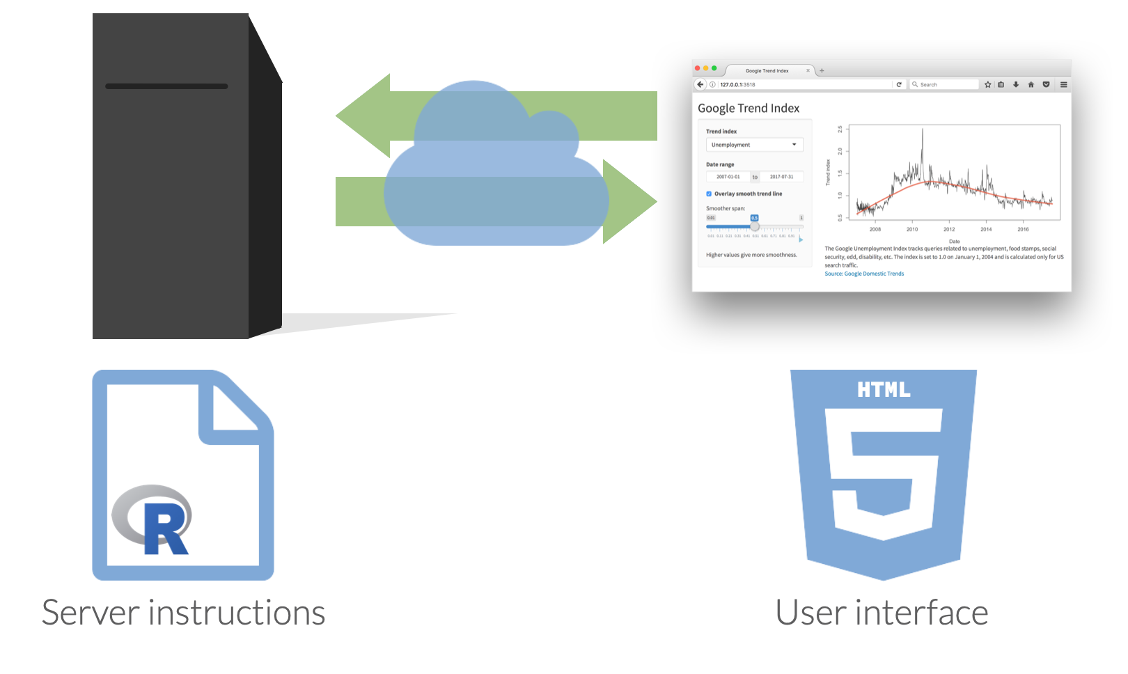
Anatomy of a Shiny app
What’s in an app?
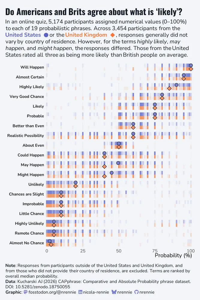
Data: How likely is ‘likely’?
Source: Online quiz by Adam Kucharski via TidyTuesday
In an online quiz, created as an independent project by Adam Kucharski, over 5,000 participants compared pairs of probability phrases (e.g. “Which conveys a higher probability: Likely or Probable?”) and assigned numerical values (0–100%) to each of 19 phrases. The resulting data can be used to analyse how people interpret common probability phrases.
Inspiration
Data: absolute_judgements
# A tibble: 98,306 × 4
   response_id term               probability order
         <dbl> <chr>                    <dbl> <dbl>
 1        5177 Little Chance               20     1
 2        5177 Almost No Chance             9     2
 3        5177 Remote Chance               18     3
 4        5177 May Happen                  44     4
 5        5177 Chances are Slight          27     5
 6        5177 Almost Certain              85     6
 7        5177 Likely                      74     7
 8        5177 Unlikely                    33     8
 9        5177 Very Good Chance            80     9
10        5177 Will Happen                 93    10
# ℹ 98,296 more rows
Data: relative_judgements
# A tibble: 5,174 × 6
   response_id country_of_residence timestamp age_band english_background
         <dbl> <chr>                <chr>     <chr>    <chr>
 1        5177 United States        2026-02   45-54    English is my first lang…
 2        5176 United States        2026-02   25-34    English is my first lang…
 3        5175 <NA>                 2026-02   <NA>     <NA>
 4        5174 Myanmar (Burma)      2026-02   25-34    English is my first lang…
 5        5173 <NA>                 2026-02   <NA>     <NA>
 6        5172 United Kingdom       2026-02   25-34    English is my first lang…
 7        5171 Ireland              2026-02   75+      English is my first lang…
 8        5170 United States        2026-02   35-44    English is my first lang…
 9        5169 United States        2026-02   35-44    English is my first lang…
10        5168 Canada               2026-02   35-44    English is not my first …
# ℹ 5,164 more rows
# ℹ 1 more variable: education_level <chr>
Ultimate goal
Interactive reporting with Shiny
Livecoding
Go to the ae-13 project and code along in app-1.R.
Highlights:
- Data pre-processing
- Basic reactivity
Livecoding
Go to the ae-13 project and code along in app-2.R.
Highlights:
- Data pre-processing outside of the app
- Dynamic UI generation
- Tabsets
Interactive visualizations with Shiny
Livecoding
Go to the ae-13 project and code along in app-3.R.
Highlights:
- Linked brushing
Reference
Reference
The code for the app can be found here.
# Load packages ---------------------------------------------------------------

library(tidyverse)
library(shiny)
library(shinyWidgets)
library(bslib)
library(DT)
library(glue)

# Define colours --------------------------------------------------------------

bg_col <- "#FAFAFA"
fg_col <- "#000000"
highlight_col <- "#7f93b3"
comparison_col <- "#FA9161"

# Load data -------------------------------------------------------------------

absolute_judgements <- read_csv(
  "data/absolute-judgements-subset.csv"
)
respondent_metadata <- read_csv(
  "data/respondent-metadata-subset.csv"
)

# Prep data -------------------------------------------------------------------

countries_to_include <- respondent_metadata |>
  distinct(country_of_residence) |>
  pull()

# Set country choices ---------------------------------------------------------

country_choices <- setdiff(countries_to_include, "United States")

# UI --------------------------------------------------------------------------

ui <- fluidPage(
  theme = bs_theme(bg = bg_col, fg = "#000000"),
  tags$head(
    tags$style(
      HTML(
        glue(
          ".comparison-picker .bootstrap-select .btn {{
            color: {comparison_col} !important;
            font-weight: bold;
          }}"
        )
      )
    )
  ),
  titlePanel('Do Americans agree with others about what is "likely"?'),
  p(
    div(
      style = "display: inline-block; line-height: 2;",
      "In an online quiz, participants assigned numerical values (0-100%) to each of 19
    probabilistic phrases. The plot below compares the distribution of responses from the",
      tags$span(
        style = glue("font-weight: bold; color: {highlight_col};"),
        "United States"
      ),
      "and",
      tags$span(
        class = "comparison-picker",
        pickerInput(
          inputId = "comparison_country",
          label = NULL,
          choices = country_choices,
          selected = "United Kingdom",
          inline = TRUE,
          width = "fit"
        )
      ),
      "by country of residence."
    )
  ),
  tabsetPanel(
    tabPanel(
      "Plot",
      plotOutput("prob_plot", height = "900px", brush = "brushed_points"),
      br(),
      uiOutput("note_text"),
      br(),
      br(),
      HTML(
        "<b>Source</b>: Kucharski AJ (2026) CAPphrase: Comparative and Absolute Probability ",
        "phrase dataset. DOI: <a href='https://doi.org/10.5281/zenodo.18750055'>10.5281/zenodo.18750055</a>."
      )
    ),
    tabPanel(
      "Data",
      br(),
      DTOutput("data_table")
    )
  )
)

# Server ----------------------------------------------------------------------

server <- function(input, output, session) {
  output$note_text <- renderUI({
    HTML(
      glue(
        "<b>Note</b>: Responses from participants outside of the United States and {input$comparison_country}, and from those who did not provide their country of residence, are excluded. Terms are ranked by overall median probability."
      )
    )
  })

  plot_data <- reactive({
    countries <- c("United States", input$comparison_country)

    term_ranks <- absolute_judgements |>
      left_join(respondent_metadata, by = "response_id") |>
      group_by(term) |>
      summarize(med_prob = median(probability)) |>
      arrange(desc(med_prob))

    absolute_judgements |>
      mutate(term = factor(term, levels = term_ranks$term)) |>
      left_join(respondent_metadata, by = "response_id") |>
      filter(country_of_residence %in% countries) |>
      drop_na(country_of_residence) |>
      mutate(y = if_else(country_of_residence == "United States", 0.5, -0.5))
  })

  summary_data <- reactive({
    plot_data() |>
      group_by(country_of_residence, term) |>
      summarize(med_prob = median(probability), .groups = "drop") |>
      mutate(y = if_else(country_of_residence == "United States", 0.5, -0.5))
  })

  output$data_table <- DT::renderDT({
    brushedPoints(
      plot_data() |> select(-c(timestamp)),
      input$brushed_points,
      panelvar1 = "term"
    )
  })

  output$prob_plot <- renderPlot({
    comp <- input$comparison_country

    ggplot() +
      geom_point(
        data = plot_data(),
        mapping = aes(
          x = probability,
          y = y,
          color = country_of_residence
        ),
        alpha = 0.1,
        shape = "square",
        size = 2
      ) +
      geom_point(
        data = summary_data(),
        mapping = aes(
          x = med_prob,
          y = y,
          fill = country_of_residence,
          shape = country_of_residence
        ),
        size = 2,
        alpha = 1
      ) +
      facet_wrap(~term, ncol = 1, strip.position = "left") +
      scale_color_manual(
        values = setNames(
          c(comparison_col, highlight_col),
          c(comp, "United States")
        )
      ) +
      scale_fill_manual(
        values = setNames(
          c(comparison_col, highlight_col),
          c(comp, "United States")
        )
      ) +
      scale_shape_manual(
        values = setNames(
          c("circle filled", "diamond filled"),
          c("United States", comp)
        )
      ) +
      scale_x_continuous(expand = expansion(0, 0)) +
      scale_y_continuous(limits = c(-0.75, 0.75)) +
      labs(
        x = "Probability (%)",
        y = NULL,
        color = NULL,
        fill = NULL,
        shape = NULL,
      ) +
      coord_cartesian(clip = "off") +
      theme_minimal(base_size = 16) +
      theme(
        legend.position = "none",
        plot.margin = margin(20, 15, 5, 5, "pt"),
        plot.background = element_rect(fill = bg_col),
        panel.background = element_rect(fill = bg_col, colour = bg_col),
        strip.text.y.left = element_text(
          face = "bold",
          angle = 0,
          hjust = 1
        ),
        axis.text.y = element_blank(),
        axis.title.x = element_text(hjust = 1),
        panel.grid.major.y = element_blank(),
        panel.grid.minor.y = element_blank(),
        panel.grid.minor = element_blank(),
      )
  })
}

shinyApp(ui, server)