# load packages
library(tidyverse)
library(tidymodels)
library(colorspace)
library(cowplot)
library(distributional)
library(emmeans)
library(gapminder)
library(ggdist)
library(margins)
library(ungeviz) # install_github("wilkelab/ungeviz")

# set theme for ggplot2
ggplot2::theme_set(ggplot2::theme_minimal(base_size = 16))

# set figure parameters for knitr
knitr::opts_chunk$set(
  fig.width = 7, # 7" width
  fig.asp = 0.618, # the golden ratio
  fig.retina = 3, # dpi multiplier for displaying HTML output on retina
  fig.align = "center", # center align figures
  dpi = 300 # higher dpi, sharper image
)Visualizing uncertainty I
Lecture 16
It helps to visualize a set of possible outcomes
Possible outcomes from 100 individual games played
Frequency framing
This type of visualization is called frequency framing
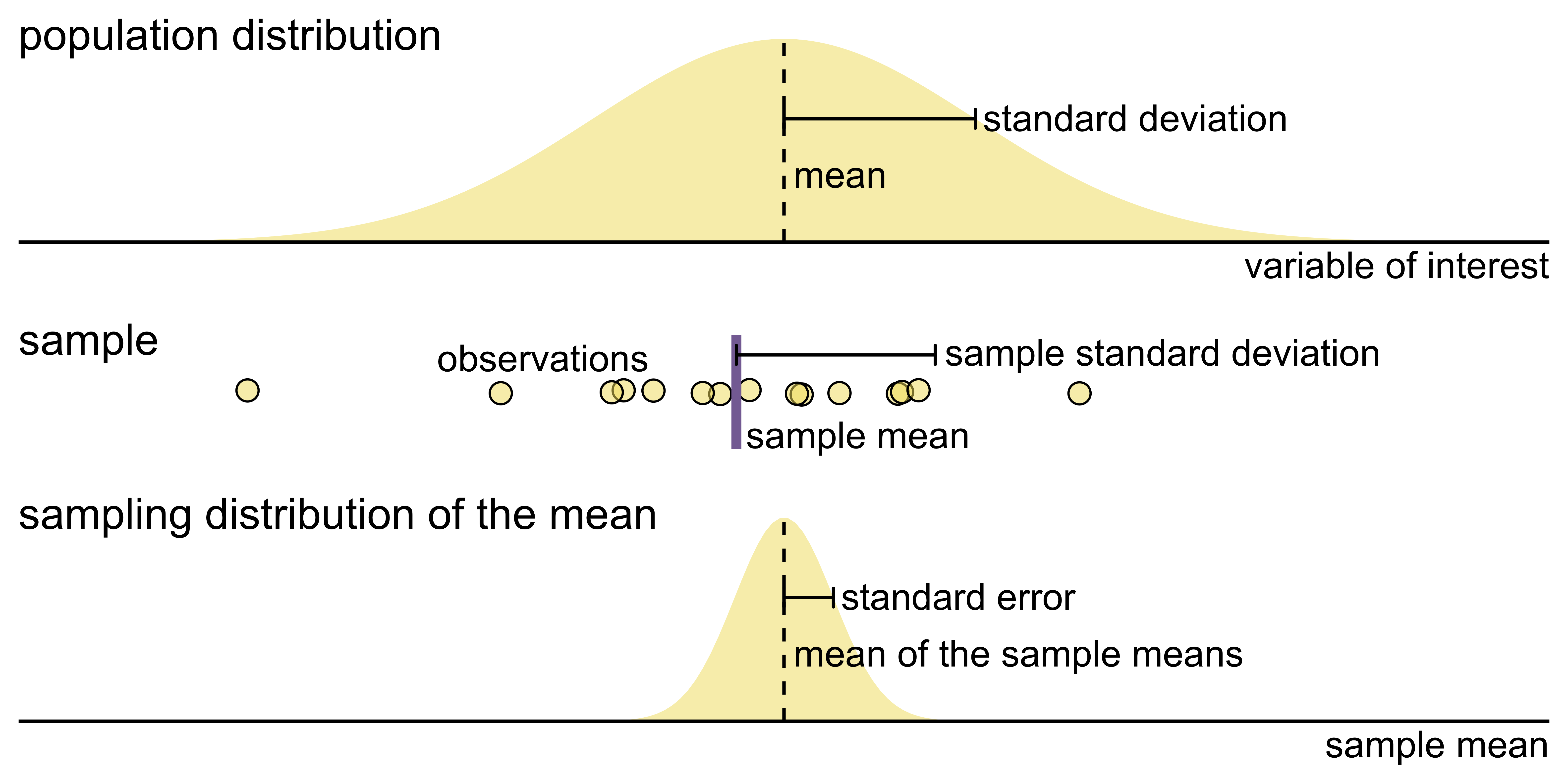
Key concepts of statistical sampling
Key concepts of statistical sampling
Key concepts of statistical sampling
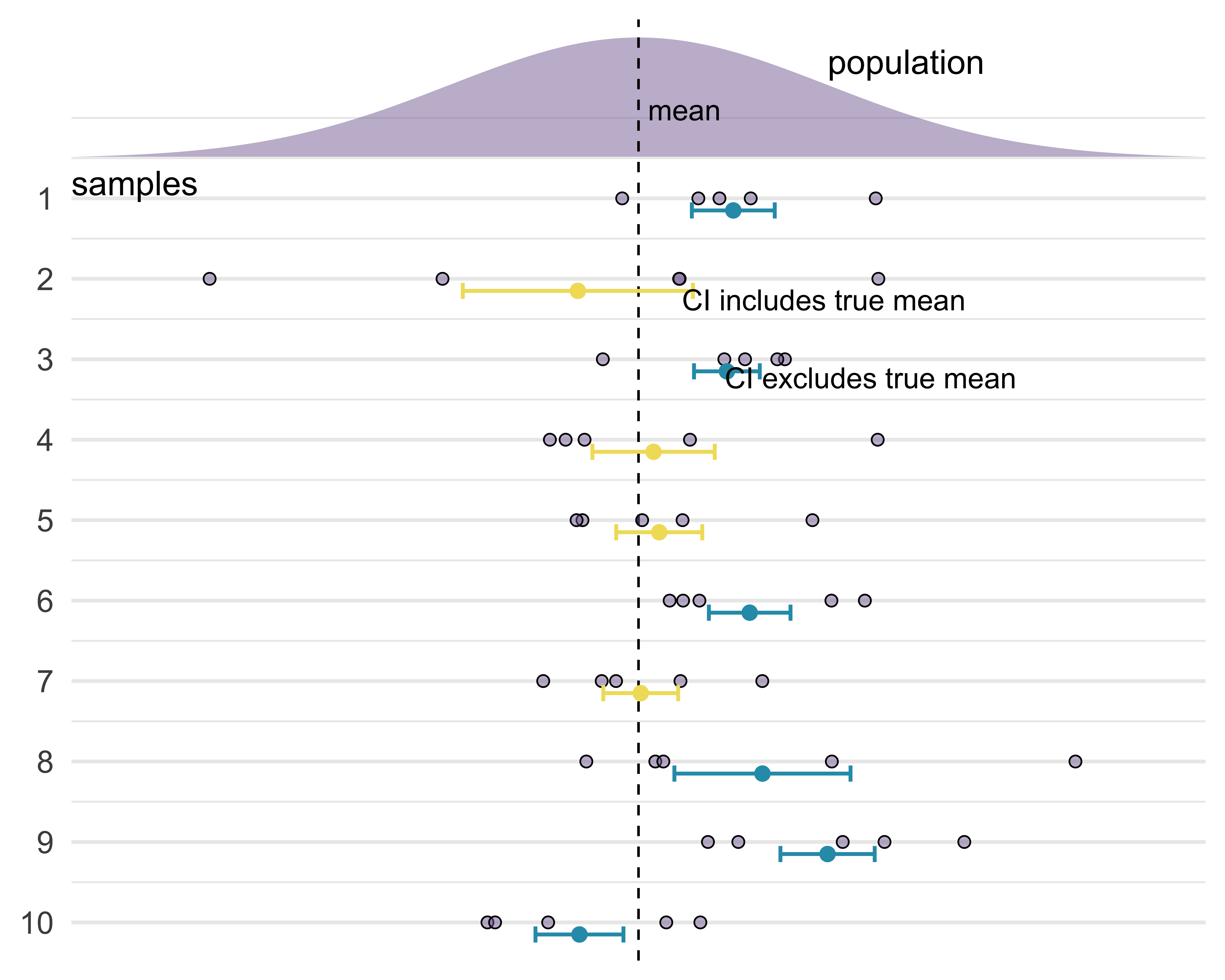
Frequentist interpretation of a confidence interval
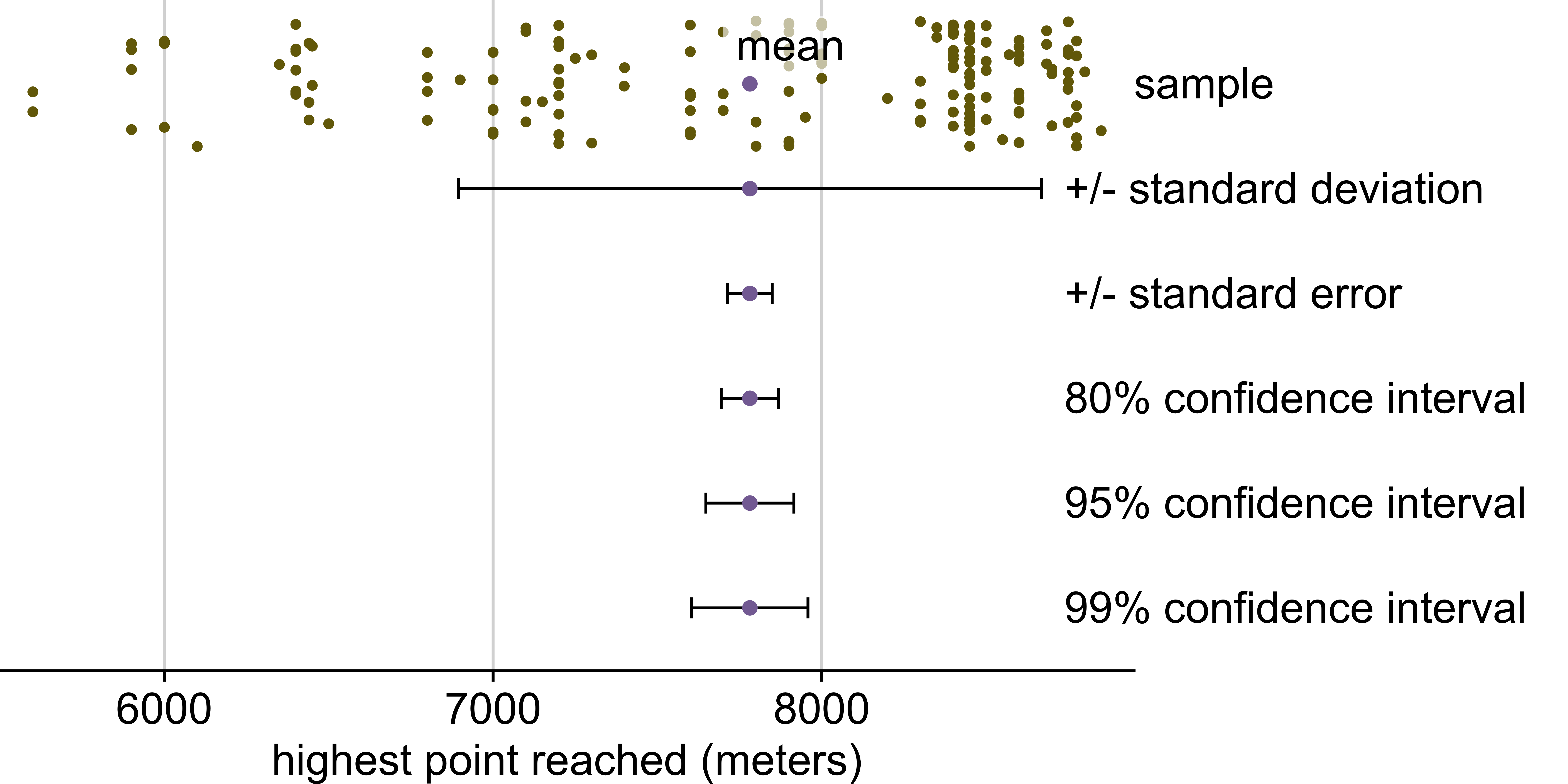
Highest point reached on Everest in 2019
Includes only climbers and expedition members who did not summit
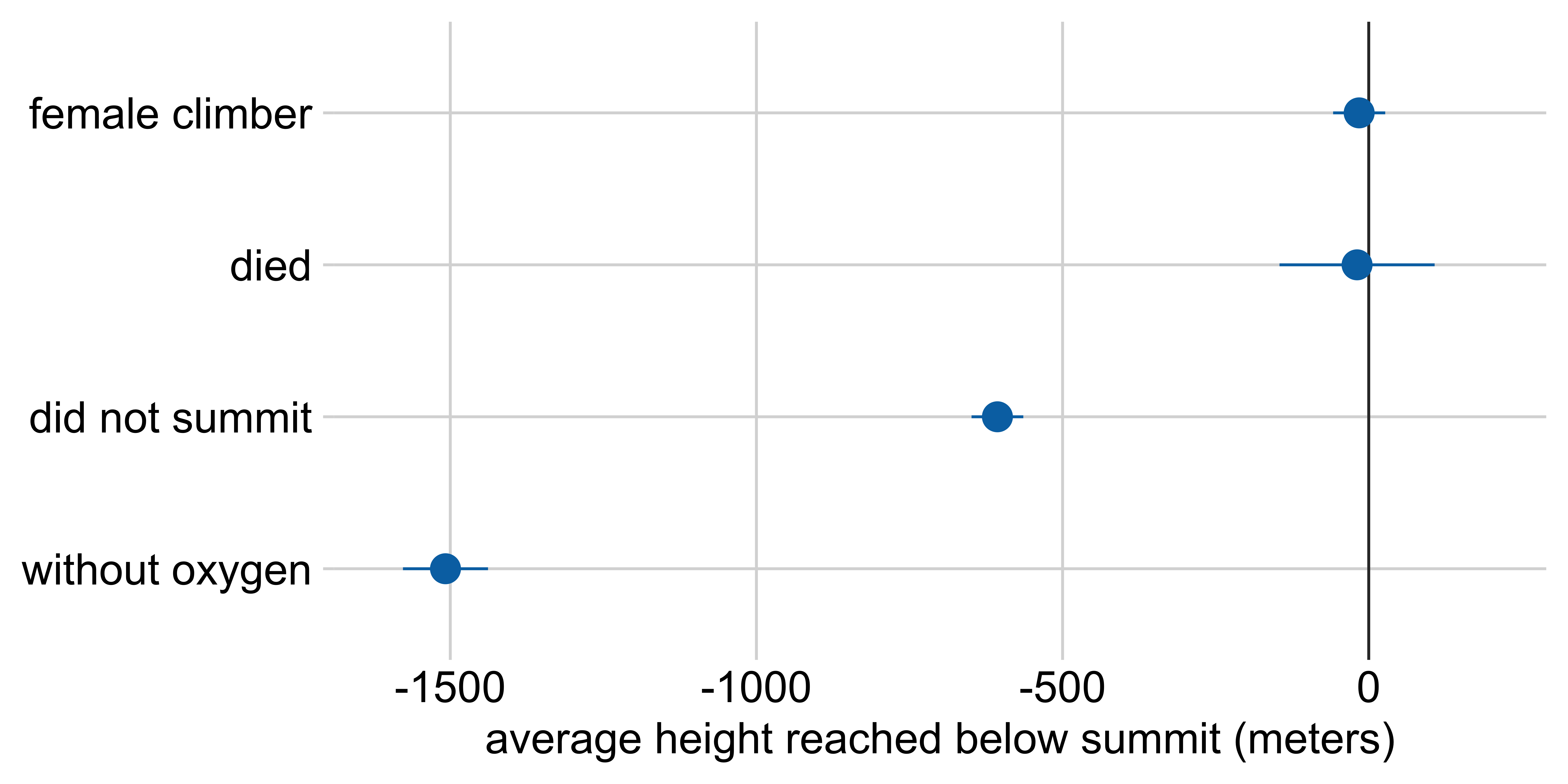
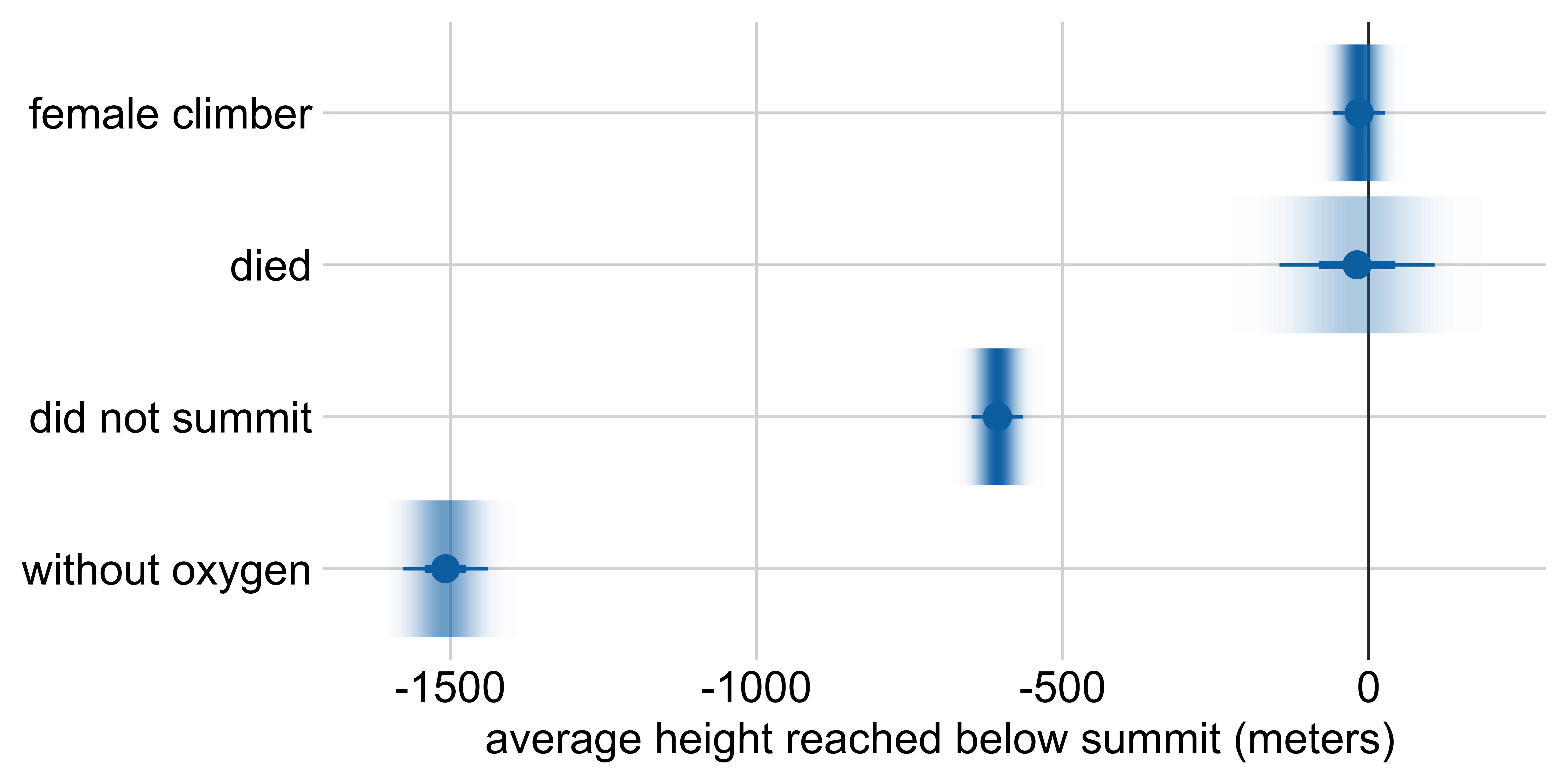
Marginal effects: Height reached on Everest
Average height reached relative to:
a male climber who climbed with oxygen, summited, and survived
Marginal effects: Height reached on Everest
Other visualization options: half-eye

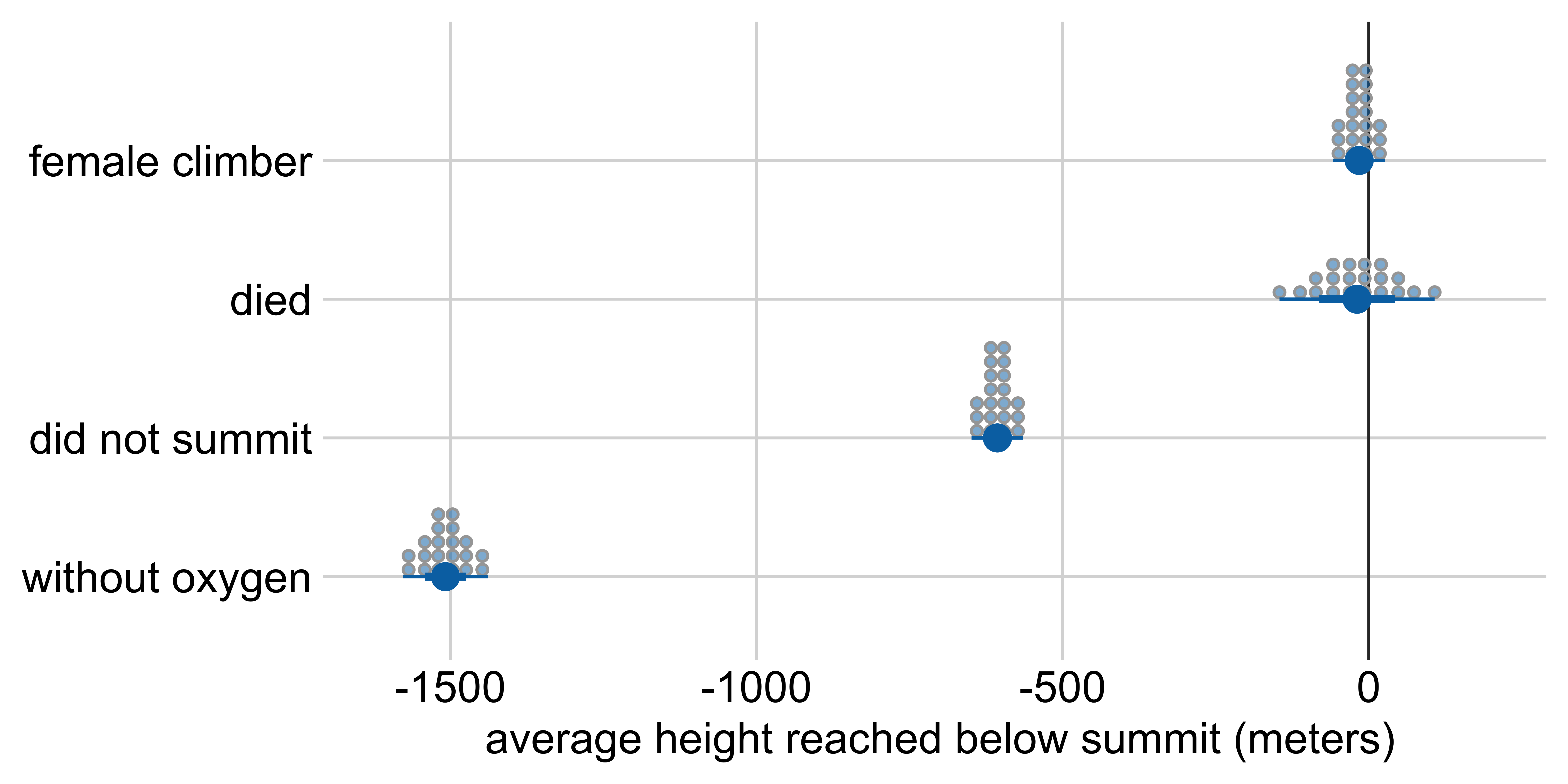
Marginal effects: Height reached on Everest
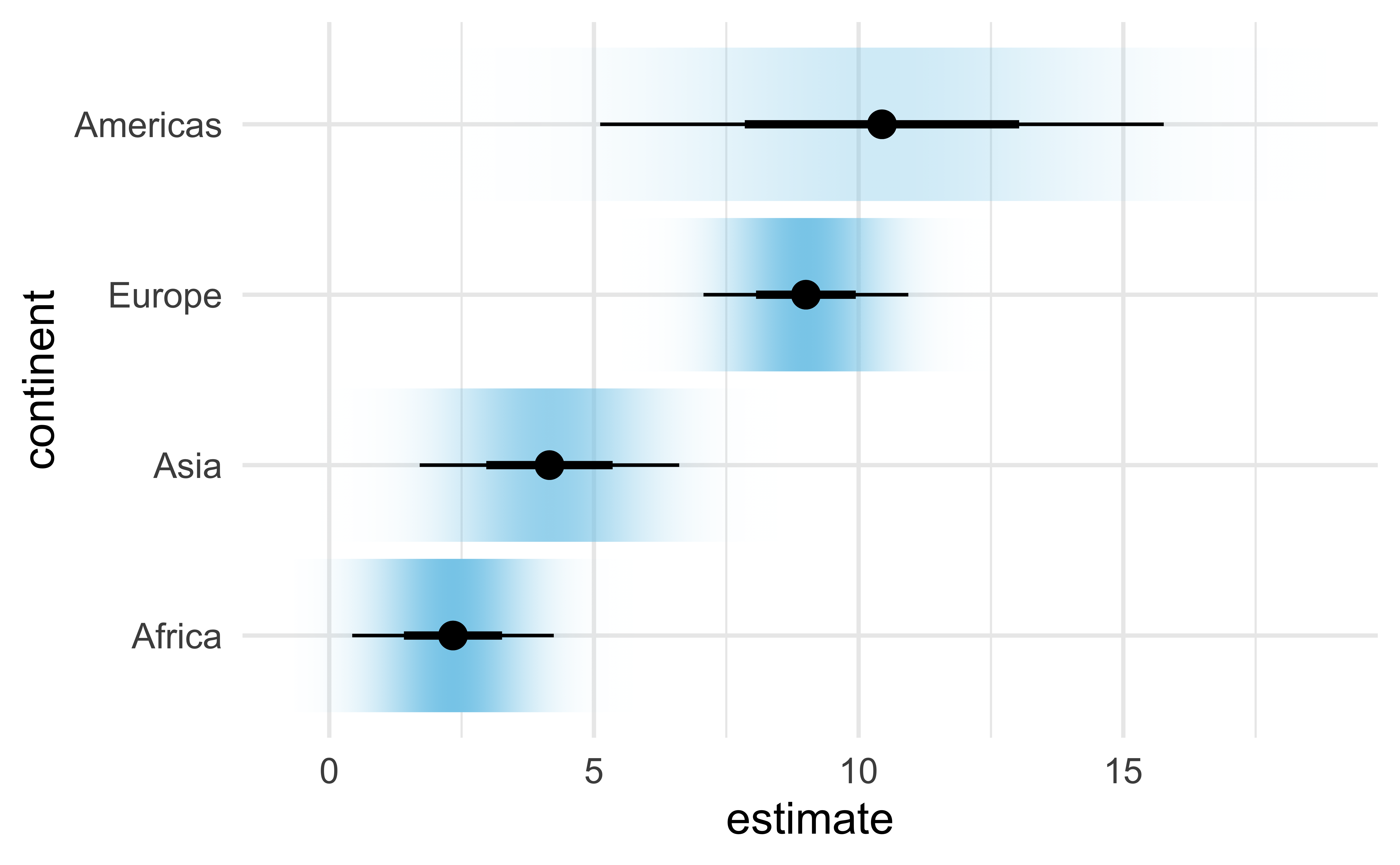
Other visualization options: gradient interval
Marginal effects: Height reached on Everest
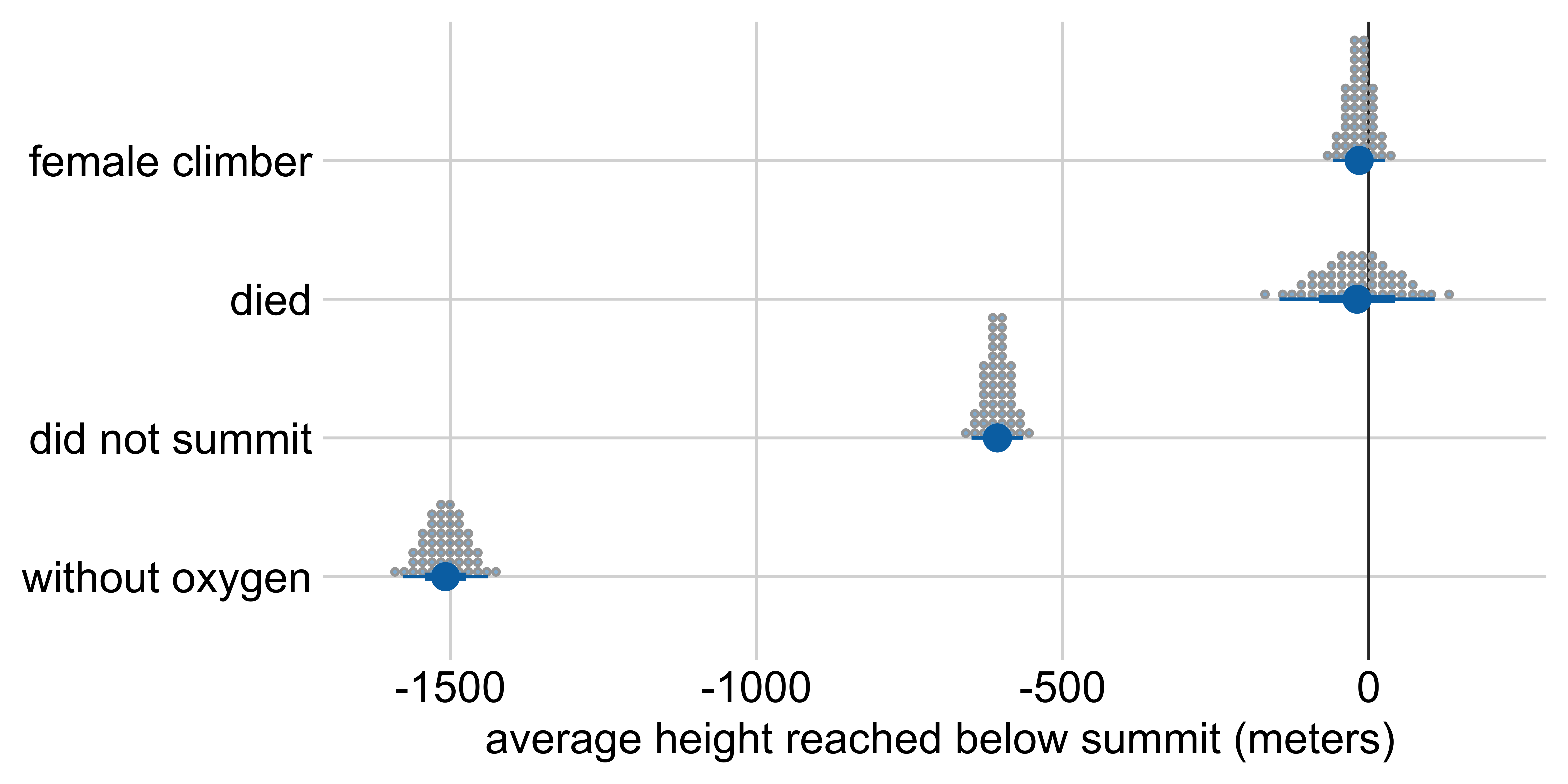
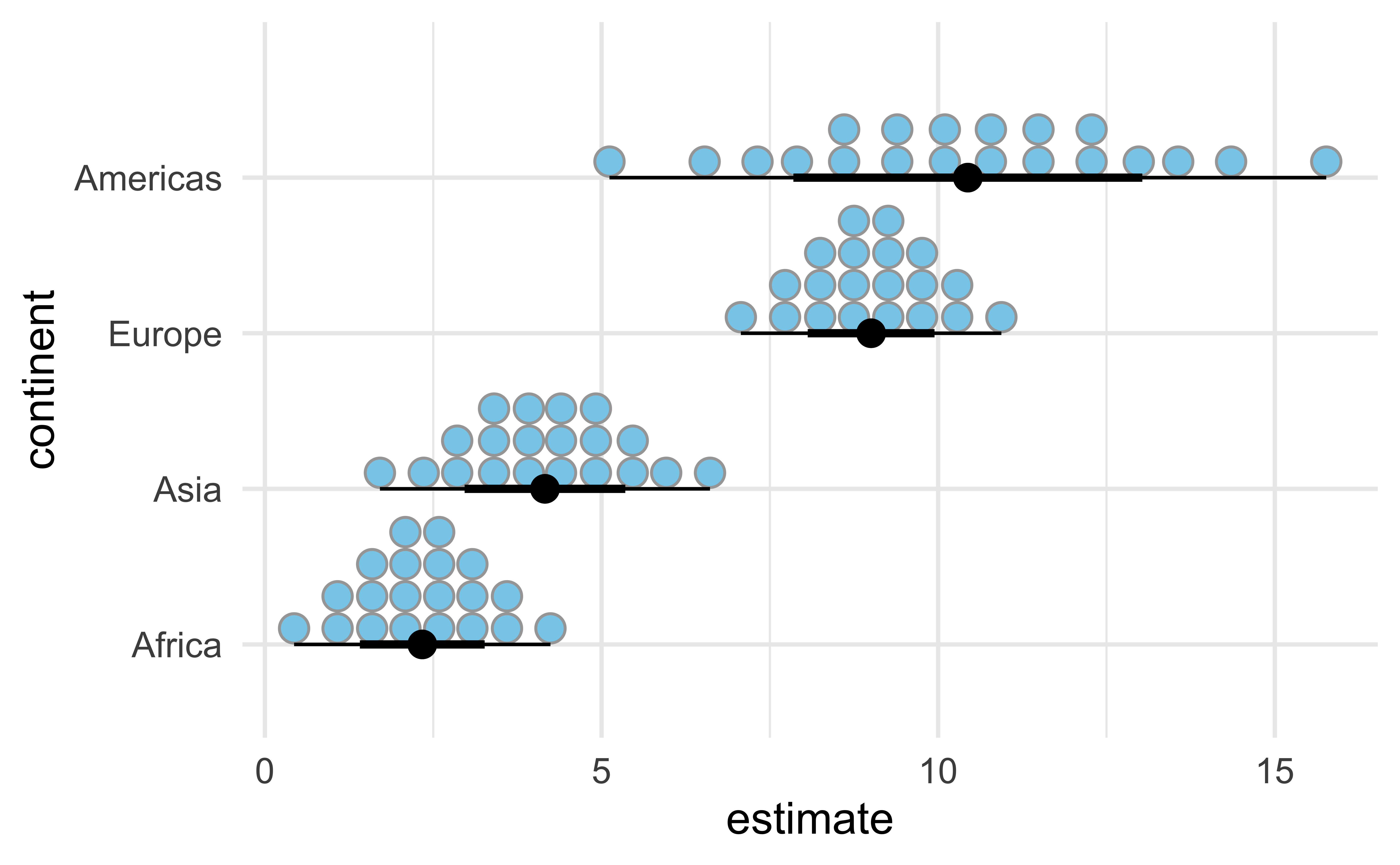
Other visualization options: quantile dotplot
Marginal effects: Height reached on Everest
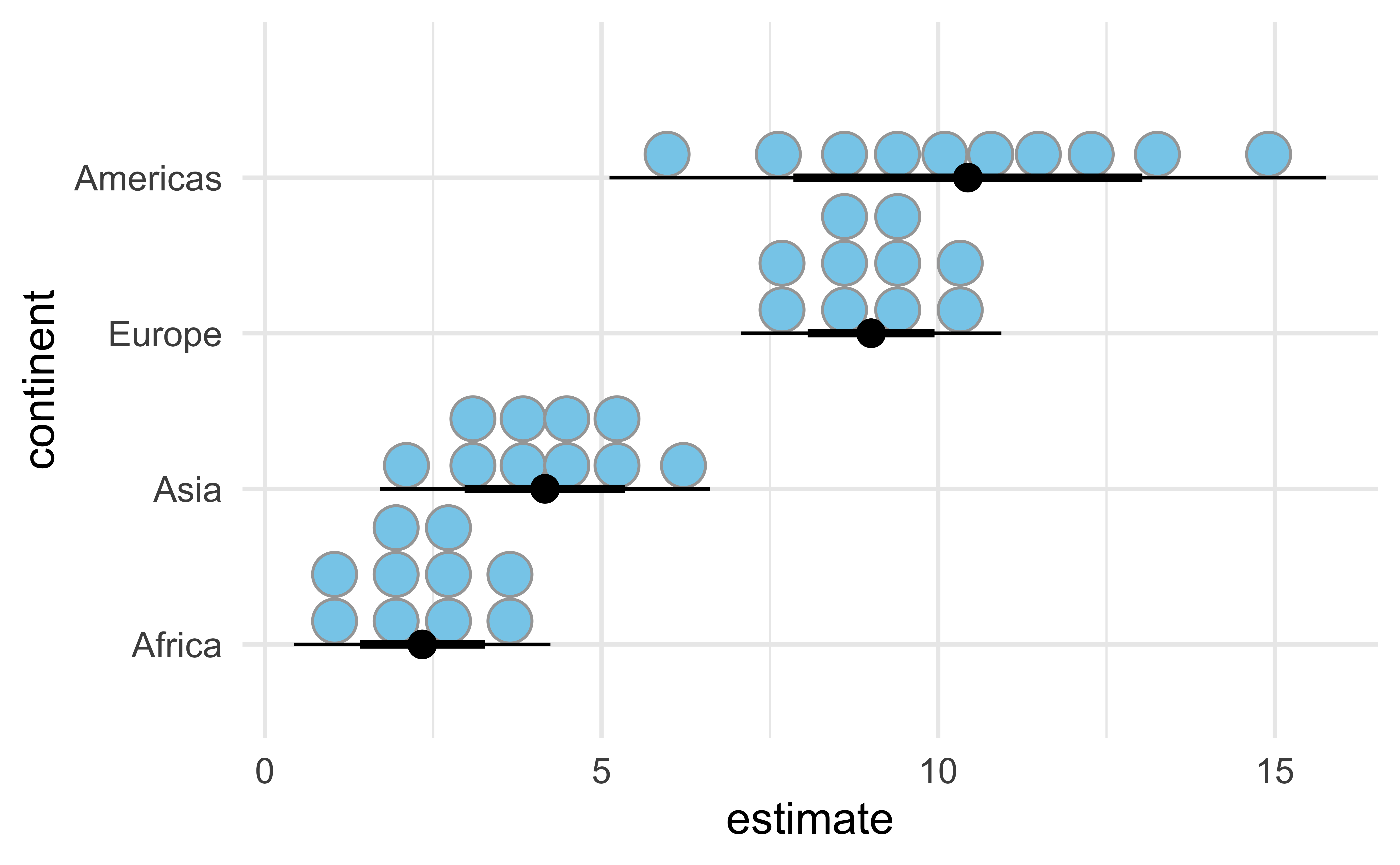
Other visualization options: quantile dotplot
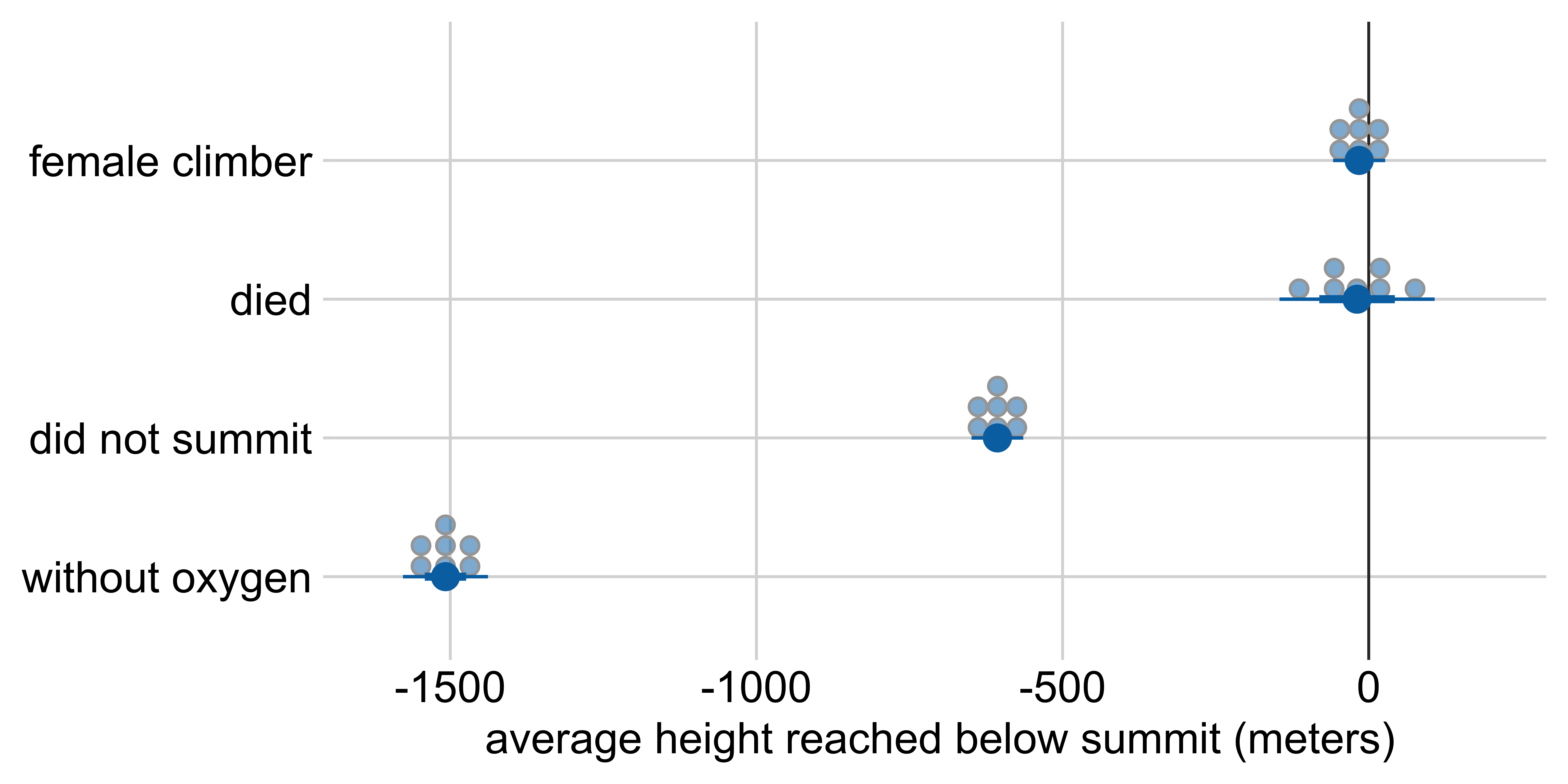
Marginal effects: Height reached on Everest
Other visualization options: quantile dotplot
Making a plot with error bars in R
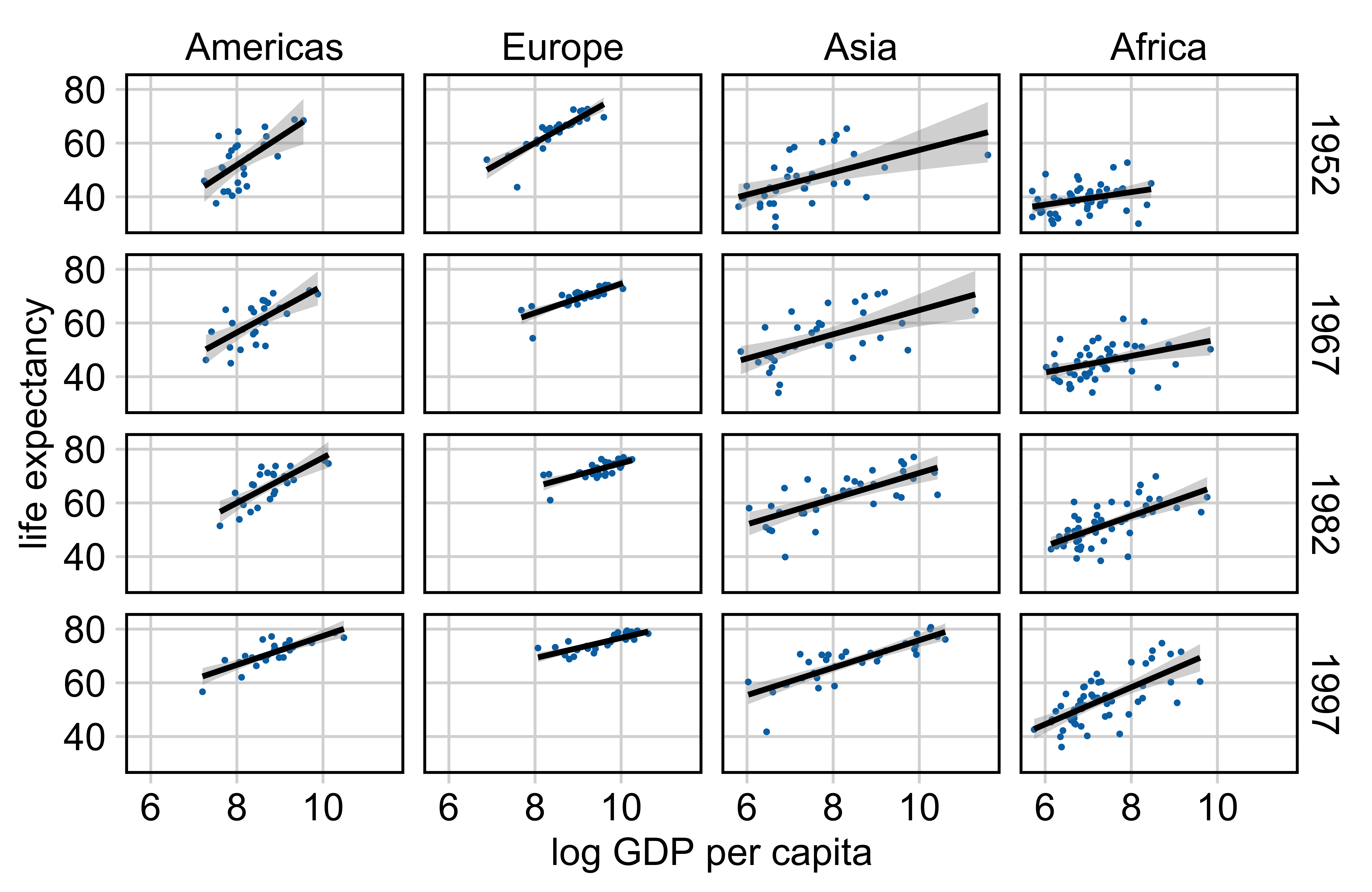
Example: Relationship between life expectancy and GDP per capita
Making a plot with error bars in R
Example: Relationship between life expectancy and GDP per capita

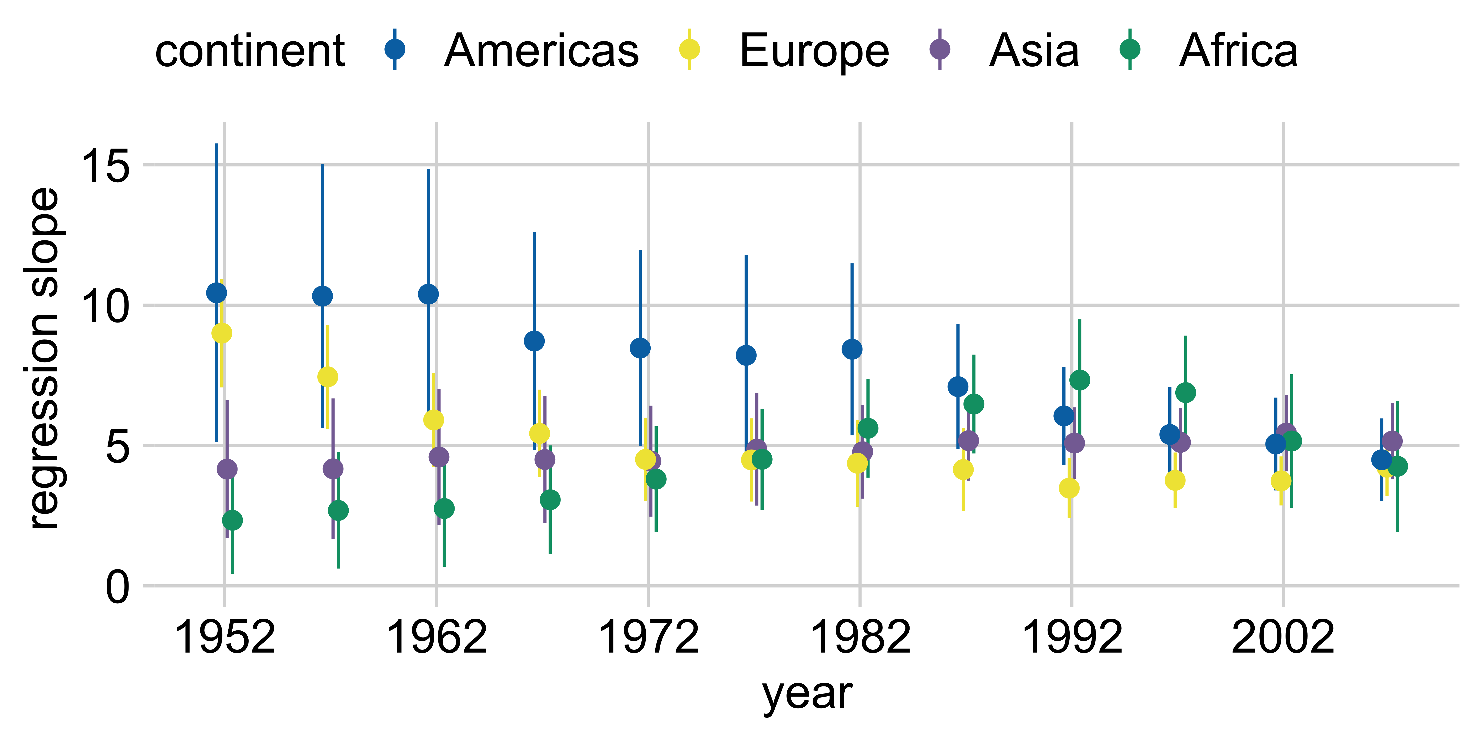
Making a plot with error bars in R
ggplot(lm_data) +
  aes(
    x = year, y = estimate,
    ymin = estimate - 1.96*std.error,
    ymax = estimate + 1.96*std.error,
    color = continent
  ) +
  geom_pointrange(
    position = position_dodge(width = 1)
  ) +
  scale_x_continuous(
    breaks = gapminder |> distinct(year) |> pull(year)
  ) +
  theme(legend.position = "top")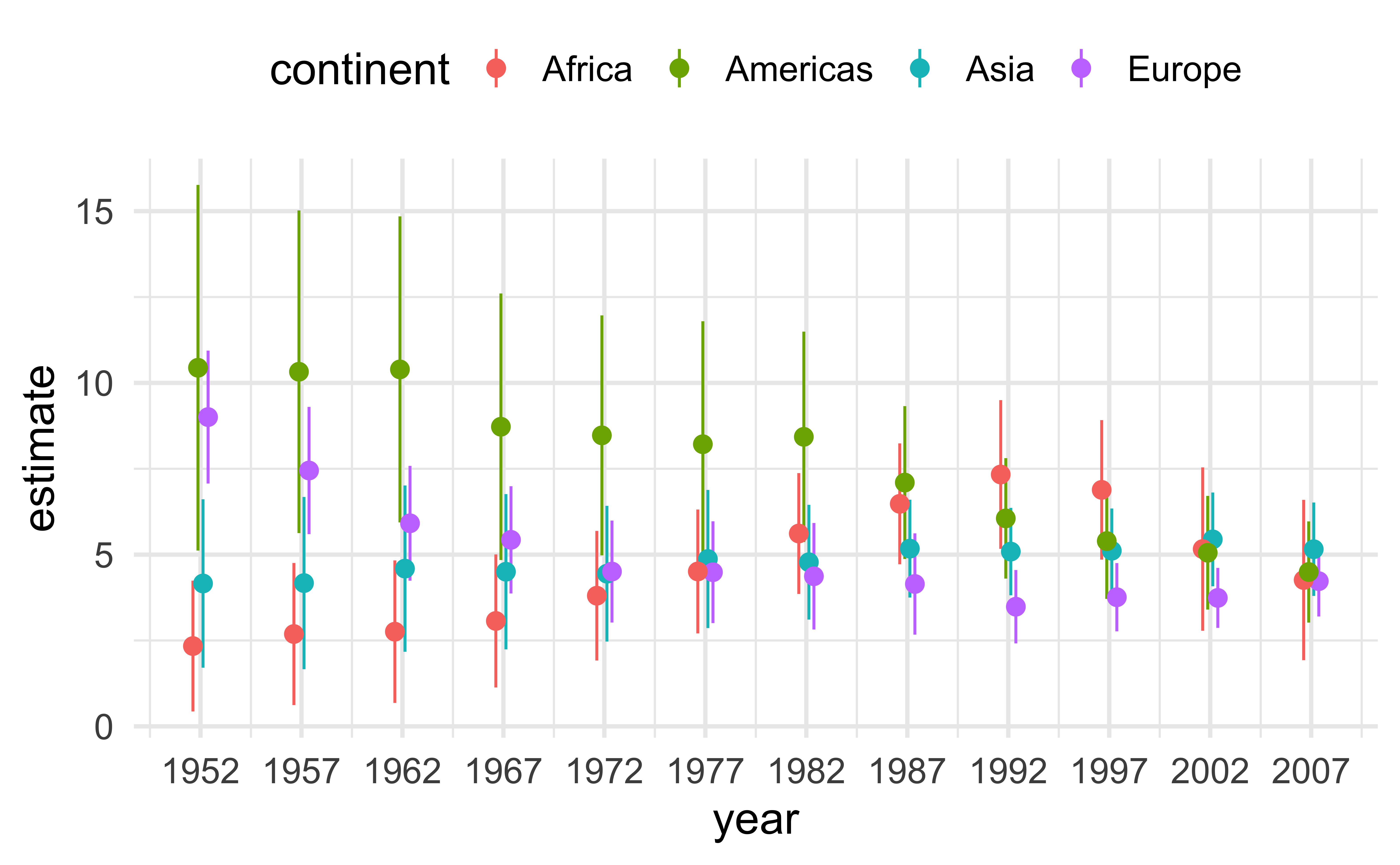
Half-eye
ggdist::stat_dist_halfeye():
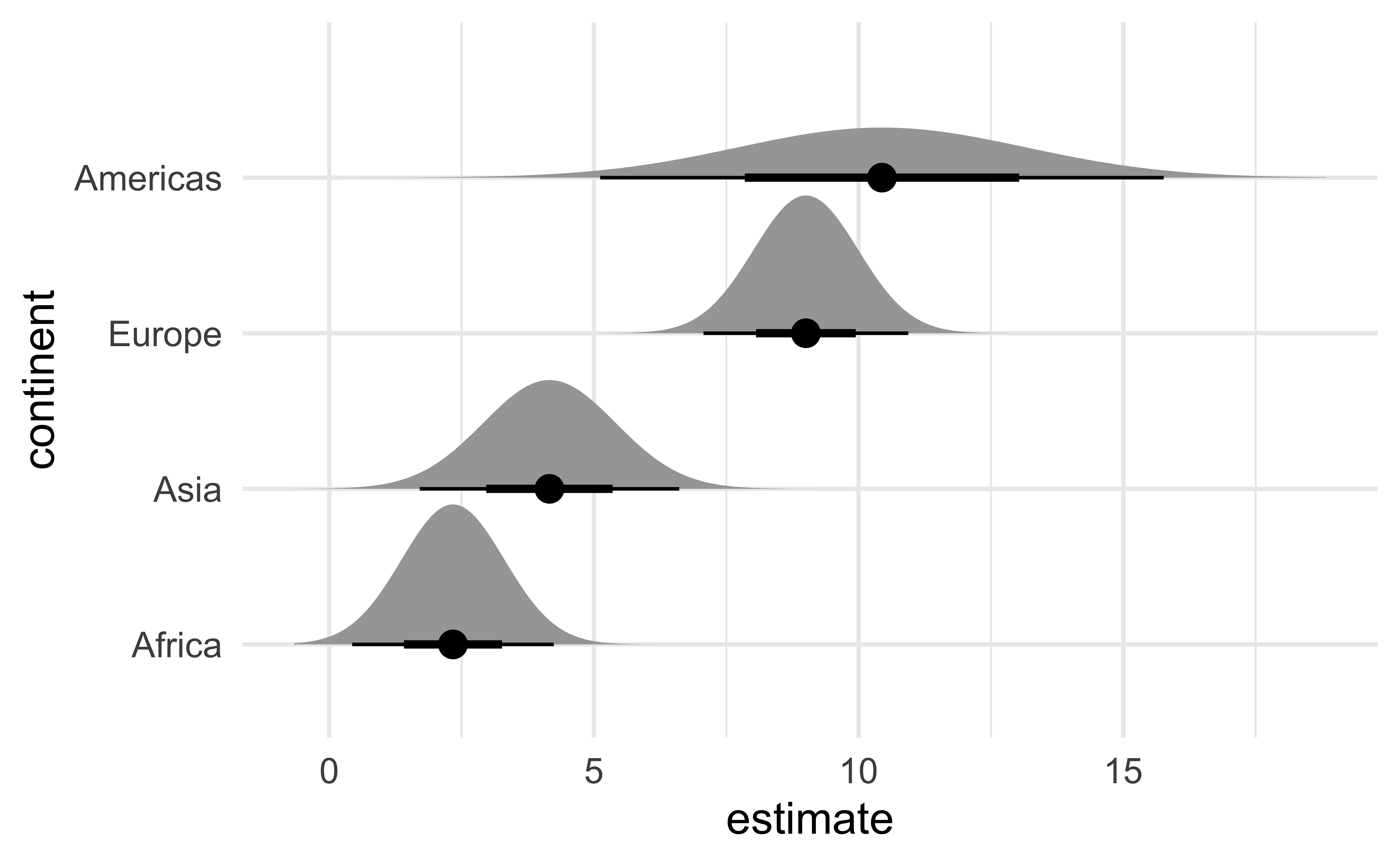
Gradient interval
ggdist::stat_dist_gradientinterval():
Dots interval
ggdist::stat_dist_dotsinterval():
Dots interval
ggdist::stat_dist_dotsinterval():
Further reading and acknowledgements
- Acknowledgements: Slides from Visualizing uncertainty by Claus Wilke
- Further reading
- Fundamentals of Data Visualization: Chapter 16: Visualizing uncertainty
- Data Visualization—A Practical Introduction: Chapter 6.6: Grouped analysis and list columns
- Data Visualization—A Practical Introduction: Chapter 6.7: Plot marginal effects
- ggdist reference documentation: https://mjskay.github.io/ggdist/index.html
- ggdist vignette: Frequentist uncertainty visualization
![]()