# load packages
library(tidyverse)
library(mapproj)
library(sf)
library(geofacet)
library(scales)

# set theme for ggplot2
ggplot2::theme_set(ggplot2::theme_minimal(base_size = 16))

# set figure parameters for knitr
knitr::opts_chunk$set(
  fig.width = 7, # 7" width
  fig.asp = 0.618, # the golden ratio
  fig.retina = 3, # dpi multiplier for displaying HTML output on retina
  fig.align = "center", # center align figures
  dpi = 300 # higher dpi, sharper image
)Visualizing geospatial data I
Lecture 16
Visualizing geographic areas
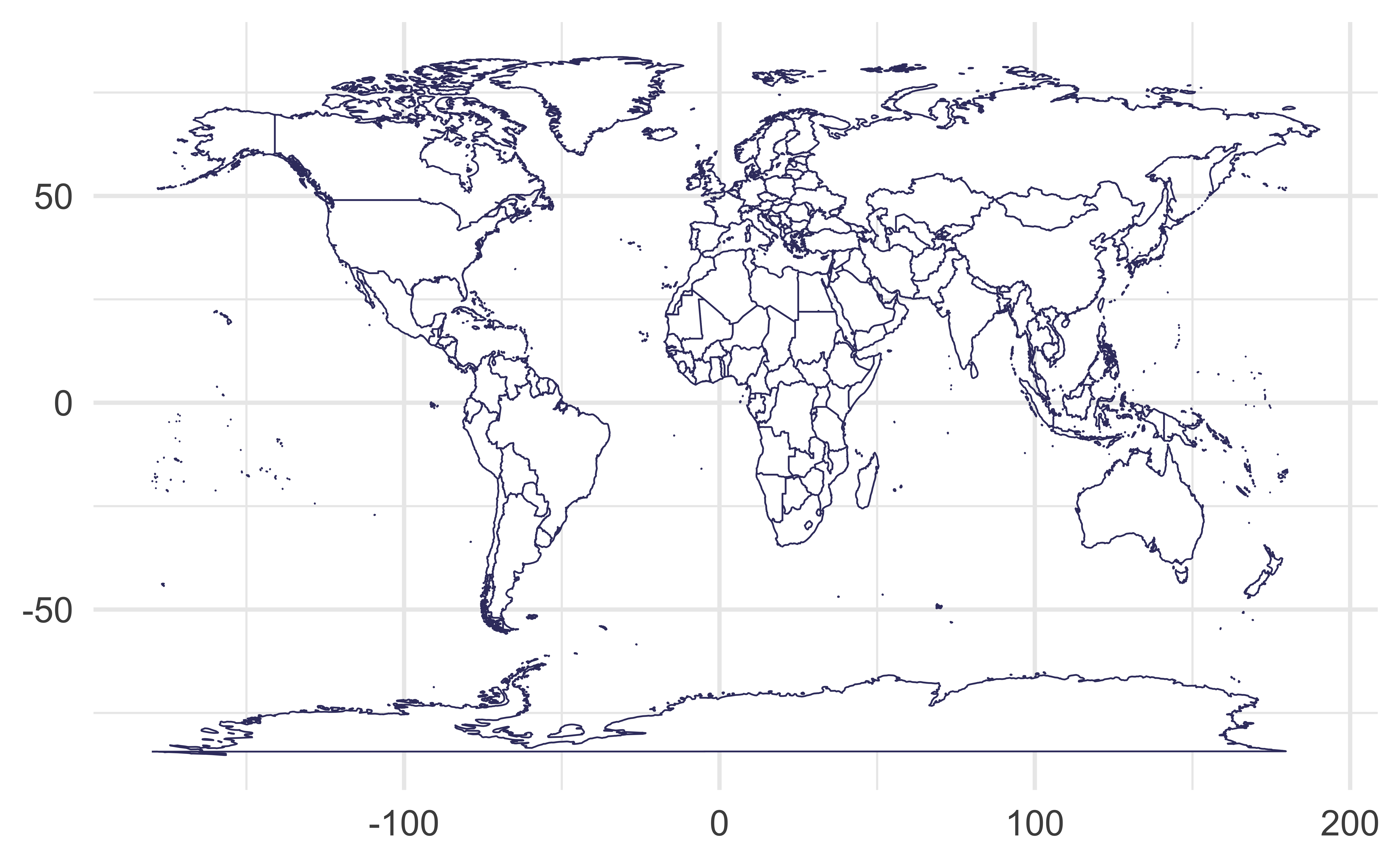
Without any projection, on the cartesian coordinate system
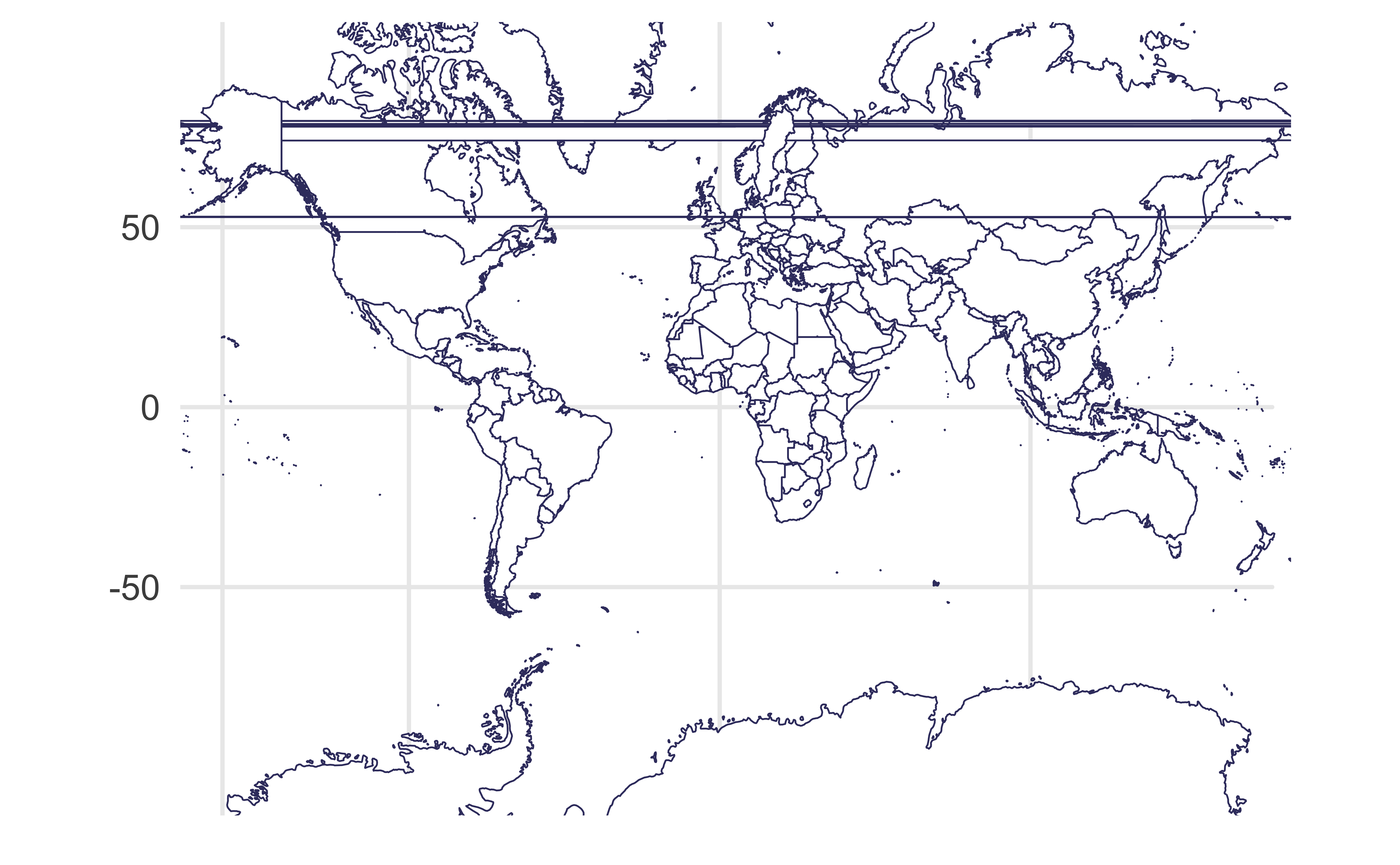
Mercator projection
Meridians are equally spaced and vertical, parallels are horizontal lines whose spacing increases the further we move away from the equator
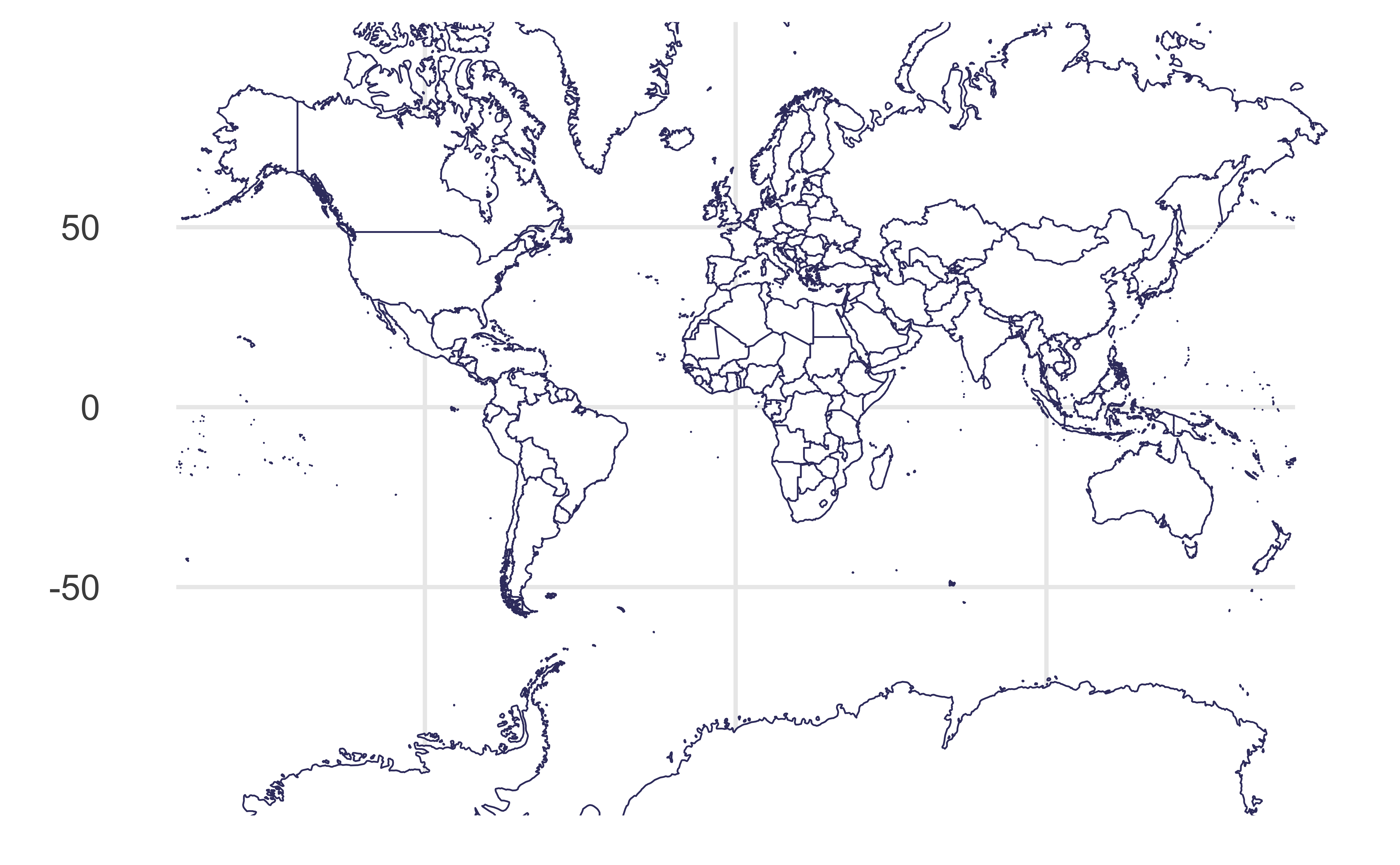
Mercator projection
without the weird straight lines through the earth!
Sinusoidal projection
Parallels are equally spaced
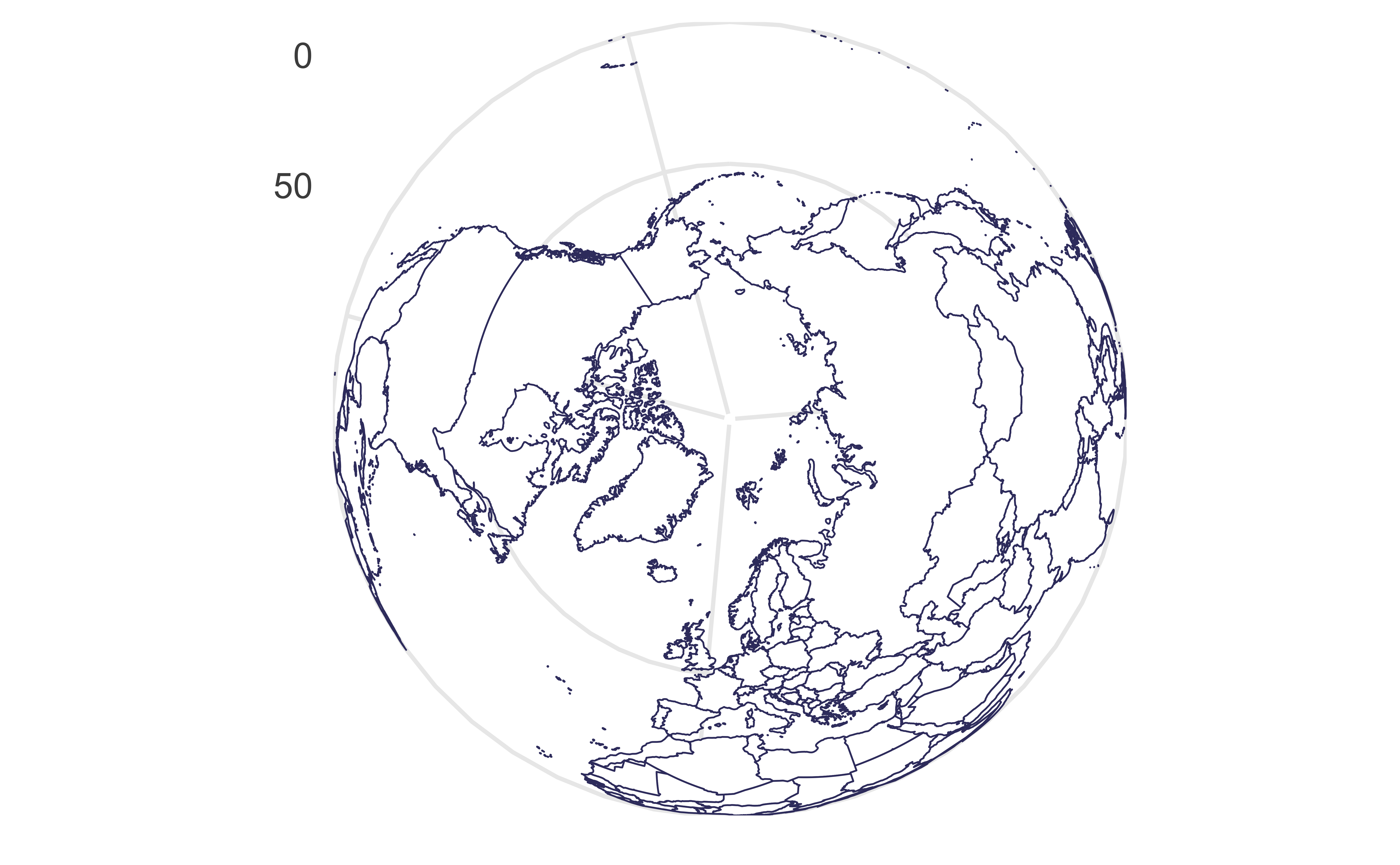
Orthographic projection
Viewed from infinity
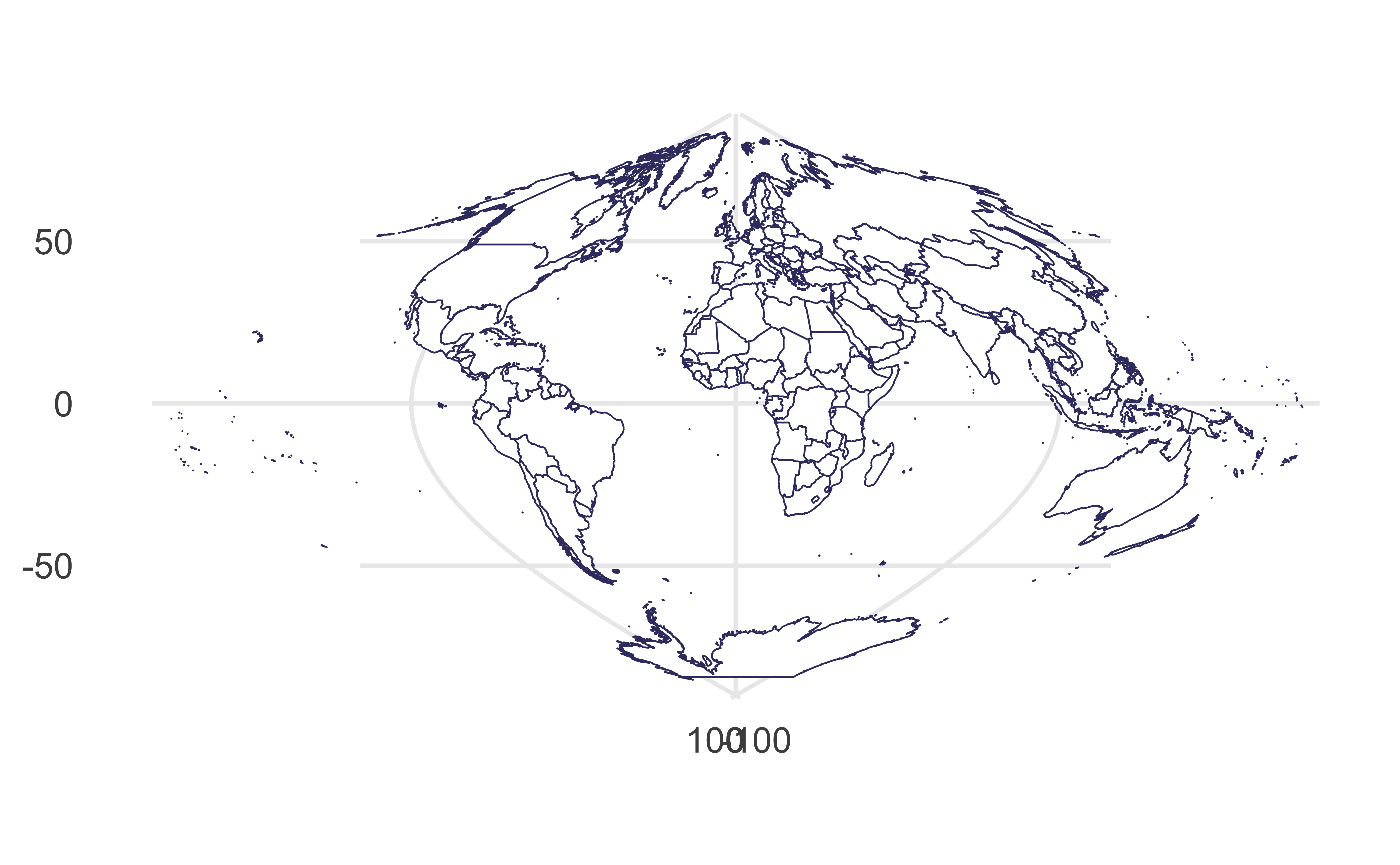
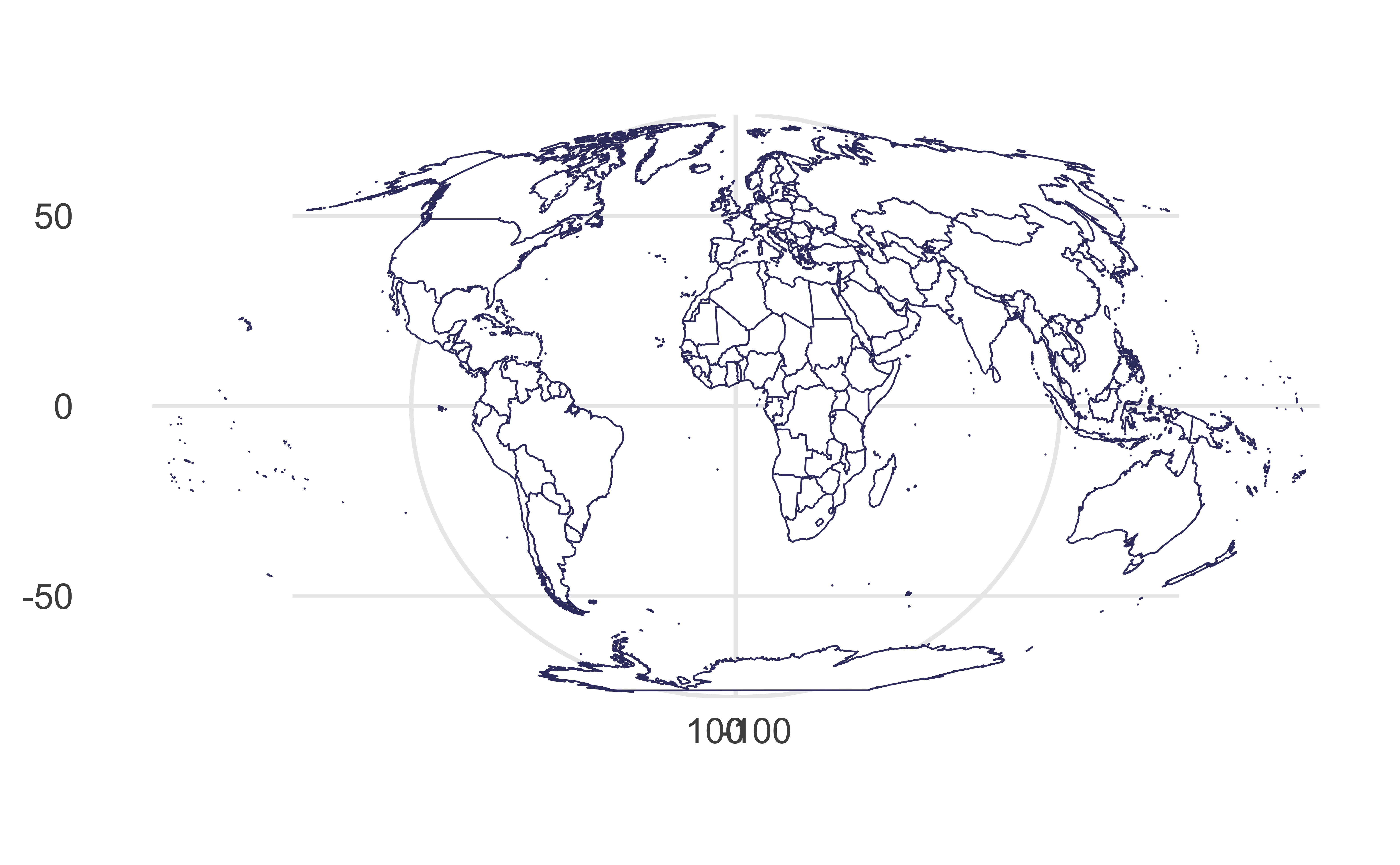
Mollweide projection
Equator is represented as a straight horizontal line perpendicular to a central meridian that is one-half the equator’s length, trades accuracy of angle and shape for accuracy of proportions in area
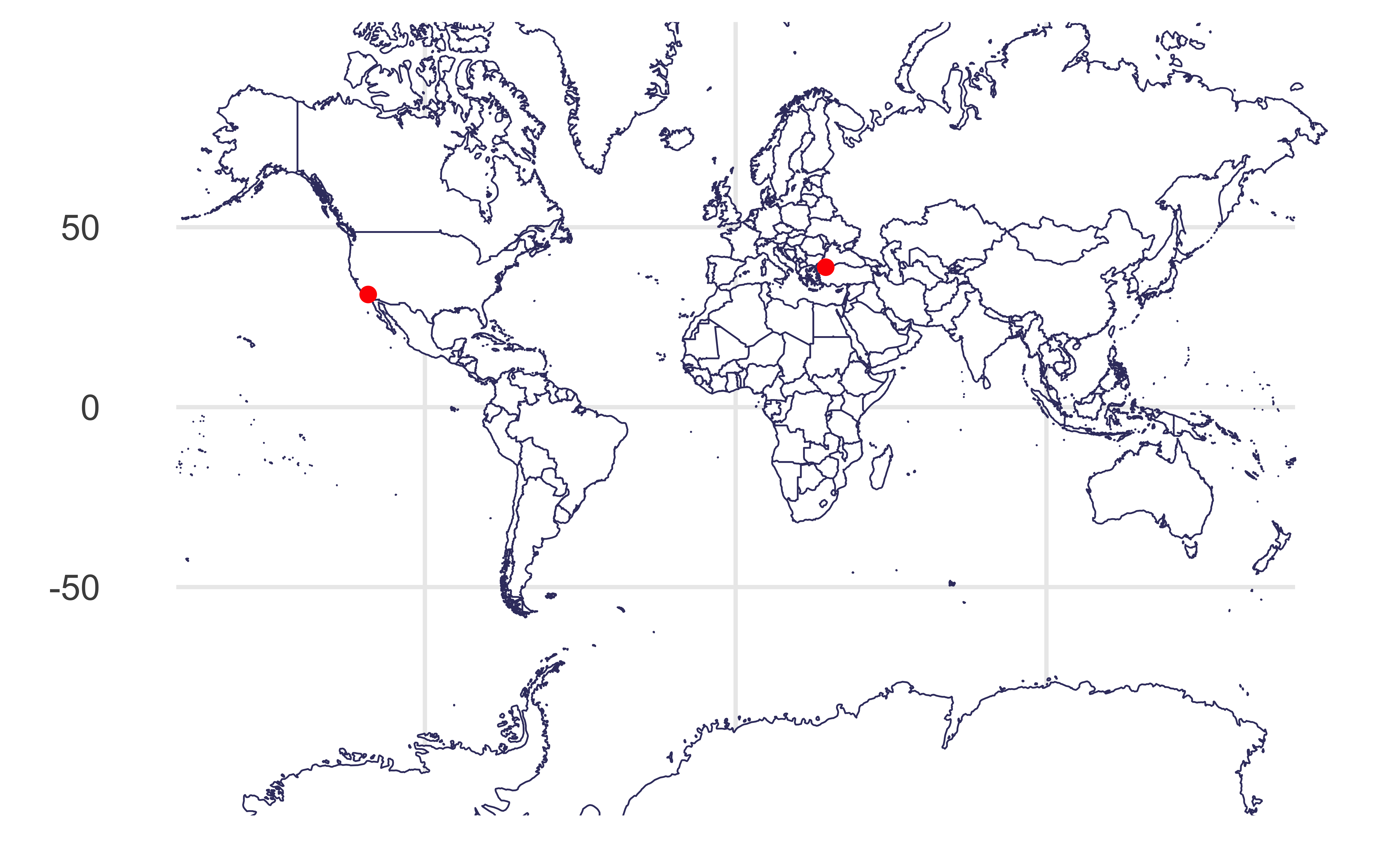
Visualizing distances
Draw a line between Istanbul and Los Angeles.
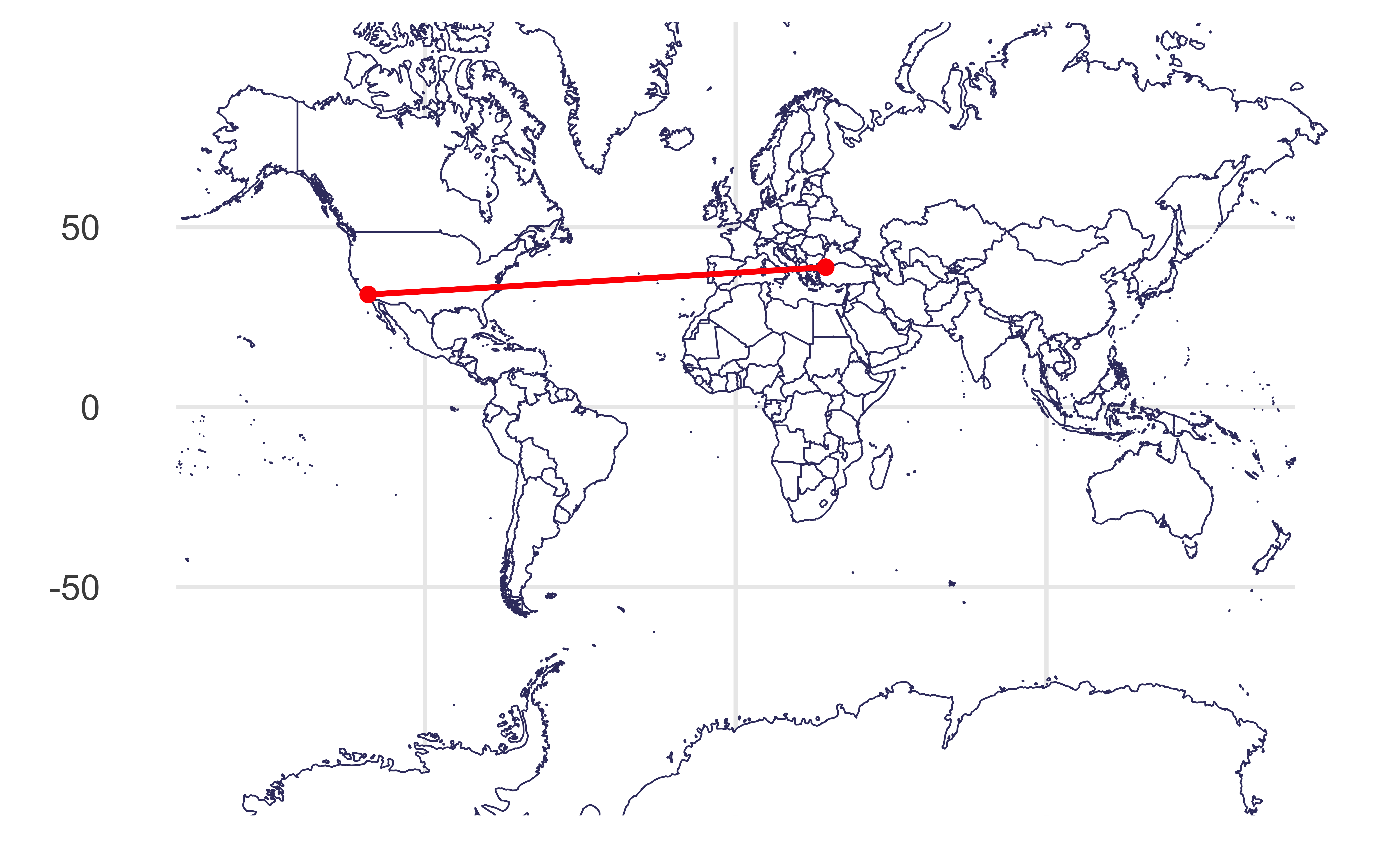
Visualizing distances
As if the earth is flat:
Visualizing distances
Based on a spherical model of the earth:
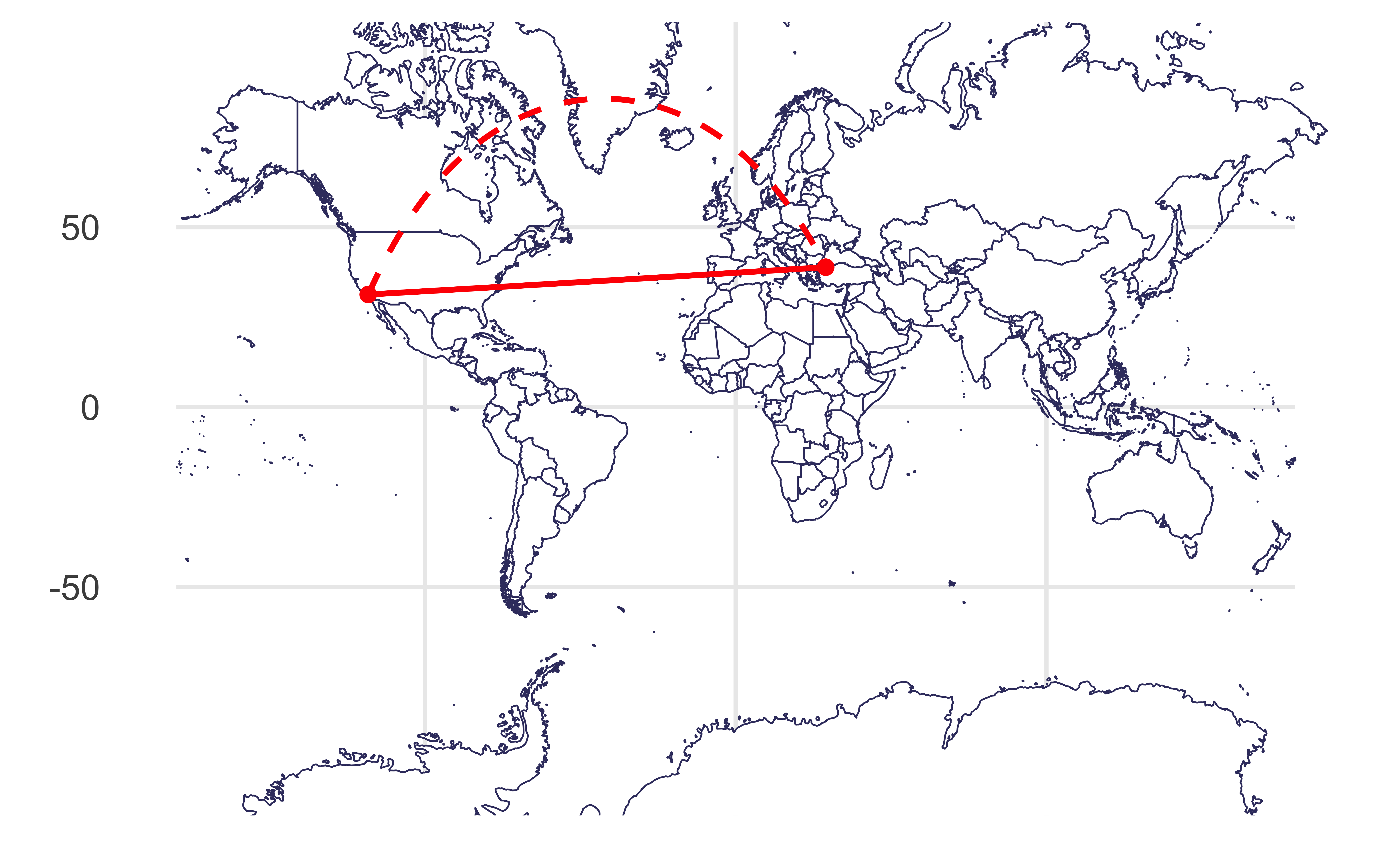
Plotting both distances

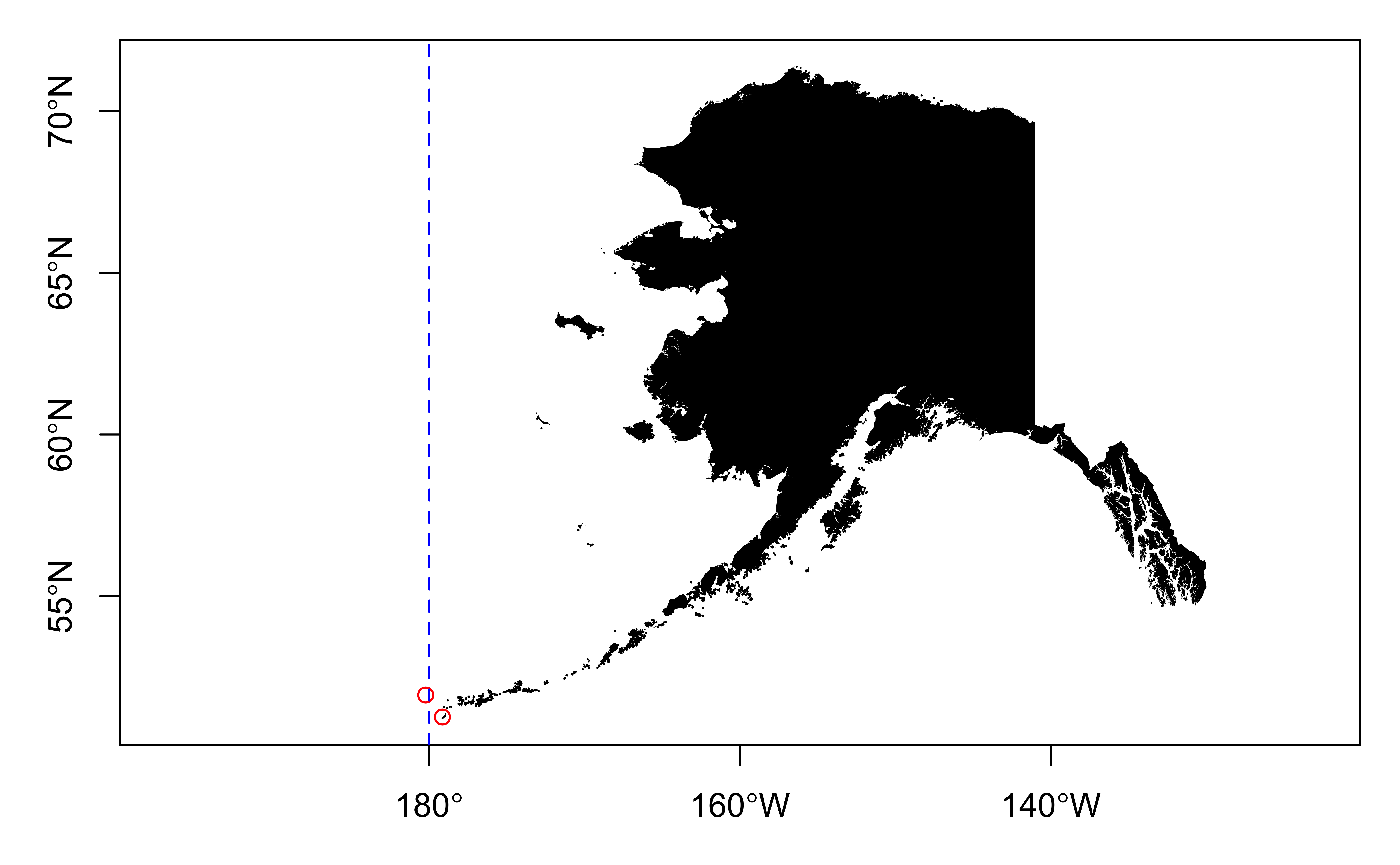
Dateline
Improve
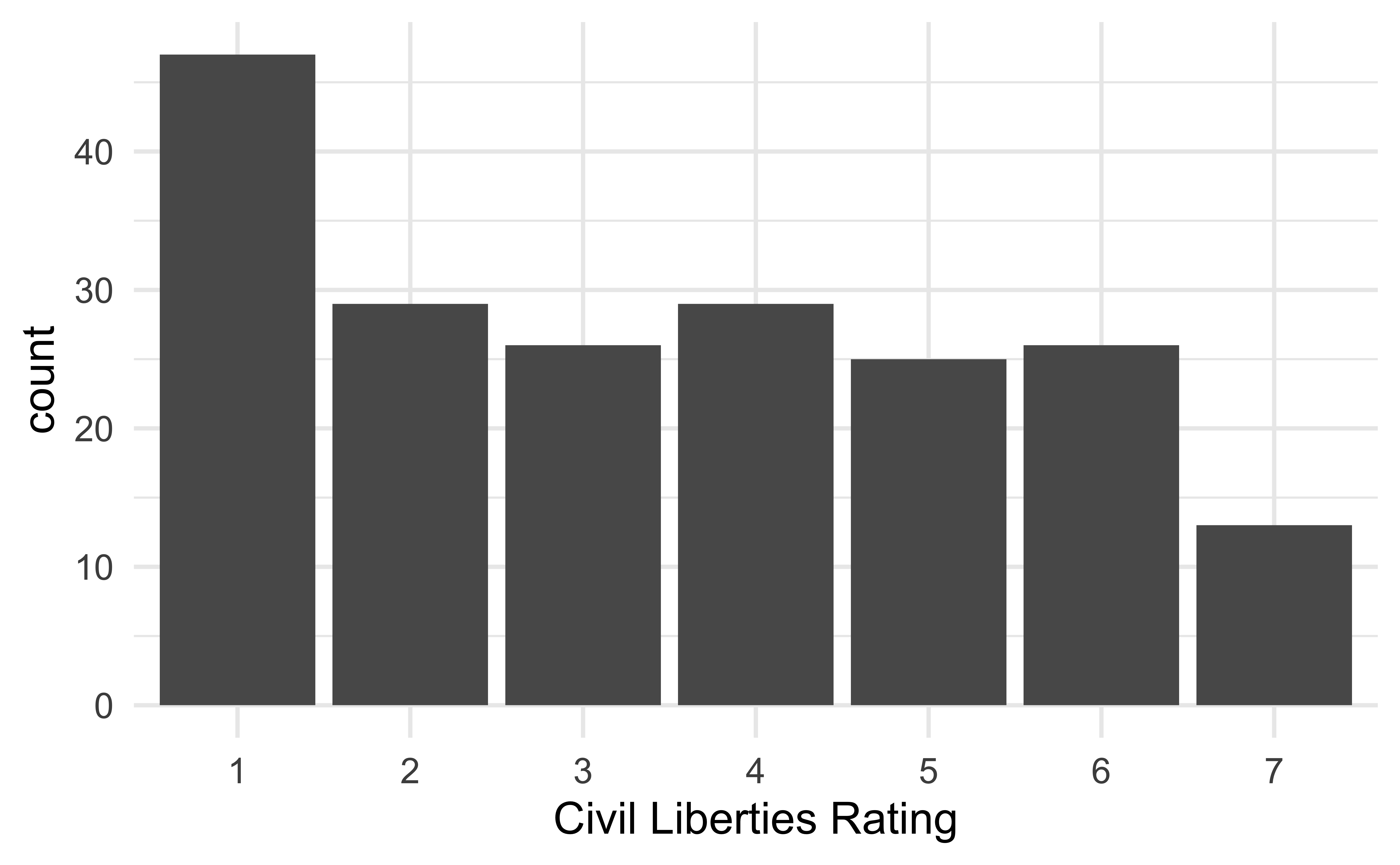
The following visualization shows the distribution civil liberties ratings (1 - greatest degree of freedom to 7 - smallest degree of freedom). This is, undoubtedly, not the best visualization we can make of these data. How can we improve it?
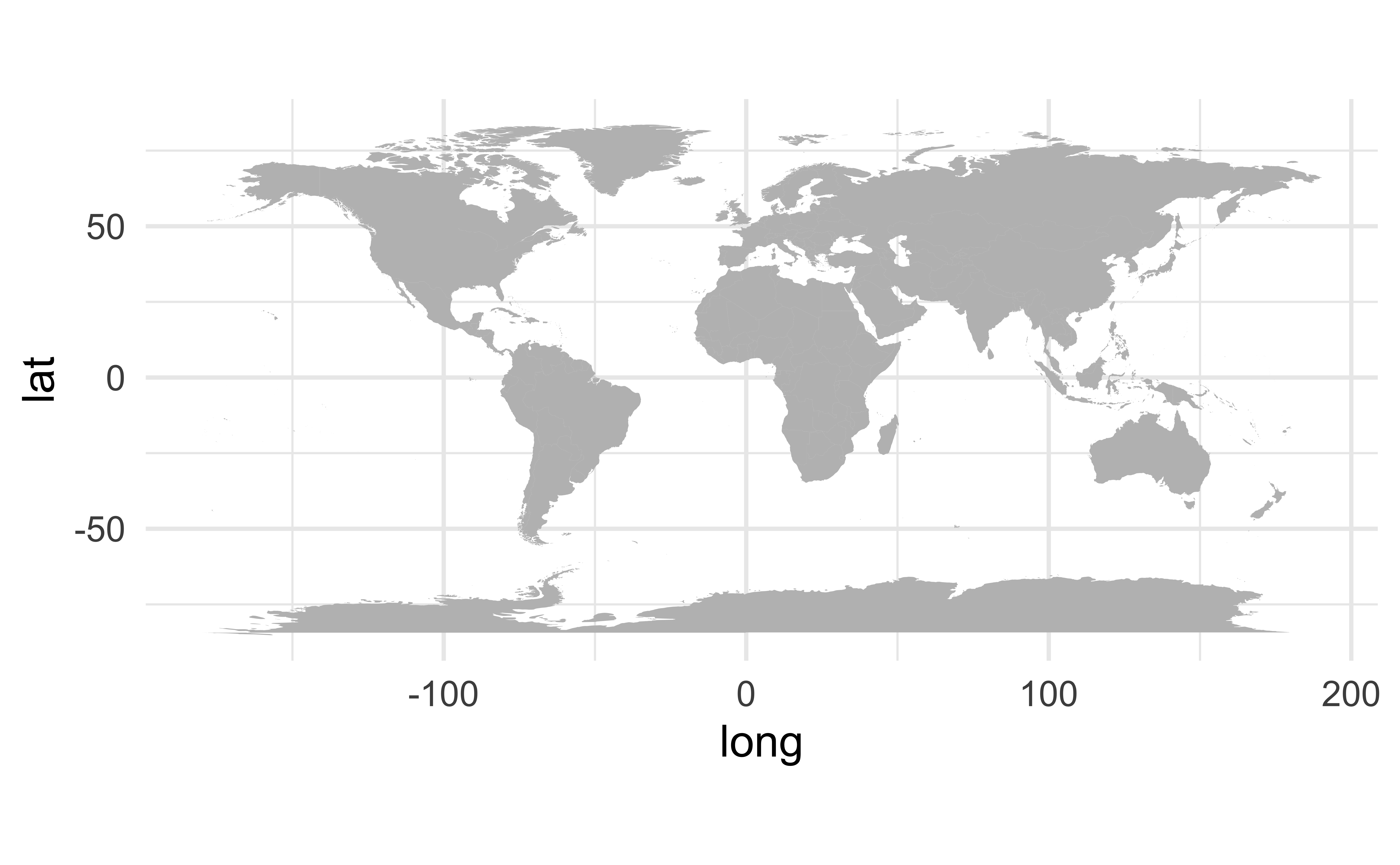
Mapping the world
Mapping freedom
What is missing/misleading about the following map?
Let’s map!
Recreate the following visualization in ae-11.
Facet by state
Geofacet by state
Geofacet by state, with improvements
