# load packages
library(tidyverse)
library(ggrepel)
library(patchwork)
library(tidytext)
library(hrbrthemes) # pak::pak("hrbrmstr/hrbrthemes")
library(scales)
library(textdata)

# set theme for ggplot2
ggplot2::theme_set(ggplot2::theme_minimal(base_size = 16))

# no plot sizing defaults for this slide deckPresentation-ready plots I
Lecture 11
Data viz of the day
Important
Please sit with your team today!
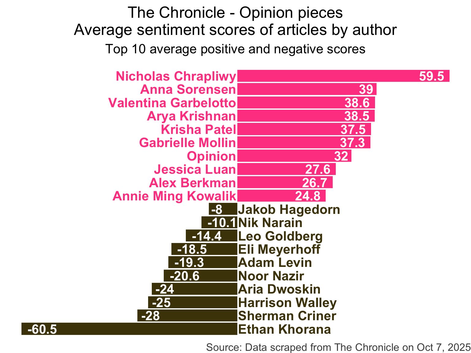
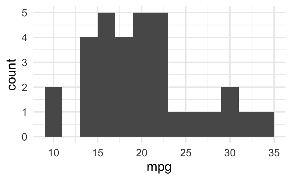
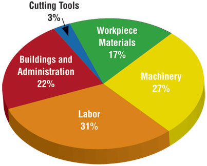
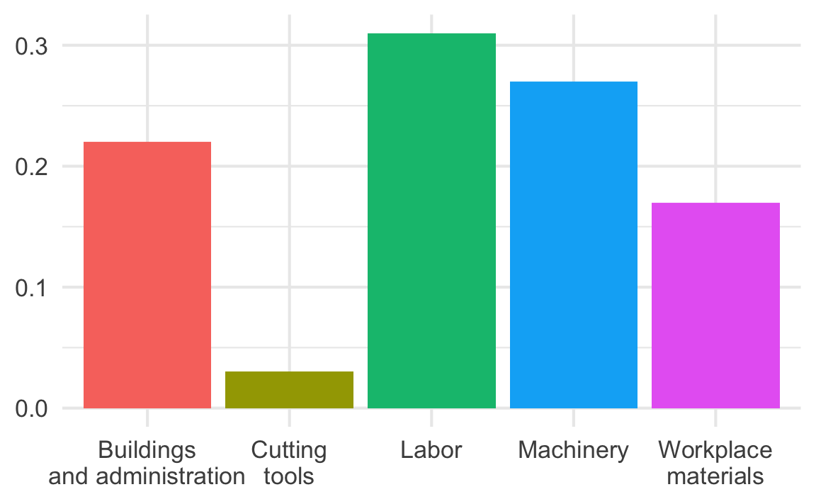
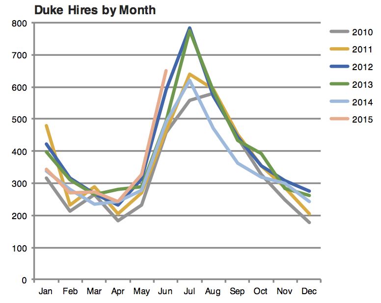
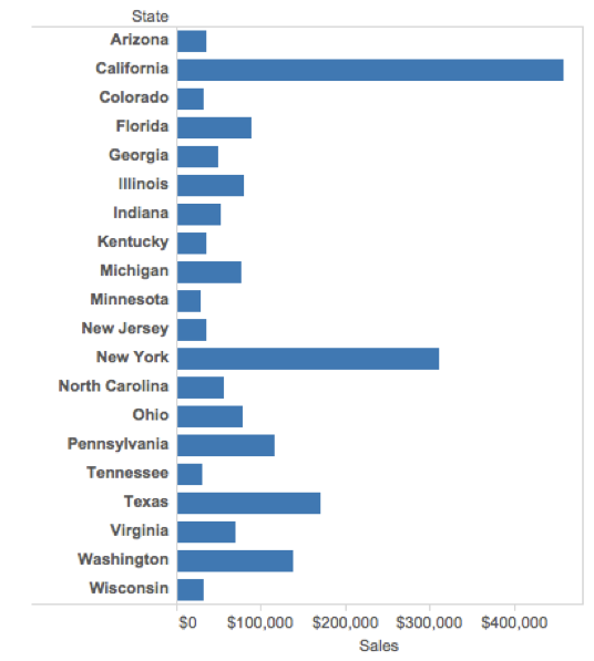
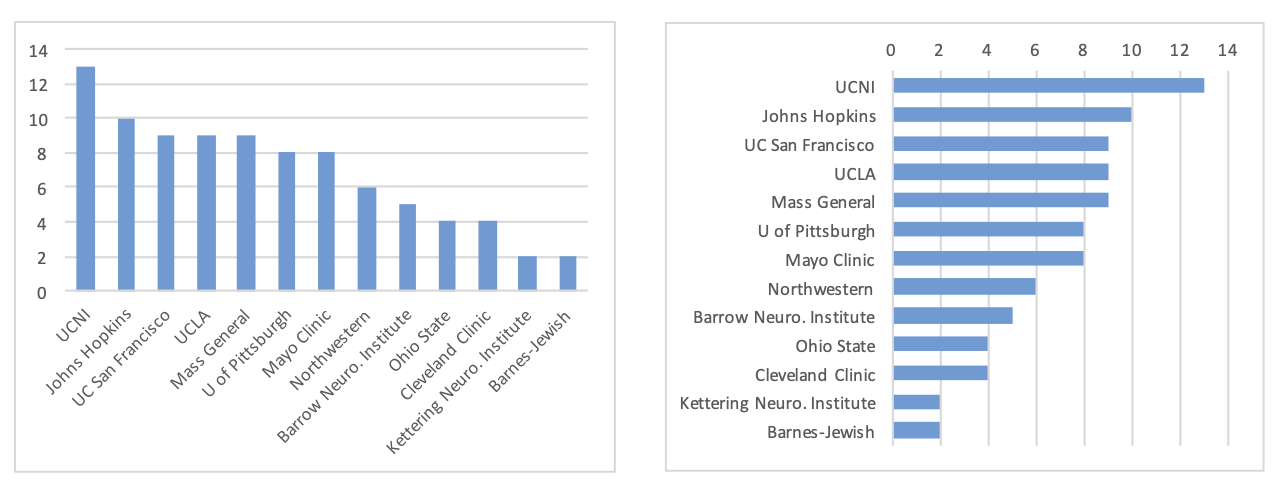
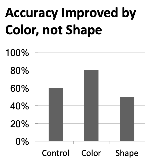
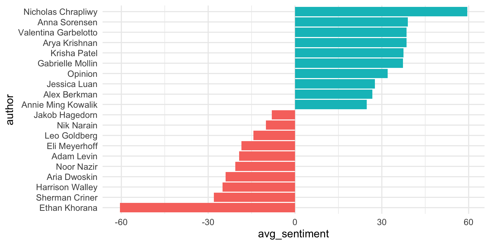
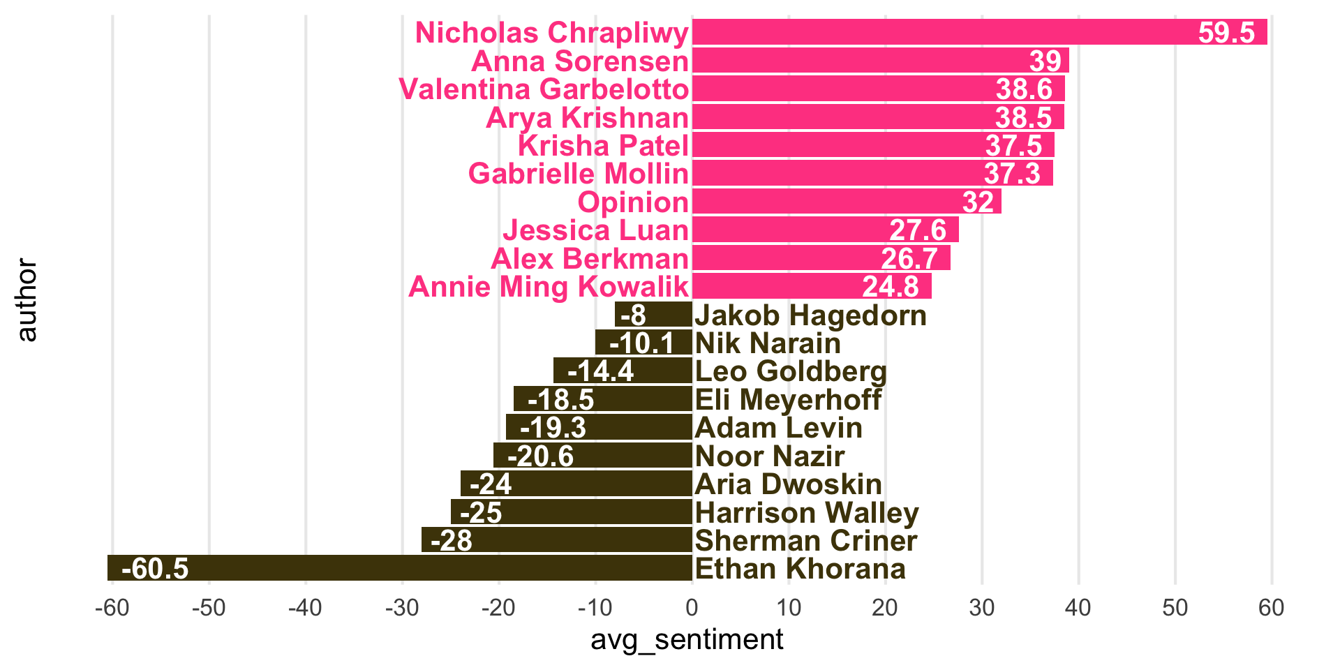
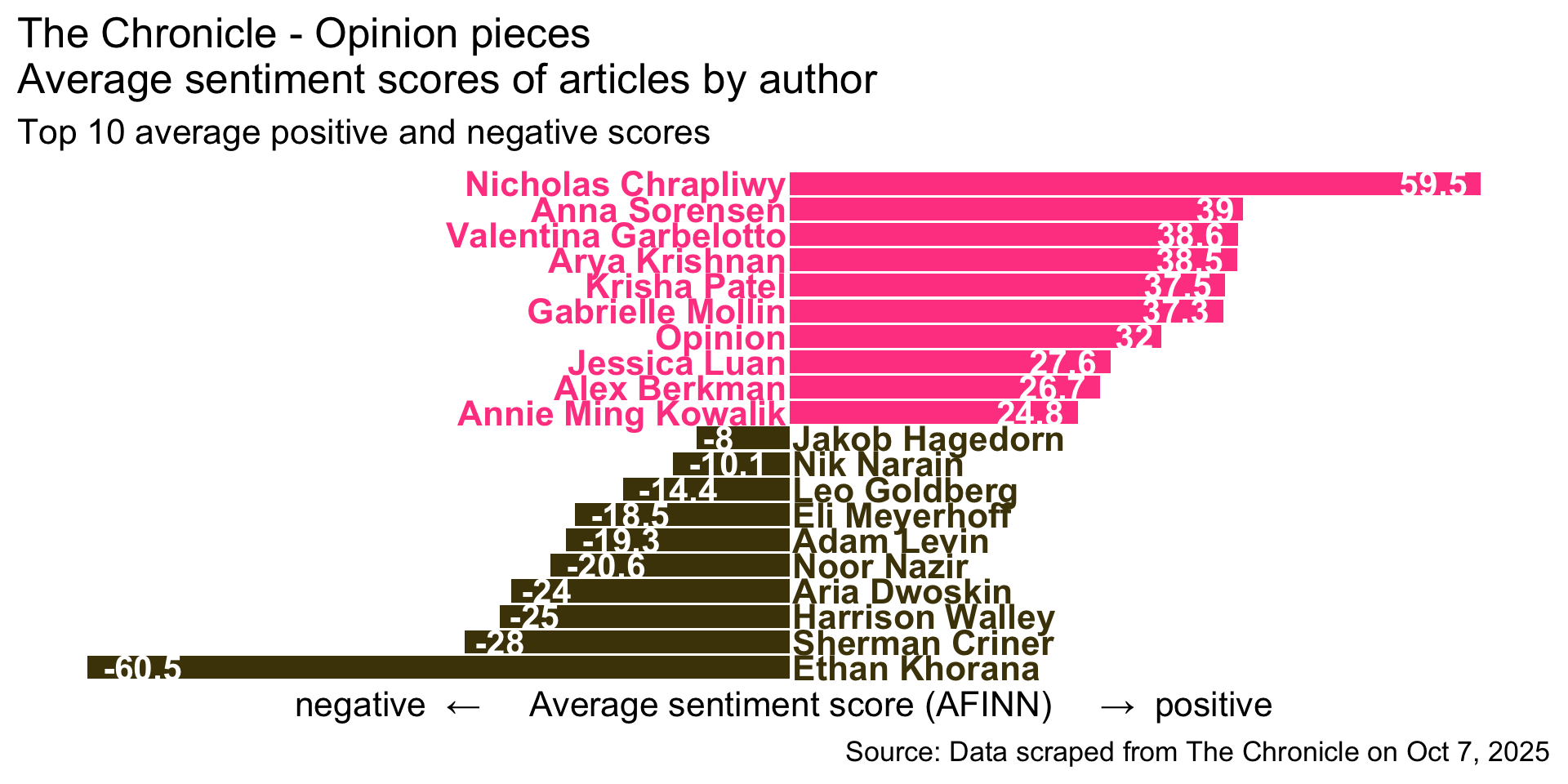
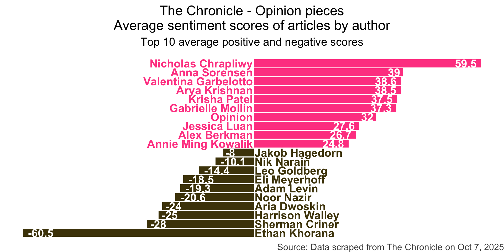
What is wrong with this plot?
Slide with single plot, little text
The plot will fill the empty space in the slide.

Slide with single plot, lots of text
If there is more text on the slide
The plot will shrink
To make room for the text
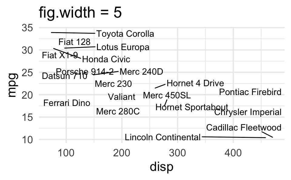
Small fig-width
For a zoomed-in look
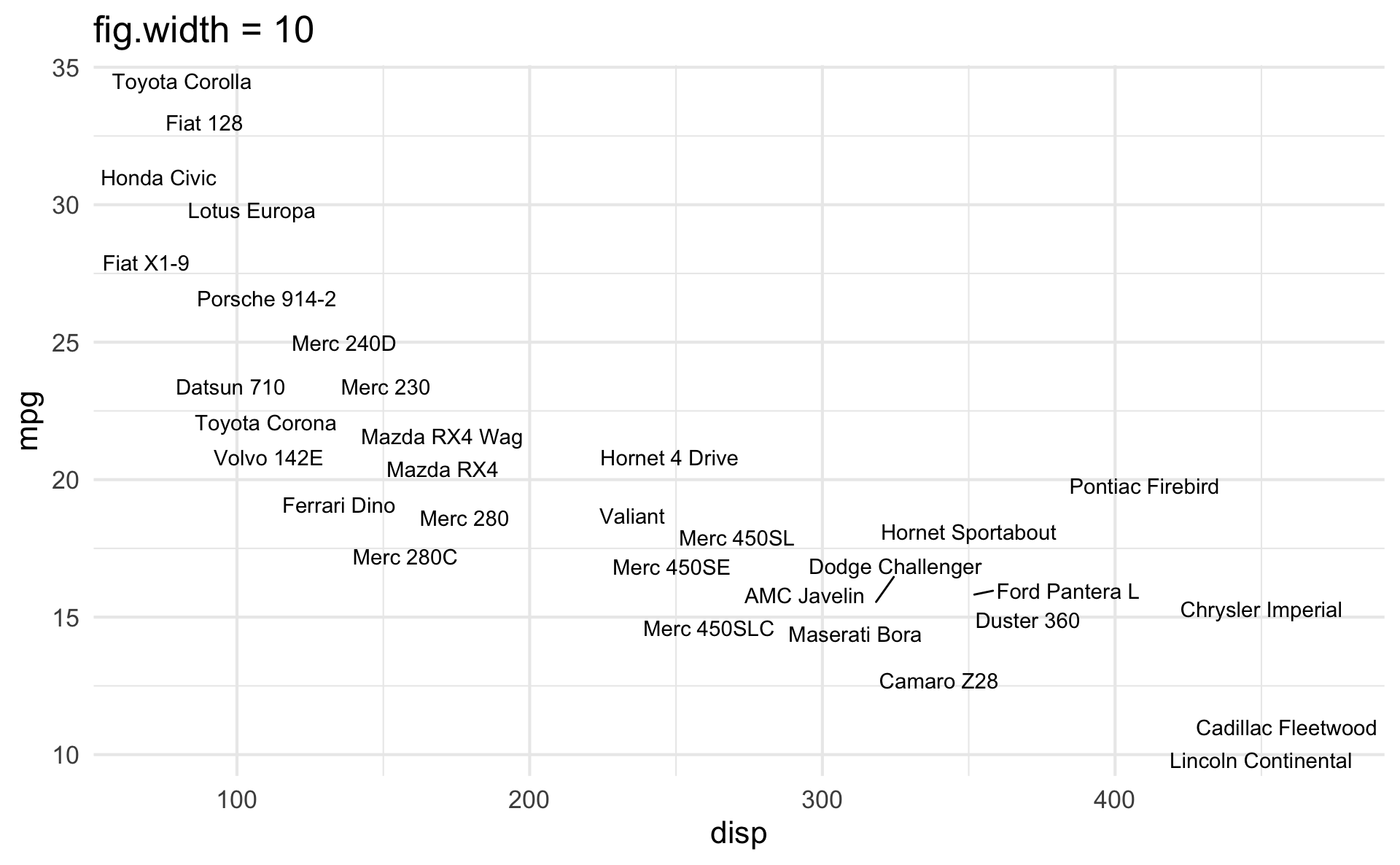
Large fig-width
For a zoomed-out look

fig-width affects text size
Columns
Insert > Slide Columns
Quarto will automatically resize your plots to fit side-by-side.
layout-ncol


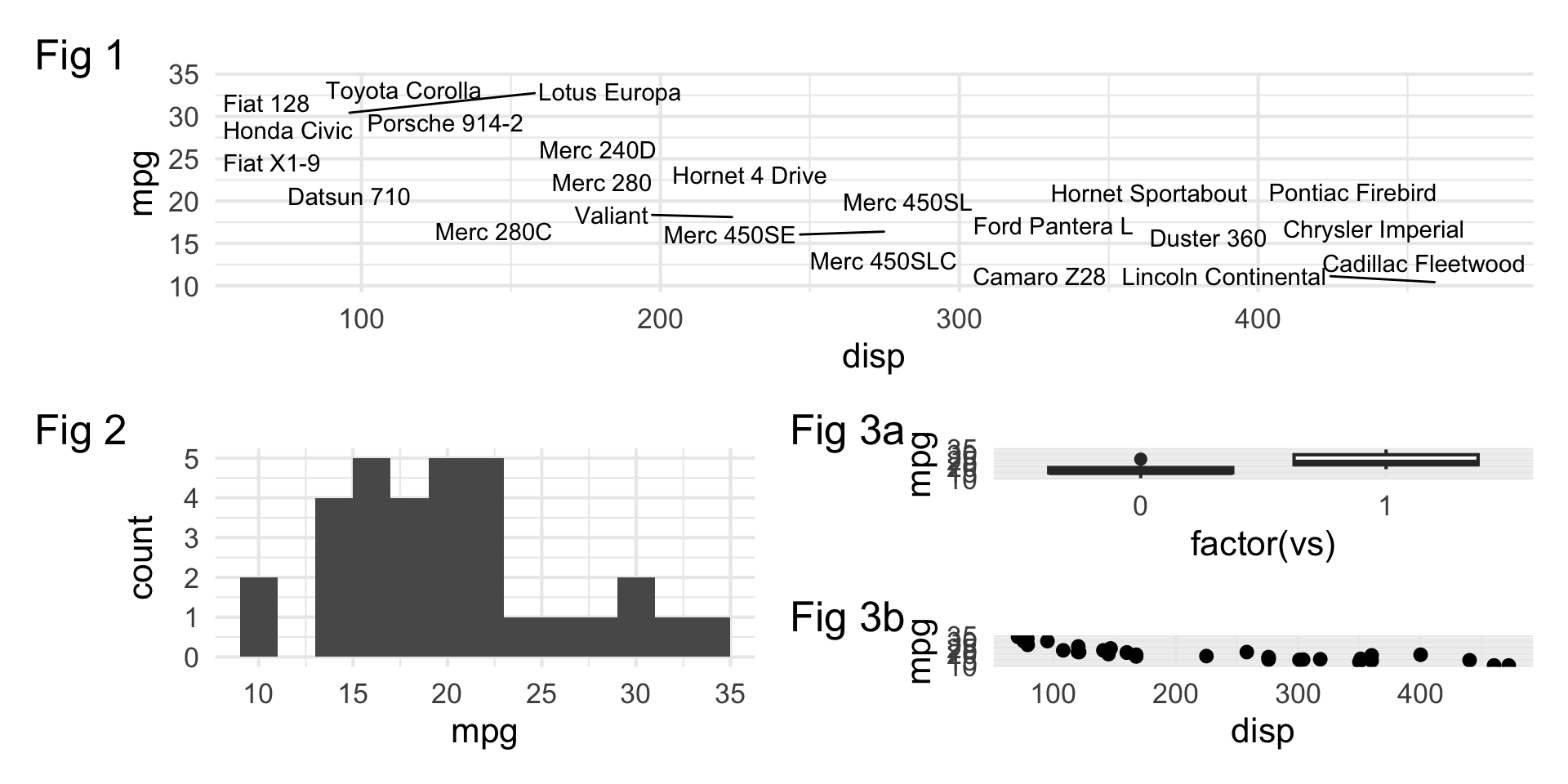
patchwork
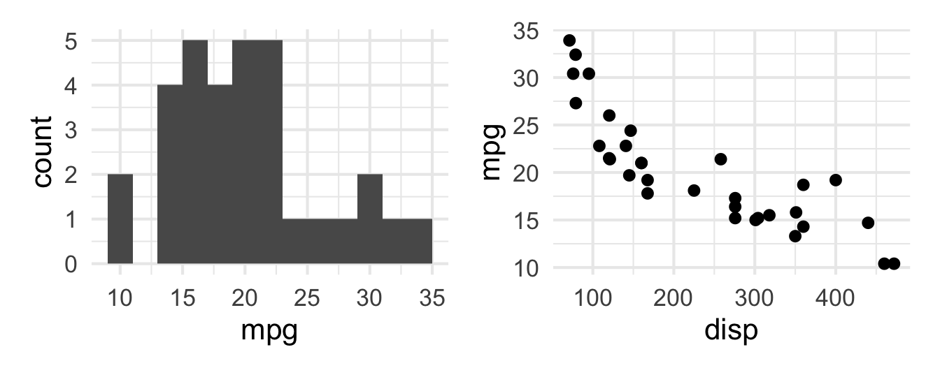
patchwork layout I
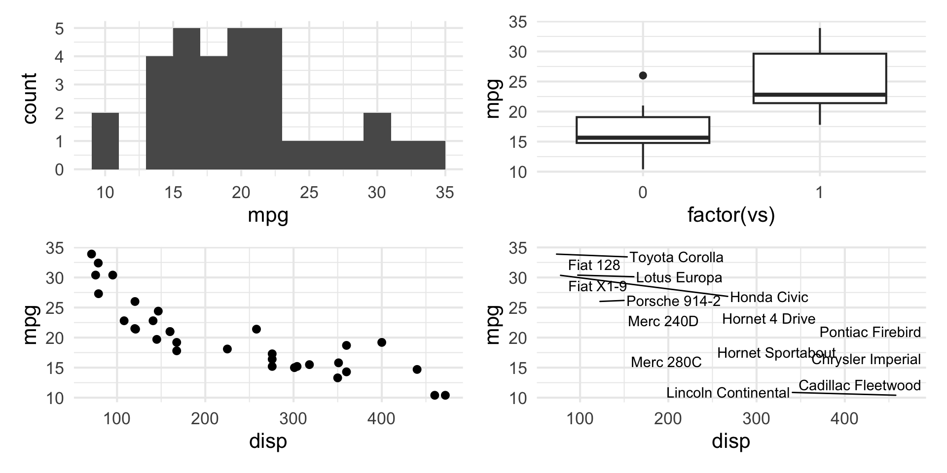
patchwork layout II
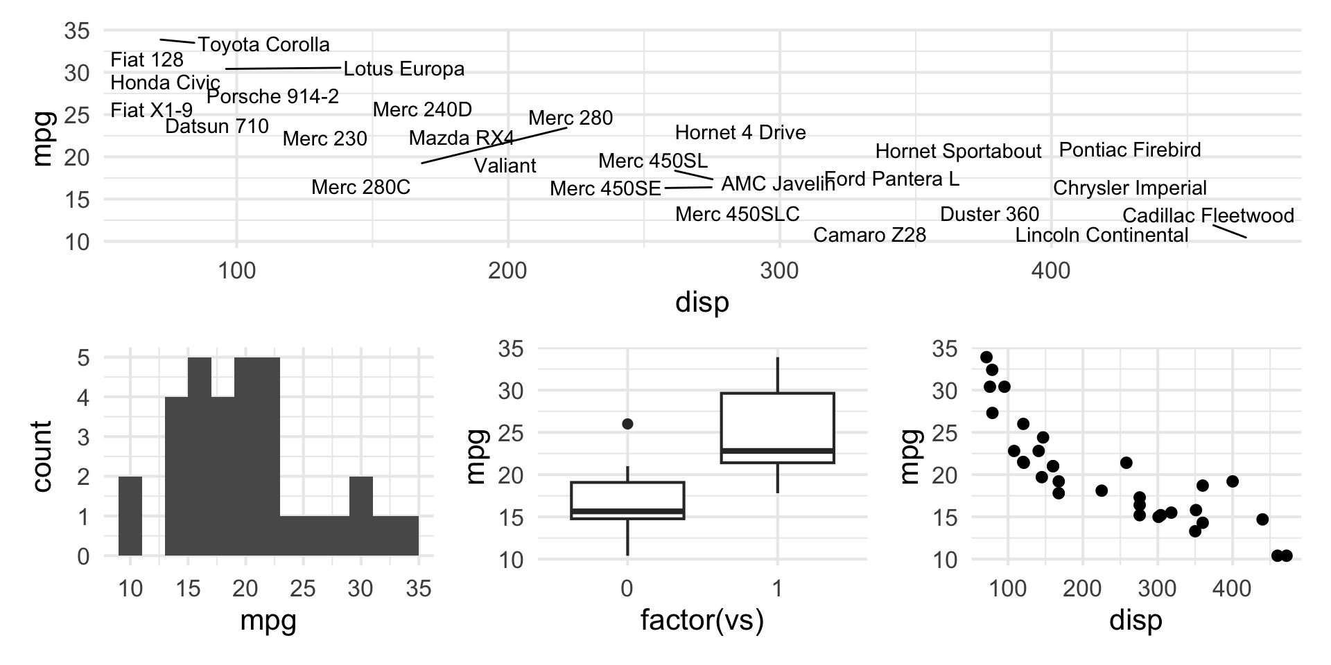
patchwork layout III
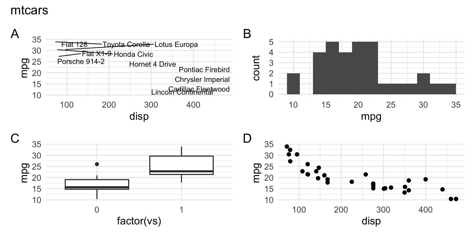
patchwork layout IV
Keep it simple
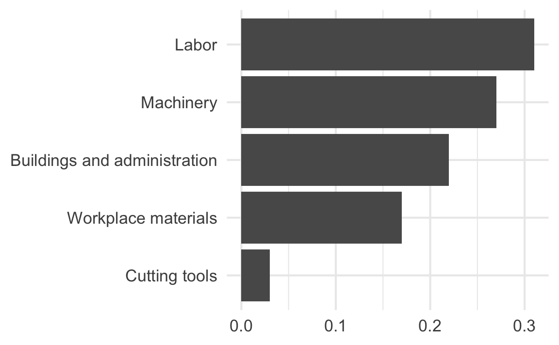
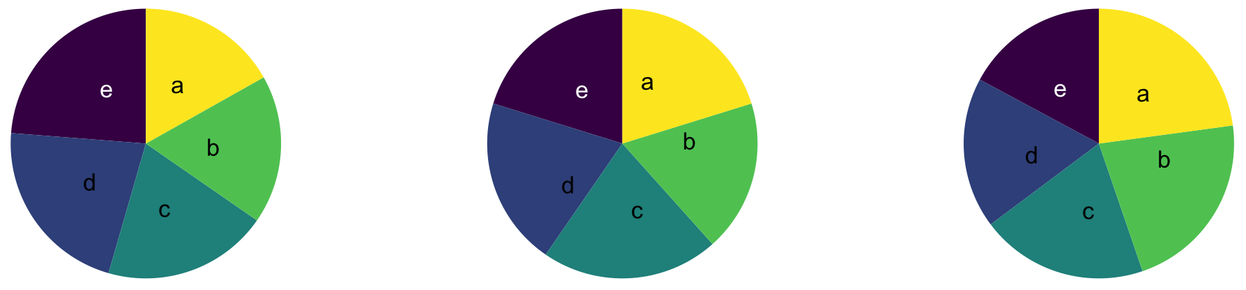
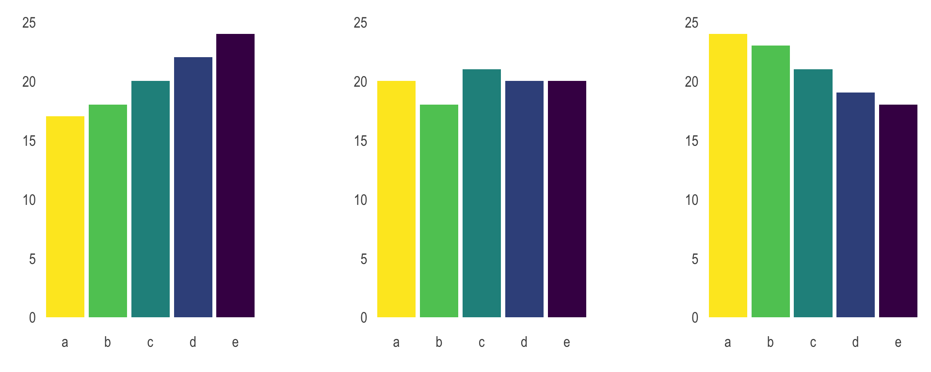
Judging relative area
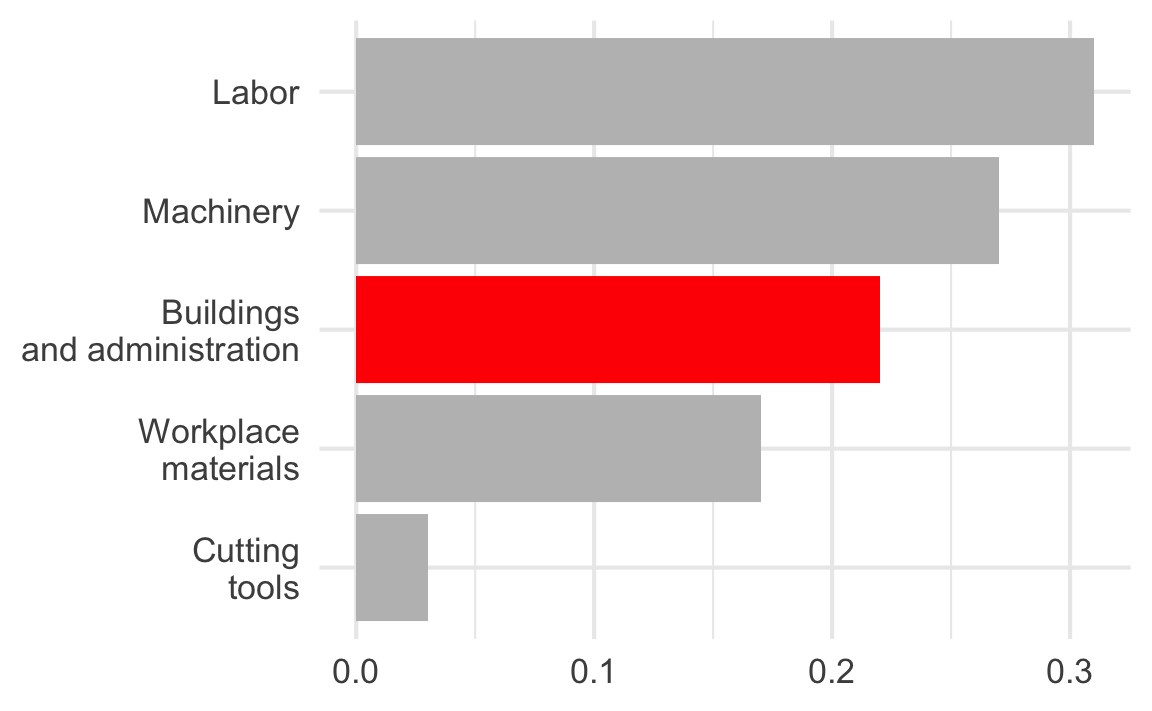
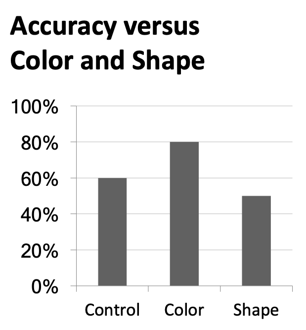
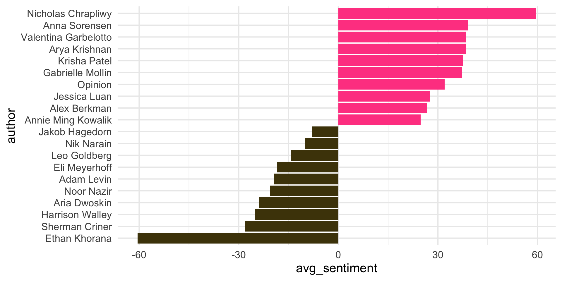
Use color to draw attention
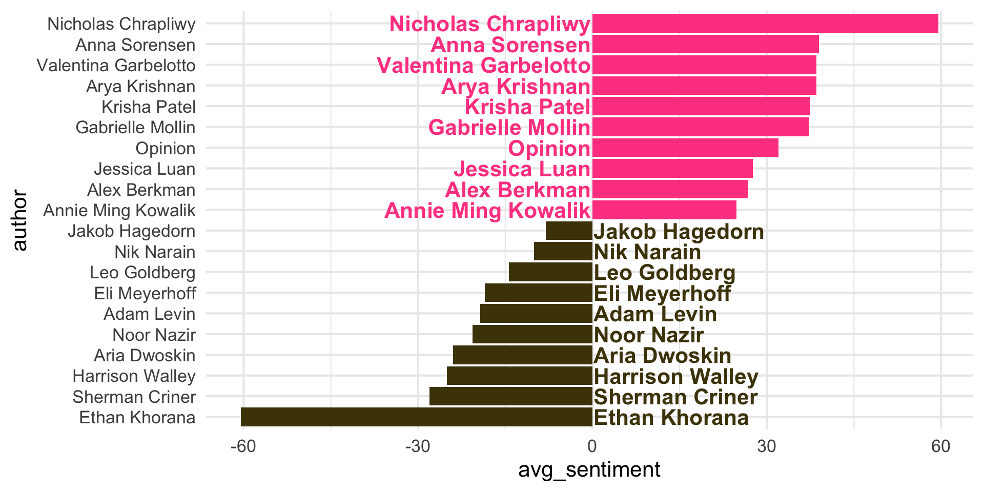
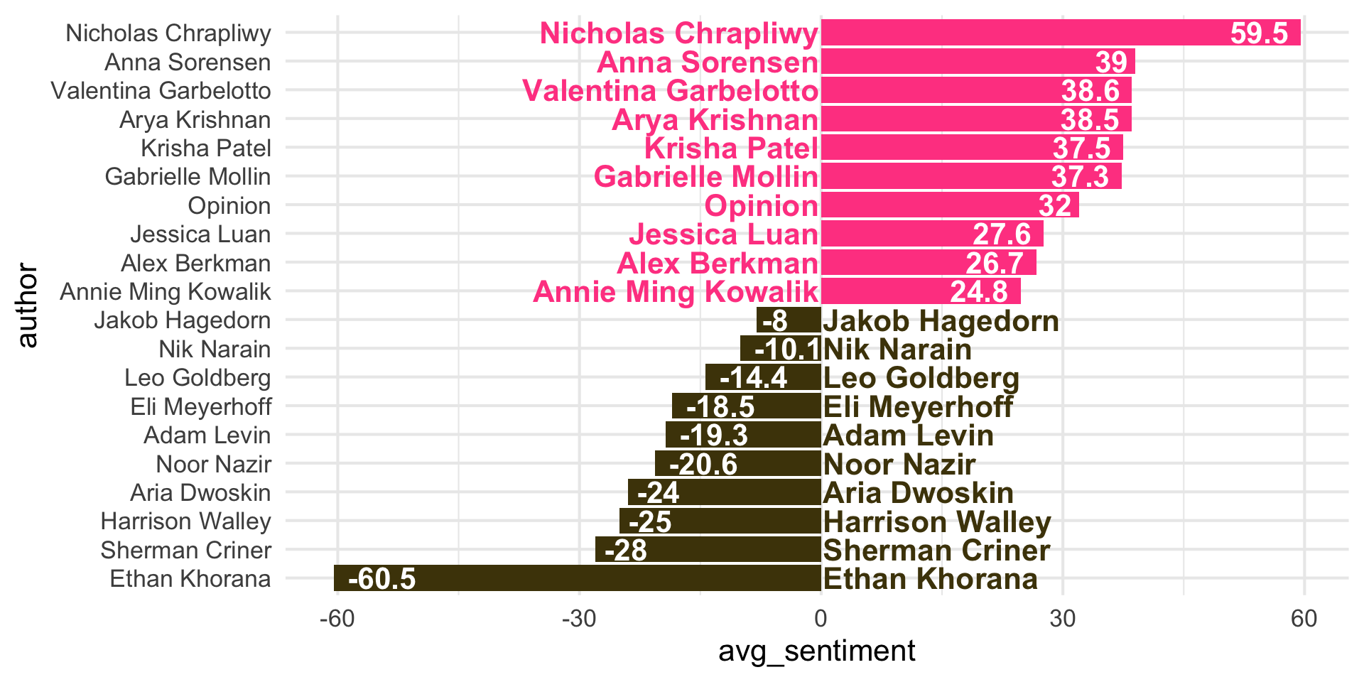
Tell a story
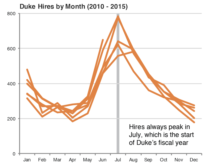
Leave out non-story details
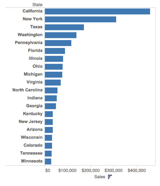
Order matters
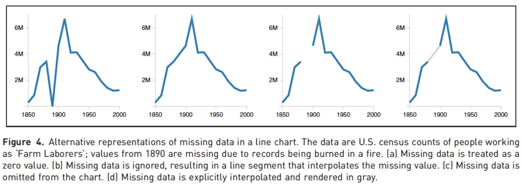
Clearly indicate missing data
Reduce cognitive load
Use descriptive titles
Annotate figures
Step 2
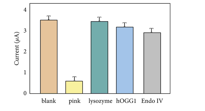
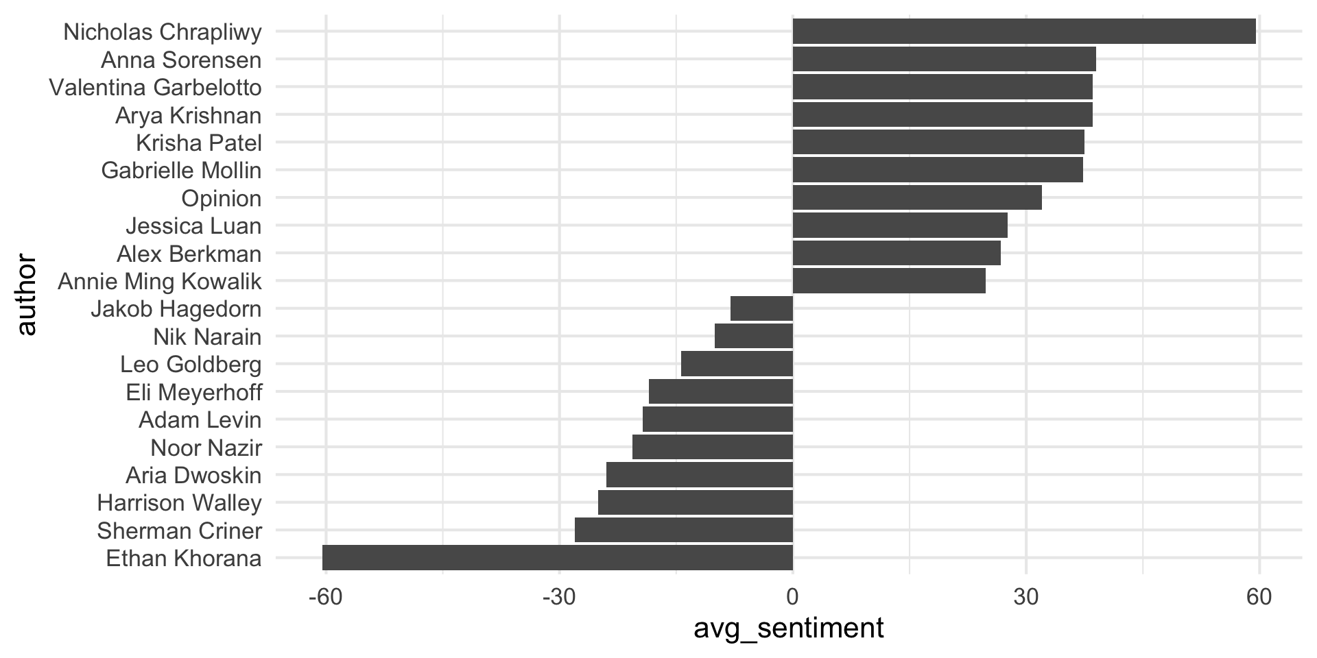
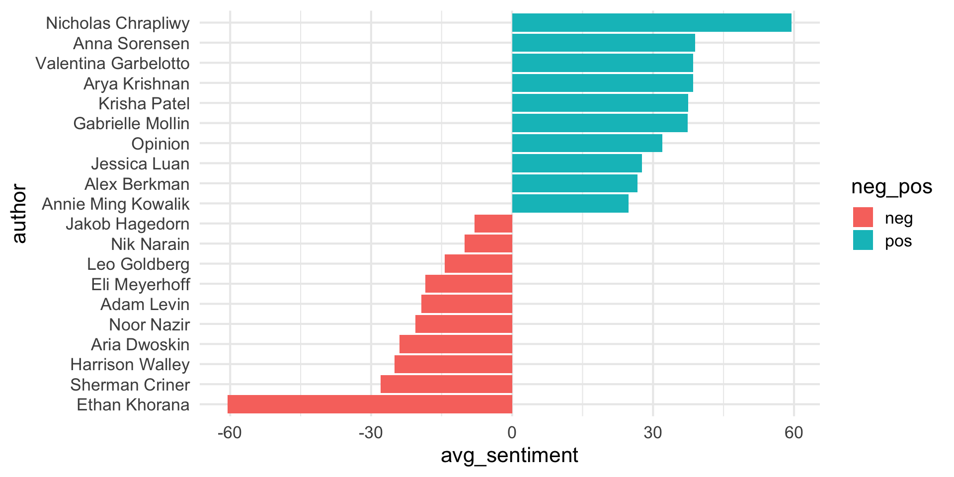
How would you improve this visualization?
Step 3
Step 4
Step 5
Step 6
Step 7
Step 8
Step 9
Step 10
Step 11