Presentation ready plots I
Lecture 10
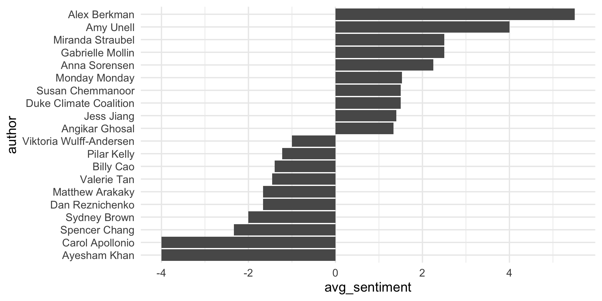
Keep it simple
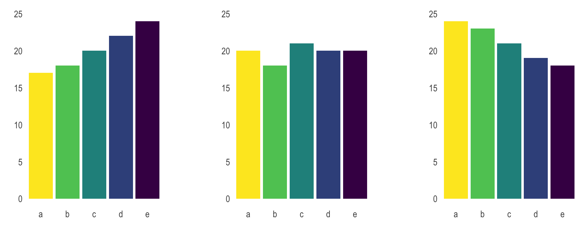
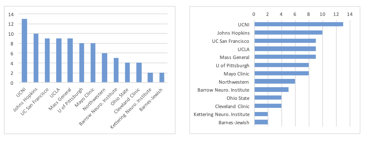
Judging relative area
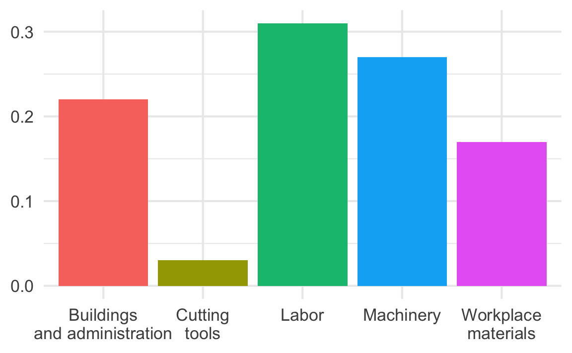
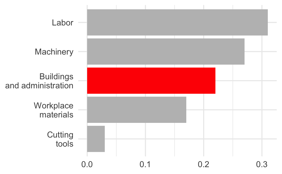
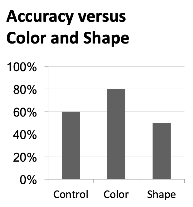
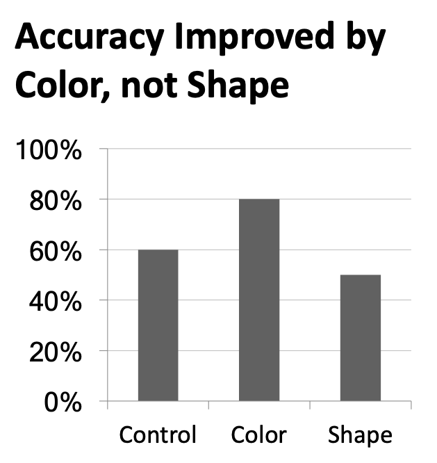
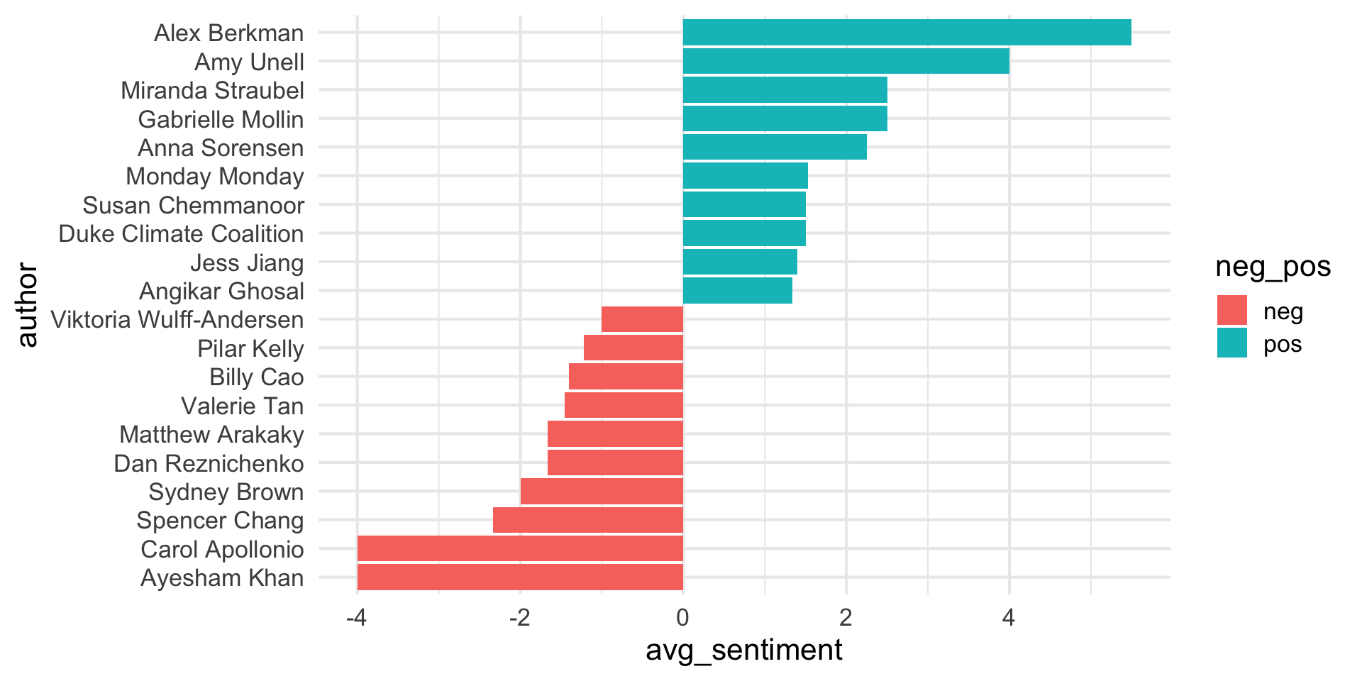
Use color to draw attention
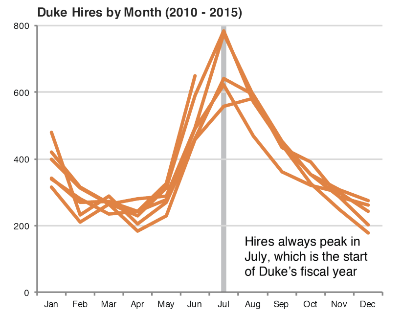
Tell a story
Leave out non-story details
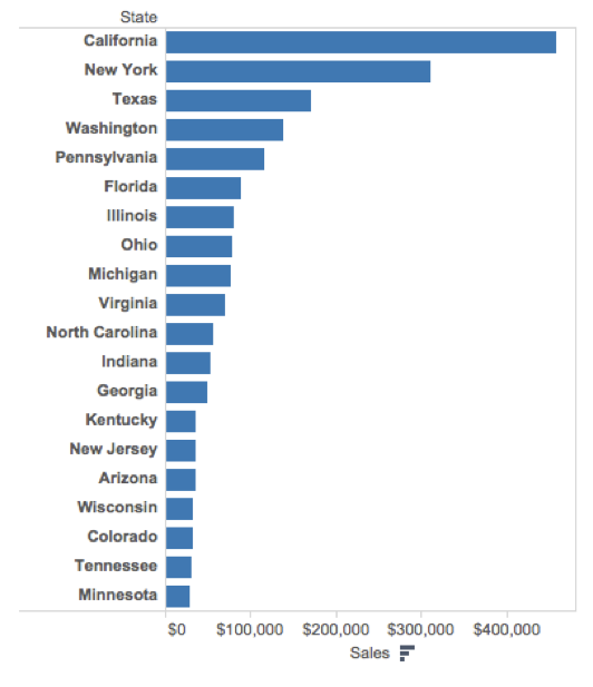
Order matters
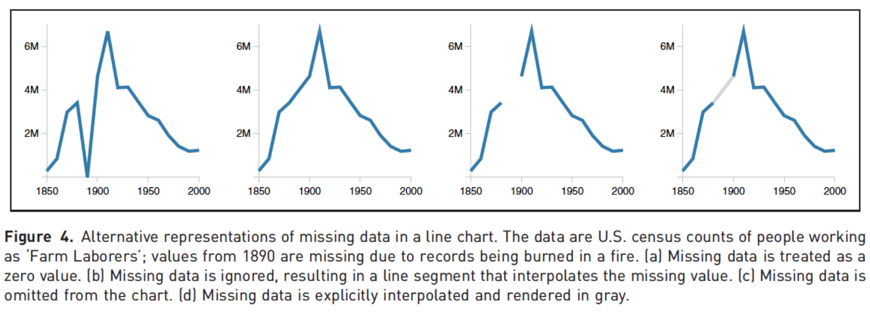
Clearly indicate missing data
Reduce cognitive load
Use descriptive titles
Annotate figures
Slide with single plot, little text
The plot will fill the empty space in the slide.

Slide with single plot, lots of text
If there is more text on the slide
The plot will shrink
To make room for the text

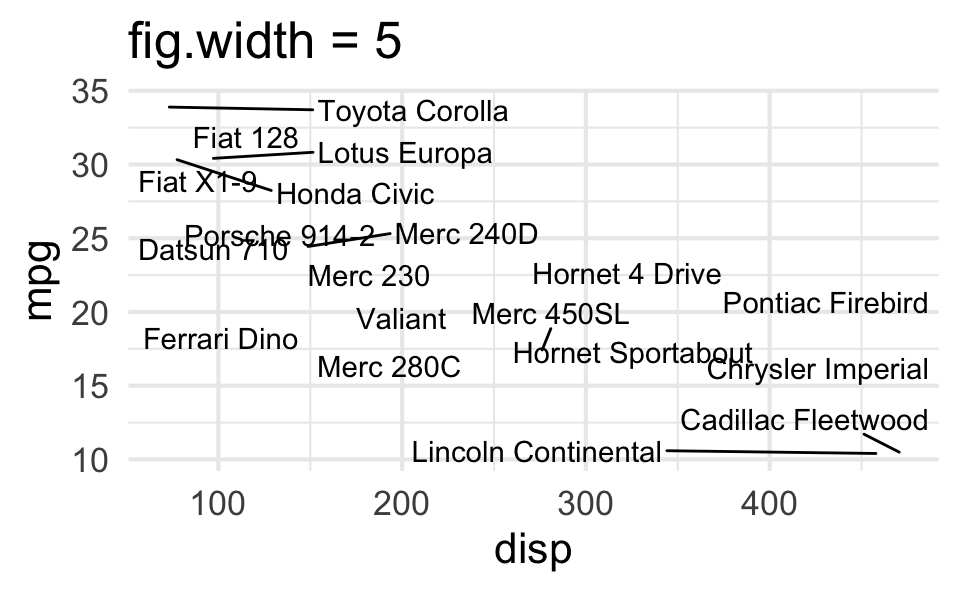
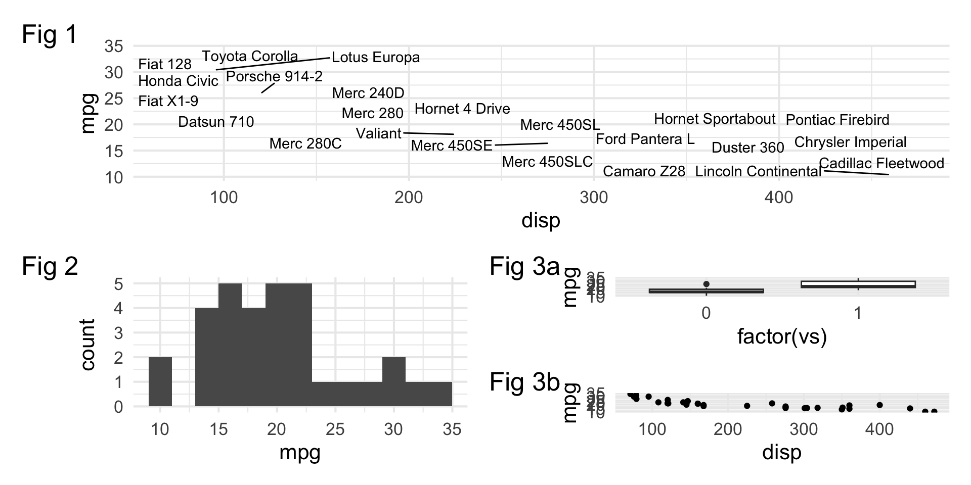
Small fig-width
For a zoomed-in look
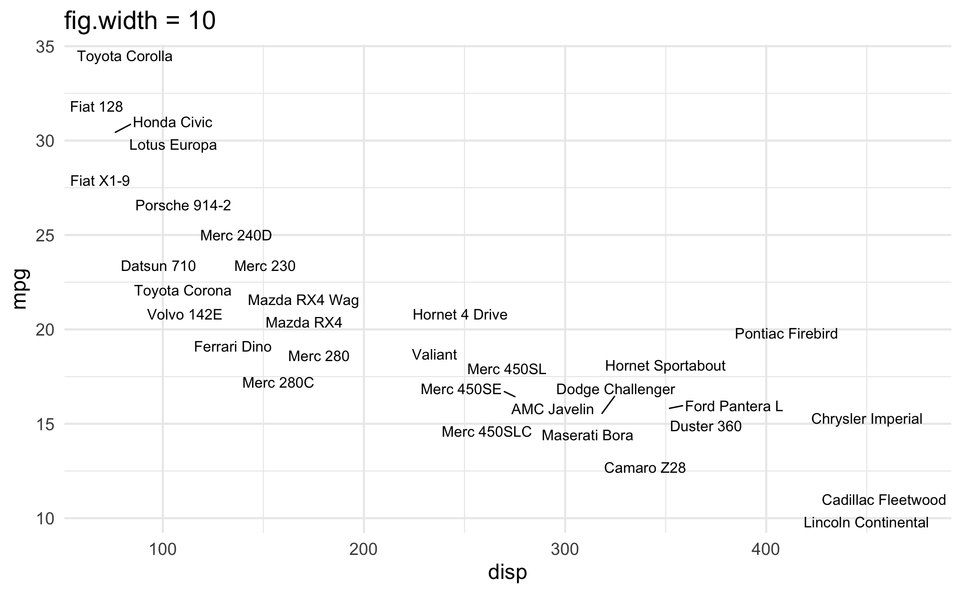
Large fig-width
For a zoomed-out look
fig-width affects text size
Columns
Insert > Slide Columns
Quarto will automatically resize your plots to fit side-by-side.

layout-ncol

patchwork
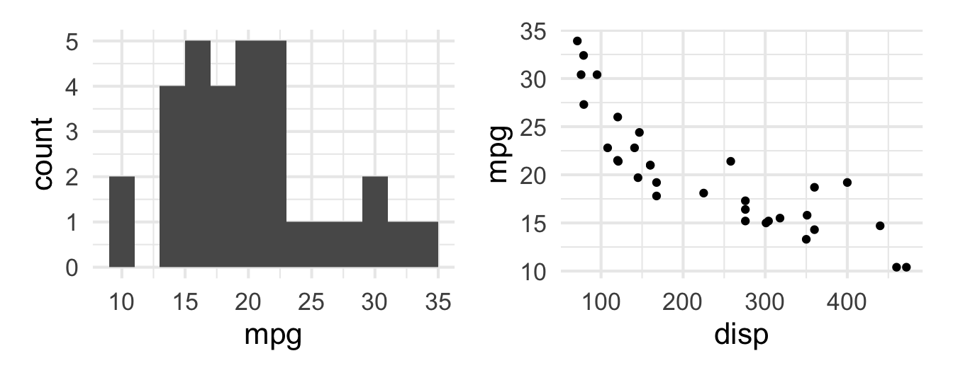
patchwork layout I
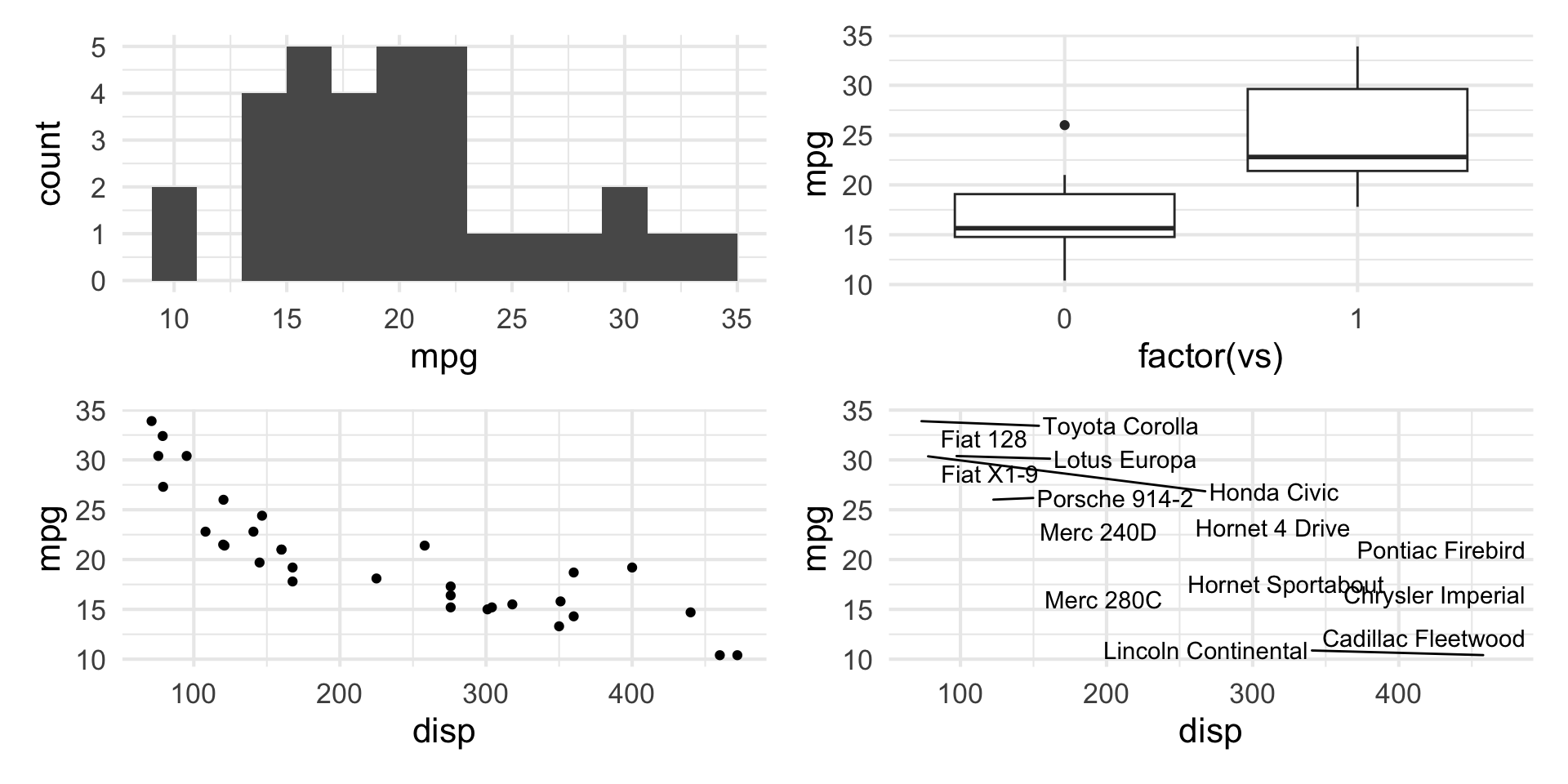
patchwork layout II
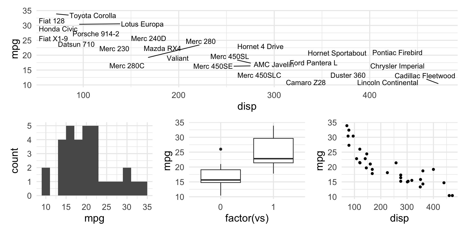
patchwork layout III
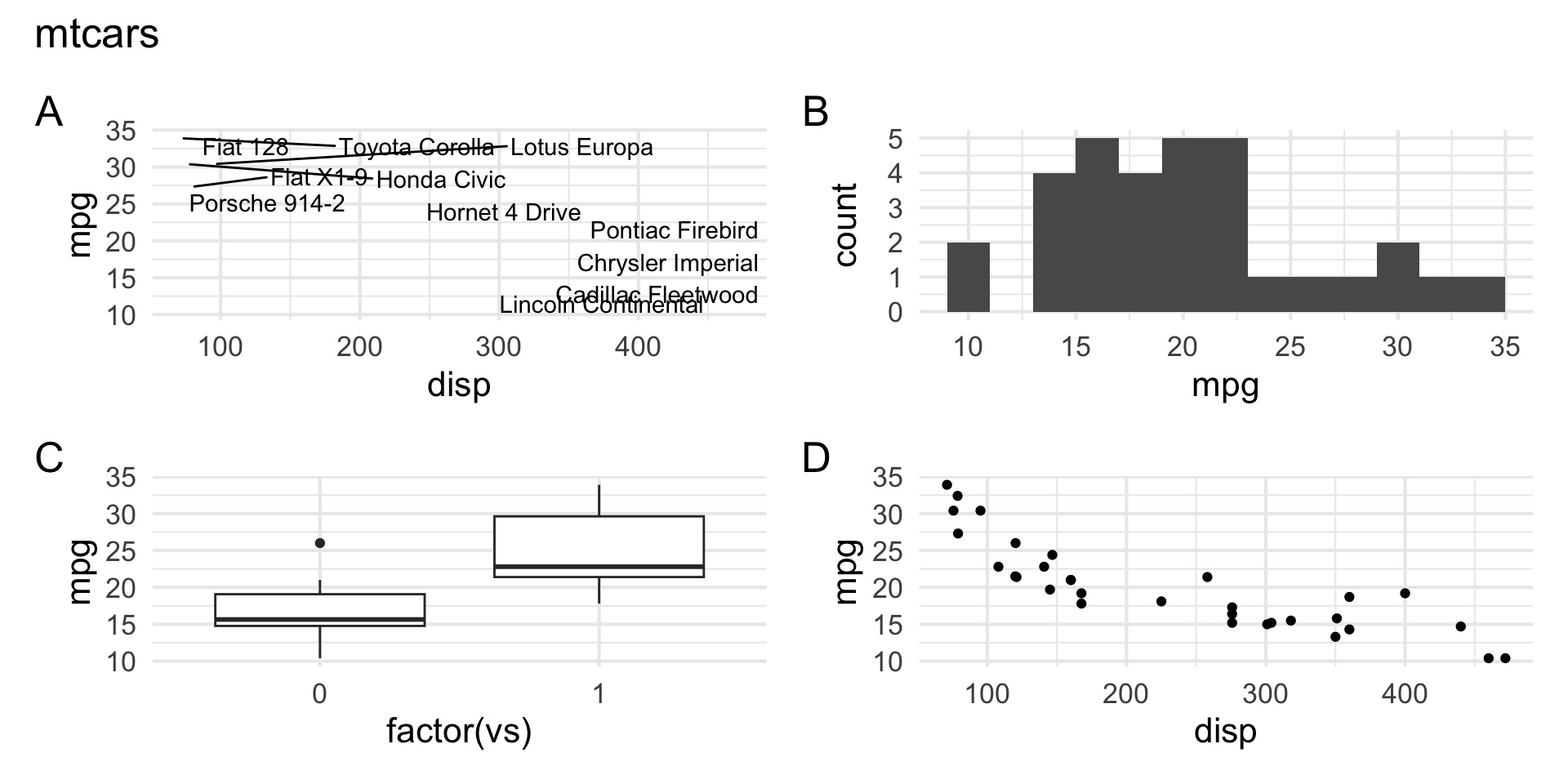
patchwork layout IV
Step 2
Step 3
Step 4
Step 5
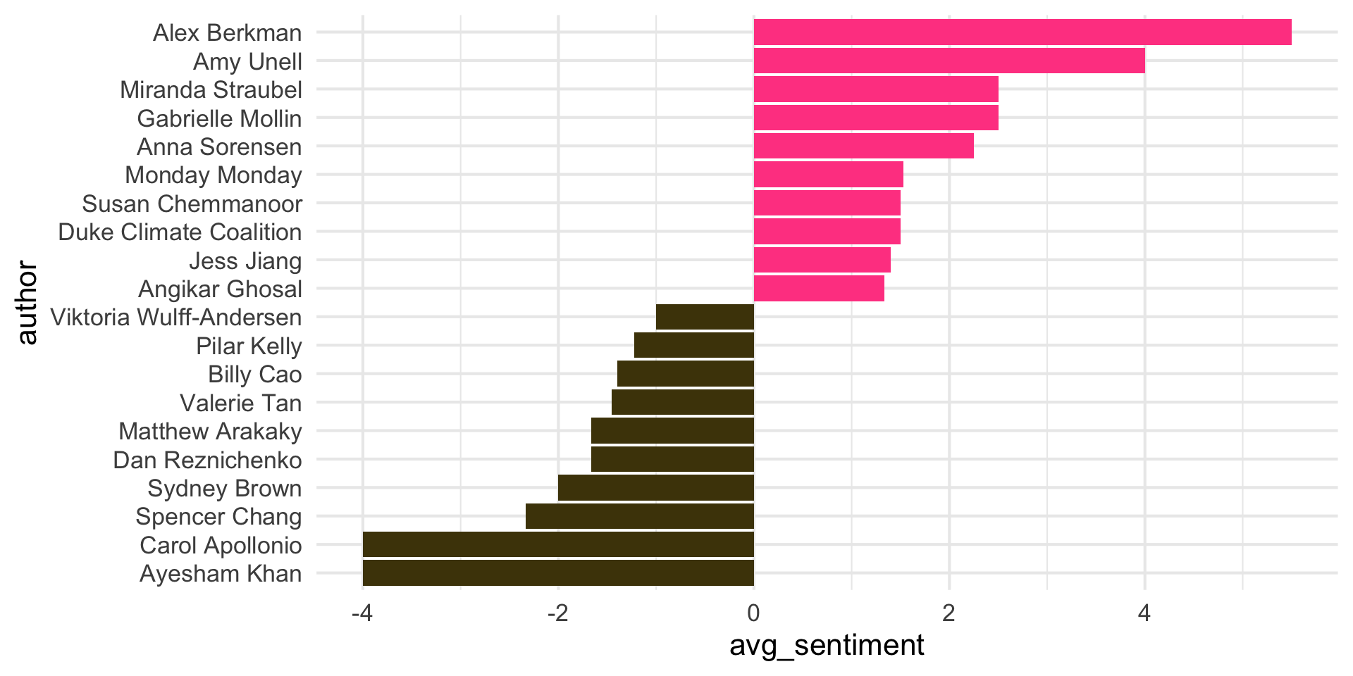
Step 6
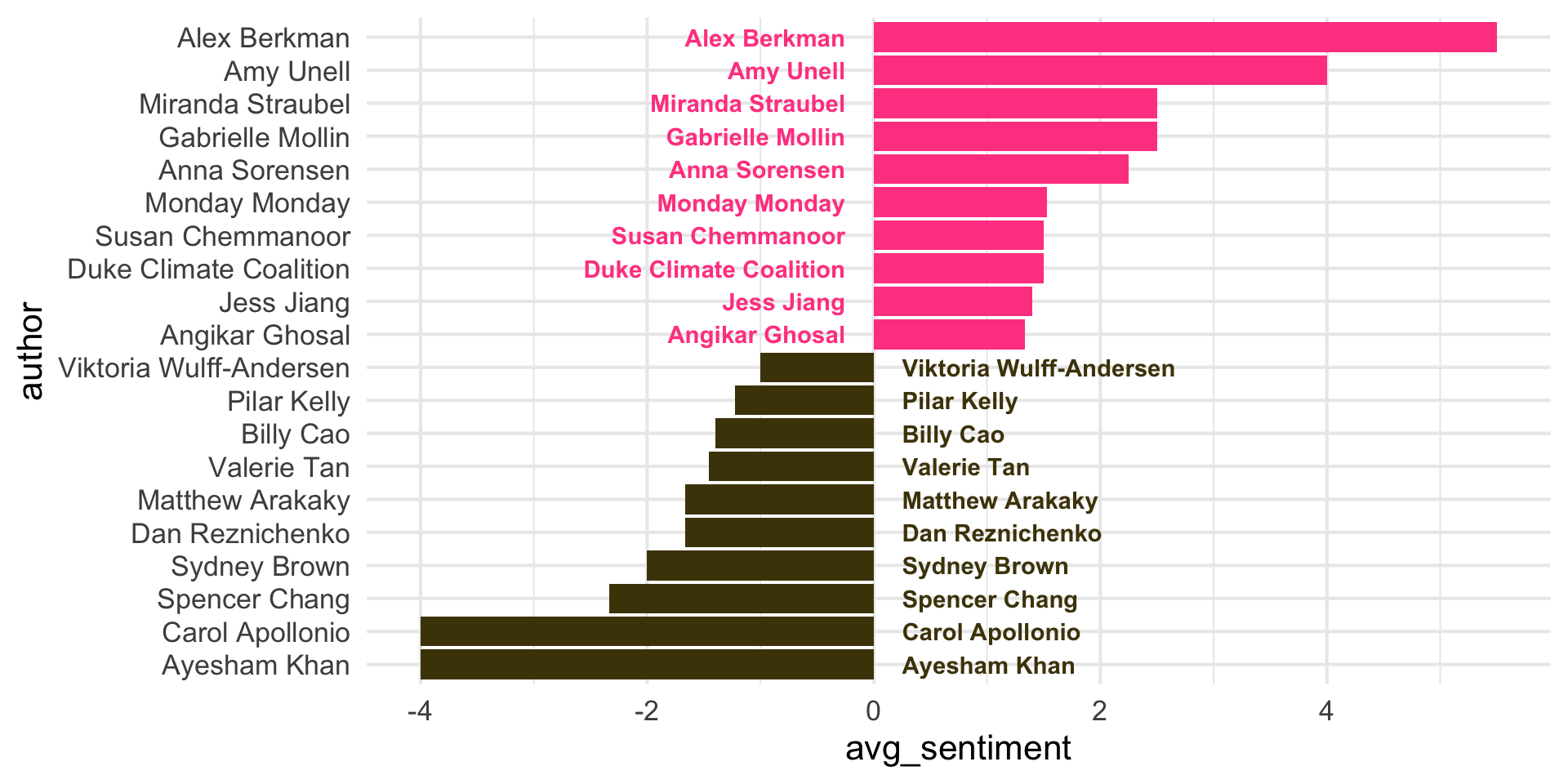
Step 7
Step 8
Step 9
Step 10
Step 11
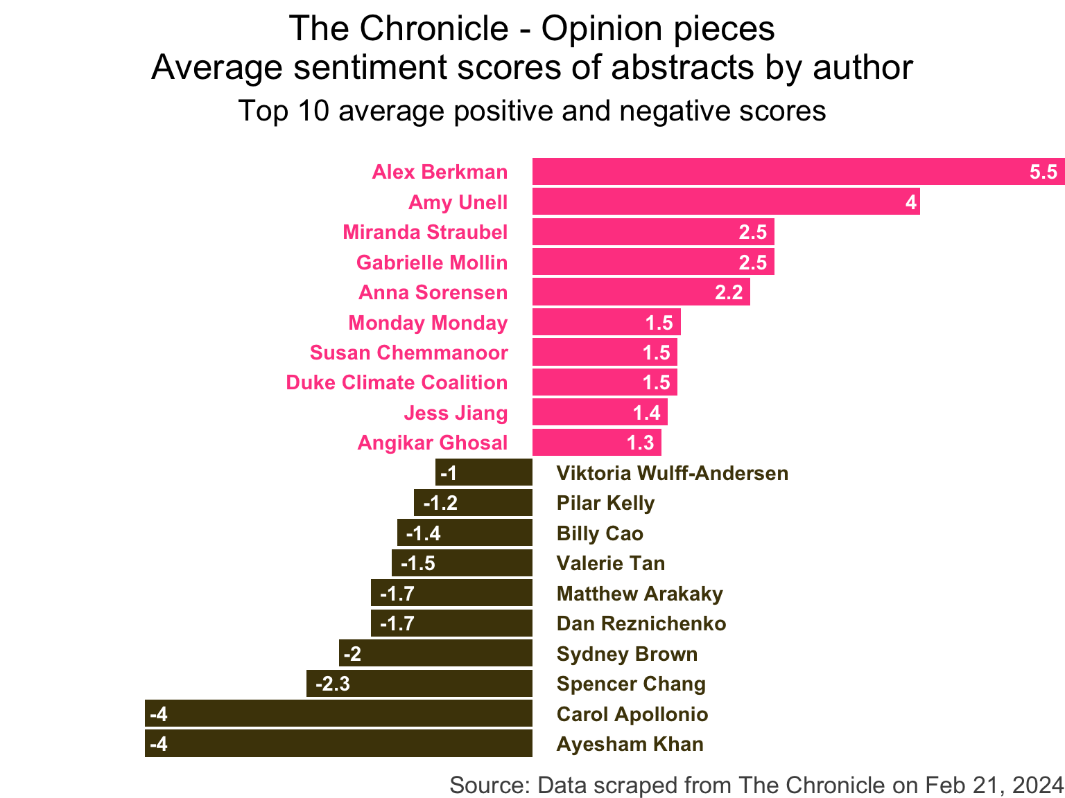
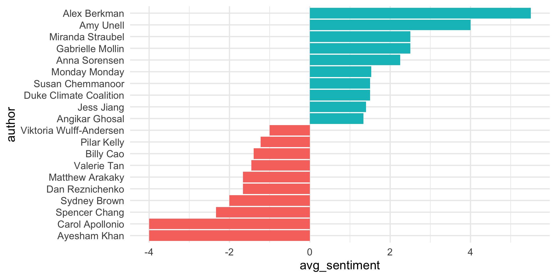
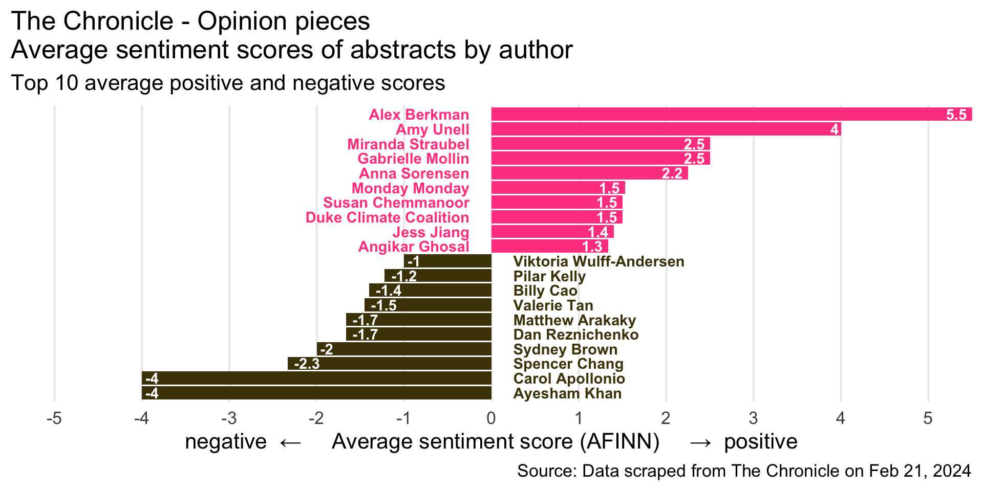
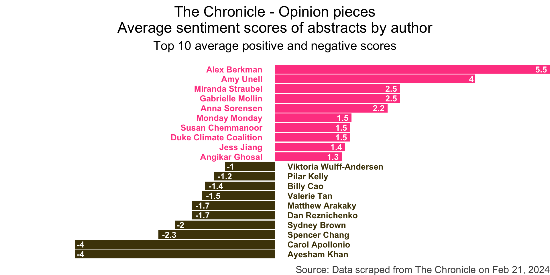
```{r}
#| output-location: slide
#| code-line-numbers: "|4-6"
#| fig-width: 8
#| fig-asp: 0.75
#| fig-align: center
chronicle_to_plot |>
  ggplot(aes(y = author, x = avg_sentiment)) +
geom_col(aes(fill = neg_pos), show.legend = FALSE) +
geom_text(
aes(x = label_position, label = author, color = neg_pos),
hjust = c(rep(1,10), rep(0, 10)),
show.legend = FALSE,
fontface = "bold"
) +
geom_text(
aes(label = round(avg_sentiment, 1)),
hjust = c(rep(1.25,10), rep(-0.25, 10)),
color = "white",
fontface = "bold"
) +
scale_fill_manual(values = c("neg" = "#4d4009", "pos" = "#FF4B91")) +
scale_color_manual(values = c("neg" = "#4d4009", "pos" = "#FF4B91")) +
scale_x_continuous(breaks = -5:5, minor_breaks = NULL) +
scale_y_discrete(breaks = NULL) +
coord_cartesian(xlim = c(-5, 5)) +
labs(
x = "negative ← Average sentiment score (AFINN) → positive",
y = NULL,
title = "The Chronicle - Opinion pieces\nAverage sentiment scores of abstracts by author",
subtitle = "Top 10 average positive and negative scores",
caption = "Source: Data scraped from The Chronicle on Feb 21, 2024"
) +
theme_void(base_size = 16) +
theme(
plot.title = element_text(hjust = 0.5),
plot.subtitle = element_text(hjust = 0.5, margin = unit(c(0.5, 0, 1, 0), "lines")),
axis.text.y = element_blank(),
plot.caption = element_text(color = "gray30")
)
```![]()
Step 11