# load packages
library(tidyverse)
library(scales)
library(ggthemes)
library(colorspace)
library(ggrepel)
library(ggpp) # enhances support for data labels + annotations

# set theme for ggplot2
ggplot2::theme_set(ggplot2::theme_minimal(base_size = 14))

# set figure parameters for knitr
knitr::opts_chunk$set(
  fig.width = 7, # 7" width
  fig.asp = 0.618, # the golden ratio
  fig.retina = 3, # dpi multiplier for displaying HTML output on retina
  fig.align = "center", # center align figures
  dpi = 300 # higher dpi, sharper image
)Visualizing time series data I
Lecture 5
Dataviz of the day
What is this a visualization of? Type your guess in the Zoom poll.
Source: StackOverflow post by Machavity
Durham-Chapel Hill AQI
In ae-03, recreate the following visualization.
Show hint
aqi_levels <- tribble(
  ~aqi_min , ~aqi_max , ~color    , ~level                           ,
         0 ,       50 , "#D8EEDA" , "Good"                           ,
        51 ,      100 , "#F1E7D4" , "Moderate"                       ,
       101 ,      150 , "#F8E4D8" , "Unhealthy for sensitive groups" ,
       151 ,      200 , "#FEE2E1" , "Unhealthy"                      ,
       201 ,      300 , "#F4E3F7" , "Very unhealthy"                 ,
       301 ,      400 , "#F9D0D4" , "Hazardous"
) |>
  mutate(aqi_mid = ((aqi_min + aqi_max) / 2))
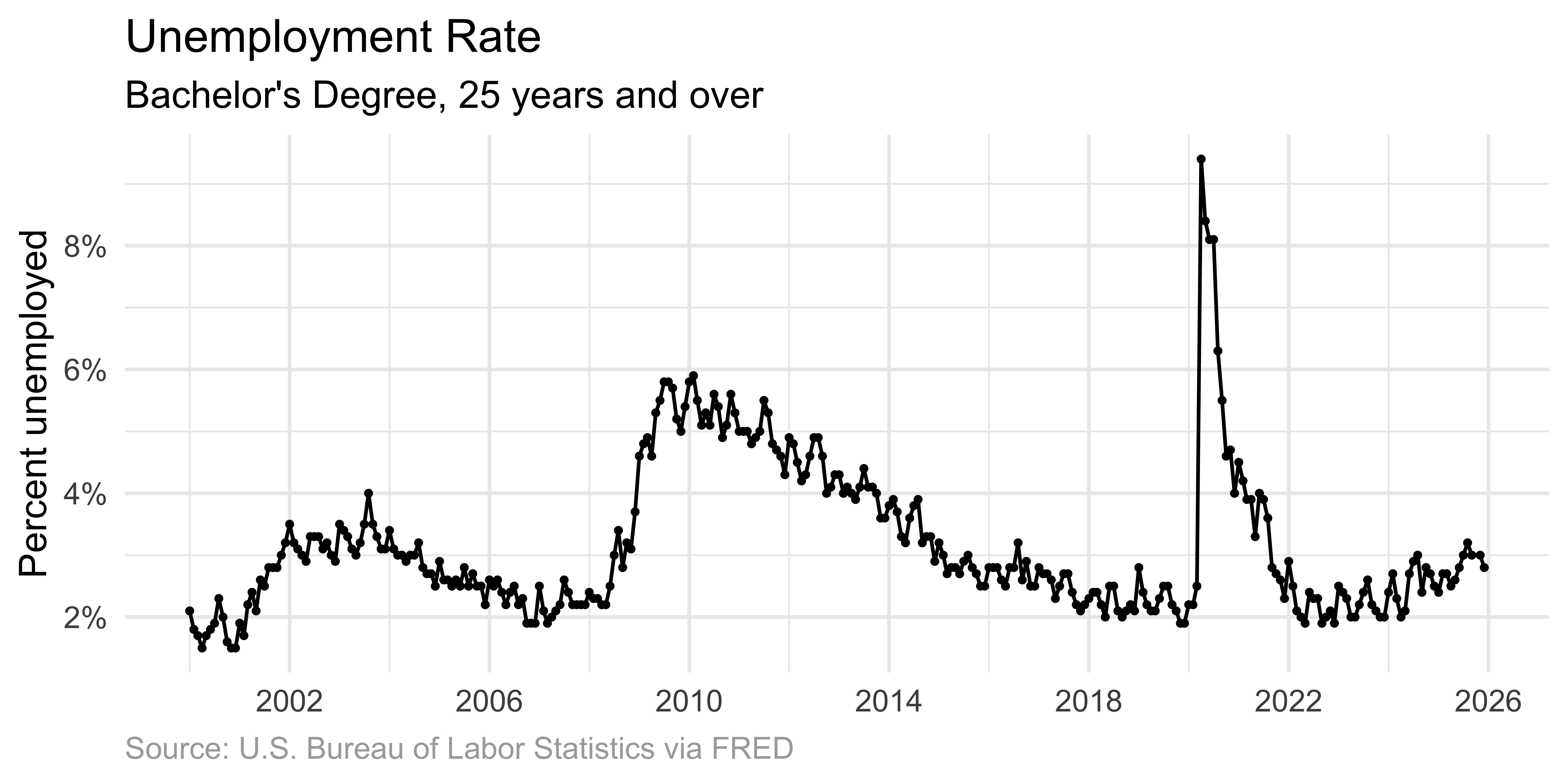
Scatter plot
Individual dots mark each observation.
p_unemp_bachelor <- ggplot(
unemp_bachelor,
aes(x = date, y = unemp_rate)
) +
scale_x_date(date_breaks = "4 years", label = label_date(format = "%Y")) +
labs(
title = "Unemployment Rate",
subtitle = "Bachelor's Degree, 25 years and over",
x = NULL,
y = "Percent unemployed",
caption = "Source: U.S. Bureau of Labor Statistics via FRED"
) +
theme(
plot.caption = element_text(color = "darkgray", hjust = 0)
)
p_unemp_bachelor +
geom_point(size = 0.7) +
scale_y_continuous(
labels = label_percent(scale = 1),
breaks = seq(0, 10, 2)
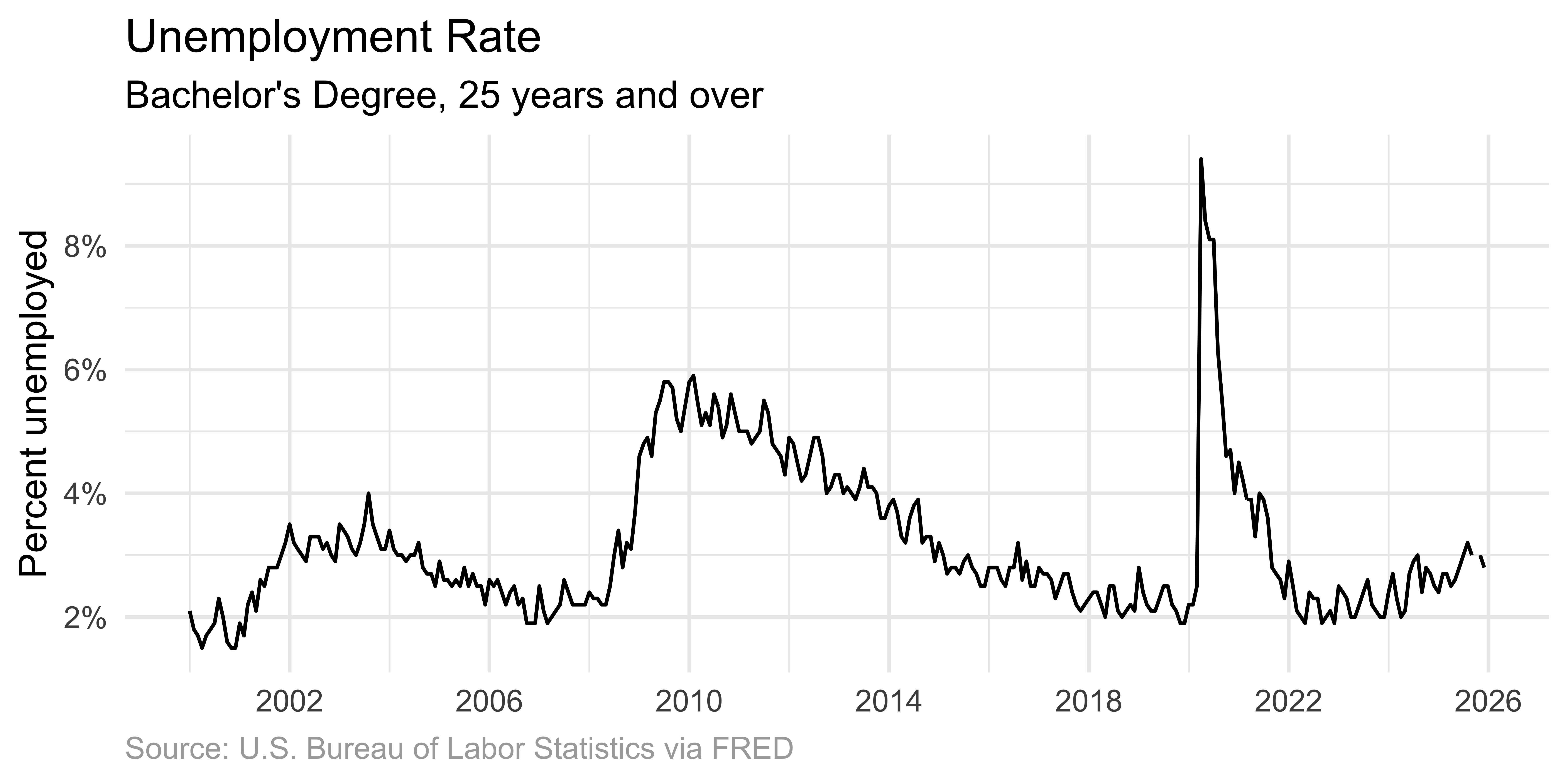
)Line graph with points
Connecting points emphasizes the ordered relationship.
Line graph only
Omitting dots emphasizes the overall temporal trend.
Area graph
Shading beneath the curve highlights the magnitude of values.
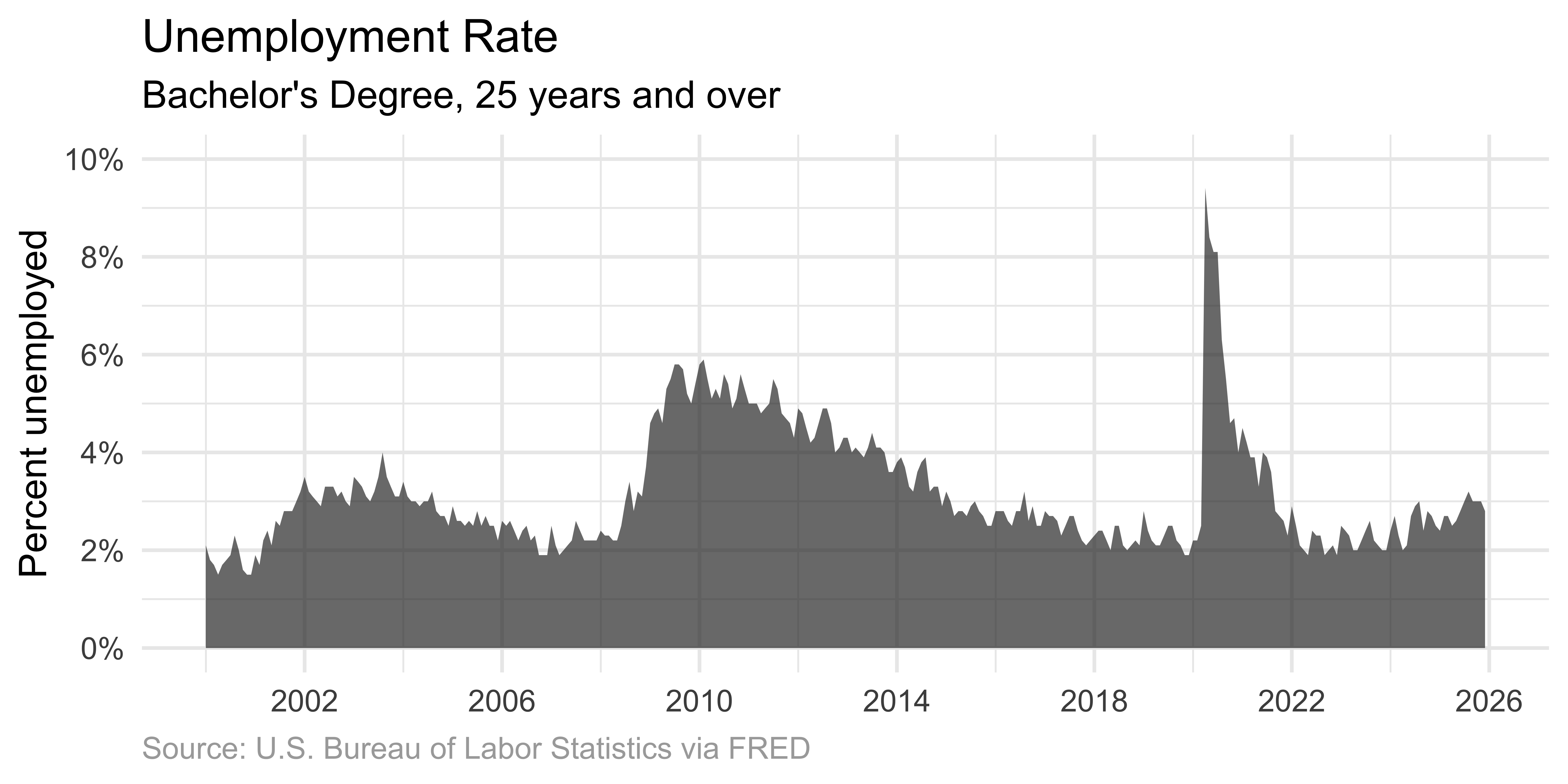
Important
When using area graphs, the y-axis must start at zero. The filled area represents quantity – if the axis doesn’t start at zero, the visual representation misrepresents the data.
Scatter plot
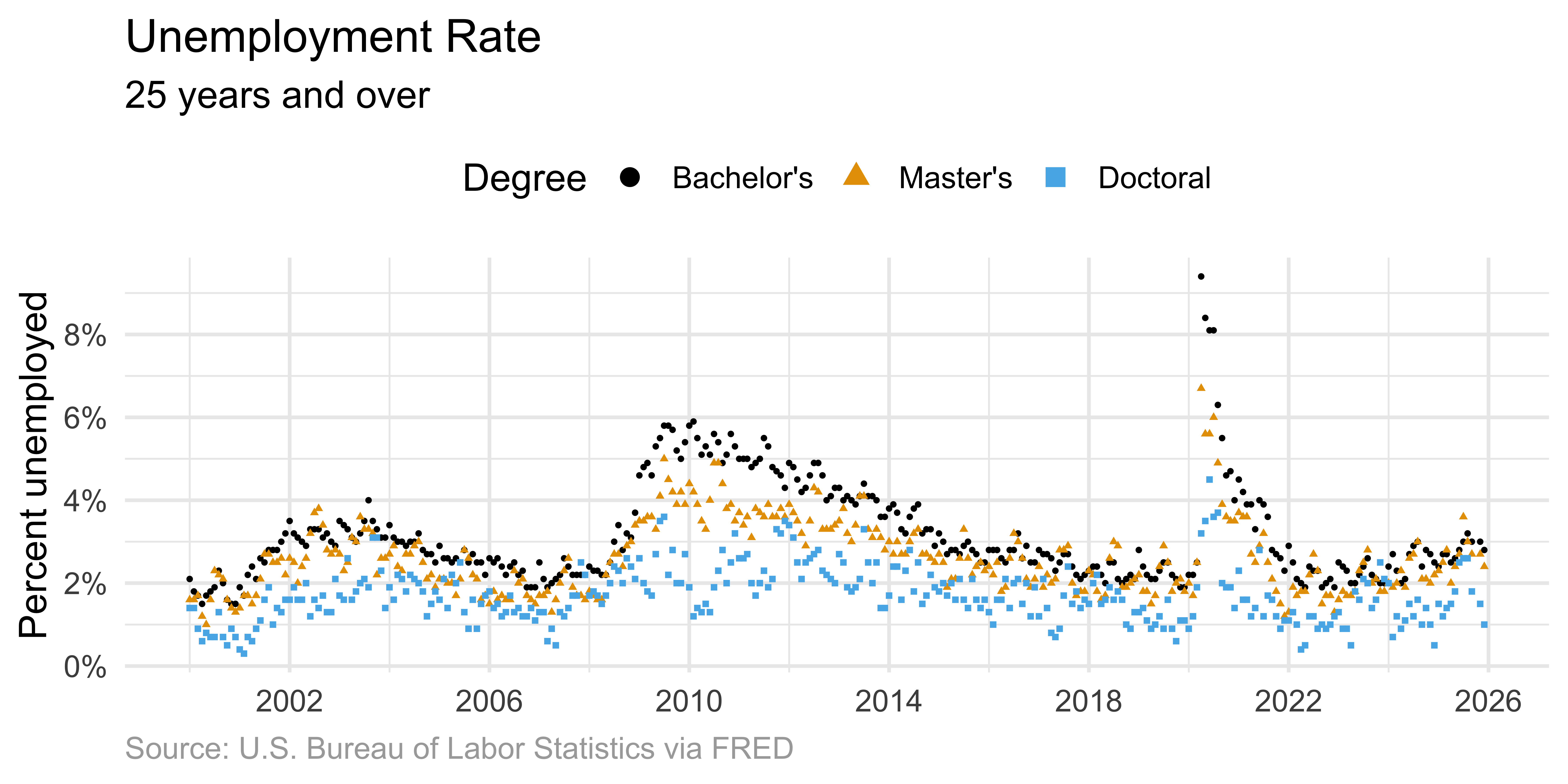
Solution: Connected lines
Connected lines help readers follow each individual time course.
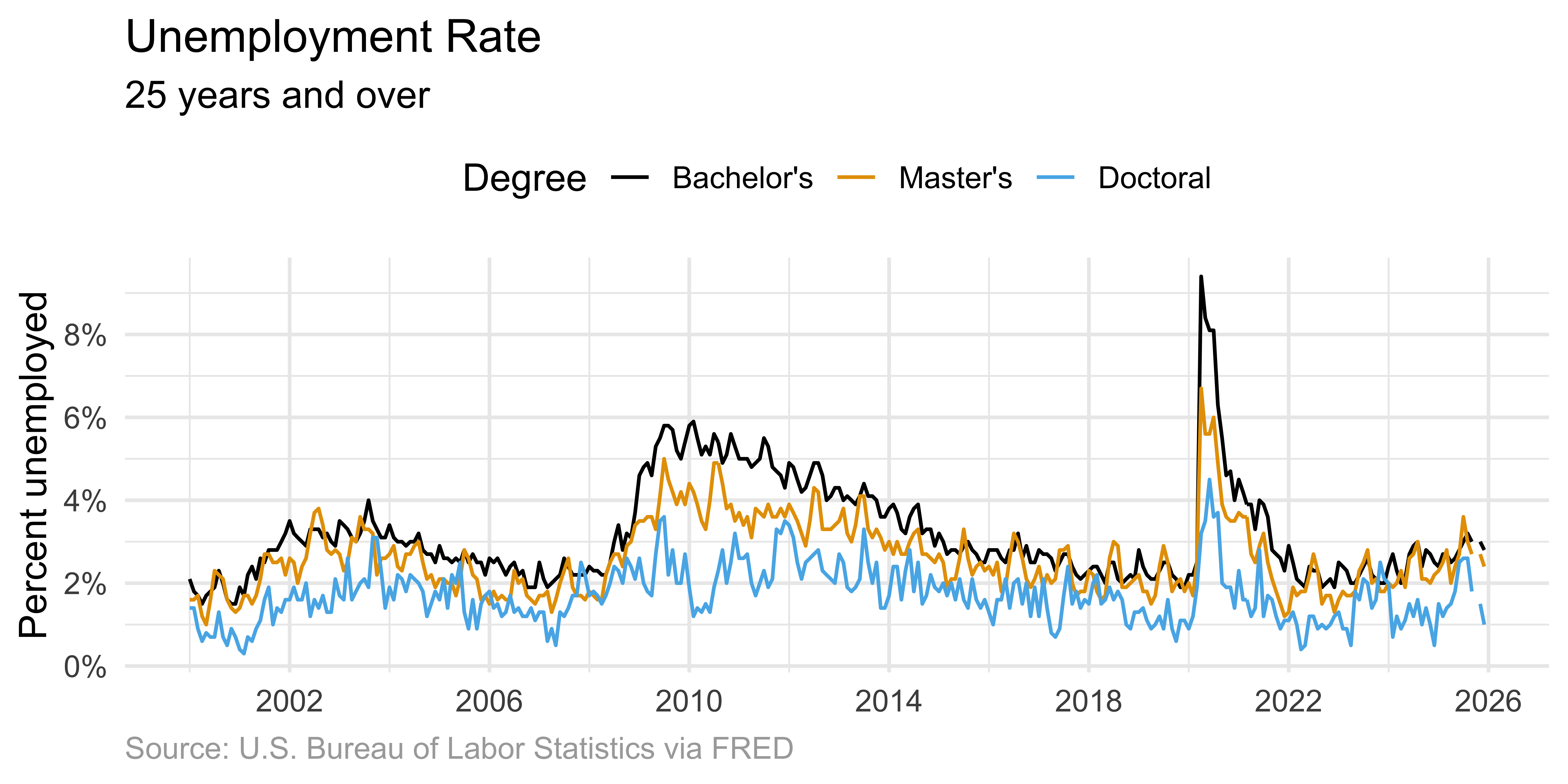
ggplot(
  unemp,
  aes(x = date, y = unemp_rate, color = degree, shape = degree)
) +
  geom_line() +
  scale_x_date(date_breaks = "4 years", label = label_date(format = "%Y")) +
  scale_y_continuous(
    labels = label_percent(scale = 1),
    breaks = seq(0, 10, 2)
  ) +
  scale_color_colorblind() +
  labs(
    title = "Unemployment Rate",
    subtitle = "25 years and over",
    x = NULL,
    y = "Percent unemployed",
    color = "Degree",
    caption = "Source: U.S. Bureau of Labor Statistics via FRED"
  ) +
  theme(
    plot.caption = element_text(color = "darkgray", hjust = 0),
    legend.position = "top"
  )
Direct labeling
Direct labeling reduces cognitive load compared to legends.
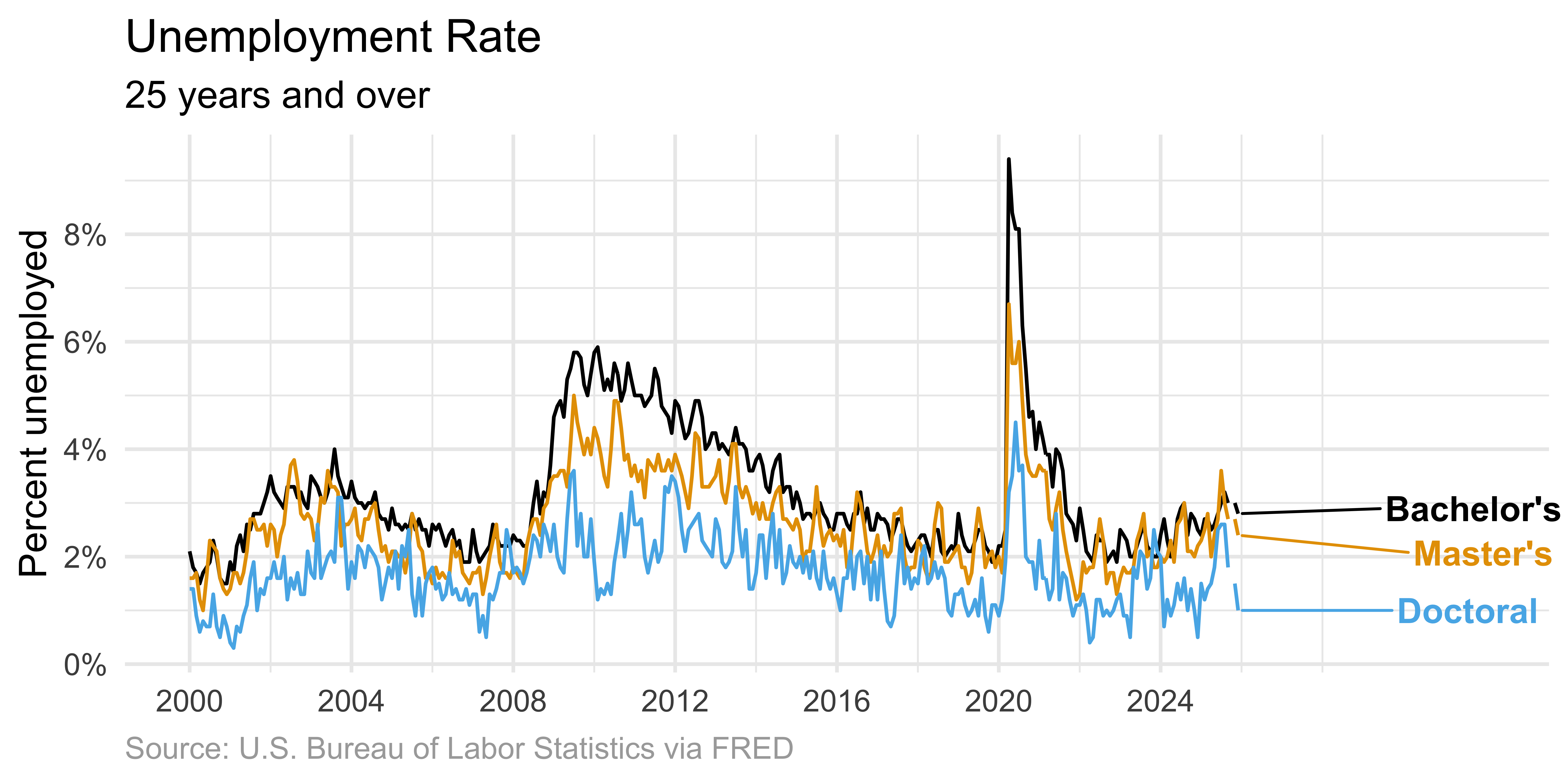
unemp |>
  # add label for the last entry in each degree type
  mutate(
    label = case_when(
      date == max(date) & degree == "Bachelor's" ~ "Bachelor's",
      date == max(date) & degree == "Master's" ~ "Master's",
      date == max(date) & degree == "Doctoral" ~ "Doctoral",
      .default = NA
    )
  ) |>
  ggplot(aes(x = date, y = unemp_rate, color = degree, shape = degree)) +
  geom_line() +
  # add labels to plot, avoiding overlap
  geom_text_repel(
    aes(label = label),
    hjust = -1,
    na.rm = TRUE,
    fontface = "bold",
    size = 4.5
  ) +
  # adjust x-axis limits (to make room for labels) + breaks (for data only)
  scale_x_date(
    label = label_date(format = "%Y"),
    limits = c(NA_Date_, ymd("2032-01-01")),
    breaks = seq(ymd("2000-01-01"), ymd("2026-01-01"), by = "4 years")
  ) +
  scale_y_continuous(
    labels = label_percent(scale = 1),
    breaks = seq(0, 10, 2)
  ) +
  scale_color_colorblind() +
  labs(
    title = "Unemployment Rate",
    subtitle = "25 years and over",
    x = NULL,
    y = "Percent unemployed",
    color = "Degree",
    caption = "Source: U.S. Bureau of Labor Statistics via FRED"
  ) +
  theme(
    plot.caption = element_text(color = "darkgray", hjust = 0),
    legend.position = "none" # turn off line and text geom legends
  ) +
coord_cartesian(clip = "off") # don't cut off labelsUnemployment for Bachelor’s & Master’s
In ae-04, recreate the following visualization.