# load packages
library(tidyverse)
library(scales)
library(openintro)
library(ggthemes)
library(palmerpenguins)
library(ThemePark) # pak::pak("MatthewBJane/ThemePark")
library(tidykids) # pak::pak("jrosen48/tidykids")
library(colorspace)
library(glue)

# set theme for ggplot2
ggplot2::theme_set(ggplot2::theme_minimal(base_size = 14))

# set figure parameters for knitr
knitr::opts_chunk$set(
  fig.width = 7, # 7" width
  fig.asp = 0.618, # the golden ratio
  fig.retina = 3, # dpi multiplier for displaying HTML output on retina
  fig.align = "center", # center align figures
  dpi = 300 # higher dpi, sharper image
)Themes + axes + annotation
Lecture 4
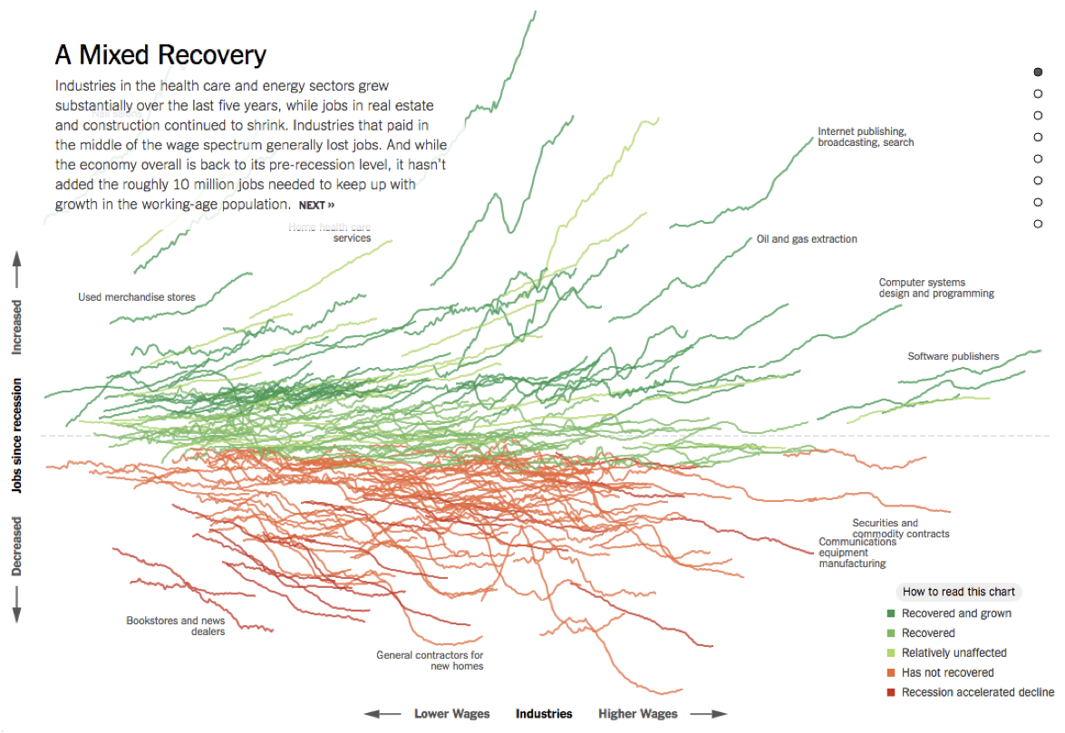
Dataviz of the day
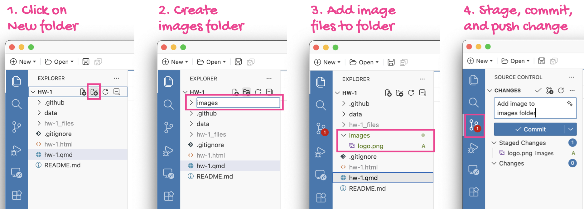
Images folder
TL;DR - Read your email / Canvas announcement.
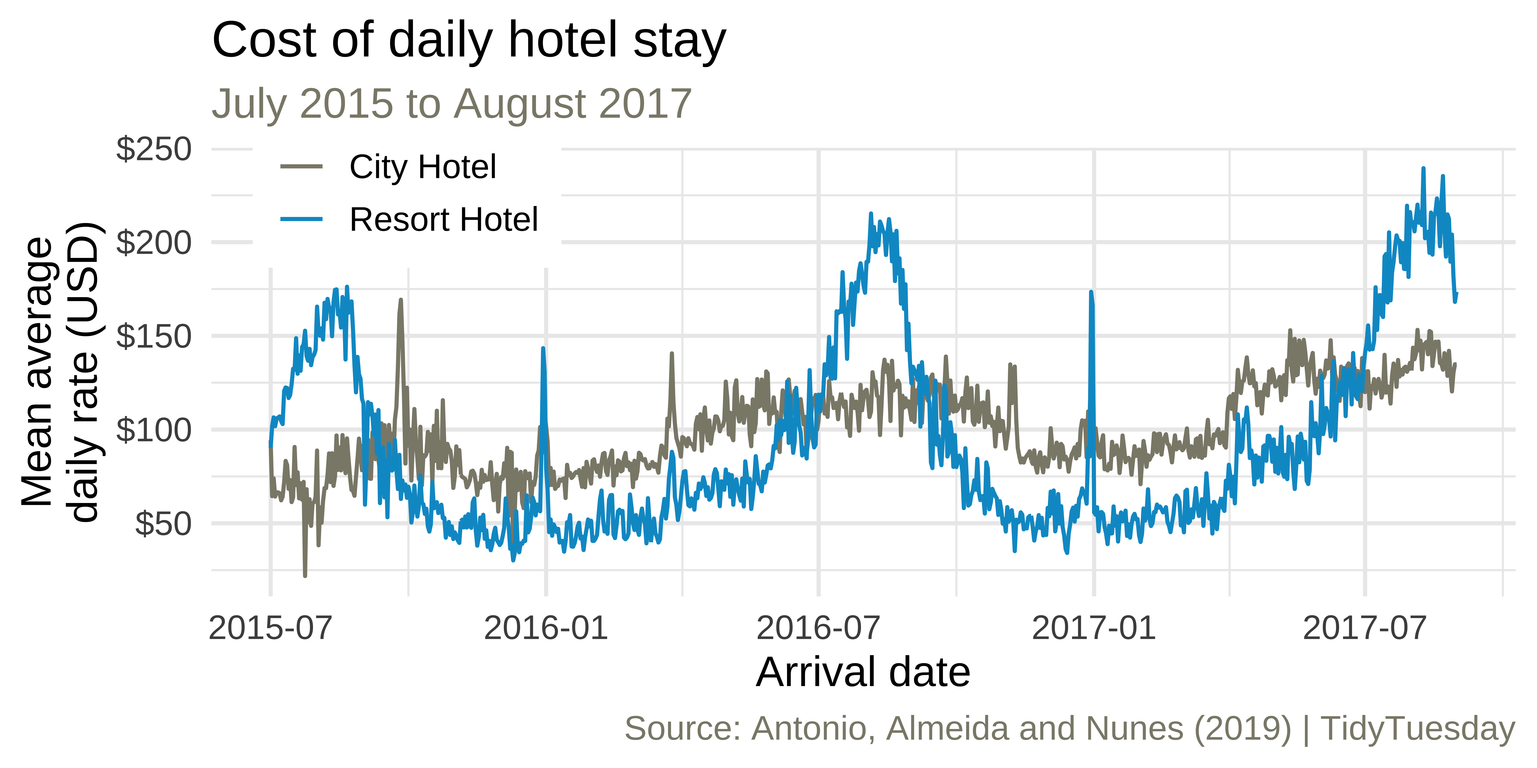
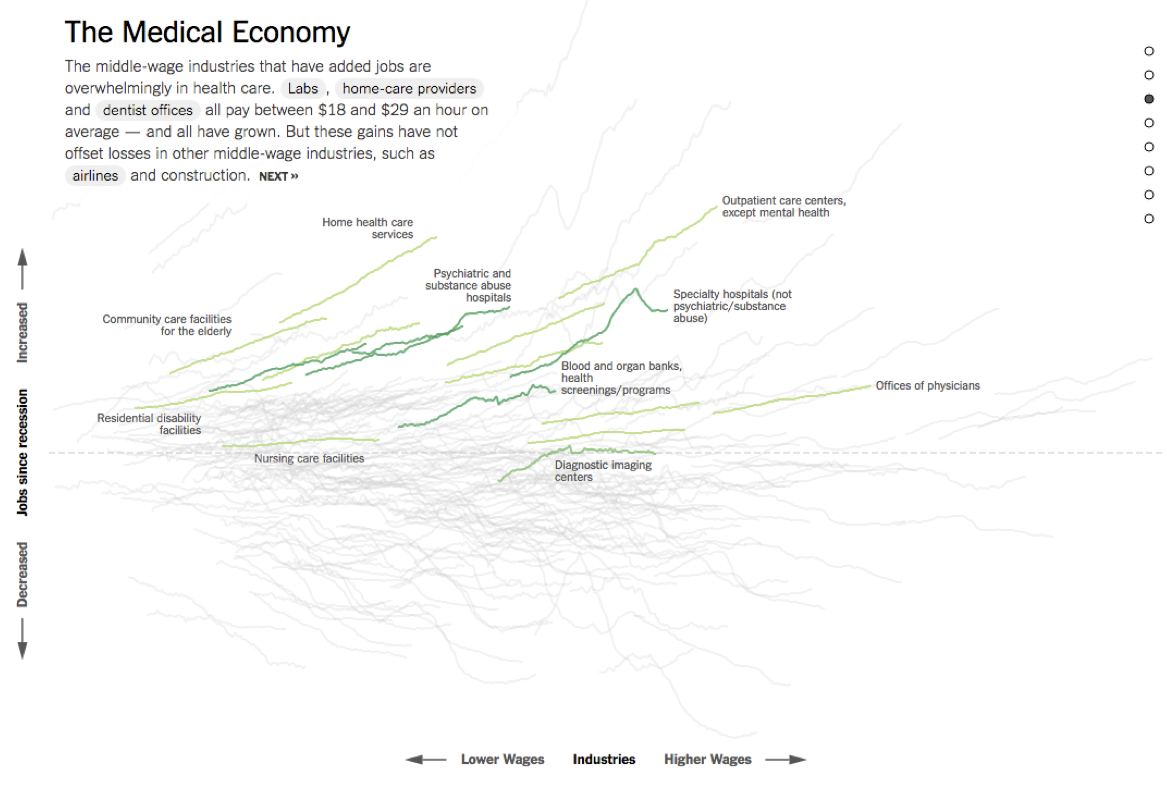
Average cost of daily stay
We recreated this visualization in ae-02 - Part 1. Any questions?
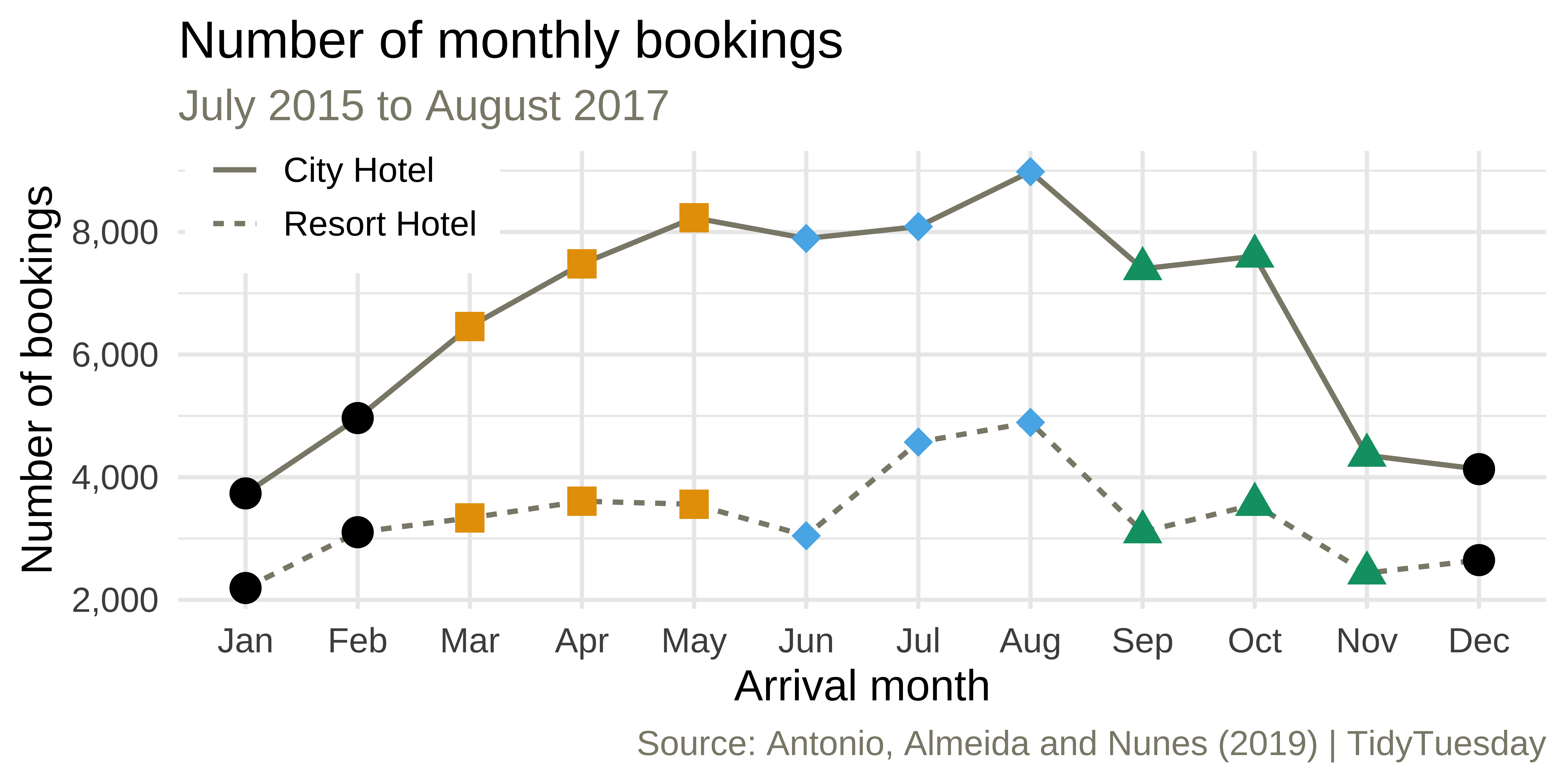
Monthly bookings

Monthly bookings
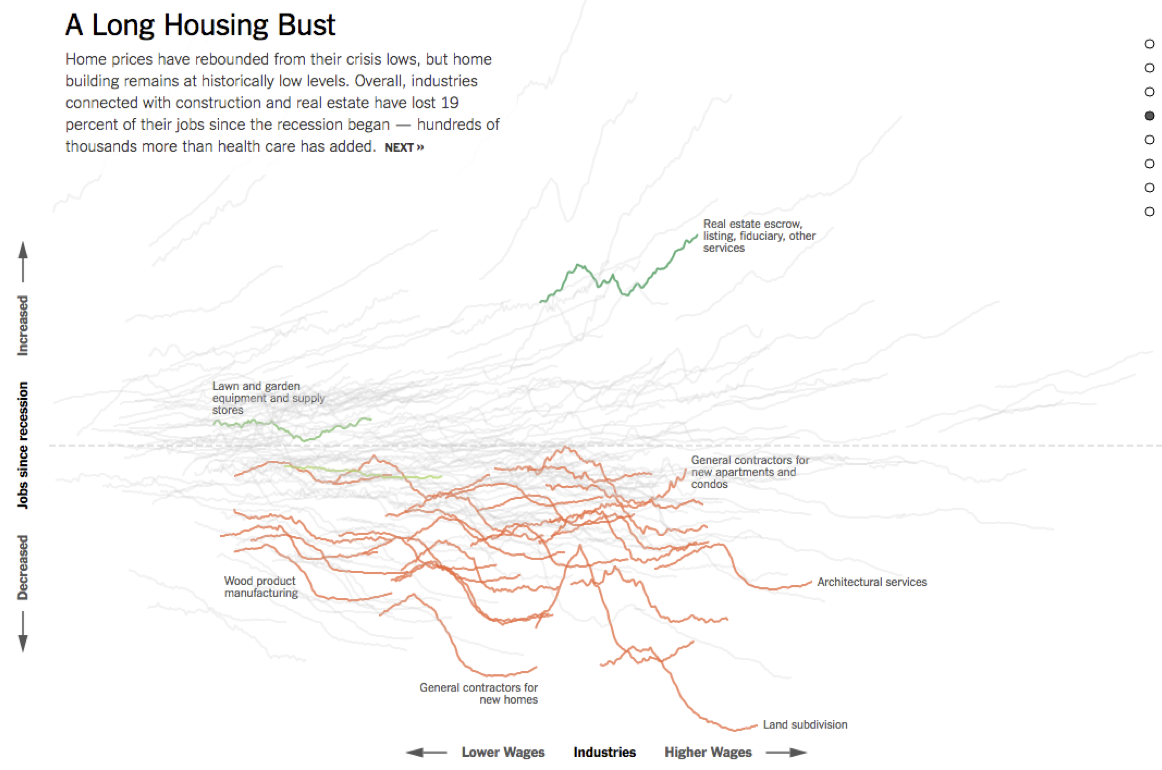
ae-02 - Part 2: Let’s recreate this visualization!
Complete themes
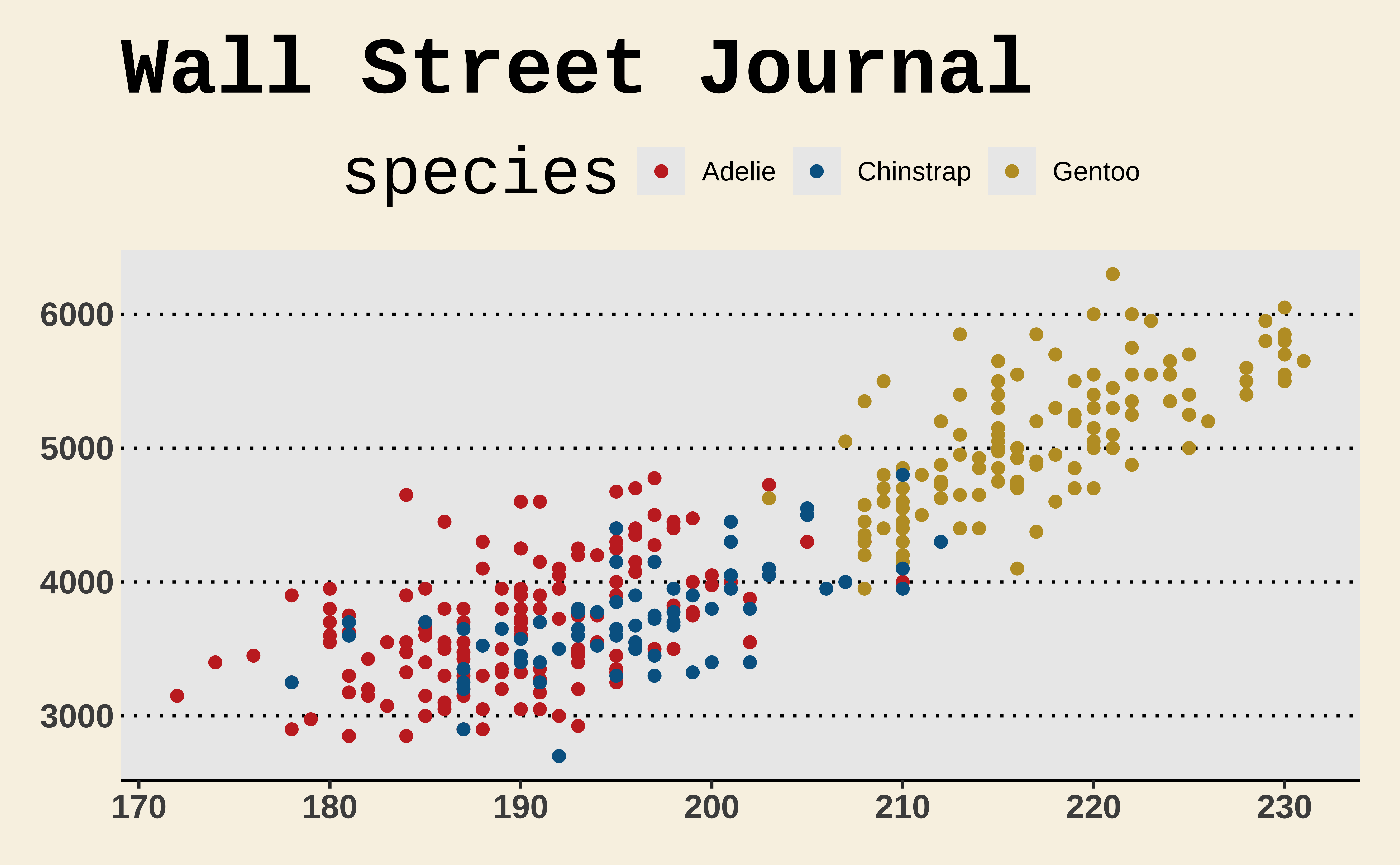
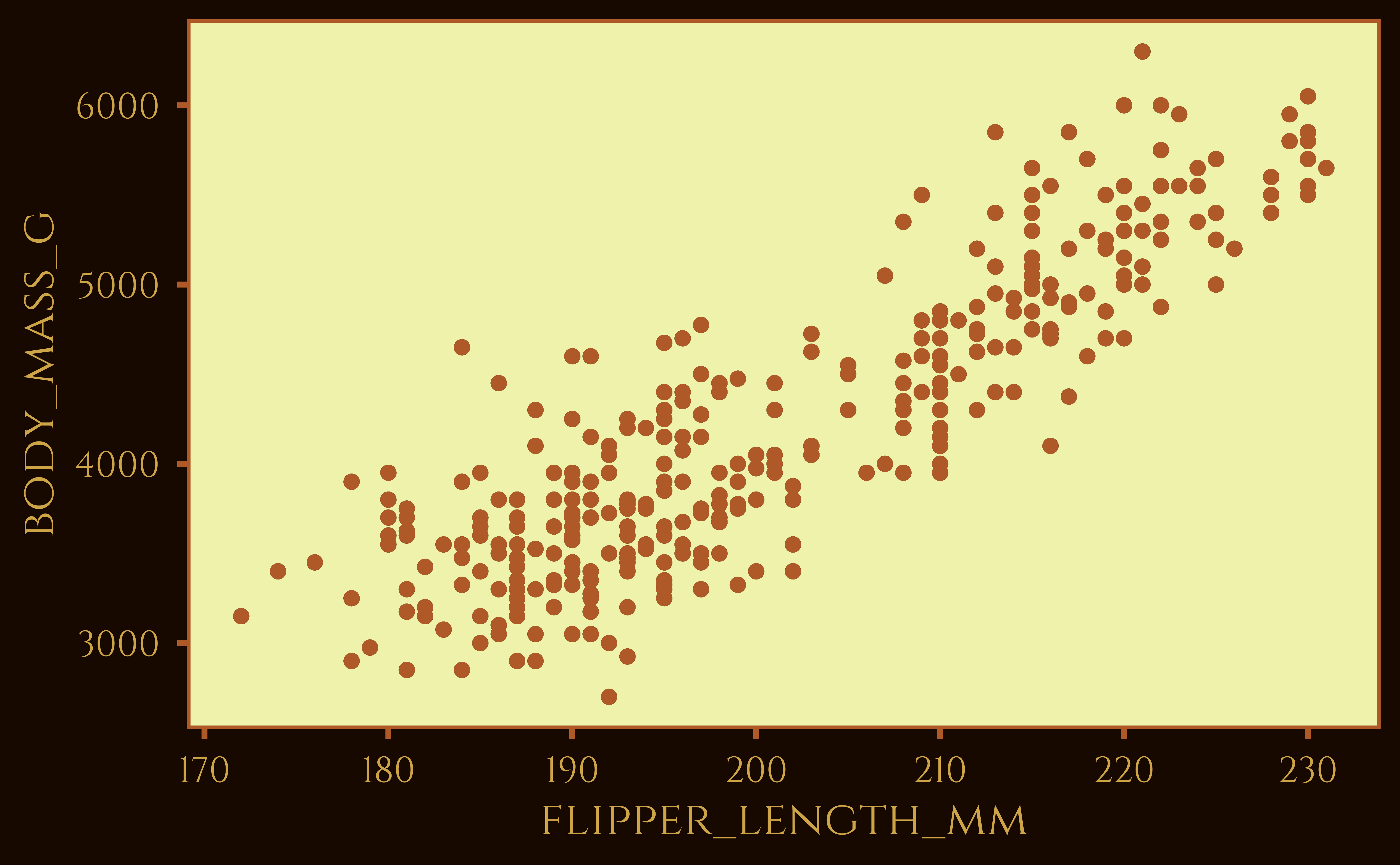
Themes from ggthemes
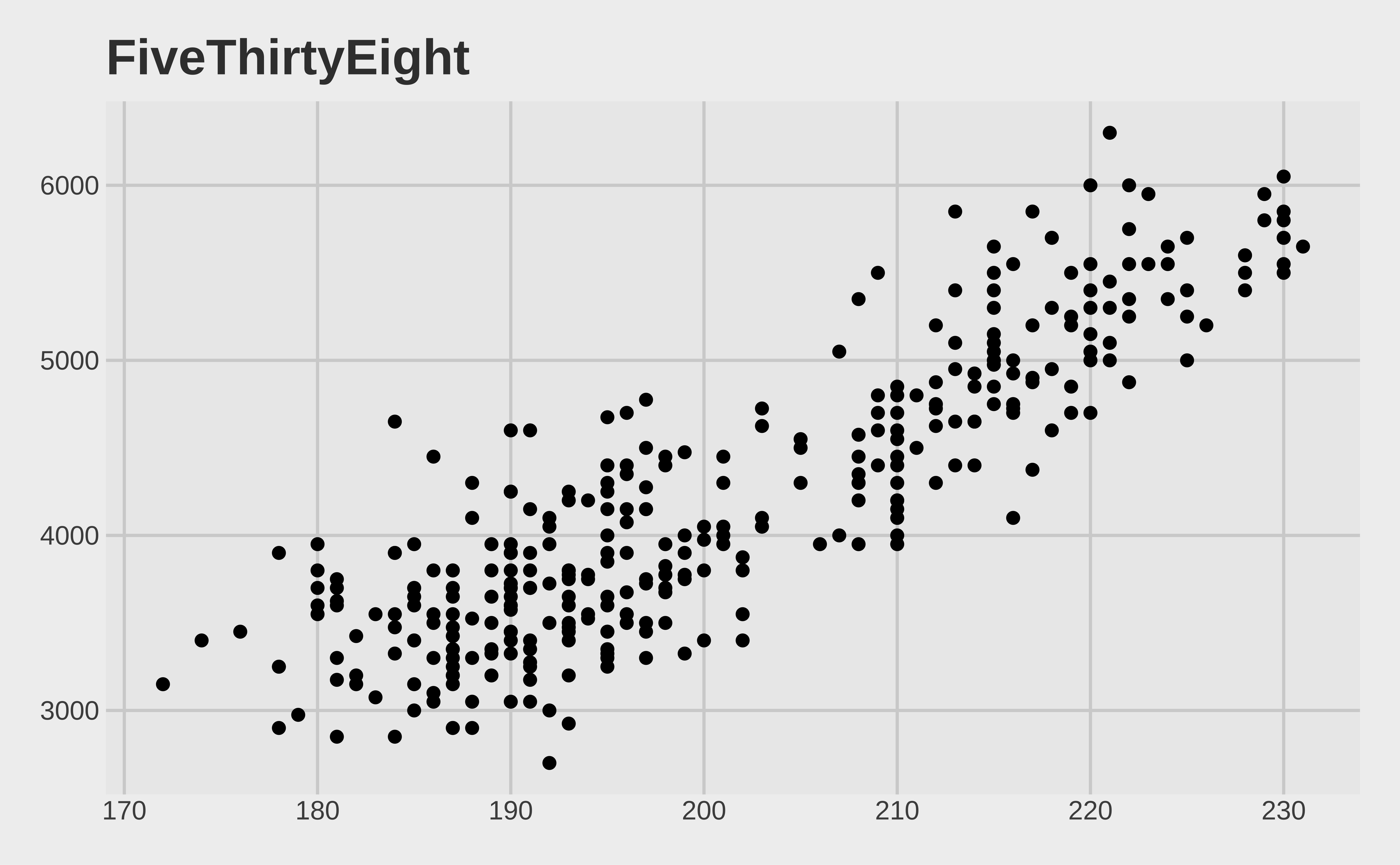
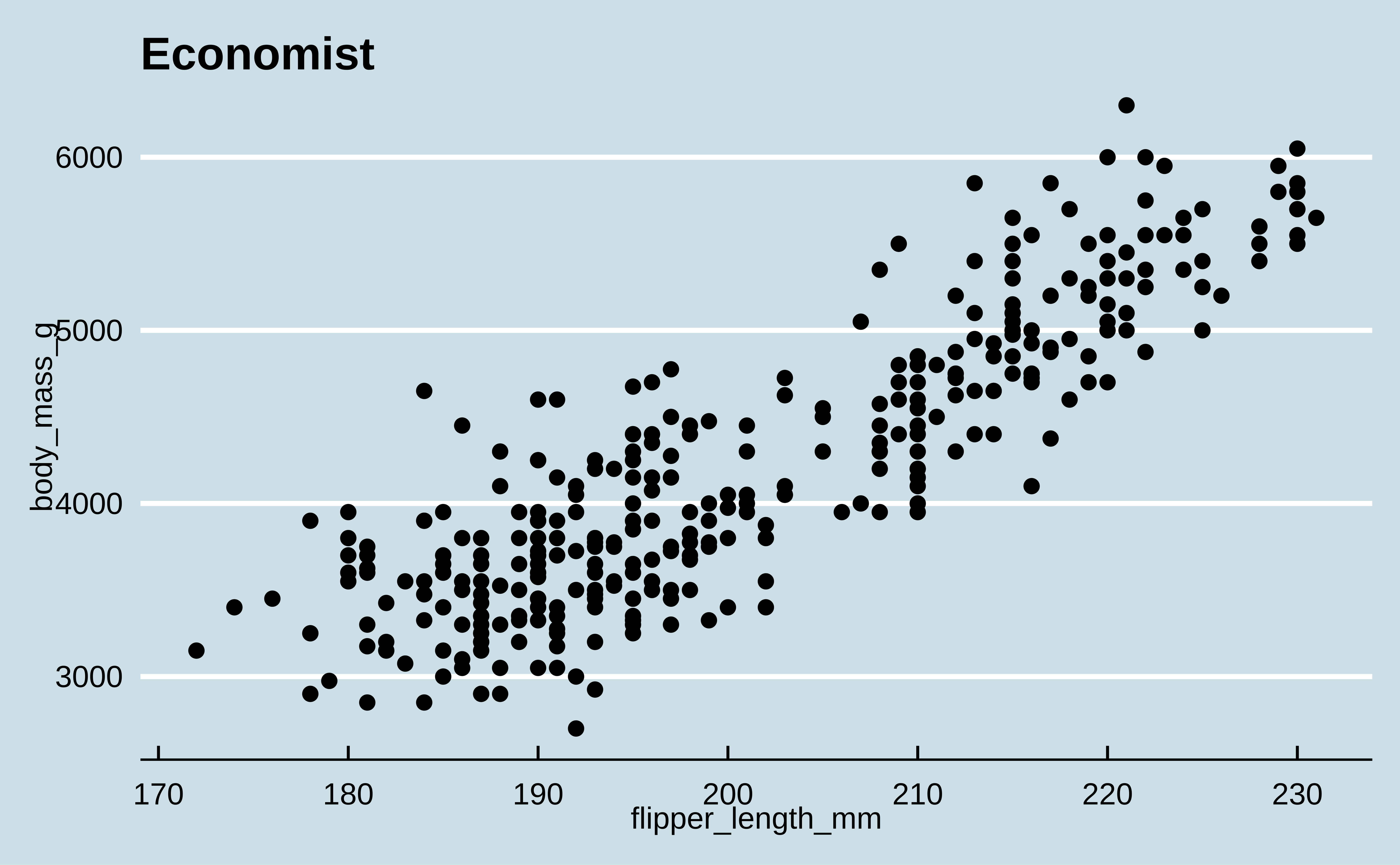
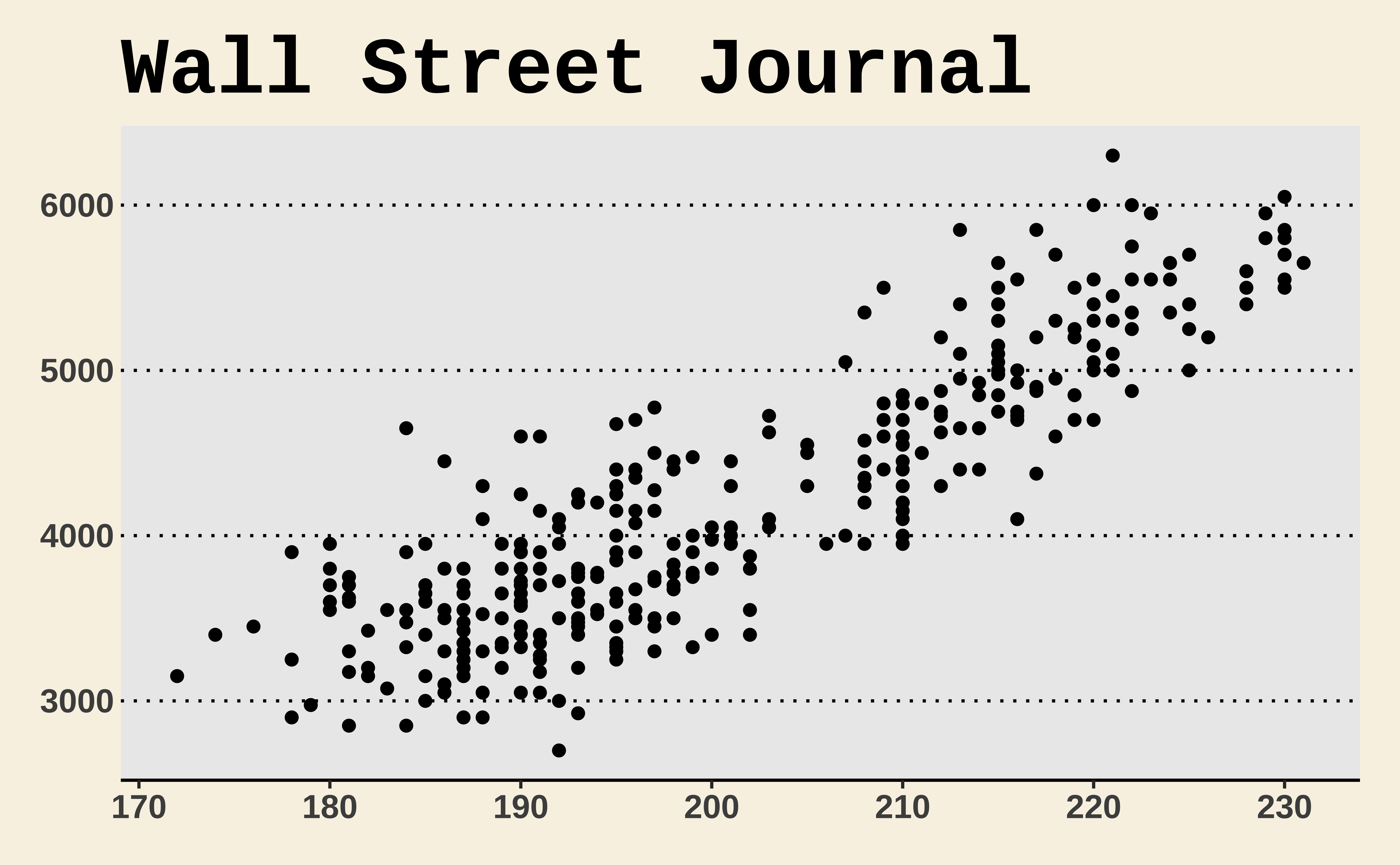
Themes and color scales from ggthemes

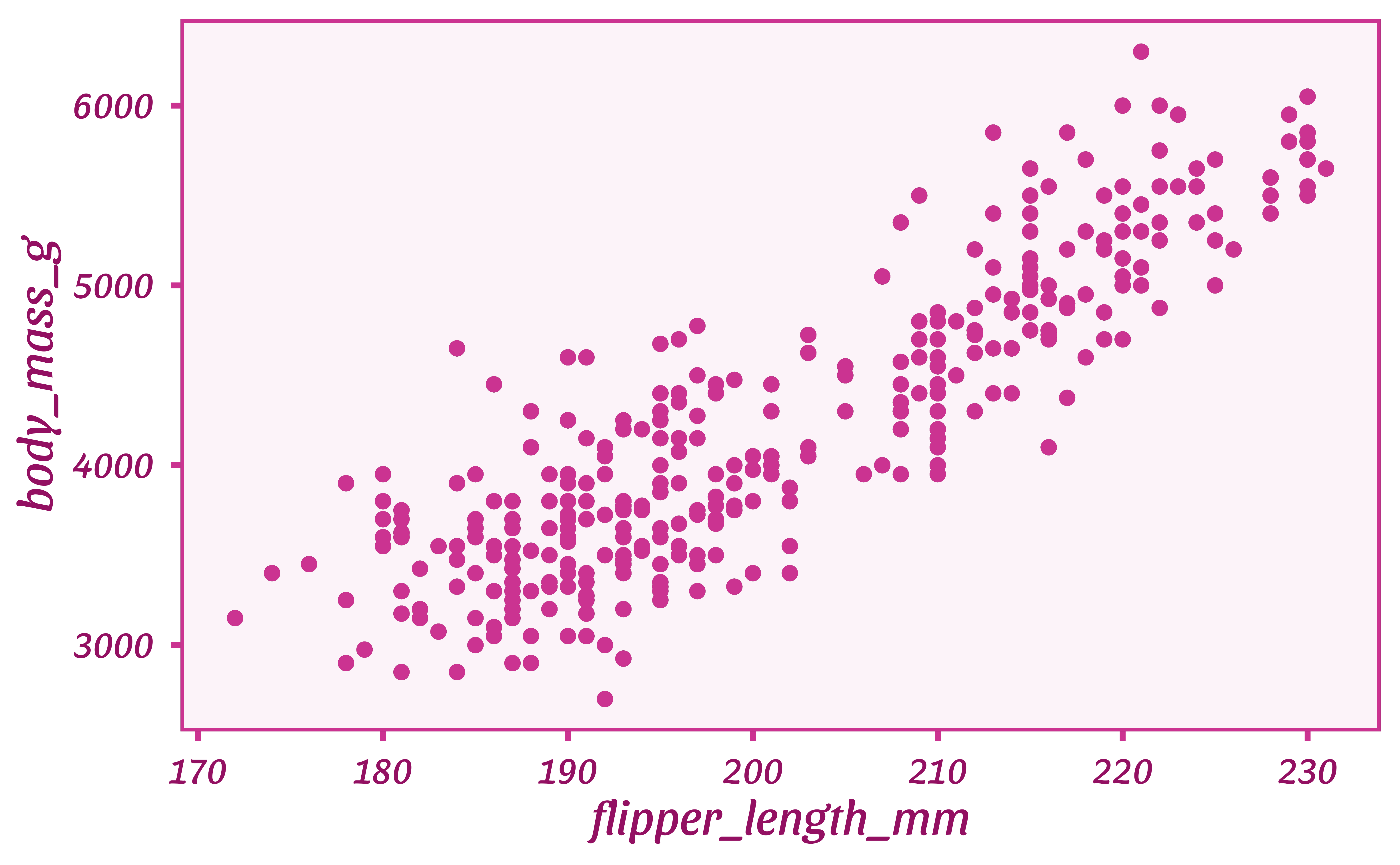
Themes from ThemePark
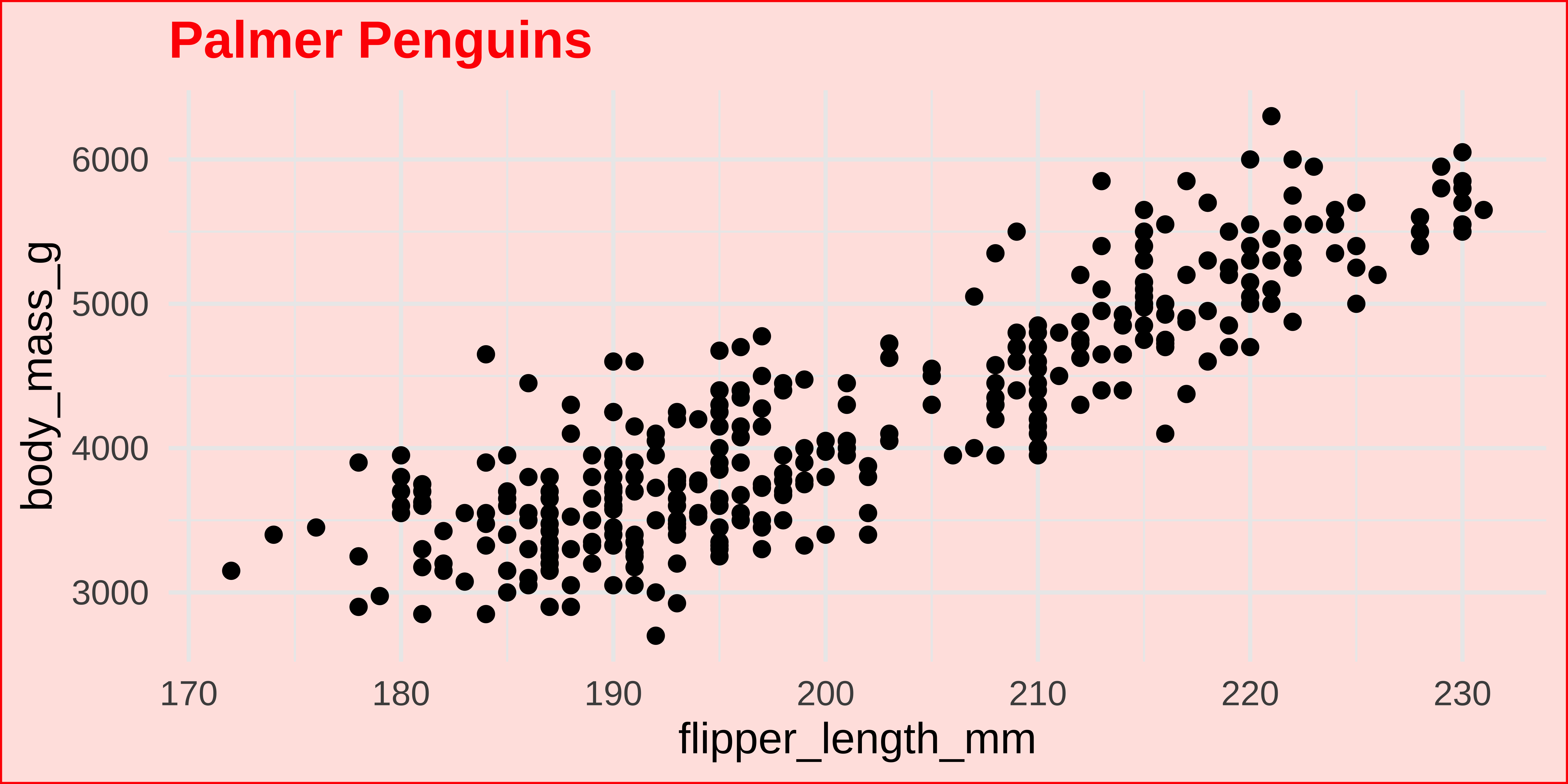
Modifying theme elements
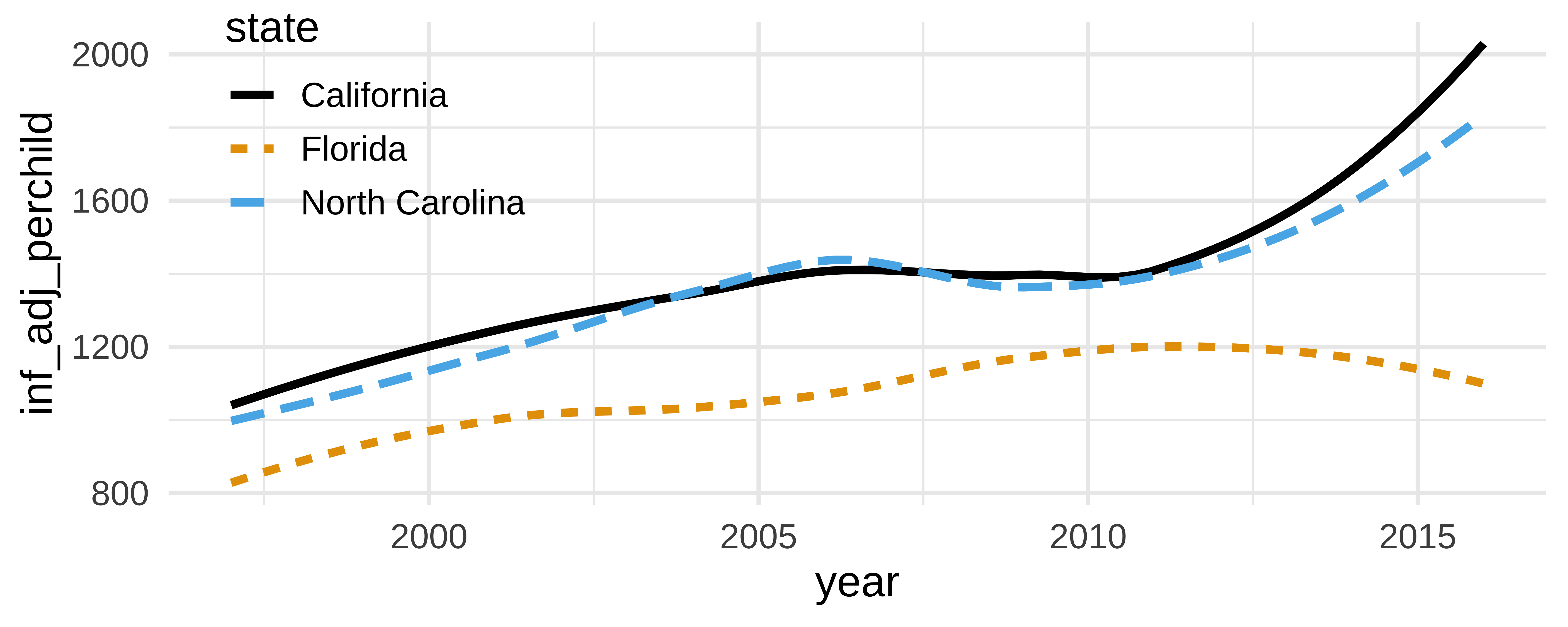
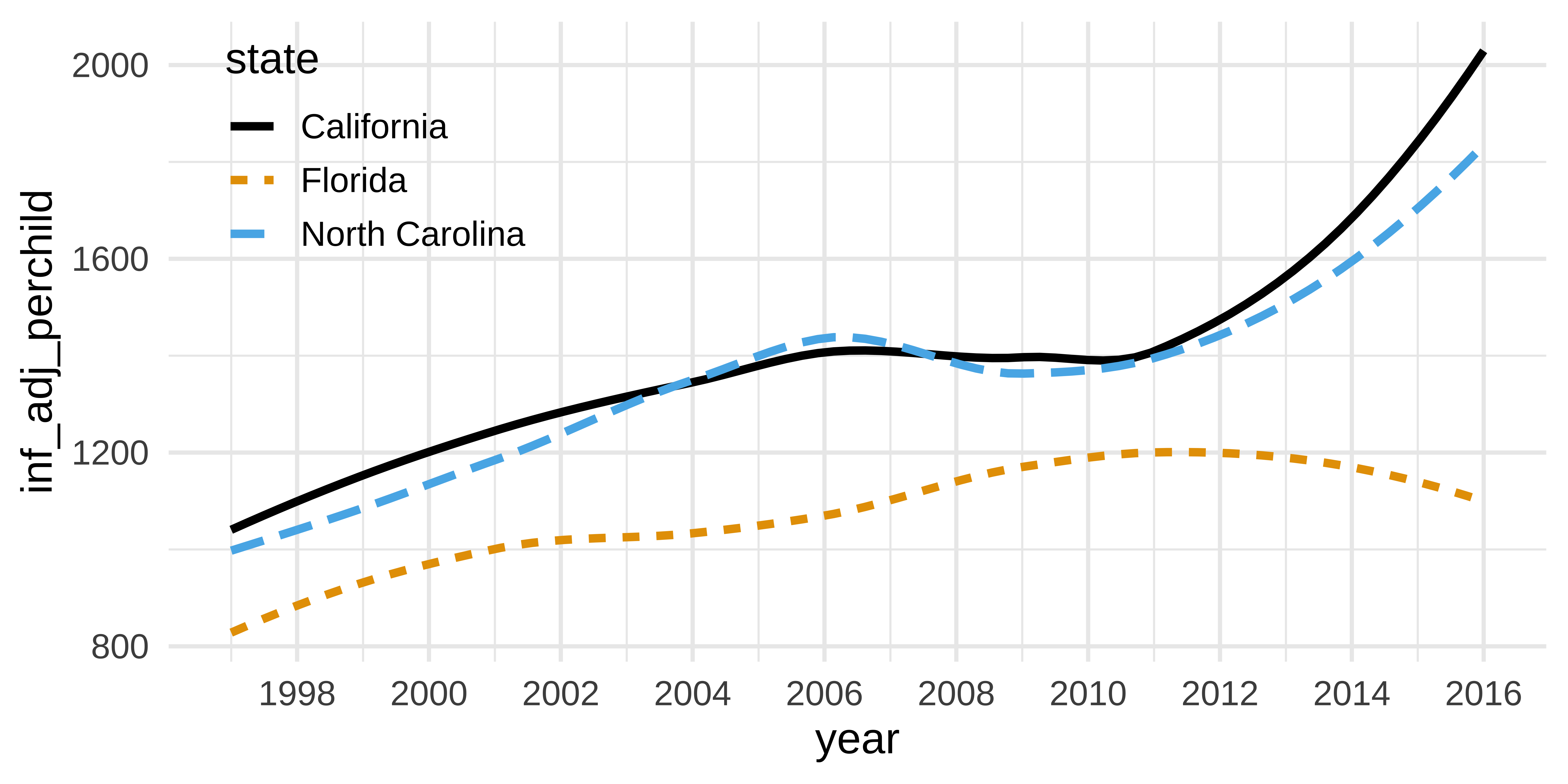
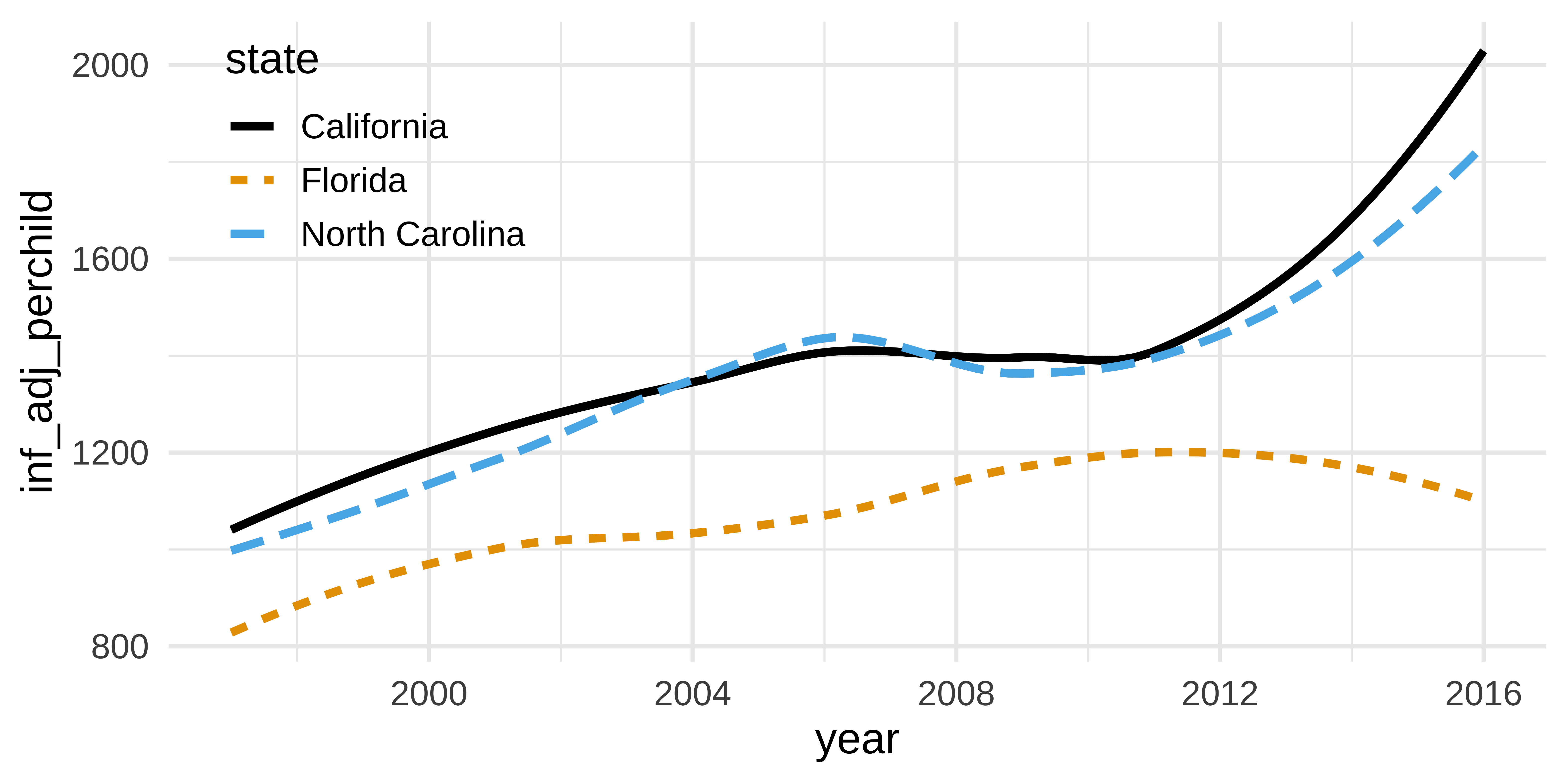
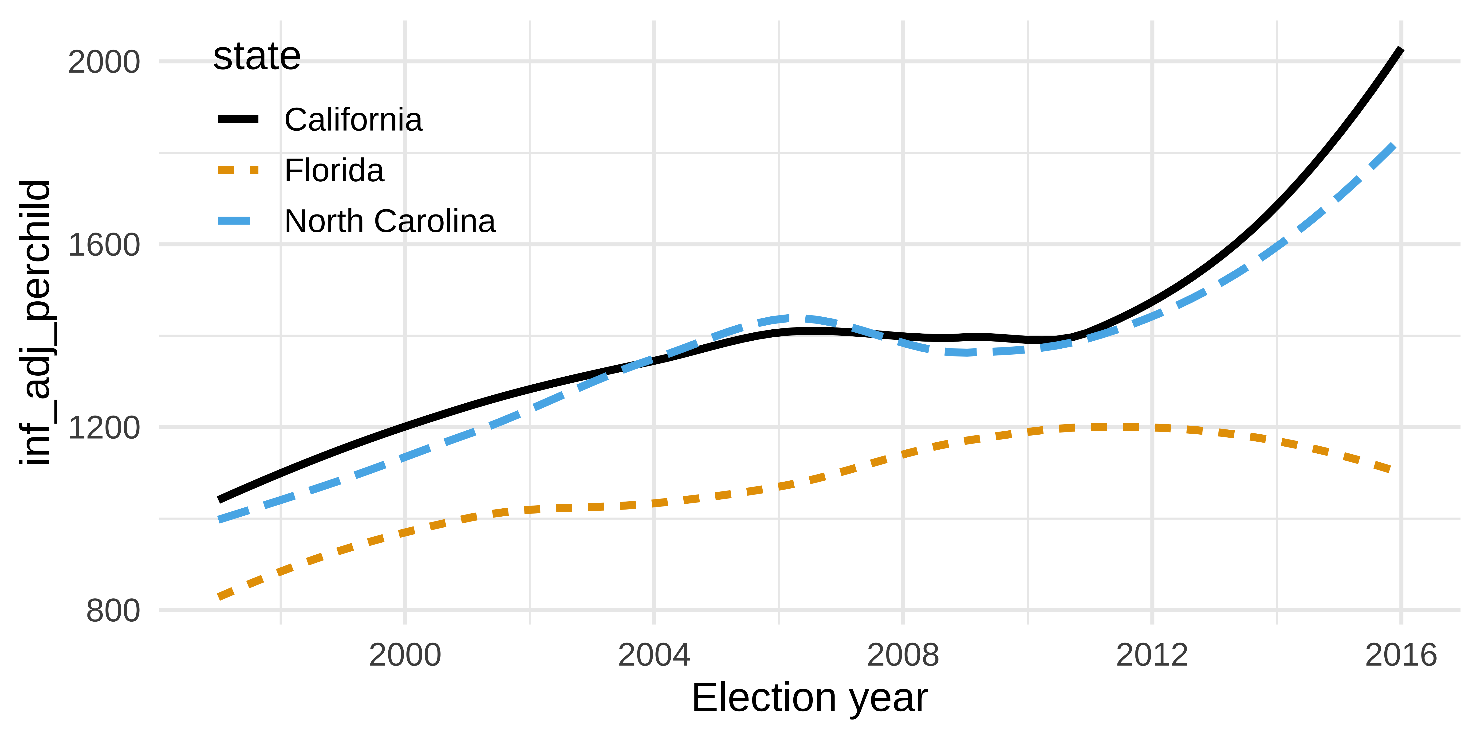
Axis breaks
How can the following figure be improved with custom breaks in axes, if at all? The y-axis is public spending on public health efforts for each year per child in 2016 dollars.
kids_plot <- tidykids |>
  mutate(year = as.numeric(year)) |>
  filter(
    state %in% c("North Carolina", "California", "Florida"),
    expenditure == "pubhealth"
  ) |>
  ggplot(aes(x = year, y = inf_adj_perchild, color = state, linetype = state)) +
  geom_smooth(se = FALSE) +
  scale_color_colorblind() +
  theme(legend.position = c(0.15, 0.8))

kids_plot
`geom_smooth()` using method = 'loess' and formula = 'y ~ x'Context matters
Conciseness matters
Precision matters
Why annotate?
geom_text()
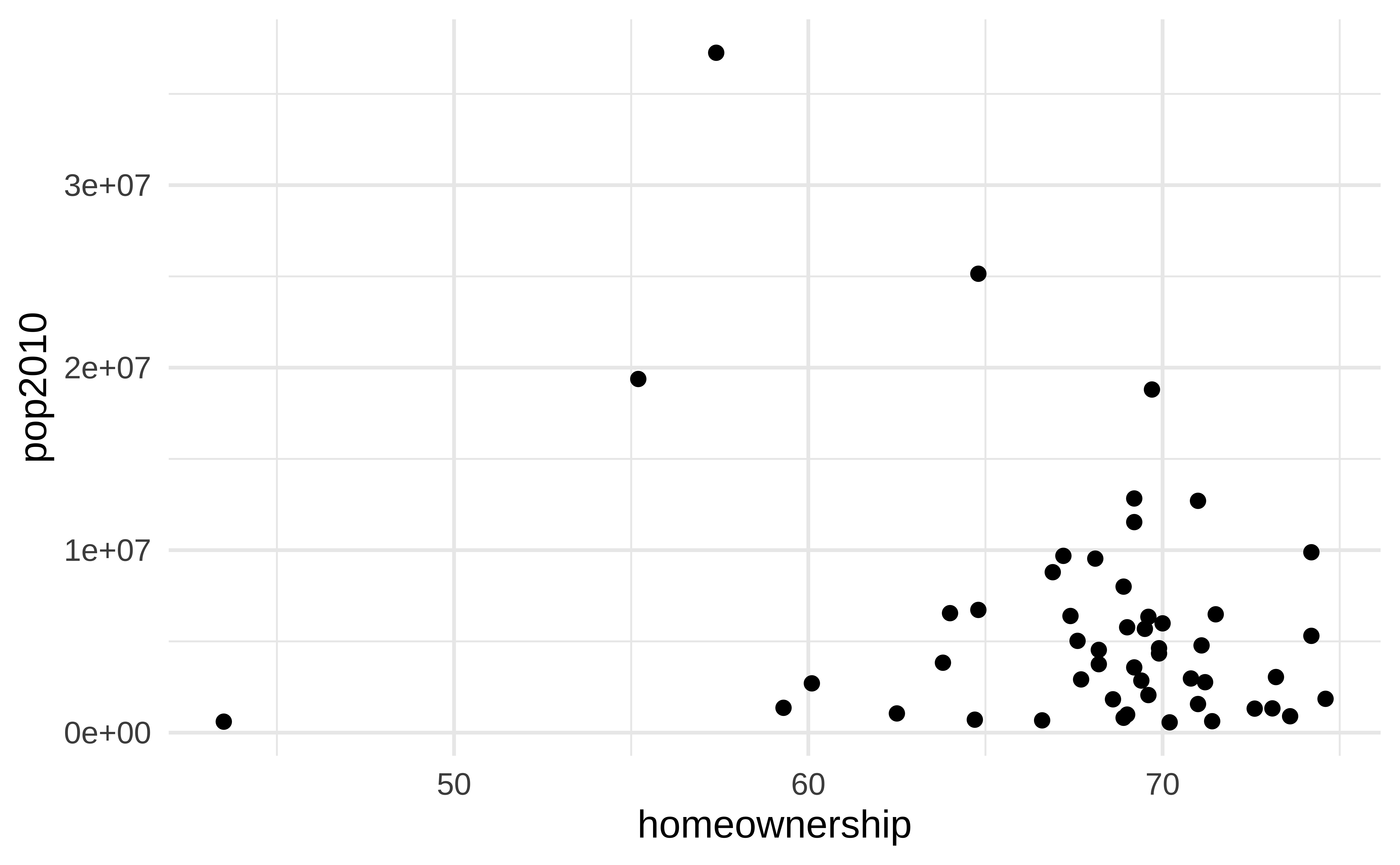
Can be useful when individual observations are identifiable, but can also get overwhelming…
How would you improve this visualization?
geom_text() improved
state_stats <- state_stats |>
  mutate(
    labelled = if_else(homeownership < 50 | pop2010 > 13000000, TRUE, FALSE)
  )

ggplot(state_stats, aes(x = homeownership, y = pop2010)) +
  geom_point(alpha = 0.5) +
  geom_point(
    data = state_stats |> filter(labelled),
    shape = "circle open",
    color = "red",
    size = 4
  ) +
  geom_text(
    data = state_stats |> filter(labelled),
    aes(label = abbr),
    hjust = 1,
    vjust = -1,
    color = "red"
  ) +
  coord_cartesian(clip = "off")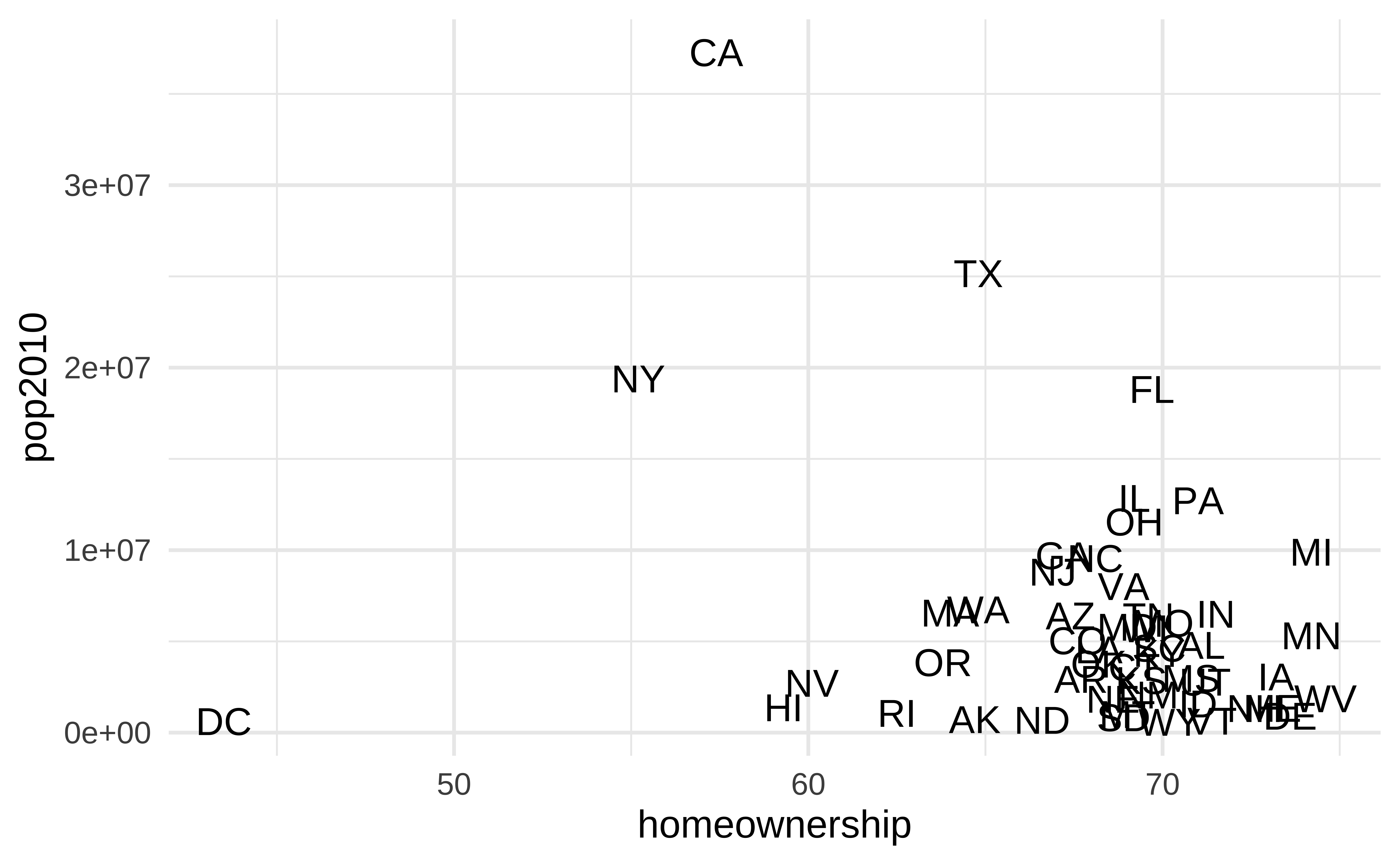
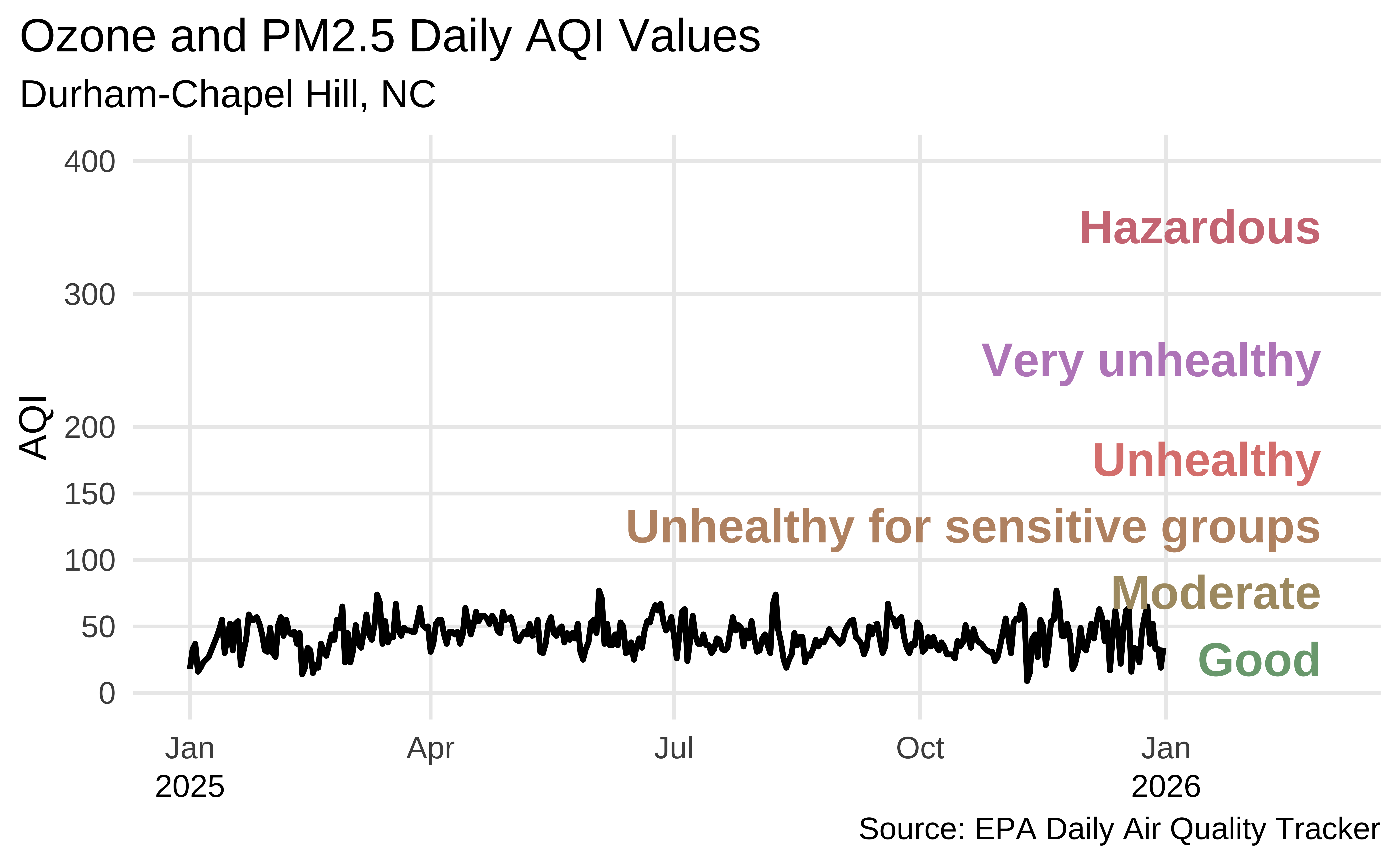
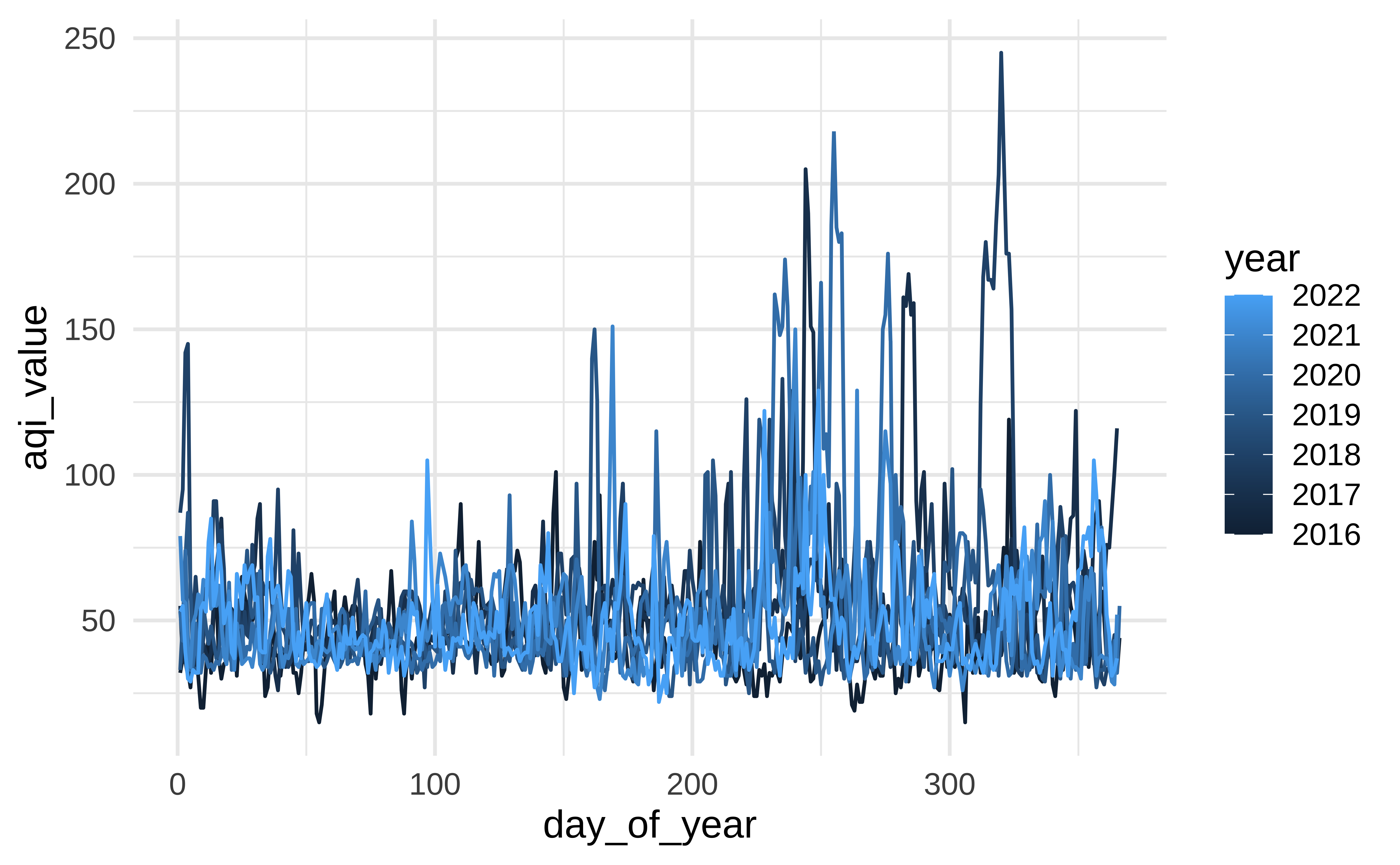
Durham-Chapel Hill AQI
In ae-03, recreate the following visualization.
All of the data doesn’t tell a story
Plot AQI over years
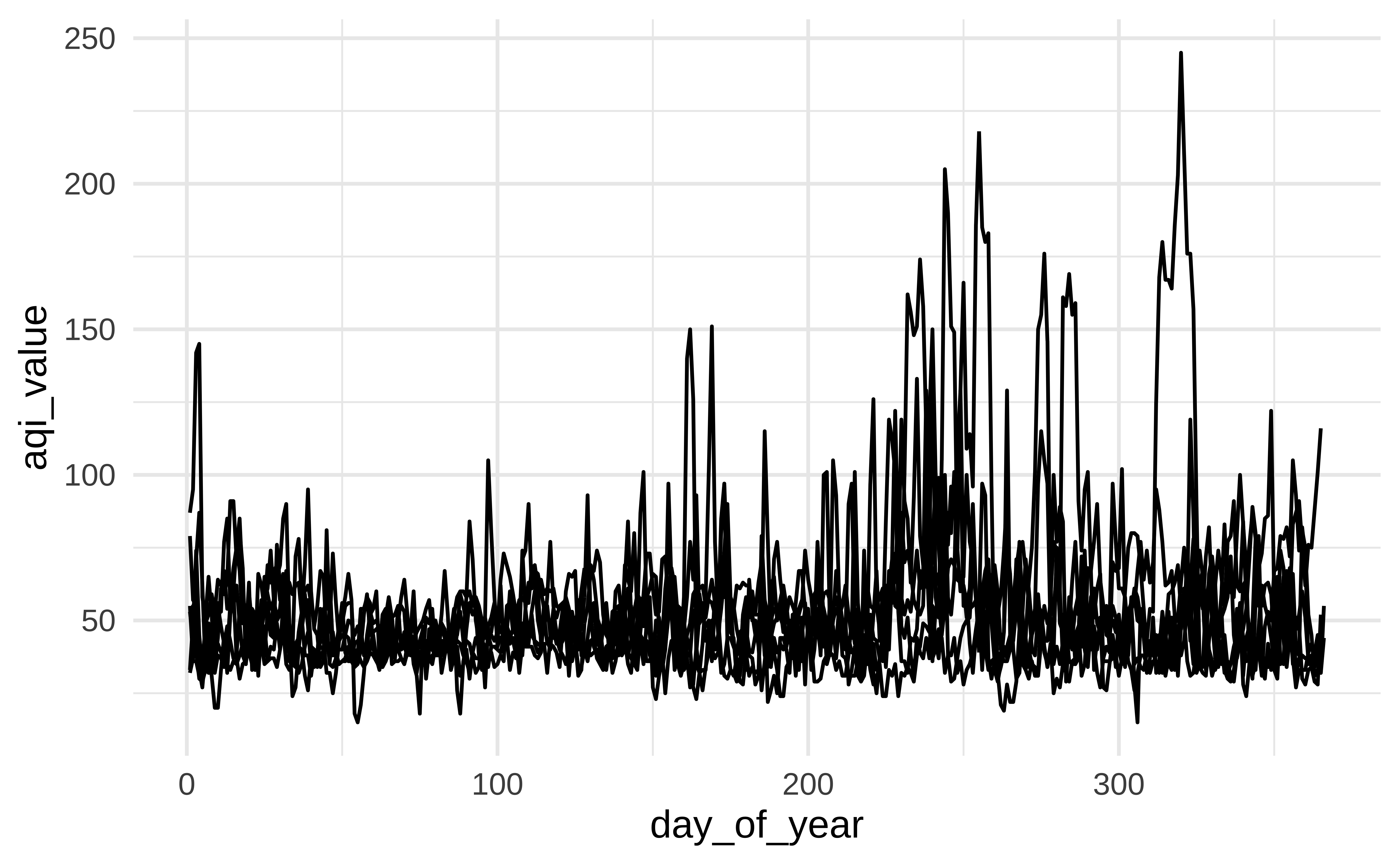
Plot AQI over years

Plot AQI over years
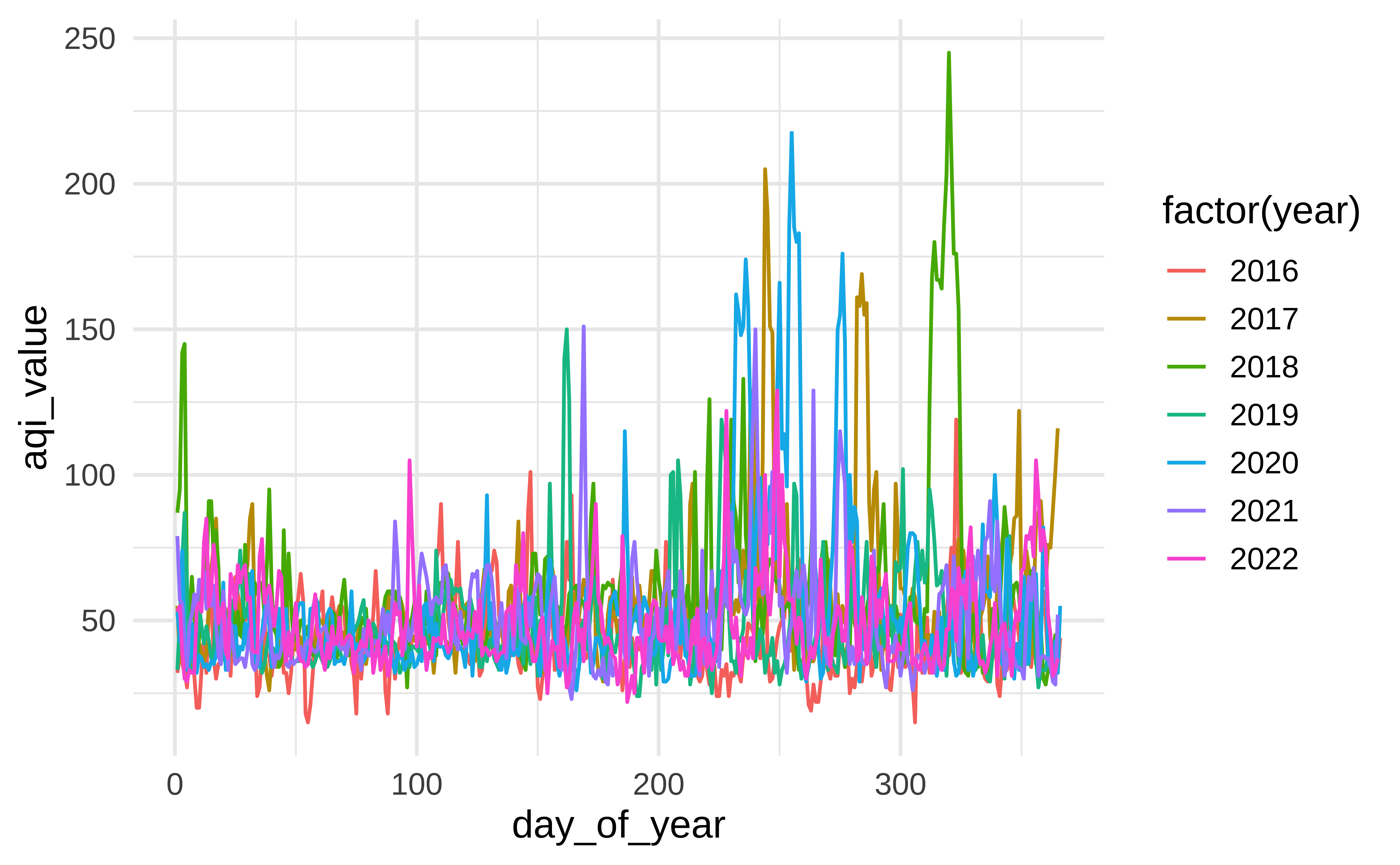
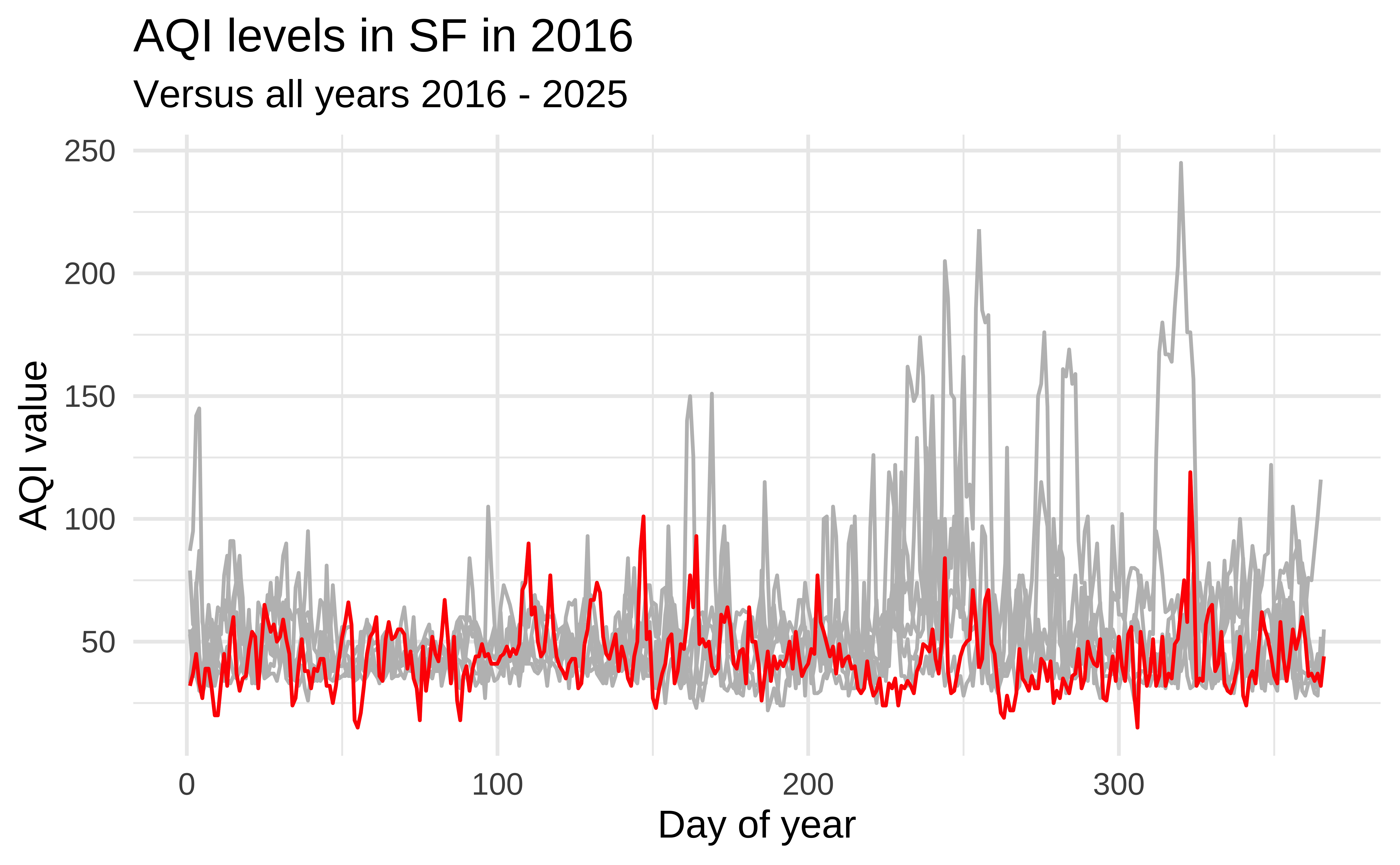
Highlight 2016

Highlight 2017
Highlight 2018

Highlight any year
year_to_highlight <- 2018

ggplot(sf, aes(x = day_of_year, y = aqi_value, group = year)) +
  geom_line(color = "gray") +
  geom_line(data = sf |> filter(year == year_to_highlight), color = "red") +
  labs(
    title = glue("AQI levels in SF in {year_to_highlight}"),
    subtitle = "Versus all years 2016 - 2025",
    x = "Day of year",
    y = "AQI value"
  )