Deep dive into ggplot2 layers

Lecture 2

Dr. Mine Çetinkaya-Rundel

Duke University
STA 313 - Spring 2026

Warm up

Announcements

Setup

# load packages
library(tidyverse)
library(scales)
library(openintro)

# set theme for ggplot2
ggplot2::theme_set(ggplot2::theme_minimal(base_size = 14))

# set figure parameters for knitr
knitr::opts_chunk$set(
  fig.width = 7, # 7" width
  fig.asp = 0.618, # the golden ratio
  fig.retina = 3, # dpi multiplier for displaying HTML output on retina
  fig.align = "center", # center align figures
  dpi = 300 # higher dpi, sharper image
)

A/B testing

Data: Sale prices of houses in Duke Forest

  • Data on houses that were sold in the Duke Forest neighborhood of Durham, NC around November 2020

  • Scraped from Zillow

  • Source: openintro::duke_forest

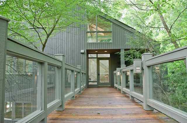
Modernist house in Duke Forest

openintro::duke_forest

glimpse(duke_forest)
Rows: 98
Columns: 13
$ address    <chr> "1 Learned Pl, Durham, NC 27705", "1616 Pinecrest Rd, Durha…
$ price      <dbl> 1520000, 1030000, 420000, 680000, 428500, 456000, 1270000, …
$ bed        <dbl> 3, 5, 2, 4, 4, 3, 5, 4, 4, 3, 4, 4, 3, 5, 4, 5, 3, 4, 4, 3,…
$ bath       <dbl> 4.0, 4.0, 3.0, 3.0, 3.0, 3.0, 5.0, 3.0, 5.0, 2.0, 3.0, 3.0,…
$ area       <dbl> 6040, 4475, 1745, 2091, 1772, 1950, 3909, 2841, 3924, 2173,…
$ type       <chr> "Single Family", "Single Family", "Single Family", "Single …
$ year_built <dbl> 1972, 1969, 1959, 1961, 2020, 2014, 1968, 1973, 1972, 1964,…
$ heating    <chr> "Other, Gas", "Forced air, Gas", "Forced air, Gas", "Heat p…
$ cooling    <fct> central, central, central, central, central, central, centr…
$ parking    <chr> "0 spaces", "Carport, Covered", "Garage - Attached, Covered…
$ lot        <dbl> 0.97, 1.38, 0.51, 0.84, 0.16, 0.45, 0.94, 0.79, 0.53, 0.73,…
$ hoa        <chr> NA, NA, NA, NA, NA, NA, NA, NA, NA, NA, NA, NA, NA, NA, NA,…
$ url        <chr> "https://www.zillow.com/homedetails/1-Learned-Pl-Durham-NC-…

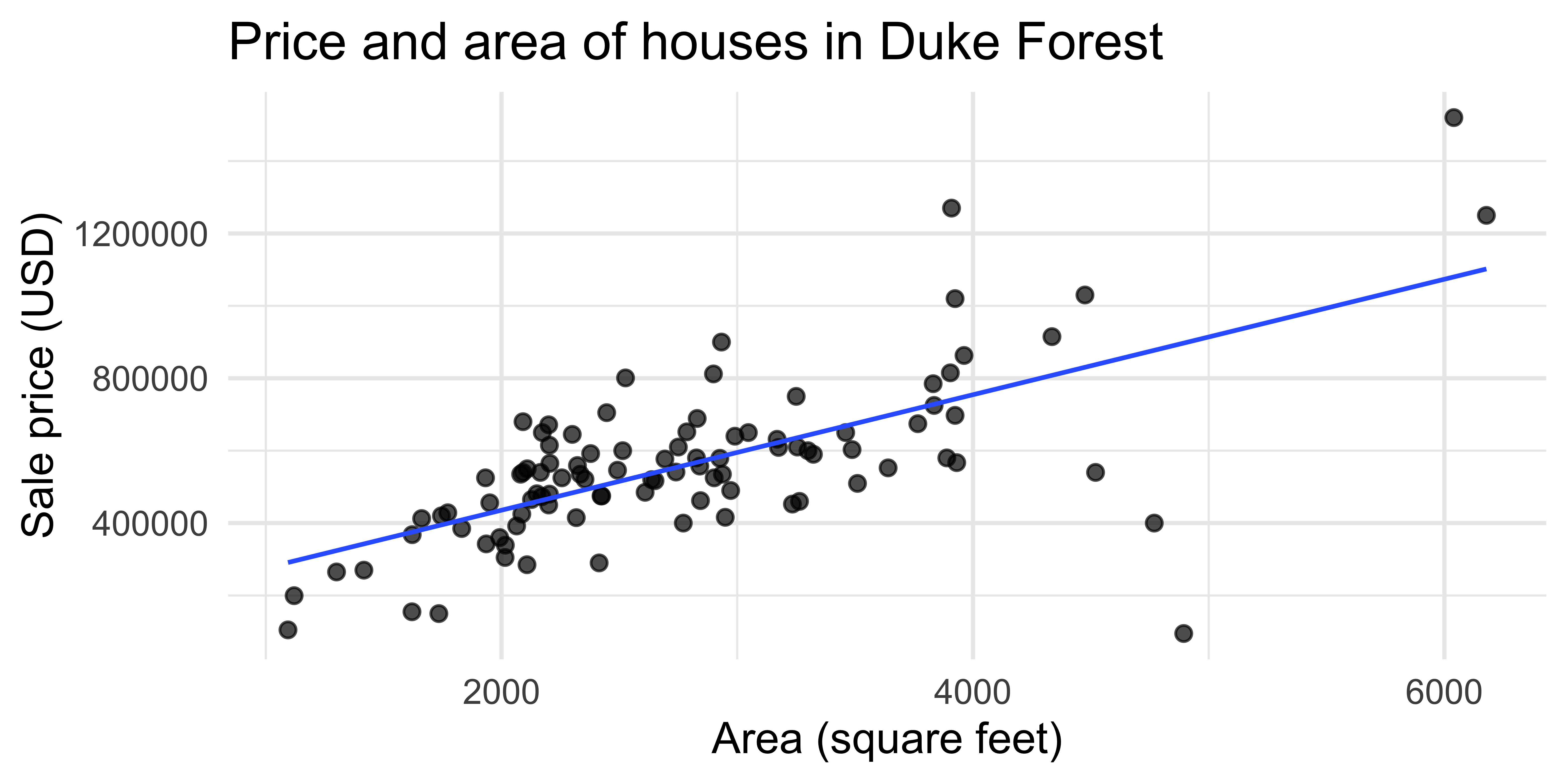
A simple visualization

ggplot(duke_forest, aes(x = area, y = price)) +
  geom_point(alpha = 0.7, size = 2) +
  geom_smooth(method = "lm", se = FALSE, linewidth = 0.7) +
  labs(
    x = "Area (square feet)",
    y = "Sale price (USD)",
    title = "Price and area of houses in Duke Forest"
  )
`geom_smooth()` using formula = 'y ~ x'

New variable: decade_built

duke_forest <- duke_forest |>
  mutate(decade_built = (year_built %/% 10) * 10)

duke_forest |>
  select(year_built, decade_built)
# A tibble: 98 × 2
   year_built decade_built
        <dbl>        <dbl>
 1       1972         1970
 2       1969         1960
 3       1959         1950
 4       1961         1960
 5       2020         2020
 6       2014         2010
 7       1968         1960
 8       1973         1970
 9       1972         1970
10       1964         1960
# ℹ 88 more rows

New variable: decade_built_cat

duke_forest <- duke_forest |>
  mutate(
    decade_built_cat = case_when(
      decade_built <= 1940 ~ "1940 or before",
      decade_built >= 1990 ~ "1990 or after",
      .default = as.character(decade_built)
    )
  )

duke_forest |>
  count(decade_built_cat)
# A tibble: 6 × 2
  decade_built_cat     n
  <chr>            <int>
1 1940 or before       8
2 1950                26
3 1960                32
4 1970                11
5 1980                13
6 1990 or after        8

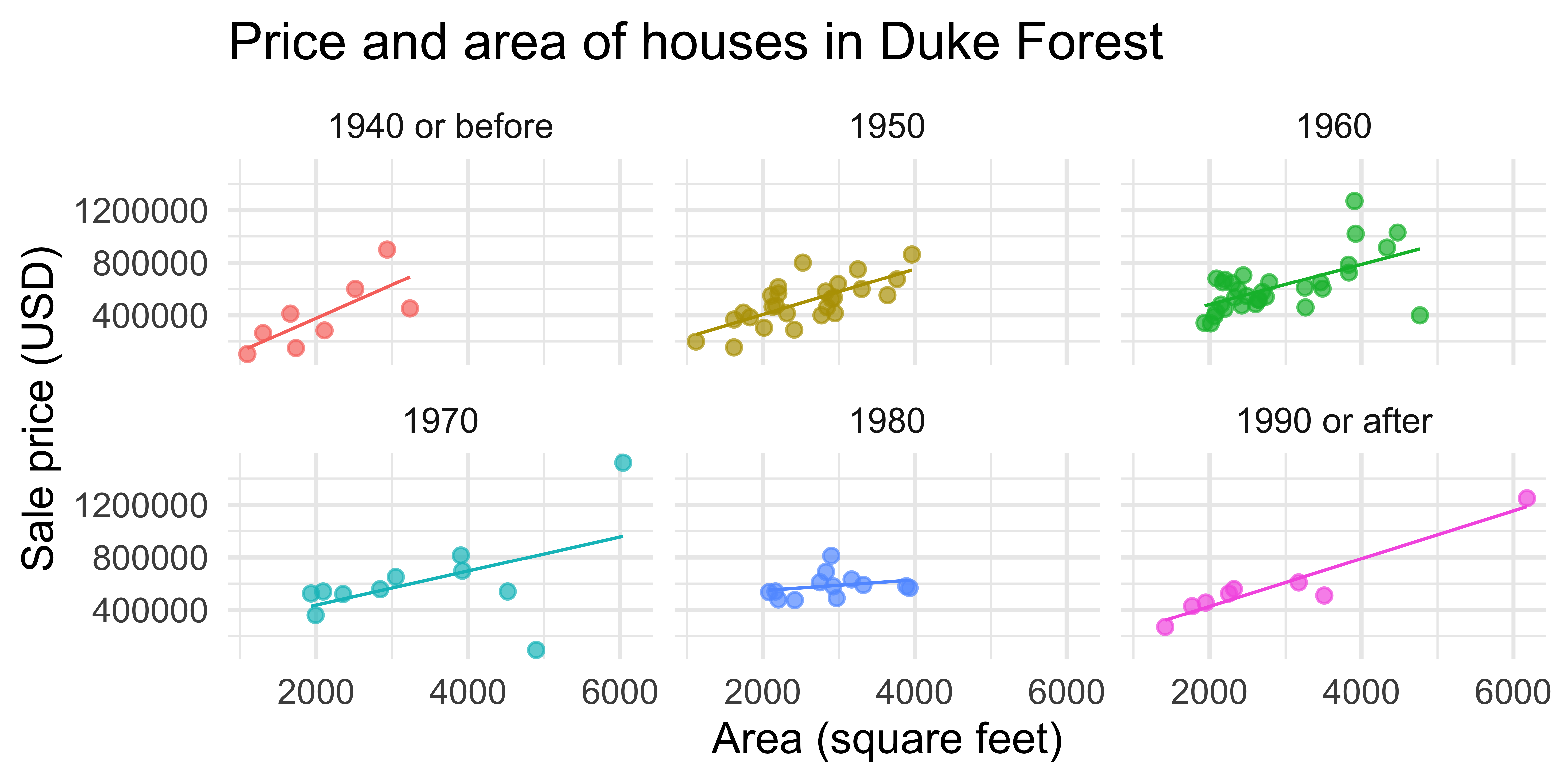
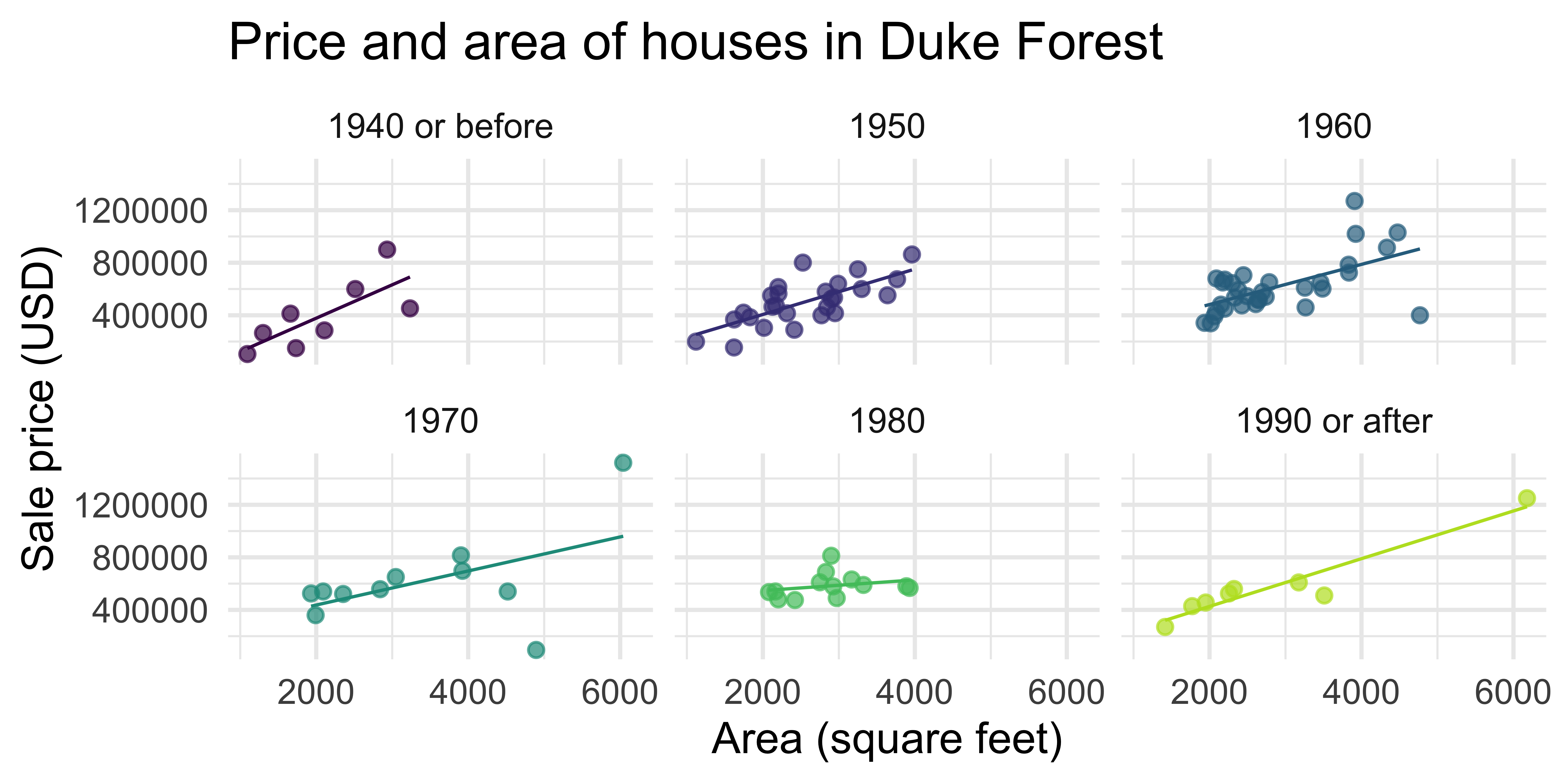
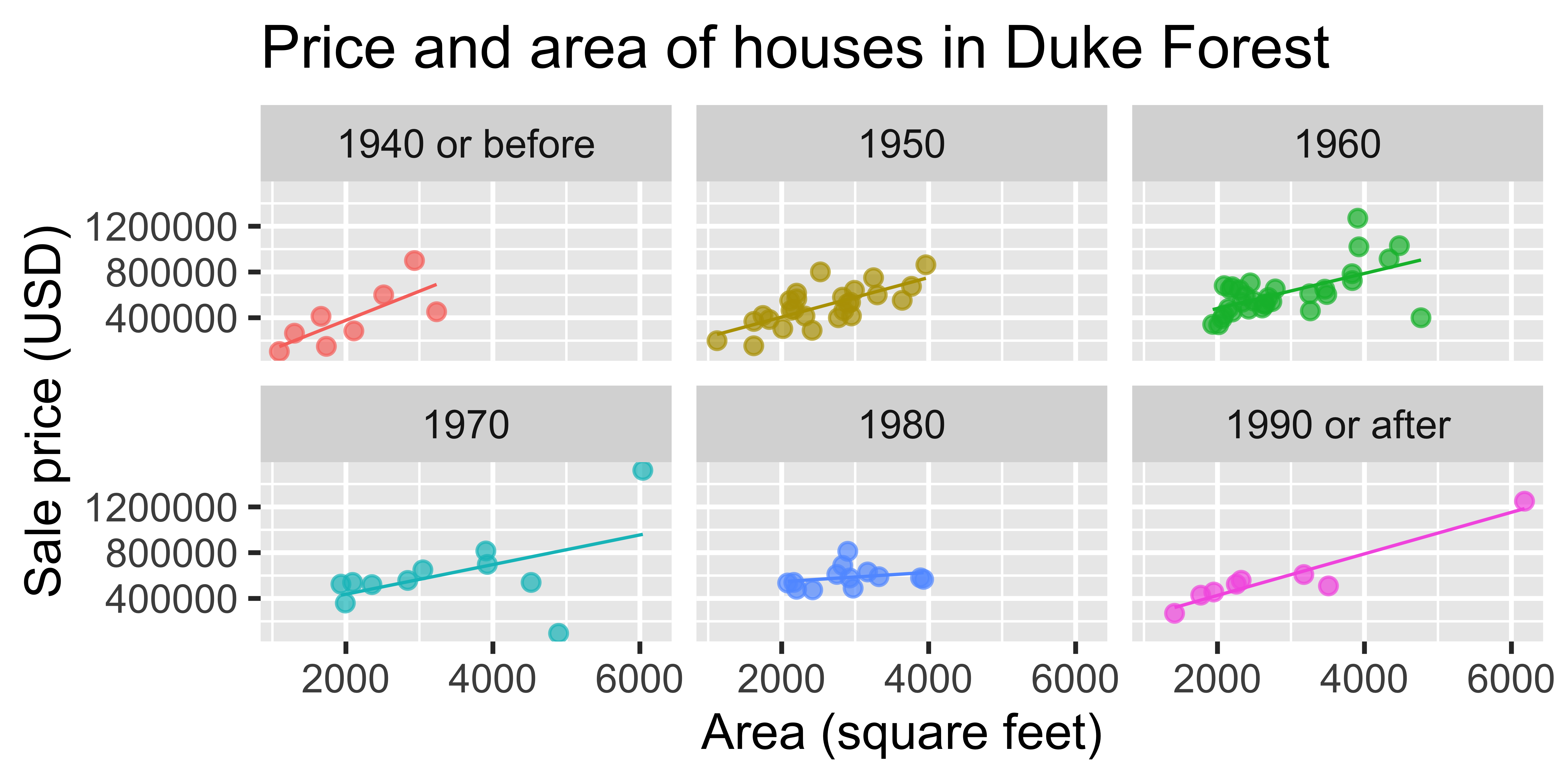
A slightly more complex visualization

ggplot(
  duke_forest,
  aes(x = area, y = price, color = decade_built_cat)
) +
  geom_point(alpha = 0.7, show.legend = FALSE) +
  geom_smooth(method = "lm", se = FALSE, linewidth = 0.5, show.legend = FALSE) +
  facet_wrap(~decade_built_cat) +
  labs(
    x = "Area (square feet)",
    y = "Sale price (USD)",
    color = "Decade built",
    title = "Price and area of houses in Duke Forest"
  )
`geom_smooth()` using formula = 'y ~ x'

A/B testing

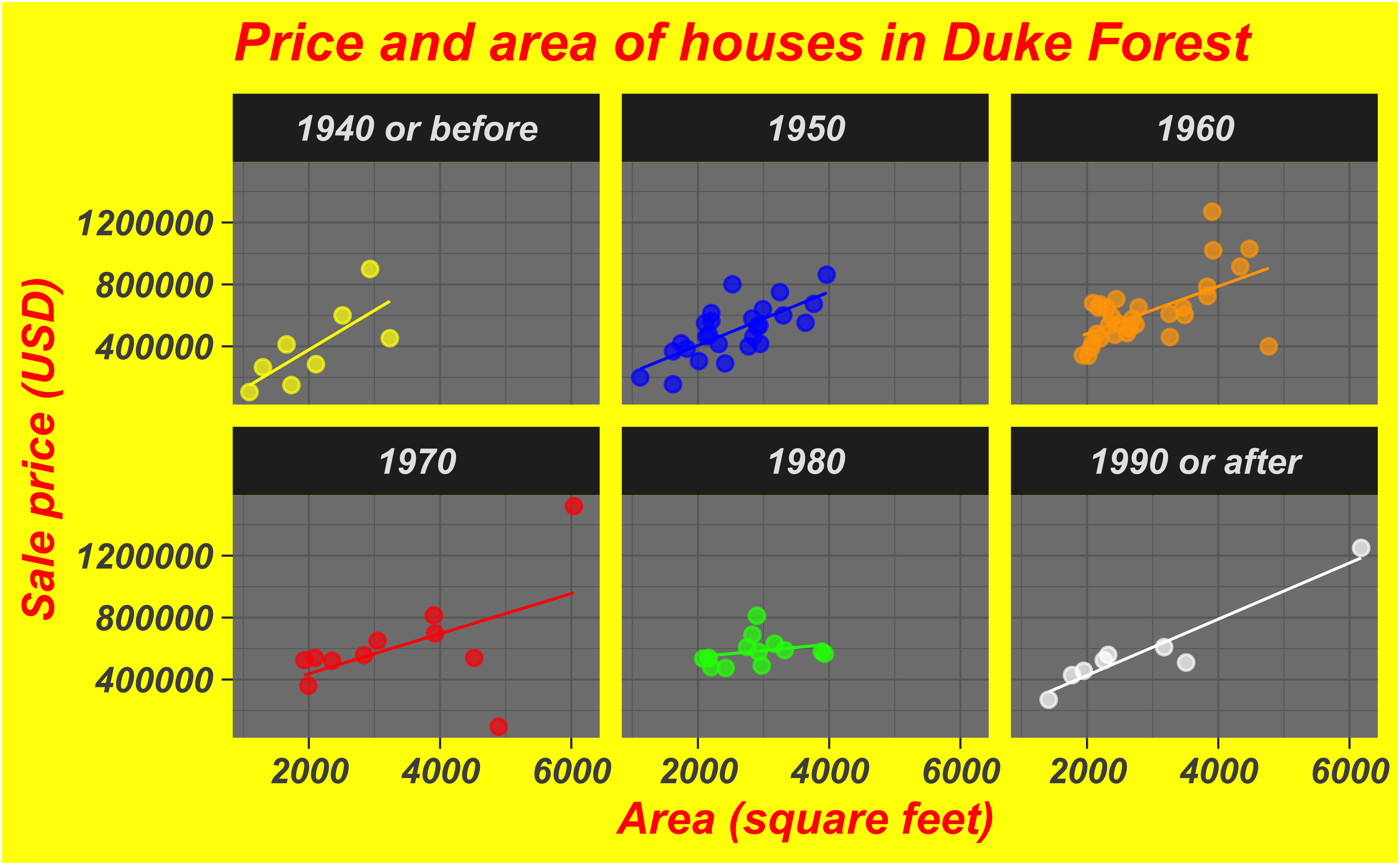
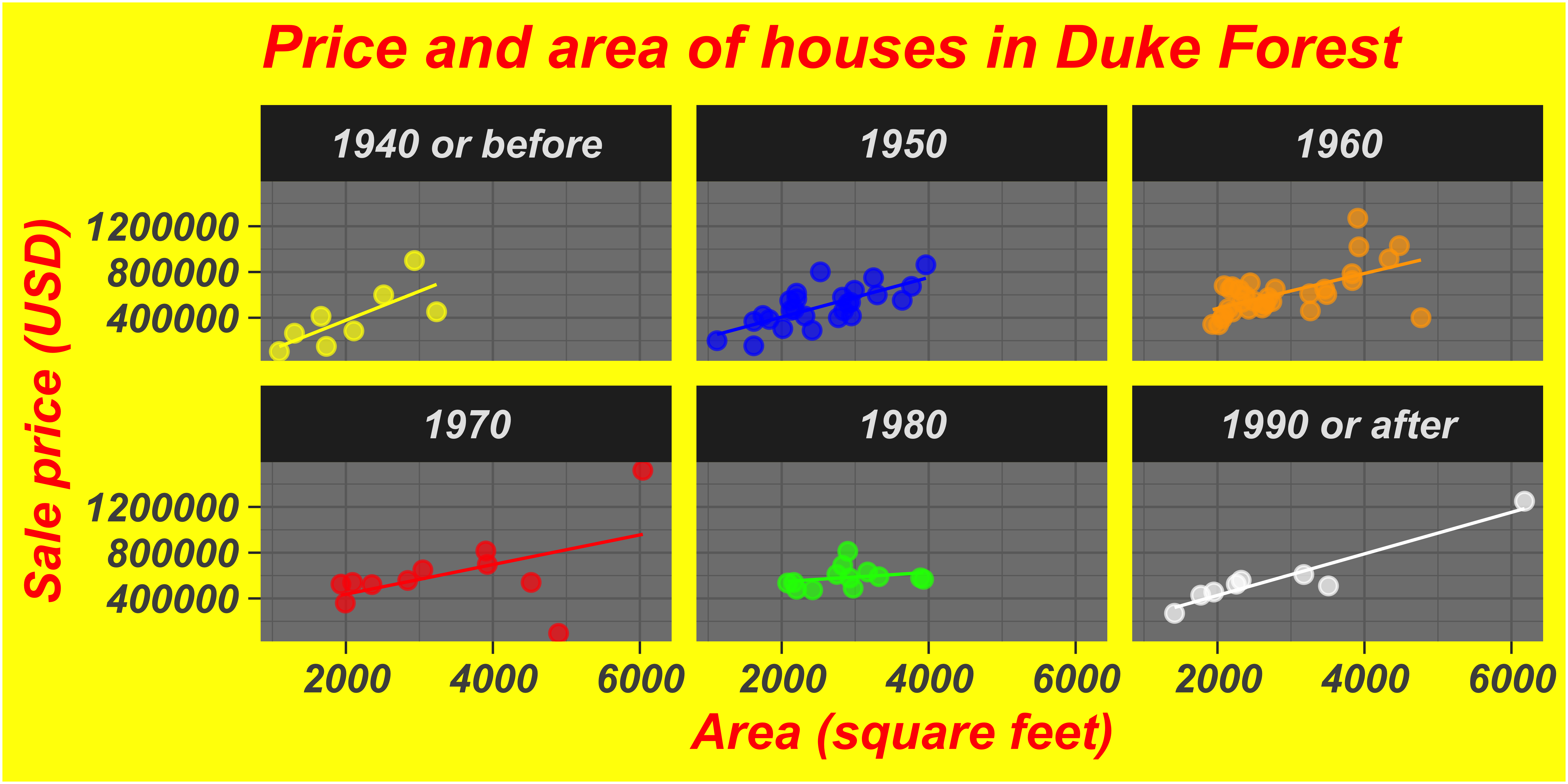
In the next two slides, the same plots are created with different “cosmetic” choices. Examine the plots two given (Plot A and Plot B), and indicate your preference by voting for one of them in the Vote tab.

Test 1

Test 2

What makes figures bad?

Bad taste
Data-to-ink ratio

Tufte strongly recommends maximizing the data-to-ink ratio this in the Visual Display of Quantitative Information (Tufte, 1983).

Graphical excellence is the well-designed presentation of interesting data—a matter of substance, of statistics, and of design … [It] consists of complex ideas communicated with clarity, precision, and efficiency. … [It] is that which gives to the viewer the greatest number of ideas in the shortest time with the least ink in the smallest space … [It] is nearly always multivariate … And graphical excellence requires telling the truth about the data. (Tufte, 1983, p. 51).
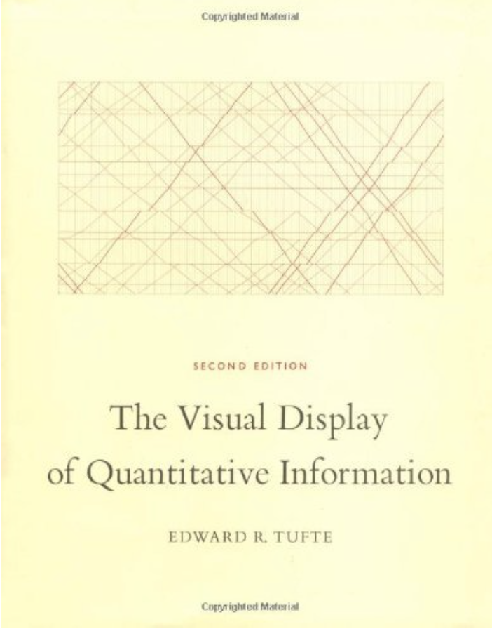
Cover of The Visual Display of Quantitative Information

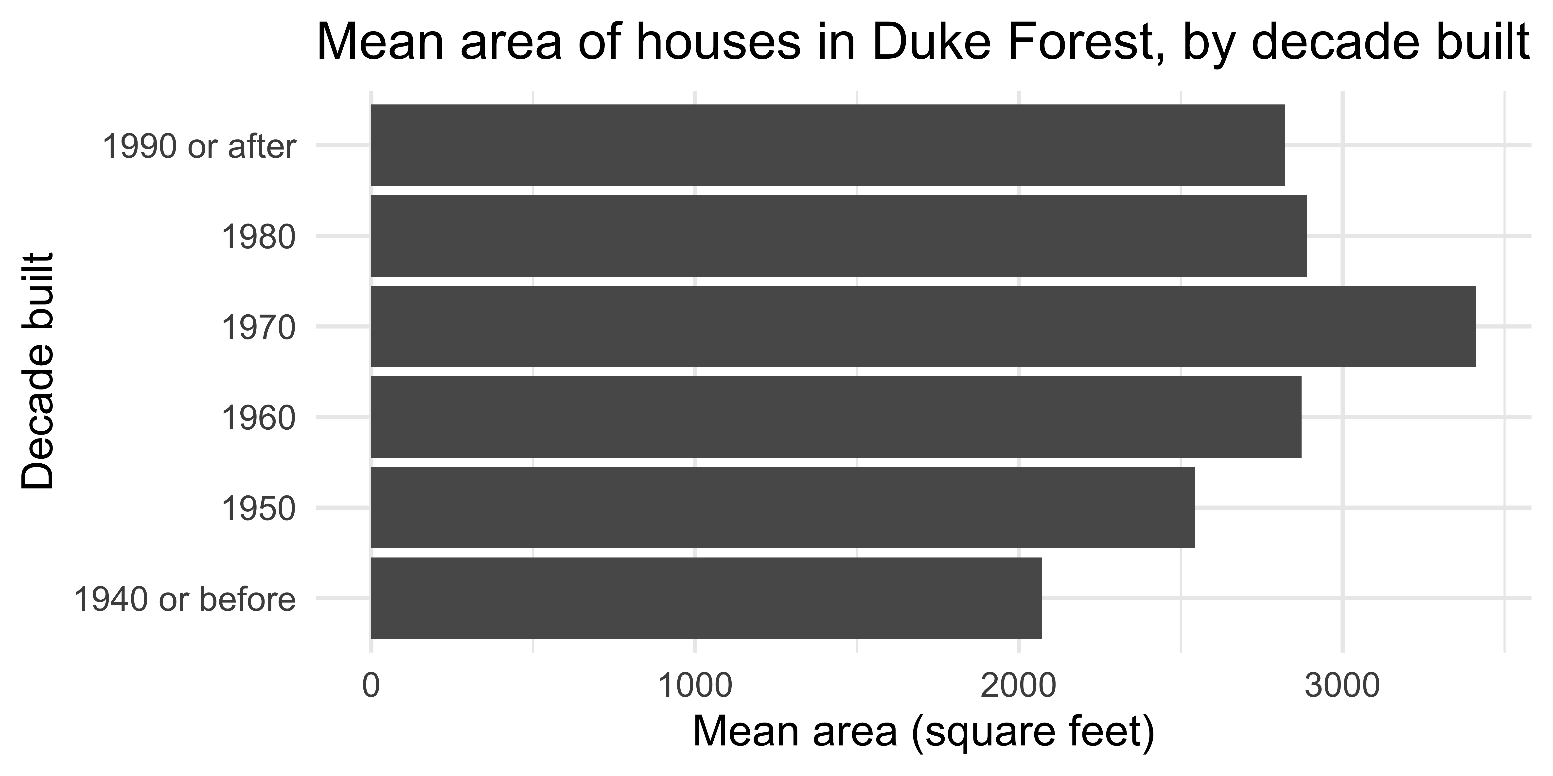
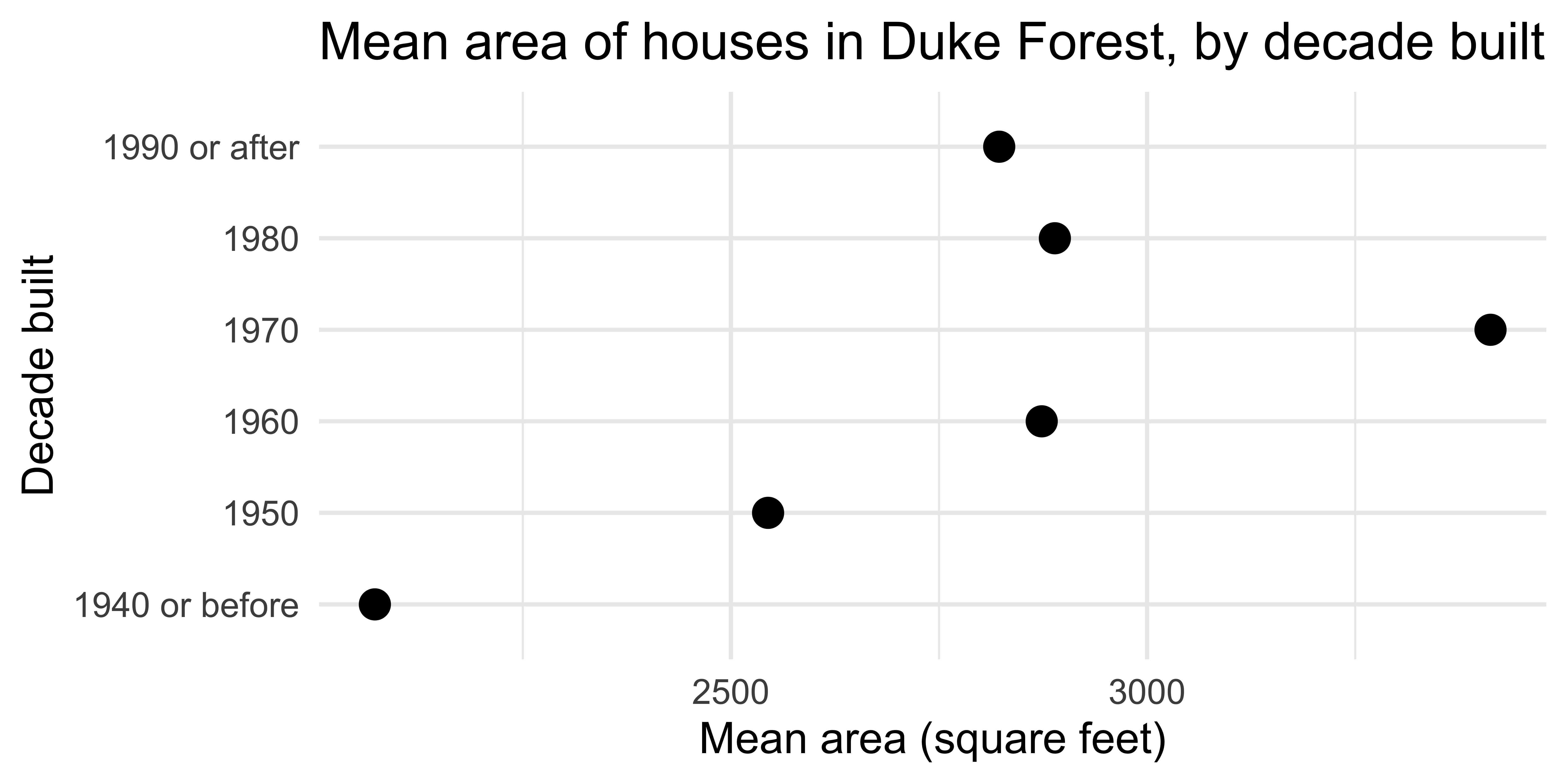
Which of the plots has a higher data-to-ink ratio?

A deeper look

at the plotting code

Summary statistics

mean_area_decade <- duke_forest |>
  group_by(decade_built_cat) |>
  summarize(mean_area = mean(area))

mean_area_decade
# A tibble: 6 × 2
  decade_built_cat mean_area
  <chr>                <dbl>
1 1940 or before       2072.
2 1950                 2545.
3 1960                 2873.
4 1970                 3413.
5 1980                 2889.
6 1990 or after        2822.

Barplot

ggplot(
  mean_area_decade,
  aes(y = decade_built_cat, x = mean_area)
) +
  geom_col() +
  labs(
    x = "Mean area (square feet)",
    y = "Decade built",
    title = "Mean area of houses in Duke Forest, by decade built"
  )

Scaterplot

ggplot(
  mean_area_decade,
  aes(y = decade_built_cat, x = mean_area)
) +
  geom_point(size = 4) +
  labs(
    x = "Mean area (square feet)",
    y = "Decade built",
    title = "Mean area of houses in Duke Forest, by decade built"
  )

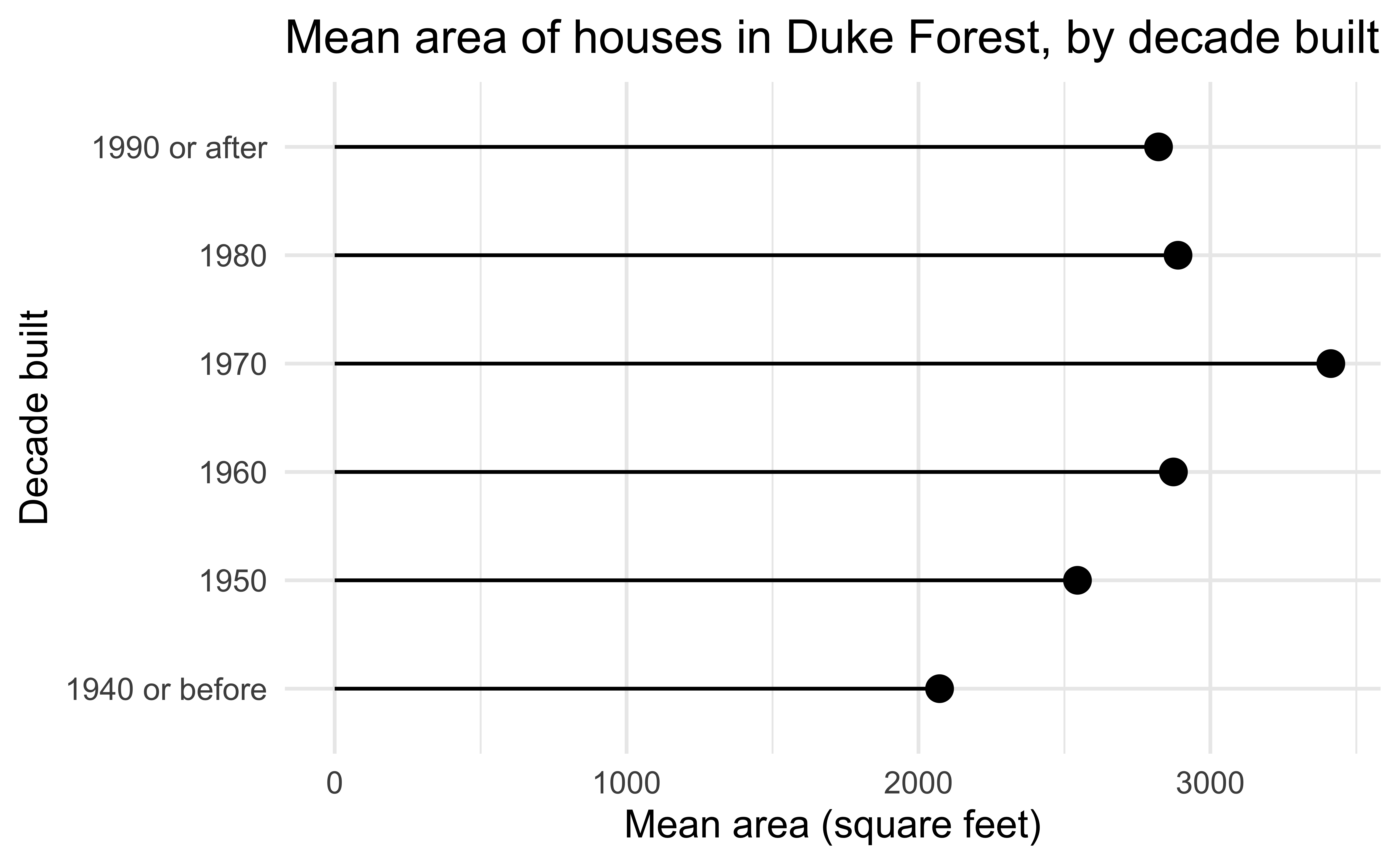
Lollipop chart – a happy medium?

Application exercise

  • Go to the course GitHub organization: https://github.com/vizdata-s24

  • Clone the repo called ae-01-YOUR-GITHUB-NAME and work on the exercise.

  • Once you’re done, commit and push your changes to GitHub.

  • Label your cell(s) and pay attention to code style and formatting!
Bad data

Bad perception

Aspect ratios affect our perception of rates of change, modeled after an example by William S. Cleveland.

Aesthetic mappings in ggplot2

A second look: lollipop chart

ggplot(
  mean_area_decade,
  aes(y = decade_built_cat, x = mean_area)
) +
  geom_point(size = 4) +
  geom_segment(aes(
    x = 0,
    xend = mean_area,
    y = decade_built_cat,
    yend = decade_built_cat
  )) +
  labs(
    x = "Mean area (square feet)",
    y = "Decade built",
    title = "Mean area of houses in Duke Forest, by decade built"
  )

Activity: Spot the differences I

Can you spot the differences between the code here and the one provided in the previous slide? Are there any differences in the resulting plot? Work in a pair (or group) to answer.

ggplot(
  mean_area_decade,
  aes(y = decade_built_cat, x = mean_area)
) +
  geom_point(size = 4) +
  geom_segment(aes(
    xend = 0,
    yend = decade_built_cat
  )) +
  labs(
    x = "Mean area (square feet)",
    y = "Decade built",
    title = "Mean area of houses in Duke Forest, by decade built"
  )

Global vs. layer-specific aesthetics

  • Aesthetic mappings can be supplied in the initial ggplot() call, in individual layers, or in some combination of both.

  • Within each layer, you can add, override, or remove mappings.

  • If you only have one layer in the plot, the way you specify aesthetics doesn’t make any difference. However, the distinction is important when you start adding additional layers.

Activity: Spot the differences II

Do you expect the following plots to be the same or different? If different, how? Discuss in a pair (or group) without running the code and sketch the resulting plots based on what you think the code will produce.

# Plot A
ggplot(duke_forest, aes(x = area, y = price)) +
  geom_point(aes(color = decade_built_cat))
# Plot B
ggplot(duke_forest, aes(x = area, y = price)) +
  geom_point(color = "blue")
# Plot C
ggplot(duke_forest, aes(x = area, y = price)) +
  geom_point(color = "#a493ba")

Wrap up

Think back to all the plots you saw in the lecture, without flipping back through the slides. Which plot first comes to mind?

Geoms

Geoms

  • Geometric objects, or geoms for short, perform the actual rendering of the layer, controlling the type of plot that you create

  • You can think of them as “the geometric shape used to represent the data”

One variable

  • Discrete:

    • geom_bar(): display distribution of discrete variable.
  • Continuous

    • geom_histogram(): bin and count continuous variable, display with bars

    • geom_density(): smoothed density estimate

    • geom_dotplot(): stack individual points into a dot plot

    • geom_freqpoly(): bin and count continuous variable, display with lines

Aside

Always use “typewriter text” (monospace font) when writing function names, and follow with (), e.g.,

  • geom_freqpoly()

  • mean()

  • lm()

geom_dotplot()

What does each point represent? How are their locations determined? What do the x and y axes represent?

ggplot(duke_forest, aes(x = price)) +
  geom_dotplot(binwidth = 50000, dotsize = 0.7)

Comparing across groups

Which of the following allows for easier comparison across groups?

ggplot(duke_forest, aes(x = price, fill = decade_built_cat)) +
  geom_histogram(binwidth = 100000)

ggplot(duke_forest, aes(x = price, color = decade_built_cat)) +
  geom_freqpoly(binwidth = 100000, linewidth = 1)

Two variables - both continuous

  • geom_point(): scatterplot

  • geom_quantile(): smoothed quantile regression

  • geom_rug(): marginal rug plots

  • geom_smooth(): smoothed line of best fit

  • geom_text(): text labels

Two variables - show density

  • geom_bin2d(): bin into rectangles and count

  • geom_density2d(): smoothed 2d density estimate

  • geom_hex(): bin into hexagons and count

geom_hex()

Not very helpful for 98 observations:

ggplot(duke_forest, aes(x = area, y = price)) +
  geom_hex()

geom_hex()

More helpful for 53940 observations:

ggplot(diamonds, aes(x = carat, y = price)) +
  geom_hex()

geom_hex()

(Maybe) even more helpful on the (natural) log scale:

ggplot(diamonds, aes(x = carat, y = price)) +
  geom_hex() +
  scale_fill_gradient(trans = "log")

geom_hex() and warnings

  • Requires installing the hexbin package separately!
install.packages("hexbin")
  • Otherwise you might see
Warning: Computation failed in `stat_binhex()`

Two variables

  • At least one discrete
    • geom_count(): count number of point at distinct locations
    • geom_jitter(): randomly jitter overlapping points
  • One continuous, one discrete
    • geom_col(): a bar chart of pre-computed summaries
    • geom_boxplot(): boxplots
    • geom_violin(): show density of values in each group

geom_jitter()

How are the following three plots different?

ggplot(duke_forest, aes(x = bed, y = price)) +
  geom_point()

ggplot(duke_forest, aes(x = bed, y = price)) +
  geom_jitter()

ggplot(duke_forest, aes(x = bed, y = price)) +
  geom_jitter()

geom_jitter() and set.seed()

set.seed(1234)

ggplot(duke_forest, aes(x = bed, y = price)) +
  geom_jitter()

set.seed(1234)

ggplot(duke_forest, aes(x = bed, y = price)) +
  geom_jitter()

Two variables

  • One time, one continuous
    • geom_area(): area plot
    • geom_line(): line plot
    • geom_step(): step plot
  • Display uncertainty:
    • geom_crossbar(): vertical bar with center
    • geom_errorbar(): error bars
    • geom_linerange(): vertical line
    • geom_pointrange(): vertical line with center
  • Spatial
    • geom_sf(): for map data (more on this later…)

Average price per year built

mean_price_year <- duke_forest |>
  group_by(year_built) |>
  summarize(
    n = n(),
    mean_price = mean(price),
    sd_price = sd(price)
  )

mean_price_year
# A tibble: 44 × 4
   year_built     n mean_price sd_price
        <dbl> <int>      <dbl>    <dbl>
 1       1923     1     285000      NA 
 2       1934     1     600000      NA 
 3       1938     1     265000      NA 
 4       1940     1     105000      NA 
 5       1941     2     432500   28284.
 6       1945     2     525000  530330.
 7       1951     2     567500  258094.
 8       1952     2     531250  469165.
 9       1953     2     575000   35355.
10       1954     4     600000   33912.
# ℹ 34 more rows

geom_line()

ggplot(mean_price_year, aes(x = year_built, y = mean_price)) +
  geom_line()

geom_area()

ggplot(mean_price_year, aes(x = year_built, y = mean_price)) +
  geom_area()

geom_step()

ggplot(mean_price_year, aes(x = year_built, y = mean_price)) +
  geom_step()